“Design used to be the seasoning you’d sprinkle on for taste. Now it’s the flour you need at the start of the recipe.’’

— John Maeda, Designer and Technologist
closeing x icon

Contact us

Please tell us a bit about your project idea and we’ll get back to you as soon as possible.
Tell us about your project idea
Thank you! Your submission has been received!
Oops! Something went wrong while submitting the form.
closeing x icon
Privacy Policy

This Privacy policy was published on March 1st, 2020.

GDPR compliance

At UX GIRL we are committed to protect and respect your privacy in compliance with EU - General Data Protection Regulation (GDPR) 2016/679, dated April 27th, 2016. This privacy statement explains when and why we collect personal information, how we use it, the conditions under which we may disclose it to others and how we keep it secure. This Privacy Policy applies to the use of our services, products and our sales, but also marketing and client contract fulfilment activities. It also applies to individuals seeking a job at UX GIRL.

About UX GIRL

UX GIRL is a design studio firm that specialises in research, strategy and design and offers clients software design services. Our company is headquartered in Warsaw, Poland and you can get in touch with us by writing to hello@uxgirl.com.

When we collect personal data about you
  • When you interact with us in person – through correspondence, by phone, by social media, or through our uxgirl.com (“Site”).
  • When we get personal information from other legitimate sources, such as third-party data aggregators, UX GIRL marketing partners, public sources or social networks. We only use this data if you have given your consent to them to share your personal data with others.
  • We may collect personal data if it is considered to be of legitimate interest and if this interest is not overridden by your privacy interests. We make sure an assessment is made, with an established mutual interest between you and UX GIRL.
  • When you are using our products.
Why we collect and use personal data

We collect and use personal data mainly to perform direct sales, direct marketing, and customer service. We also collect data about partners and persons seeking a job or working in our company. We may use your information for the following purposes:

  • Send you marketing communications which you have requested. These may include information about our services, products, events, activities, and promotions of our partners. This communication is subscription based and requires your consent.
  • Send you information about the services and products that you have purchased from us.
  • Perform direct sales activities in cases where legitimate and mutual interest is established.
  • Provide you content and venue details on a webinar or event you signed up for.
  • Reply to a ‘Contact me’ or other web forms you have completed on our Site (e.g., to download an ebook).
  • Follow up on incoming requests (client support, emails, chats, or phone calls).
  • Perform contractual obligations such as invoices, reminders, and similar. The contract may be with UX GIRL directly or with a UX GIRL partner.
  • Notify you of any disruptions to our services.
  • Contact you to conduct surveys about your opinion on our services and products.
  • When we do a business deal or negotiate a business deal, involving sale or transfer of all or a part of our business or assets. These deals can include any merger, financing, acquisition, or bankruptcy transaction or proceeding.
  • Process a job application.
  • To comply with laws.
  • To respond to lawful requests and legal process.
  • To protect the rights and property of UX GIRL, our agents, customers, and others. Includes enforcing our agreements, policies, and terms of use.
  • In an emergency. Includes protecting the safety of our employees, our customers, or any person.
Type of personal data collected

We collect your email, full name and company’s name, but in addition, we can also collect phone numbers. We may also collect feedback, comments and questions received from you in service-related communication and activities, such as meetings, phone calls, chats, documents, and emails.

If you apply for a job at UX GIRL, we collect the data you provide during the application process. UX GIRL does not collect or process any particular categories of personal data, such as unique public identifiers or sensitive personal data.

Information we collect automatically

We automatically log information about you and your computer. For example, when visiting uxgirl.com, we log ‎your computer operating system type,‎ browser type,‎ browser language,‎ pages you viewed,‎ how long you spent on a page,‎ access times,‎ internet protocol (IP) address and information about your actions on our Site.

The use of cookies and web beacons

We may log information using "cookies." Cookies are small data files stored on your hard drive by a website. Cookies help us make our Site and your visit better.

We may log information using digital images called web beacons on our Site or in our emails.

This information is used to make our Site work more efficiently, as well as to provide business and marketing information to the owners of the Site, and to gather such personal data as browser type and operating system, referring page, path through site, domain of ISP, etc. for the purposes of understanding how visitors use our Site. Cookies and similar technologies help us tailor our Site to your personal needs, as well as to detect and prevent security threats and abuse. If used alone, cookies and web beacons do not personally identify you.

How long we keep your data

We store personal data for as long as we find it necessary to fulfil the purpose for which the personal data was collected, while also considering our need to answer your queries or resolve possible problems. This helps us to comply with legal requirements under applicable laws, to attend to any legal claims/complaints, and for safeguarding purposes.

This means that we may retain your personal data for a reasonable period after your last interaction with us. When the personal data that we have collected is no longer required, we will delete it securely. We may process data for statistical purposes, but in such cases, data will be anonymised.

Your rights to your personal data

You have the following rights concerning your personal data:

  • The right to request a copy of your personal data that UX GIRL holds about you.
  • The right to request that UX GIRL correct your personal data if inaccurate or out of date.
  • The right to request that your personal data is deleted when it is no longer necessary for UX GIRL to retain such data.
  • The right to withdraw any consent to personal data processing at any time. For example, your consent to receive digital marketing messages. If you want to withdraw your consent for digital marketing messages, please make use of the link to manage your subscriptions included in our communication.
  • The right to request that UX GIRL provides you with your personal data.
  • The right to request a restriction on further data processing, in case there is a dispute about the accuracy or processing of your personal data.
  • The right to object to the processing of personal data, in case data processing has been based on legitimate interest and/or direct marketing.

Any query about your privacy rights should be sent to hello@uxgirl.com.

Hotjar’s privacy policy

We use Hotjar in order to better understand our users’ needs and to optimize this service and experience. Hotjar is a technology service that helps us better understand our users experience (e.g. how much time they spend on which pages, which links they choose to click, what users do and don’t like, etc.) and this enables us to build and maintain our service with user feedback. Hotjar uses cookies and other technologies to collect data on our users’ behavior and their devices (in particular device's IP address (captured and stored only in anonymized form), device screen size, device type (unique device identifiers), browser information, geographic location (country only), preferred language used to display our website). Hotjar stores this information in a pseudonymized user profile. Neither Hotjar nor we will ever use this information to identify individual users or to match it with further data on an individual user. For further details, please see Hotjar’s privacy policy by clicking on this link.

You can opt-out to the creation of a user profile, Hotjar’s storing of data about your usage of our site and Hotjar’s use of tracking cookies on other websites by following this opt-out link.

Sharethis’s privacy policy

We use Sharethis to enable our users to share our content on social media. Sharethis lets us collects information about the number of shares of our posts. For further details, please see Sharethis’s privacy policy by clicking on this link.

You can opt-out of Sharethis collecting data about you by following this opt-out link.

Changes to this Privacy Policy

UX GIRL reserves the right to amend this privacy policy at any time. The latest version will always be found on our Site. We encourage you to check this page occasionally to ensure that you are happy with any changes.

If we make changes that significantly alter our privacy practices, we will notify you by email or post a notice on our Site before the change takes effect.

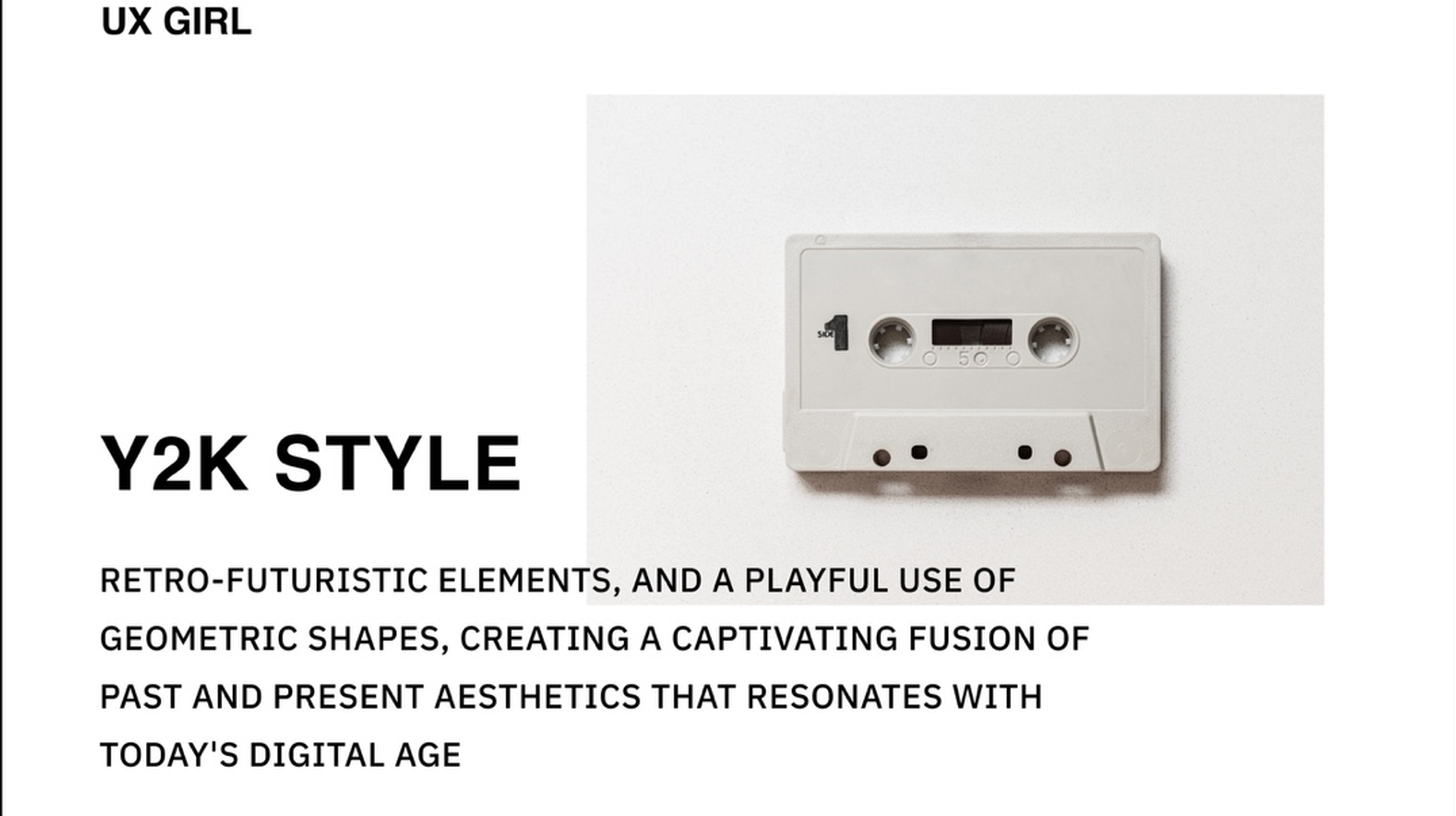
A minimalistic graphic promoting the Y2K style, featuring the large bold text 'Y2K STYLE' and a detailed description below. To the right is a small, white, vintage audio cassette tape centered on a plain white background

Product Design

Flashback to Y2K: Style & Modern Interface Design

reading time  - clock - icon
3 min
Author picture
  • Explore the return of Y2K-inspired design.
  • Learn how retro aesthetics influence modern interfaces.
  • Discover when nostalgic design enhances UX.
  • Understand how to balance trends with usability.

There are many trends in user interface design. In this article, we'll delve into the resurgence of Y2K style and how it's shaping the digital landscape today, bridging the past and future in design. Explore the exciting world of Y2K design and its impact on contemporary interfaces.

What is Y2K style?

Y2K style is the aesthetics of user interface design or graphic design. It features a vibrant and bold color palette, with neon greens, electric blues and metallic silvers taking center stage. Geometric shapes dominated Y2K's design, especially those with futuristic edges such as sharp angles and asymmetry. Additionally, elements such as pixelation, glitch effects, and kaleidoscopic patterns frequently appeared, adding a surreal and dreamlike feel to the visuals. The Y2K aesthetic is a combination of optimism and concern that marked the dawn of the digital age and is causing a powerful resurgence in modern interface design.

Y2K in UI Design

The Y2K aesthetic's resurgence has been particularly striking in the field of user interface design. Designers have enthusiastically embraced the Y2K style's vibrant colors and bold shapes, giving digital interfaces a captivating and futuristic edge.

Y2K-inspired UI designs prominently feature audacious color palettes, often including neon shades and metallic tones. These vibrant colors instantly grab users' attention and create a memorable visual experience.

Geometric shapes, asymmetry, and dynamic patterns are fundamental to Y2K-inspired UI design. Sharp angles and futuristic designs can be seen in buttons, icons, and navigation elements, guiding users through digital spaces with a unique visual language.

Pixelation and glitch effects add a touch of nostalgia and a sense of unpredictability to these interfaces, creating a dreamlike quality. These elements not only engage users but also provide a refreshing departure from conventional, minimalistic designs in the digital landscape.

Challenges and opportunities of Y2K aesthetics

The resurgence of Y2K aesthetics in contemporary design presents a unique set of challenges and opportunities. One significant challenge lies in finding the right balance between nostalgia and modern functionality. Designers must ensure that Y2K elements enhance the user experience without compromising usability.

Another challenge is avoiding overuse. While Y2K aesthetics can be visually engaging, excessive application can lead to a cluttered and overwhelming interface. Designers need to judiciously incorporate these elements to create a cohesive and user-friendly design.

Opportunities arise from the emotional resonance and nostalgia associated with Y2K aesthetics. Leveraging these elements can create a stronger user-brand connection, evoking positive emotions and memories.

Furthermore, the Y2K resurgence opens doors for experimentation and innovation. Designers can explore new ways to blend Y2K aesthetics with cutting-edge technology, offering users fresh and memorable digital experiences.

Which Users Can Y2K UI Design Target?

The resurgence of Y2K UI design presents an exciting opportunity to engage a diverse range of users. This aesthetic, with its unique blend of nostalgia and modernity, has the potential to resonate with various audiences. Let's explore which users Y2K UI design can effectively target.

Nostalgia Enthusiasts: Y2K UI design naturally appeals to those who have fond memories of the early 2000s. Users who grew up during that era may be drawn to the design style, as it evokes feelings of nostalgia and sentimentality. This group often seeks a connection to their past and enjoys interfaces that transport them back to the turn of the millennium.

Generation Z: While not firsthand witnesses to the Y2K era, Generation Z has shown a remarkable affinity for the aesthetics of the time. Y2K UI design can tap into their interest in retro and vintage styles, offering a fresh take on a period they may have missed but still find intriguing.

Visual and Creative Professionals: Y2K UI design, with its vibrant colors and bold shapes, often resonates with visual and creative professionals. Graphic designers, artists, and those in the creative industries appreciate the design elements that challenge the status quo and inspire creativity. Y2K UI design can be a source of inspiration for this group.

Brands and Marketers: For businesses and marketers, Y2K UI design offers a distinctive way to capture the attention of users. It's an excellent choice for creating memorable digital experiences, enhancing brand recognition, and standing out in a crowded marketplace. The unique visual language can leave a lasting impression on potential customers.

Tech Enthusiasts: Tech-savvy users who embrace innovation are often intrigued by the fusion of Y2K aesthetics with modern technology. Y2K UI design can offer a unique, cutting-edge user experience that appeals to those who are eager to explore new design trends and digital frontiers.

Inspiring Websites Made in Y4K Style

While Y2K aesthetics have made a resounding comeback, some designers are already pushing the boundaries into the future, embracing what we can playfully term "Y4K" style. These websites embody the spirit of Y2K design while introducing innovative elements that capture the essence of contemporary design. Let's take a look at a few remarkable examples:

Nexal Studio's website flawlessly blends Y2K aesthetics with futuristic elements. The site features an array of bright, contrasting colors, reminiscent of the early 2000s, combined with smooth animations and modern design techniques.

A promotional graphic for 'NEXAL' featuring a casual photo of four young team members inside an office. One man is laughing, another is pointing up, and two others are smiling slightly. The photo is framed by a soft, rounded light-beige background with the large, bold black text 'NEXAL' highlighted by a curved yellow bar above the group.

BC Design celebrates its 10th anniversary with a website that brilliantly incorporates Y2K aesthetics and old game design. The use of gradients and unique layouts adds a futuristic twist, offering an innovative take on the Y2K-inspired design.

Y2K-style digital interface with neon green text ‘Share Prints Win Prizes,’ countdown timer, pixel globe graphic, and glowing futuristic UI elements.

The Flow Ventures takes Y2K design to new heights by combining it with glitch effects and pixelation. The result is a visually striking website that encapsulates the retro-futuristic essence while maintaining user-friendliness.

Screenshot of the Flow Ventures landing page against a soft, cloudy background. The main headline reads 'Flow Ventures' in large, pixelated white font, with the tagline 'THE FIRST LOW-CODE VENTURE STUDIO' displayed above. The page highlights that Flow Ventures creates SaaS products using Webflow, technical development, and AI, and features logos of products like 'sixstar' and 'Data_GOAT

Chloé Digital's website is an exceptional blend of Y2K aesthetics and contemporary web design. It showcases dynamic shapes, bold typography, and vibrant colors, presenting a unique digital experience that appeals to both nostalgia enthusiasts and modern design aficionados.

A screenshot of a website in a vintage operating system or 'desktop' aesthetic, featuring multiple layered windows with old-school borders. A central pop-up asks users to 'Join the CD World Community' with fields for name and email, while other windows display content like 'Myth or Fact? How well do you know the creator industry?' and the site's main visual of hands typing on a retro keyboard.

In conclusion, as the design world continues to evolve, Y2K aesthetics remain a timeless source of inspiration. They bridge generations and offer a fascinating glimpse into the future, where past and present collide to create immersive, visually captivating online experiences.

Author picture
She specializes in interaction design, responsive interfaces, and user-centered digital experiences. Her expertise includes usability, visual hierarchy, and interface optimization for web and mobile products.
A minimalist Bento Grid layout graphic featuring the large black text 'Bento Grid' on a light background, surrounded by four smaller, stacked tiles that highlight key statistics and features, including 'Up to 100% satisfied users' and 'Over 30 million Bento Grid Products'.
reading time  - clock - icon
5 min

Beyond Boxes: Elevating Design with Bento Grid Patterns

What is Bento Grid?

Bento Grid draws inspiration from the iconic Japanese lunchbox, transforming its neatly divided compartments into a visually appealing and organized layout for websites. This design pattern employs a grid-based structure, slicing the website's content into distinct sections or compartments. Each compartment serves a unique purpose, providing a dedicated space to showcase specific features, thus offering visitors an intuitive and engaging way to navigate through information.

Benefits of Bento Grid

Users engaged with products featuring the Bento Grid layout enjoy numerous benefits. These benefits include:

Structure and Organization: Bento Grid introduces a structured layout, dividing the UI into well-defined compartments. Each compartment serves a unique purpose, housing specific elements such as navigation menus, content sections, or interactive features. This systematic organization enhances the overall clarity of the interface, allowing users to navigate with ease and find information effortlessly.

Visual Hierarchy: The grid-based structure of Bento Grid naturally lends itself to creating a visual hierarchy. By allocating different sections for various content or features, designers can guide users' attention and emphasize key elements. This inherent visual hierarchy contributes to a more intuitive user experience, ensuring that important information stands out.

Seamless Responsiveness: Bento Grid adapts seamlessly to various screen sizes and resolutions, making it a responsive choice for UI design. Whether viewed on a desktop, tablet, or smartphone, the grid-based layout ensures a consistent and user-friendly experience. This adaptability is crucial in an era where users access interfaces across a diverse range of devices.

Storytelling through Design: Much like the compartments of a bento box tell a culinary story, Bento Grid allows designers to weave a narrative through visual elements. Each compartment becomes a chapter in the user's journey, conveying information in a structured and engaging manner. This storytelling approach enhances user engagement and creates a memorable user experience.

Emphasis on User Engagement: Bento Grid is not just about organization; it's about creating an engaging user experience. By presenting information in visually distinct compartments, users are encouraged to explore different facets of the interface. This design pattern promotes interaction, keeping users intrigued and invested in the content or functionality presented.

Challenges Associated with Bento Grid

Every design solution presents its own set of challenges that designers must navigate. Despite its numerous advantages, Bento Grid also encounters several challenges. Here are a few:

Flexibility Constraints

The structured nature of the Bento Grid may introduce certain limitations in design flexibility, making it more challenging to adapt to unconventional design concepts.

Need for Careful Planning

Effectively utilizing the Bento Grid requires meticulous planning and thoughtful allocation of space within individual compartments, which can be time-consuming.

Potential for Monotony

Without proper diversification, Bento Grid runs the risk of inducing monotony in projects, potentially making interfaces appear repetitive or predictable.

While acknowledging these challenges, it's essential to note that their significance can vary based on specific project contexts and applications of the Bento Grid design.

Real-world examples of Bento Grid usage

Apple is a pinnacle in the world of technology, employs the Bento Grid with exceptional finesse. The amalgamation of high-quality graphics and gradients transforms ordinary tiles into a stunning display of aesthetics and functionality.

Promotional infographic detailing the features of the Apple Studio Display monitor. Highlights include the '27-inch 5K Retina display,' 'Nano-texture glass option,' 'Six-speaker sound system with Spatial Audio,' 'Studio-quality mics,' 'Center Stage' 12MP camera, 'Integration with macOS,' and 'Tilt and height adjustable stand option,' surrounding a central image of the monitor displaying a colorful abstract wallpaper

On the BetterStack website, dedicated to developer tools, the Bento Grid excels in presenting a diverse array of features and services. Compact compartments facilitate a clear presentation of alternatives to popular tools, enabling users to swiftly compare and choose the most suitable solutions.

The WorkOS website, specializing in identity management tools, utilizes the Bento Grid to organize various aspects of the Single Sign-On solution. In this case, the separation of different pieces of information works remarkably well, turning information into visually appealing graphics rather than typical product details.

A section of the WorkOS website promoting their authentication platform, titled 'Support your first enterprise customer in days.' It highlights Single Sign-On (SSO) integration, SAML + OpenID Connect support, and connectivity with '20+ Identity providers,' emphasizing that the service provides authentication while allowing the user to 'B.Y.O. database, UX, and UI'

Bento Grid finds its application in dashboard design, as exemplified by Setproduct. In screens where designers need to present a large amount of data to users, the segregation and proper visualization of information become exceptionally important.

Promotional graphic for ORION, offering '25 ready-to-use templates.' The image displays a collage of dark and light-mode dashboard and data visualization interfaces, featuring financial statistics, dynamic charts, and data flow diagrams, highlighting flexibility and speed in building layouts.

All these examples illustrate that the Bento Grid is not merely a theoretical model but a practical tool that contributes to the effective communication of information and encourages user interaction. The inspiring use of the Bento Grid in real-world projects confirms that it is not just an aesthetic maneuver but a strategy that enhances user experiences, conveying complex information in an accessible and attractive manner.

A man and a woman collaborating at a desk, smiling as they review colorful sticky notes and sketches in a warmly lit, creative workspace
reading time  - clock - icon
5 min

Building AI Products? Why UX Is Essential

As AI projects gain traction and SaaS ventures become less popular to start, I’ve noticed a new mindset emerging-the belief that you can build an entire AI project on your own. The idea is that you don’t need a designer or even analysts to help shape your groundbreaking AI product because there’s now an abundance of AI tools, like Midjourney and DALL·E, that can assist with the process. But let me tell you-you couldn’t be more wrong, and I’m about to prove it.

So, why do you need a designer in the first place in this new era of AI tools for your AI project? I’m going to break it down and cover the most important aspects-focusing on the key principles behind creating truly great AI products.

AI Products Have More Functionalities Than Just Chat

Most AI products come with additional features that determine whether they are truly usable or not. Take image generation tools, for example-they offer a wide range of options like vary subtle, vary strong, or even a seed ID. But let’s be honest-does anyone even know what that is, anyway? ChatGPT is fairly simple since it’s just text-based, but when you move into text-to-image or text-to-video interfaces, it quickly becomes clear that a basic text field isn’t enough. Sure, you can use it by just typing in prompts, but without proper use of functionalities, you won’t be able to tap into its full potential.

Another example-take the Share feature in ChatGPT. Let’s face it, it just doesn’t work! Whether you’re trying to share a conversation with someone else or even a teammate, it’s always a hassle. More often than not, you’ll end up copying and pasting the answer instead because OpenAI clearly didn’t test or design this feature with usability in mind or is it just strategy? (evil laugh, not mine of course). To sum up, AI products are usually based on Writing functionalities, but not fully. You will still need to design a proper user flow and user interface with a UX designer, before starting the development of a feature.

Midjourney settings interface showing options for image size, aesthetics (stylization, weirdness, variety), model version selection, and speed mode, displayed on a clean white dashboard layout
Midjourney user interface

Pricing segmentation and upsell

If you’re building a groundbreaking AI product, you’ll definitely want to monetize it somehow (those API credits can be a real hassle to pay for, right?). This means you’ll need a solid market strategy, a well-designed pricing structure, and upsell functionalities that encourage users to move up tier-not down.

This is where a skilled UX designer becomes invaluable. Figuring out the best places to introduce upsells and designing a smooth, effective funnel isn’t just an afterthought-it’s a crucial part of your product’s success. Because let’s be real, aside from great AI functionality, your second biggest priority is making sure users actually want to pay for it.

A Midjourney upgrade pop-up showing pricing and premium features, including no daily limits, artistic control, commercial license, private images, fast generation, creative upscale, and unlimited uploads. A large abstract illustration appears on the left side, with upgrade pricing starting at $10 per month on the right
In order to generate more images in Recraft at once you need to upgrade

Great UI doesn’t automatically translate to great UX (even with AI generated graphics)

There are countless tools available for creating stunning assets-take Midjourney, for example, which we even shared tips and tricks for in one of our articles. Yes, you can use AI tools like this to generate benchmarks or even the visual assets you need for your project with ease.

But remember-UI is not UX. A visually impressive interface won’t save a poorly designed experience. If the entire user journey isn’t thoughtfully crafted, with all edge cases considered, you’ll likely run into serious user retention issues down the line. A beautiful UI means nothing if users get frustrated and leave.

A dark-themed AI interface showing a welcome screen with a colorful 3D brain illustration on the right. The left side includes the text ‘Welcome to AI,’ a prompt input field, and a blue ‘Generate’ button. Below are three feature cards labeled Chat, Images, and Documents.
Super quick presentation of ChatGPT "generate a beautiful UI for an AI product" output, but what is the product about?

Introducing AI features for Fintech and Health care

Some industries require extreme precision in user input and output, meaning they might not benefit from AI-driven features as much as others. Imagine you're planning a detailed travel itinerary for clients in a city you know nothing about. You could spend hours researching, or you could use an AI writing tool to generate ideas you might never have thought of on your own. In this case, AI is a helpful assistant.

Now, imagine using the same AI-generated interface to initiate a bank transaction or transfer money to another person or institution. The potential for errors is enormous-and the consequences could be serious. That’s why industries that rely on precision, like healthcare and fintech, will integrate AI carefully and sparingly. Many of the interfaces we use today in these fields will likely remain unchanged, even after the AI revolution.

If you're building an AI product in fintech or healthcare, it’s critical to carefully plan functionalities with a dedicated UX designer-ideally, one who specializes in the industry. At UX GIRL, fintech is one of our core specialties. We’ve honed our skills through years of experience and have mastered the craft of creating highly usable fintech interfaces.

Slide titled ‘Use cases for AI in fintech’ listing examples including credit risk assessment, fraud detection, virtual assistants, AI-based personal finance tools, and algorithmic trading and portfolio management
IBM Research proposes following use cases for fintech to use AI

Focus on Your Use-Who Is Still Human

The tools might be evolving, but remember-you’re still designing for human beings, and not everyone effortlessly navigates the ever-changing world of new tech. Sometimes, it’s better to stick with familiar interaction patterns rather than reinvent the wheel.

Take Windows ME, for example. Microsoft tried to revolutionize the operating system world, but instead of being embraced, it became one of the most infamous failures in tech history. Users found it confusing, buggy, and unintuitive, leading many to downgrade to older versions or simply wait for a completely new release rather than adapt to it. The lesson? No matter how advanced your AI product is, if the user experience isn’t intuitive and user-friendly, people won’t hesitate to abandon it.

So maybe it’s best to hire another human to design for a human-not a machine.

A man working on a laptop in a bright, modern office filled with plants. Another person works at a desk in the background, and a large monitor displaying design software is visible on the right

Afterword: The AI Revolution Needs Great UX-And So Do You

AI is changing the way we build products, but one thing remains the same-your users are still human. No matter how advanced your AI tool is, if people can’t navigate it easily, trust it, or see its full potential, they won’t use it.

That’s why great UX design isn’t optional-it’s essential. From crafting seamless user journeys to designing intuitive interactions, a skilled UX designer ensures that your AI product isn’t just powerful but also usable and profitable.

At UX GIRL, we specialize in creating AI-friendly, user-first designs, particularly in high-stakes industries like fintech and healthcare. Whether you're building a cutting-edge AI tool or enhancing an existing product, we can help you design experiences that delight users and drive business success.

Need a UX designer for your AI product? Let’s talk. Get in touch with UX GIRL today and let’s build something great together!

A collage-style graphic showing various Midjourney prompt examples, including paintings, dogs on the beach, mountains, and bubble letter balloons, with the title ‘Midjourney Tips & Tricks’ displayed on the left.
reading time  - clock - icon
5 min

Master MidJourney: Essential Tips & Tricks to Create Stunning AI Art

Midjourney is an innovative tool based on diffusion technology that allows you to generate images using artificial intelligence from descriptive text inputs, also known as prompts. This tool makes it possible to bring nearly any creative vision to life on screen.

In addition to creating images, Midjourney serves as a great source of inspiration for further creative work. However, to use it effectively, it’s important to understand how to craft prompts and make the most of its features.

How to Write an Effective Prompt?

A prompt is a text description that Midjourney uses to generate an image. Here are a few key guidelines to help you craft the perfect prompt:

1. Be Specific

Describe exactly what you want to see. Avoid vague language or ambiguous terms. Instead of writing "cats," try something more detailed, like: "Photorealistic portrait of three Persian cats with blue eyes."

2. Use Keywords

Incorporate keywords relevant to the effect you want to achieve, such as realistic, moody, minimalistic.

3. Effective Descriptions

Terms like "dreamy," "realistic," or "painterly" can significantly influence the style of the generated image. However, don’t overuse descriptive terms to avoid overwhelming the final output.

4. Context, Not Instructions

Focus on describing the context of the scene (e.g., sunset over a lake) rather than technical instructions. Concentrate on atmosphere, composition, and mood rather than creating overly complex command sequences.

5. Experiment

Small changes in the prompt can greatly affect the result. Gradually adjust single elements to better understand how each change impacts the final image.

What to Include in Your Prompt?

When creating a prompt, consider including the following elements to precisely define your expectations:

Subject: person, animal, character, object

Medium: photo, painting, illustration, sculpture

Scenery: indoors, outdoors, underwater, urban setting

Lighting: ambient, neon, overcast, studio lights

Mood: calm, energetic, nostalgic

Composition: portrait, close-up, bird's-eye view, detailed shot

Midjourney Parameters - The Key to Greater Control

Aspect Ratio --ar

The default aspect ratio for images is 1:1. If you need different proportions, use the --ar parameter, e.g., --ar 16:9 for a widescreen format.

Two AI-generated images of dogs on a beach. The left image shows a dog sitting by the shoreline under a bright sky with clouds. The right image shows a golden retriever sitting on the sand with the ocean and blurred buildings in the background. Below each image is a prompt demonstrating the use of ‘/imagine’ commands, one with a standard prompt and one with the aspect ratio parameter --ar 16:9.

Stylize --s (0-1000)

The --s parameter controls the level of stylization. A higher value allows Midjourney to add more creative interpretation to your prompt. At a higher setting, you may see intricate details like reflections, fireflies, or embellishments.

Note: Stylize is not the same as Style!

Two images of a dog drawn in a children’s art style. The left image shows a brightly colored, cartoon-like dog with large round eyes and patchwork colors in orange, yellow, green, blue, and red. The right image shows a more painterly children’s illustration of an orange dog with large expressive eyes against a dark blue background

Chaos --c (0-100)

The chaos parameter generates varied interpretations of the prompt. A value of 100 produces very different versions of the image, which can be useful for brainstorming and exploring different concepts.

Weird --w (0-3000)

This parameter generates unusual and unexpected interpretations of your prompt. It’s ideal for creating unconventional and avant-garde visuals.

Two illustrated drawings of a small dog on a skateboard. The left drawing shows the dog sitting calmly on a yellow skateboard, while the right drawing shows the dog doing an energetic trick on a black skateboard. Both drawings resemble children’s artwork with soft colored-pencil textures

Style --style

The --style option allows you to select a specific style mode. The "raw" style generates unembellished images closely matching the prompt, while the "niji" style is ideal for anime and comic-inspired visuals.

Two illustrations of a dog riding a skateboard. The left image shows a crayon-style children’s drawing of a yellow dog on a green skateboard against a scribbled blue background. The right image shows a vibrant, stylized cartoon dog performing a skateboard trick in mid-air on a bright blue background.

Speeding Up Your Midjourney Workflow - Functional Parameters

Repeat --repeat

This parameter allows you to generate multiple images based on the same prompt in one go, - - repeat 3 allows you to create 12 images. 

Permutations {}

Permutations allow you to generate multiple variations of a prompt at once. By listing options in curly brackets, such as Spring {morning, sunset, night}, you will receive images corresponding to each variant.

A grid of eight images showing transparent bubble balloons shaped like the letters U and X floating in a bright blue sky with clouds.

Tile --tile

The --tile parameter creates seamless, repeating patterns. Make sure that the design elements in your prompt can form a cohesive pattern.

No --no

If Midjourney persistently adds an unwanted element to your image, you can use the --no parameter to exclude it, e.g., --no text to remove text overlays.

Two still-life style nature paintings. The left painting shows a vibrant, fantasy-like forest scene filled with colorful flowers, dense trees, a small stream, and birds. The right painting shows a calm, realistic forest landscape with tall trees reflected in a still pond, with no flowers present

Conclusion

Midjourney offers virtually limitless creative possibilities - from simple illustrations to intricate and inspiring artwork. The key to success lies in experimenting with prompts and parameters. The more familiar you become with the tool’s features, the more control you will have over the final output. Let your creativity flow and have fun creating images that match your vision!

Begin your design adventure now!

Contact us