“Design used to be the seasoning you’d sprinkle on for taste. Now it’s the flour you need at the start of the recipe.’’
— John Maeda, Designer and Technologist
Contact us
Please tell us a bit about your project idea and we’ll get back to you as soon as possible.
Thank you! Your submission has been received!
Oops! Something went wrong while submitting the form.
Privacy Policy
This Privacy policy was published on March 1st, 2020.
GDPR compliance
At UX GIRL we are committed to protect and respect your privacy in compliance with EU - General Data Protection Regulation (GDPR) 2016/679, dated April 27th, 2016. This privacy statement explains when and why we collect personal information, how we use it, the conditions under which we may disclose it to others and how we keep it secure. This Privacy Policy applies to the use of our services, products and our sales, but also marketing and client contract fulfilment activities. It also applies to individuals seeking a job at UX GIRL.
About UX GIRL
UX GIRL is a design studio firm that specialises in research, strategy and design and offers clients software design services. Our company is headquartered in Warsaw, Poland and you can get in touch with us by writing to hello@uxgirl.com.
When we collect personal data about you
When you interact with us in person – through correspondence, by phone, by social media, or through our uxgirl.com (“Site”).
When we get personal information from other legitimate sources, such as third-party data aggregators, UX GIRL marketing partners, public sources or social networks. We only use this data if you have given your consent to them to share your personal data with others.
We may collect personal data if it is considered to be of legitimate interest and if this interest is not overridden by your privacy interests. We make sure an assessment is made, with an established mutual interest between you and UX GIRL.
When you are using our products.
Why we collect and use personal data
We collect and use personal data mainly to perform direct sales, direct marketing, and customer service. We also collect data about partners and persons seeking a job or working in our company. We may use your information for the following purposes:
Send you marketing communications which you have requested. These may include information about our services, products, events, activities, and promotions of our partners. This communication is subscription based and requires your consent.
Send you information about the services and products that you have purchased from us.
Perform direct sales activities in cases where legitimate and mutual interest is established.
Provide you content and venue details on a webinar or event you signed up for.
Reply to a ‘Contact me’ or other web forms you have completed on our Site (e.g., to download an ebook).
Follow up on incoming requests (client support, emails, chats, or phone calls).
Perform contractual obligations such as invoices, reminders, and similar. The contract may be with UX GIRL directly or with a UX GIRL partner.
Notify you of any disruptions to our services.
Contact you to conduct surveys about your opinion on our services and products.
When we do a business deal or negotiate a business deal, involving sale or transfer of all or a part of our business or assets. These deals can include any merger, financing, acquisition, or bankruptcy transaction or proceeding.
Process a job application.
To comply with laws.
To respond to lawful requests and legal process.
To protect the rights and property of UX GIRL, our agents, customers, and others. Includes enforcing our agreements, policies, and terms of use.
In an emergency. Includes protecting the safety of our employees, our customers, or any person.
Type of personal data collected
We collect your email, full name and company’s name, but in addition, we can also collect phone numbers. We may also collect feedback, comments and questions received from you in service-related communication and activities, such as meetings, phone calls, chats, documents, and emails.
If you apply for a job at UX GIRL, we collect the data you provide during the application process. UX GIRL does not collect or process any particular categories of personal data, such as unique public identifiers or sensitive personal data.
Information we collect automatically
We automatically log information about you and your computer. For example, when visiting uxgirl.com, we log your computer operating system type, browser type, browser language, pages you viewed, how long you spent on a page, access times, internet protocol (IP) address and information about your actions on our Site.
The use of cookies and web beacons
We may log information using "cookies." Cookies are small data files stored on your hard drive by a website. Cookies help us make our Site and your visit better.
We may log information using digital images called web beacons on our Site or in our emails.
This information is used to make our Site work more efficiently, as well as to provide business and marketing information to the owners of the Site, and to gather such personal data as browser type and operating system, referring page, path through site, domain of ISP, etc. for the purposes of understanding how visitors use our Site. Cookies and similar technologies help us tailor our Site to your personal needs, as well as to detect and prevent security threats and abuse. If used alone, cookies and web beacons do not personally identify you.
How long we keep your data
We store personal data for as long as we find it necessary to fulfil the purpose for which the personal data was collected, while also considering our need to answer your queries or resolve possible problems. This helps us to comply with legal requirements under applicable laws, to attend to any legal claims/complaints, and for safeguarding purposes.
This means that we may retain your personal data for a reasonable period after your last interaction with us. When the personal data that we have collected is no longer required, we will delete it securely. We may process data for statistical purposes, but in such cases, data will be anonymised.
Your rights to your personal data
You have the following rights concerning your personal data:
The right to request a copy of your personal data that UX GIRL holds about you.
The right to request that UX GIRL correct your personal data if inaccurate or out of date.
The right to request that your personal data is deleted when it is no longer necessary for UX GIRL to retain such data.
The right to withdraw any consent to personal data processing at any time. For example, your consent to receive digital marketing messages. If you want to withdraw your consent for digital marketing messages, please make use of the link to manage your subscriptions included in our communication.
The right to request that UX GIRL provides you with your personal data.
The right to request a restriction on further data processing, in case there is a dispute about the accuracy or processing of your personal data.
The right to object to the processing of personal data, in case data processing has been based on legitimate interest and/or direct marketing.
Any query about your privacy rights should be sent to hello@uxgirl.com.
Hotjar’s privacy policy
We use Hotjar in order to better understand our users’ needs and to optimize this service and experience. Hotjar is a technology service that helps us better understand our users experience (e.g. how much time they spend on which pages, which links they choose to click, what users do and don’t like, etc.) and this enables us to build and maintain our service with user feedback. Hotjar uses cookies and other technologies to collect data on our users’ behavior and their devices (in particular device's IP address (captured and stored only in anonymized form), device screen size, device type (unique device identifiers), browser information, geographic location (country only), preferred language used to display our website). Hotjar stores this information in a pseudonymized user profile. Neither Hotjar nor we will ever use this information to identify individual users or to match it with further data on an individual user. For further details, please see Hotjar’s privacy policy by clicking on this link.
You can opt-out to the creation of a user profile, Hotjar’s storing of data about your usage of our site and Hotjar’s use of tracking cookies on other websites by following this opt-out link.
Sharethis’s privacy policy
We use Sharethis to enable our users to share our content on social media. Sharethis lets us collects information about the number of shares of our posts. For further details, please see Sharethis’s privacy policy by clicking on this link.
You can opt-out of Sharethis collecting data about you by following this opt-out link.
Changes to this Privacy Policy
UX GIRL reserves the right to amend this privacy policy at any time. The latest version will always be found on our Site. We encourage you to check this page occasionally to ensure that you are happy with any changes.
If we make changes that significantly alter our privacy practices, we will notify you by email or post a notice on our Site before the change takes effect.
In the late 90s, the digital world was ruled by the Webmaster. This single individual was a true generalist, handling everything from graphic design to database configuration and raw coding. As the internet matured, the market demanded more complexity, leading to an era of intense specialization. We built silos, separating the ux designer,ui designer, front end developer, database manager, and data scientist into distinct departments.
While specialization allowed for scale, it also created friction. Today, however, we are witnessing a full-circle evolution. The Era of Enablers (or as I like to call them, Architects of Potential) has arrived, powered by the explosive rise of AI.
Collapsing the Silos
AI is effectively removing the technical barriers that once forced us into narrow boxes. With generative tools handling the "heavy lifting" of syntax and execution, a single builder can once again oversee the entire product lifecycle. This isn't just about efficiency; it's about proximity.
When the person designing the experience is also the one enabling the build, the distance between a concept and a finished product vanishes. More importantly, the distance between the creator and the decision makers disappears.
Why This Matters for Your Career
In this new landscape, being "just" a specialist is a risky strategy. By becoming an "Enabler," you move:
Closer to the Business: You aren't just delivering assets; you are driving KPIs.
From "How" to "Why": Your value shifts from knowing a specific programming language to having deep product intuition and systems thinking.
Toward Strategic Impact: You become a strategic partner to the business, capable of turning ideas into reality at the speed of thought.
The market is no longer looking for cogs in a machine. It is looking for architects who can leverage AI to build the future. The era of the fragmented specialist is fading; the era of the Architect of Potential is here.
Artificial intelligence is no longer a distant promise for design teams-it is already reshaping how designers think, collaborate, and create. This shift was the focus of a talk delivered by Magdalena Ostoja‑Chyżyńska, CEO & Founder of UX GIRL, during Data Science Summit, one of the key events bringing together experts from data, technology, and digital innovation.
In her presentation, “How AI and Enhanced Data Access are Transforming Today’s Design,” Magdalena explored how artificial intelligence is influencing modern design practice-not as a replacement for human creativity, but as a force that is redefining how design teams work with data, insights, and complex business requirements
Design at the Intersection of AI and Data
The talk addressed a challenge many organizations currently face: how to integrate AI into design processes without reducing originality or oversimplifying complex user problems. As Magdalena explained, the growing accessibility of data and AI models has fundamentally changed how designers approach tasks such as briefing, user research, insight synthesis, requirements definition, and asset creation.
Rather than treating AI as a purely visual or generative tool, the presentation positioned it as a broader design accelerator-one that influences decision-making long before the first interface is drawn.
Insights from Real Client Projects
A key strength of the session was its grounding in real business practice. Drawing from ongoing client work at UX GIRL, Magdalena shared observations from testing different AI tools and models across multiple stages of the design process. These experiments focused on understanding where AI genuinely supports creative and analytical work, and where its limitations become visible in real-world conditions.
During the talk, she referenced commonly used tools such as Midjourney, ChatGPT, Claude, and Recraft, explaining how they were evaluated not in isolation, but in combination with different types of data and project constraints. The emphasis was not on novelty, but on effectiveness-how these tools behave when confronted with incomplete data, ambiguous requirements, or complex stakeholder expectations.
Creativity, Control, and the Role of Data
One of the central themes of the presentation was the relationship between AI output and data quality. Magdalena highlighted that AI-driven design outcomes are only as strong as the data and context provided to the models. Enhanced access to data can dramatically improve speed and clarity, but it also increases the responsibility of design teams to curate, interpret, and challenge that data rather than accept AI-generated results at face value.
The session made it clear that AI does not remove the need for designers’ judgment. On the contrary, it amplifies the importance of critical thinking, domain knowledge, and ethical responsibility in design decisions.
Why This Talk Resonated at Data Science Summit
Presenting this topic at a data-focused conference was intentional. The session connected two worlds that often operate separately: design and data science. By showing how AI is already embedded in everyday design workflows, Magdalena demonstrated that design maturity today increasingly depends on data literacy and cross‑disciplinary collaboration.
For many attendees, the talk offered a rare perspective-AI discussed not from a purely technical standpoint, but through the lens of practical design leadership and real client constraints.
Looking Ahead
The presentation reinforced UX GIRL’s position at the intersection of design, data, and emerging technology. Rather than following trends, the studio actively tests and evaluates new tools in live projects, translating experimentation into informed design decisions.
As AI continues to evolve, the questions raised during this session remain highly relevant: how to preserve originality, how to use data responsibly, and how to ensure that technology strengthens-not flattens-the impact of design.
For those interested in how AI is shaping the future of design beyond surface-level automation, the work and insights shared by UX GIRL offer a grounded and experience-driven perspective.
Software development is entering a new era. Writing code line by line? That’s old school. Today, you vibe code - flowing quickly with AI-assisted tools, generating features in minutes, and iterating with lightning speed.
But here’s the catch: without good design, vibe coding falls apart. No matter how fast you code, if your UX and UI aren’t rock-solid, your product will hit friction fast.
That’s why we at UX GIRL created our new service: Design for Vibe Coding. Because now that AI can write your code, great design is your real competitive edge.
A split-screen comparison infographic in a beige, pink, and black color palette. The left side, "Vibe Coding Without Design," shows a dark, chaotic scene where an AI robot generates a mess of tangled wires and broken interfaces, labeled with "Messy Code" and "Broken UX," leading to a frustrated user. The right side, "Vibe Coding + UX GIRL Design," shows a clean, organized scene where the AI’s work is channeled through a "UX GIRL" funnel into modular blocks and structured blueprints, resulting in a happy user and a "Superpowered Launch."
Vibe Coding Isn’t Just Fast Code - It’s a New Way to Build
Vibe coding is the rising mindset in modern product teams - a way of working that’s fast, fluid, and creative. It's enabled by AI tools like GitHub Copilot, Replit Ghostwriter, and Codeium, which make coding feel more like jamming than engineering.
But here's the truth: AI can help you write code, but it can’t fix a broken UX. Without the right flows, component structure, and interaction logic, your fast code becomes messy code - and the vibe is gone.
Design Is Now the Foundation of Speed
According to McKinsey, companies that prioritize design outperform their competitors by up to 32% in revenue and 56% in total returns to shareholders . Forrester also reports that every $1 invested in UX brings up to $100 ROI.
In other words: code is cheap, but design drives results.
When your product is built on solid UX and clean UI, vibe coding becomes a superpower. You eliminate friction, cut dev time, and accelerate iteration - all without losing clarity.
How UX GIRL Designs for the Vibe
At UX GIRL, we design products that are dev-ready from day one. We don’t just deliver pretty interfaces - we deliver structured UX logic, scalable UI systems, and ready-to-deploy design blueprints that flow with your dev process.
Our process starts with UX workshops and research. We define user goals, create flows, build wireframes, and then bring it all to life in pixel-perfect UI. But here’s what makes us different: we design with vibe coding in mind.
That means:
Components are modular.
Layouts are logical.
Interactions are intuitive.
Everything is built to accelerate fast development and AI-assisted workflows.
Design for Vibe Coding is perfect for startup teams, AI-powered dev teams, no-code/low-code builders, and fast-scaling CTOs who need to ship fast - without sacrificing quality.
From Strong UX to Beautiful UI - in Record Time
Your MVP doesn’t start with code. It starts with clarity. A strong UX foundation and ready-to-use UI allows you to build smarter, faster, and better - whether you’re working with a team of devs or solo coding with AI.
With UX GIRL, our clients go from concept to implementation in weeks - not months. Our design packs are crafted to minimize development delays, boost usability, and drive adoption from day one.
Ready to Vibe Code?
If you’re building a product fast - and want it to work beautifully - start with a design that fuels your flow. With Design for Vibe Coding by UX GIRL, you’ll go from idea to live product faster than ever.
👉 Let’s design your next product the vibe way. Contact UX GIRL today.
For years, product teams have relied on metrics: KPIs, dashboards, charts. We’ve tracked conversion rates, NPS scores, session times, and click-throughs. But in today’s complex digital landscape-filled with nuanced user journeys and multi-touch interactions-numbers alone no longer tell the full story.
Artificial Intelligence is changing that. It’s not just processing data-it’s interpreting it. The shift is no longer from data to insights, but from measurements to meaning. AI enables us to move from simply monitoring activity to understanding the real-life situations behind the data.
The Problem: More Data, Less Clarity
Imagine a product team managing a mobile app. They notice a drop in daily active users. The dashboard makes the trend obvious—but not the cause.
Why are users dropping off? Is it a bug? New onboarding? Competitive noise?
This is the daily frustration for many teams. Analytics dashboards present signals, not narratives. Numbers show what is happening, but not why. As a result, decisions are often based on instinct instead of evidence.
The Power of Situational Awareness
Modern AI-powered by large language models and predictive algorithms-offers something beyond quantitative metrics. It enables situational awareness.
For example, instead of just reporting that “users bounce after visiting the product page,” AI might analyze multiple sources and suggest: “Users are dropping off because the availability details are hidden behind a tab, causing friction in their decision-making.”
This is a leap-from interpreting events in isolation to connecting user behavior, interface patterns, and emotional friction.
AI can combine:
Support chat transcripts,
Voice-of-customer feedback,
Heatmaps and session recordings,
Usability testing outcomes,
Analytics patterns filtered by device, region, or time.
Together, these inputs form a rich narrative that answers: What’s happening? Why is it happening? What should we do about it?
Redefining the Role of Product Teams
When AI handles the heavy lifting of data interpretation, product teams are free to do what they do best: make decisions, explore hypotheses, and run experiments.
AI doesn’t replace human intuition-it enhances it. Instead of endless reports, teams can respond to actionable, situation-based insights.
The Product Owner no longer has to guess why a user churned. The UX researcher no longer has to manually synthesize 50+ interview transcripts. The designer no longer operates in the dark.
With AI, the team sees the whole picture-faster.
But First, a Few Guardrails
AI-driven UX analysis is powerful-but not foolproof. To use it responsibly:
Garbage in, garbage out. If your data is biased, incomplete, or misleading, your insights will be too.
Context still matters. AI models lack cultural, emotional, and strategic context. Teams must interpret outputs critically.
Transparency is key. Your team should know what data the AI is using and how it arrives at its recommendations.
How to Start Shifting From Metrics to Meaning
AI is not the future—-it’s the now. Here’s how to start the shift today:
Start with one source of qualitative data (like support tickets or survey responses) and use AI to identify common patterns or friction points.
Review AI-generated insights in weekly UX or product rituals to discuss, challenge, and prioritize actions.
Compare AI interpretation with your existing KPIs to create a more complete, situational view of your users.
Do your users trust your AI? In a world filled with chatbots, predictive engines, and recommendation systems, simply having AI is no longer enough. What truly matters now is trust-not blind trust, but responsible trust built on clarity, transparency, and control.
For Product Owners, Project Managers, CTOs, and team leaders, this means one thing: UX must align with AI ethics. Why? Because poor design choices in AI experiences don’t just harm usability-they erode brand trust and can directly impact user retention and conversion.
Responsible Trust – The New UX Imperative
AI increasingly operates behind the scenes-suggesting, sorting, interpreting, and nudging. But users often don’t understand how or why these systems make decisions. That’s where responsible trust comes in.
According to the Nielsen Norman Group, responsible trust means designing systems so users clearly understand their purpose and limitations-enabling confidence without false certainty.
In short, it’s about building ethical, transparent AI that earns-not demands-user trust.
The Ethical Pitfalls of AI Interfaces
Many AI-powered interfaces unintentionally fall into problematic patterns that damage trust:
The “black box” problem – Users can’t see how AI reaches decisions.
Over-anthropomorphizing AI – Interfaces make it seem like AI “understands” or “feels.”
Hidden automation – No clear indication when AI is acting on behalf of the user.
Data bias – Algorithmic decisions based on skewed or non-representative training data.
These issues may seem subtle, but they deeply affect how much control and confidence users feel when interacting with your product.
6 Principles for Designing Ethical AI Interfaces
To foster responsible trust, teams must intentionally embed ethics into UX decisions. Here are six key principles:
Explainability – Help users understand why AI made a recommendation. Tools like IBM’s AI Explainability 360 support this.
Transparency – Clearly indicate when AI is in use and how it influences outcomes.
Consent and control – Give users options to disable or adjust AI functionality.
Disclose limitations – Be upfront about what AI cannot do or might get wrong.
Avoid manipulation – Don’t use dark patterns that nudge users toward AI-driven decisions.
Contextual sensitivity – Match AI guidance to the level of risk and user expectations (e.g., banking vs. entertainment apps).
Applying these principles shifts the AI-user relationship from passive dependency to informed cooperation.
Case Studies in Responsible UX for AI
Ethical AI design isn’t just theory-some companies are already doing it well.
Google has adopted a set of AI Principles that guide their product and UX decisions, emphasizing transparency and fairness .
Duolingo provides a great example of ethical AI in action. Its chatbot tutor clearly discloses it’s an AI and transparently explains how it generates suggestions—building trust without overpromising.
In contrast, when ChatGPT was initially used for health-related queries without clear disclaimers, it led to serious misunderstandings. OpenAI’s subsequent updates added explicit warnings, underlining the need for transparency in sensitive use cases.
Ethical UX = Smart Business
Responsible AI isn’t just a moral obligation-it’s a strategic advantage.
A 2023 McKinsey report found that organizations applying ethical AI practices see higher user satisfaction and loyalty, especially when users feel in control and informed .
For small and medium agencies, product teams, and tech leaders, investing in ethical UX is an opportunity to stand out—by creating AI that users genuinely trust.
UX and AI Collaboration: A Shared Responsibility
Embedding ethics into AI UX isn’t the job of designers alone. It requires alignment across:
UX teams, who identify interaction risks and trust gaps.
Data and engineering teams, who expose model limitations and explainability.
Product Owners and CTOs, who enforce responsible standards in delivery.
To measure trust effectively, consider tracking UX KPIs like perceived control, user comprehension, and clarity of AI outputs.
What You Can Do Today
Ready to build more trustworthy AI experiences? Start with these five practical steps:
Audit your AI touchpoints – Where is AI active in your product? Do users know?
Identify trust risks – Any hidden automation, unexplained decisions, or black-box moments?
Add layers of explainability and transparency – via tooltips, visual cues, or summary screens.
Train your team – Make sure designers, PMs, and devs understand AI ethics fundamentals.
Test for trust – In usability testing, ask: “Do users feel informed? In control? Safe?”
Conclusion
Designing AI interfaces is not just about function- t’s about responsibility. Trust doesn't emerge on its own-it must be intentionally designed.
If your goal is to create products that are future-proof, user-friendly, and competitive, then embedding ethical UX practices into your AI features isn’t optional—it’s essential.
At UX GIRL, we help organizations design AI experiences that are not only smart—but trustworthy, explainable, and transparent. Want an AI UX audit for your product? Let’s talk
In the B2B world, where purchasing decisions are more complex and sales cycles significantly longer than in B2C, UX investments can be difficult to justify. After all, a “nice interface” doesn’t close a deal. But the truth is different - well-designed UX in B2B products has a measurable impact on both sales and customer retention. The key is knowing how to measure that impact and translate it into actionable business metrics.
UX in B2B as a Sales Lever
Unlike consumer products, B2B solutions are often complex, involve multiple stakeholders, and require longer implementation periods. And yet - or perhaps because of that - good UX can accelerate purchasing decisions and reduce customer acquisition costs. Here's how:
Streamlined user journeys and clear information architecture help prospects quickly understand the product's value.
Self-service product exploration reduces the burden on sales teams - according to Forrester, 60% of B2B buyers prefer doing their own research over speaking with a salesperson
A polished, professional user experience increases trust in the product, a key decision factor in B2B deals.
Take Salesforce as an example - after redesigning their reporting interface, the adoption rate for the feature increased by over 30% in a single quarter, directly impacting upsell revenue.
UX Has a Strong Influence on Retention
Customer churn is a major concern for many B2B products. And often, the reason isn’t clearly visible. Users don’t always report their issues - they just stop using the product. That’s why poor UX is often a silent churn driver.
Conversely, features designed around actual user workflows become essential tools. The easier it is to accomplish everyday tasks, the more likely users are to stick around.
In SaaS, where long-term customer relationships drive profitability, retention can yield higher returns than new acquisition.
How to Measure UX Impact on Sales and Retention
While UX is often viewed as a “soft” discipline, its outcomes can - and should - be tied to hard metrics. Here's how you can break it down:
🔹 Metrics Linking UX to Sales:
Trial-to-paid conversion rate – improved onboarding increases perceived value faster.
Abandonment rate in purchasing funnels or sign-up flows – indicates UX friction points.
Sales cycle length – shorter decision timelines can point to clearer UX.
Demo/self-service lead volume – a UX that enables self-selling supports the sales pipeline
🔹 Metrics Linking UX to Retention:
Net Promoter Score (NPS) – gauges long-term user loyalty; UX has a strong influence.
Customer Satisfaction Score (CSAT) – short-term satisfaction after key interactions.
Feature adoption rate – shows which features users actually engage with. Low usage often signals UX barriers.
Churn rate correlated with usage activity – users abandon products when the experience gets in the way .
Implementing UX Measurement in Practice
Measurement is only useful when it informs action. Here’s how to implement UX measurement in your organization:
Foster collaboration between UX, product, sales, and customer success – UX needs to align with business goals.
Use analytics tools like Hotjar, Fullstory, or Pendo – they allow you to capture user behavior and identify friction.
Establish benchmarks and run experiments – A/B tests and UX iterations help validate changes.
What’s Next?
Rather than viewing UX as a cost, treat it as a strategic growth driver. If you have a B2B product and you can’t answer the question “how is UX impacting my revenue?” - it’s time to start tracking the right data.
At UX GIRL, we help B2B companies measure and improve their product UX to directly support conversion and retention. Whether it’s audits, onboarding redesigns, or analytics setup - we translate UX improvements into business results.
Will your users still click on your navigation menu - or just ask their browser to handle it? With the October 2025 launch of ChatGPT Atlas, OpenAI introduces a fundamentally new way of using the web. And if users are changing how they interact with digital products, your product needs to evolve too.
ChatGPT Atlas isn’t just another sleek web browser. It’s a paradigm shift - a browser designed around conversation and intelligent delegation. And that means user experience (UX) teams need to rethink how interfaces are built and evaluated.
What Is ChatGPT Atlas?
Atlas is OpenAI’s new desktop browser experience, currently available to ChatGPT Plus, Team, and Enterprise users.
Its core features include:
AI-first interface – Instead of searching, clicking, and scrolling, users can simply ask Atlas to find, explain, summarize, or act.
Direct page interaction – Atlas can analyze, summarize, and even interact with websites by filling out forms, navigating UI elements, or extracting relevant content.
App integrations – Users can connect tools like Notion, Google Drive, or Outlook for deeper context.
Context-aware personalization – Atlas remembers user preferences and activity for more relevant, personalized responses over time.
This shifts the browser’s role from passive window to active assistant - which has significant implications for UX teams.
What Does This Mean for UX Design?
In a traditional UX model, users click through interfaces. In Atlas, users delegate tasks to AI. This changes how interfaces are perceived, used, and valued.
Key shifts for product and UX teams include:
Interfaces become optional – Atlas might bypass much of the interface entirely. If users can ask, “Find me the best offer,” Atlas may never show your landing page, unless it’s structured to surface through AI.
AI becomes a secondary user – Designers must now consider two audiences: the human and the AI acting on their behalf. Interfaces must be machine-readable, semantically structured, and contextually understandable.
New behavior patterns – Instead of browsing, users issue commands. “Book my usual train” or “Submit that leave request for next Friday” are now common behaviors.
This is a UX environment where visibility, context, and actionability for AI become just as crucial as for humans.
How Can Product Teams Prepare for Atlas and AI-first Browsing?
Here are four high-impact areas where digital teams can take action:
Audit for AI-readiness Ensure that your content and UI elements (e.g., CTAs, form fields, product specs) are clear, well-structured, and easy for AI models to parse and understand.
Test with AI agents Incorporate usability testing that includes AI agents like GPT-4.5 to perform key user tasks. This helps identify areas where AI may fail to interpret or interact with your product.
Redefine success metrics Metrics like click-through rate or bounce rate may lose meaning when AI bypasses traditional navigation. New KPIs such as AI task completion or prompt-to-action success rates are emerging.
Explore new business opportunities By designing for both humans and AI, you open doors to accessibility, automation, and AI-augmented workflows that differentiate your product in the marketplace.
Final Thoughts
ChatGPT Atlas isn’t a vision of the future - it’s here. And it changes the rules for how users engage with digital experiences. To remain competitive, product teams must begin designing for AI-enhanced behavior now.
UX GIRL’s Recommendation:
If your product needs to stay visible, understandable, and actionable in an AI-first browsing world, it’s time to adapt.
At UX GIRL, we support teams with:
AI-readiness UX audits
Agent-based usability testing
Strategic workshops on hybrid (human + AI) experience design
In a world where every sprint is a race and every pixel matters, the idea of artificial intelligence stepping in to support UX work is no longer theoretical. Zeplin -long trusted by product teams for streamlining design-to-dev handoffs - is entering new territory with its latest feature: AI Design Review.
But is it a true productivity boost or just another buzzword?
At UX GIRL, we took a deep dive into how this feature works, who benefits from it, and whether it's ready for real-world product workflows.
What Is Zeplin’s AI Design Review?
Zeplin’s AI Design Review uses a combination of large language models (LLMs) and visual analysis algorithms to automatically evaluate design screens uploaded to the platform. With one click, the tool can assess:
Adherence to UI/UX best practices (contrast, visual hierarchy, spacing),
Alignment with your design system,
Text readability,
Accessibility issues,
Element alignment and padding.
The result? Designers and teams receive instant feedback before development even starts - saving time, reducing rework, and improving consistency.
Note: The feature is currently in Beta and available for Team and Organization plans
How It Works in a Real Sprint
Let’s say a designer finalizes a set of screens. Normally, they’d hand it over to the team for manual review, often leading to rounds of feedback, corrections, and delays.
With AI Review, here’s how it looks:
The designer uploads the file to Zeplin.
They trigger AI Design Review, which instantly scans layout, color, type, spacing, and accessibility.
The AI suggests corrections like:
“Low contrast between button and background.”
“Heading typography breaks consistency with subheaders.”
The designer adjusts accordingly.
PMs and developers receive a cleaner, more polished file with fewer errors.
Zeplin claims the feature can reduce design-related issues passed to development by up to 30%
Why Product Teams Should Care
For Product Owners, Project Managers, and CTOs, AI Design Review can:
Accelerate iteration cycles by catching issues early,
Improve design consistency across large or fast-changing UI systems,
Help non-designers (like PMs) understand design quality without relying solely on design reviews.
Future updates will allow teams to customize review rules based on internal design systems, making the tool even more relevant for enterprise environments.
Limitations to Watch Out For
Despite its promise, Zeplin’s AI Review isn’t a silver bullet - and it shouldn’t be treated as one. Key caveats include:
Lack of design intent: The AI can't understand why a designer made a specific decision.
No user context: It doesn’t analyze user goals, flows, or emotions behind the interface.
No support for non-English reviews (as of now).
Risk of over-automation: Teams may over-rely on AI and deliver “technically correct but uninspired” UI.
This makes it a great supporting tool, but not a replacement for thoughtful human review.
How to Integrate It Into Your Workflow
To make the most of AI Design Review, we recommend the following integration model:
Designer finishes a screen and uploads it to Zeplin.
AI Review is triggered, and suggestions are considered.
Project Manager reviews AI feedback before sprint planning or handoff.
Developers get cleaner, AI-reviewed designs, reducing back-and-forth and rework.
This model works best when combined with traditional team review sessions and design QA.
Is It Worth It? Our Verdict
If your team:
Moves fast (Agile, CI/CD),
Uses a design system,
Delivers at scale or across multiple platforms,
...then AI Design Review can help reduce errors, align expectations, and deliver better experiences faster.
Smaller teams may find it a "nice to have," but even then - testing it in one sprint can offer real insights.
Conclusion: So, Should You Use It?
Zeplin’s AI Design Review isn’t about replacing designers - it’s about giving them better tools to work smarter. It acts as a second pair of eyes, offering clear, structured feedback before handoff.
At UX GIRL, we help teams like yours build processes that combine AI-powered tools with UX strategy, research, and design expertise. If you’re curious about bringing AI into your workflow, let’s talk - we’ll show you how to make it work without losing the human touch.
In the high-speed world of Agile, where user expectations evolve faster than sprint cycles, clear communication is not just a nice-to-have - it’s critical. Yet even in well-functioning teams, UX designers and developers often struggle to stay perfectly aligned. The result? Beautifully crafted prototypes that don’t quite behave as intended once implemented, or ambiguous flows that leave testers guessing.
Enter Gherkin - a simple, structured language that can help bridge the gap between design, development, and product.
What is Gherkin (and why should UX designers care)?
Gherkin is a structured, plain-language format used to write behavior-driven development (BDD) scenarios, typically used by QA and dev teams to write automated tests. But its value goes far beyond testing.
Its real strength lies in its simplicity - it describes user behavior in a "Given–When–Then" format, making it the perfect candidate for aligning cross-functional teams around how a feature should behave.
Example:
This isn’t code - it’s user intent, written in plain English. And that makes it a powerful communication tool for designers.
How UX Designers Can Use Gherkin to Document Intent
Designers don’t need to become developers to leverage Gherkin. Instead, they can use it to clearly define interaction logic - supplementing wireframes, prototypes, and user flows with behavior-driven context.
By embedding Gherkin-style scenarios into design documentation or user stories, designers ensure that the team understands not just what the interface looks like, but how it should behave.
Here’s a UX-specific example:
This format reduces ambiguity and ensures that design intentions translate into correct implementations.
What’s in it for your team (and your bottom line)?
Introducing Gherkin into the UX process may feel like an extra step, but it pays off. Studies show that reducing ambiguity in handoffs and requirements can lead to major efficiency gains.
Fewer misunderstandings: A McKinsey report found that companies improving requirement clarity saw up to a 40% increase in team productivity (Source: McKinsey & Company).
Faster onboarding: Gherkin scenarios give new team members immediate context for how the product should behave.
Better alignment with business goals: Stakeholders can validate behavioral flows early - even before development starts.
Improved testability: QA teams can use Gherkin to write automated or manual tests directly aligned with design.
Gherkin becomes a shared language between design, product, dev, and QA - cutting down feedback loops and minimizing rework.
How to Start Using Gherkin in Your Design Process
You don’t need to overhaul your workflow overnight. Start small:
Pick one key user flow - such as login, checkout, or onboarding.
Write 1–3 scenarios in Given–When–Then format.
Share them during refinement or planning with developers and testers.
Attach the scenarios to your design files or link them in your backlog.
This lightweight addition can dramatically improve alignment - even in teams that already communicate well.
Design Is Behavior - Not Just Visuals
UX is about more than how things look - it's about how they work. While wireframes and prototypes show structure and visuals, they often leave room for interpretation when it comes to logic, rules, and edge cases.
Gherkin helps designers express interaction logic in a way that’s unambiguous and testable. And in an Agile team, that means fewer assumptions, faster delivery, and better user outcomes.
At UX GIRL, we encourage product teams to experiment with Gherkin as a way to reduce misalignment and build stronger bridges between design and development. You don’t need to be technical - you just need to care about clarity.
What’s Next?
Ready to give your design handoffs a boost? Start with a single Gherkin scenario for your next feature. Use it to open a conversation between design, dev, and QA. You might be surprised how quickly your team aligns when you’re finally speaking the same language.
Need help integrating UX practices like Gherkin into your Agile process? Reach out to UX GIRL - we help teams turn design decisions into product clarity.
Conversational AI has changed the rules of user experience. With OpenAI Apps SDK, teams can now create embedded applications that live directly inside ChatGPT - offering users seamless, intelligent, and contextual support.
But building these apps isn't just about writing smart code. It's about designing meaningful, intuitive interactions. That’s why OpenAI published official design guidelines - and why UX GIRL is here to help you translate them into real results.
What Are ChatGPT Apps and the Apps SDK?
ChatGPT apps are mini-tools that users can access directly in the ChatGPT interface. They allow users to perform tasks, analyze data, create documents, fetch information from external sources, and more - all within the flow of conversation.
The Apps SDK lets developers define these app interactions using JavaScript while maintaining full compatibility with the ChatGPT interface. But to deliver real value, apps need to feel intuitive - and that’s where UX comes in.
The Core Design Principles from OpenAI
OpenAI’s UX guidelines are built on six core principles. Here’s what they mean in practice, with insights from the UX GIRL team:
Clarity is key
Your app’s interface must clearly communicate what it does, how it works, and what users can expect. Avoid vague labels or overloaded screens. Guide users with simple language and clean layout.
Respect the user’s intent
Let users take the lead. Your app should support user goals, not hijack the conversation. Avoid aggressive prompts or forced flows.
Make progress visible
Users need feedback. Loading indicators, success confirmations, and microinteractions help users trust the process - especially in a conversational UI.
Minimize user effort
Reduce friction wherever possible. Use smart defaults, context-aware suggestions, and auto-filled values to streamline user input.
Be consistent
ChatGPT has a defined look and tone - follow it. Use system UI components and maintain consistency in voice, spacing, and layout.
Fail gracefully
Errors are inevitable. Design them to be informative and friendly. Offer users clear explanations and next steps without making them feel lost.
How Product Teams Can Apply These Guidelines
Following these principles doesn’t require a full UX overhaul - but it does require strategic thinking. Here are two practical ways your team can implement them:
1. UX-aligned development workflow:
Define realistic user conversations and app responses early.
Prototype conversations using mock UIs or prompt flows.
Test early and often - even with basic, Wizard-of-Oz style setups.
Build in real-time feedback elements (confirmation messages, visual states).
2. UX checklist for Product Owners:
Does the user always know what they can do next?
Are all actions and outcomes clearly explained?
Is app progress or system state visible?
Is tone and layout consistent with ChatGPT?
Do error messages guide users constructively?
The Unique UX Challenges of Designing Inside a Chat Interface
Unlike traditional apps, ChatGPT apps don't rely on menus, tabs, or visual hierarchies. Users interact through text - with fluid, nonlinear intent. This makes context one of the biggest UX challenges.
Small design gaps (e.g., unclear responses or missing context) can lead to confusion. That’s why good conversational design includes scenario testing, intelligent defaults, and visible state changes - even without a traditional UI.
Final Takeaways
Designing inside ChatGPT isn’t just about building functionality - it’s about earning user trust through clarity, empathy, and consistency.
At UX GIRL, we recommend:
Start with a small MVP to test a focused user goal.
Use OpenAI’s design principles as a design audit tool.
Involve UX early - especially for dialogue design and testing.
Don’t rely on AI to do everything. Guide the user intentionally.
Building with Apps SDK? Let UX GIRL help you design AI-powered experiences that convert, engage, and delight.
Is AI becoming the new operating system for digital products? After OpenAI DevDay 2025, many tech leaders would say yes. This year’s announcements go far beyond model upgrades - they offer tools that could fundamentally change how companies design, build, and monetize experiences.
At UX GIRL, we’ve analyzed the most important updates and their real impact on product teams, UX designers, and business owners.
Key Announcements You Should Know
1. ChatGPT Apps (SDK preview) Developers can now build and distribute apps directly inside ChatGPT, using a new SDK that enables more interactive and personalized experiences. This opens up a new layer of lightweight front-end experiences without building a full UI.
2. AgentKit - AI Production Agents AgentKit helps teams build autonomous AI agents capable of completing tasks end-to-end. Think onboarding assistants, support bots, or even product recommendation engines.
3. GPT‑5 Pro and mini models The new GPT‑5 Pro brings higher accuracy in complex scenarios. Meanwhile, lightweight versions of image and voice models (e.g., gpt-realtime-mini) reduce operational costs by up to 80%.
4. Sora 2 via API Sora 2 introduces text-to-video generation capabilities via API, a game-changer for education, content creation, and personalized storytelling.
5. Codex - Expanded Integrations Slack, SDK, and enterprise-grade governance tools make Codex even more practical for building collaborative, AI-powered productivity tools.
What It Means for Product, UX, and Tech Leaders
OpenAI’s DevDay updates are more than just developer features - they’re designed for real product impact. Here's why it matters:
ChatGPT Apps could act as alternative user interfaces for your product - fast to deploy, low maintenance.
AI agents allow teams to automate high-touch tasks with natural language interfaces.
Mini models lower the barrier to experimenting with AI at scale, without unpredictable infrastructure costs.
For UX teams, this means designing interactions between people and autonomous systems - where clarity, trust, and fallback mechanisms are critical.
Two Lists That Matter: Watchouts and Quick Wins
Top 5 Risks to Consider:
Cost management - poorly scoped AI use can lead to soaring API bills.
Compliance & safety - you’ll need moderation systems for AI-generated content.
Unpredictable UX - AI outputs must feel consistent and transparent to users.
AI skill gaps - many teams lack the cross-functional know-how to build responsibly.
No validation pipelines - AI decisions still need testing like any other feature.
Quick Wins You Can Act On Today:
Audit product areas that could benefit from AI-powered assistance or automation.
Launch a small experiment using AgentKit - for example, a product suggestion agent.
Run usability tests for AI-based flows to ensure user comprehension and trust.
Bring UX, product, and AI engineers together into AI-focused sprints.
Final Thoughts: AI Is No Longer Just an Add-On
OpenAI DevDay 2025 marks a shift - we’re moving from playful experiments to strategic deployments. Businesses that treat AI as a core product function, not a gimmick, will lead the next wave of user experience innovation.
At UX GIRL, we help clients identify high-impact AI use cases, prototype responsibly, and test with real users. Whether you're in fintech, education, health, or e-commerce - this is the moment to think AI-first, user-always.
We are proud and excited to announce that Magdalena Ostoja-Chyżyńska, CEO of UX GIRL, has been recognized among the outstanding leaders featured in the prestigious Strong Women in IT 2025 – Global Edition report. This global publication highlights inspiring stories of women from around the world who play a key role in driving digital transformation, innovation, and the growth of new technologies.
The report showcases women who not only achieve professional success but also inspire others with their determination, resilience, and ability to break barriers. Magdalena was selected thanks to her consistent work, broad expertise, and vision that she has been implementing in the IT industry for many years. Her story is presented in the report based on a personal questionnaire, giving readers a glimpse not only into her professional journey but also into the values she lives by every day.
As the CEO of UX GIRL, Magdalena has been building a company that places users at the very center of the design process, creating digital solutions that truly support business growth. Her leadership combines strategic expertise with a deep understanding of people’s needs – both the end users of technology and the team members she works with. Thanks to this approach, UX GIRL delivers not only innovative projects but also fosters an organizational culture built on empathy, collaboration, and responsibility.
Magdalena’s recognition is not just a celebration of her achievements but also an important voice in the global conversation about the role of women in technology. The IT sector still faces challenges around equality and representation, and initiatives such as Strong Women in IT are essential. They demonstrate that diversity, collaboration, and courage in decision-making drive meaningful change and open up new opportunities.
For years, Magdalena Ostoja-Chyżyńska has been proving that leadership in technology can successfully combine business expertise, an innovative mindset, and the ability to build teams based on trust and shared accountability. Her journey is a powerful example that women in IT not only achieve success but also have a lasting impact on the entire industry.
This recognition is both an acknowledgment of Magdalena’s accomplishments and an inspiration for all women who aspire to a career in technology.
We warmly congratulate our CEO – Magdalena Ostoja-Chyżyńska – for being named among the global leaders who are shaping the future of IT.
Some time ago, UX GIRL had the pleasure of contributing to this shift by leading a hands-on workshop for the UX and UI design team at Silky Coders. The session was facilitated by our CEO, Magdalena Ostoja-Chyżyńska, and focused on practical, responsible, and creative applications of AI in the user experience design process - from early discovery to daily execution.
The energy in the room was undeniable. Silky Coders’ team brought openness, curiosity, and a hunger for meaningful innovation. Together, we dove deep into the new frontier of UX work - where human-centered design meets AI-supported workflows.
AI in UX: Not a Threat, but a Tool
One of the key messages of the workshop was clear: AI is not here to replace designers - it’s here to support them. Rather than automating creativity, AI can serve as a strategic partner that:
Accelerates research in the discovery phase by summarizing large data sets, extracting patterns from user feedback, and supporting persona creation.
Supports ideation with concept generation tools, enabling faster brainstorming and prototyping.
Optimizes repetitive tasks such as UI variant testing, accessibility checks, and design documentation - giving designers more space for meaningful work.
According to McKinsey, teams that effectively integrate AI into their workflows can improve design delivery times by up to 30% and significantly reduce cognitive load during early research phases.
Balancing Innovation with Responsibility
An equally important topic explored during the session was responsible AI adoption. As powerful as these tools are, they come with ethical considerations: biased outputs, transparency concerns, and the risk of over-automation. The group discussed how to stay grounded in human-centered principles even as workflows evolve.
That means:
always validating AI-generated insights with real user data,
being transparent with stakeholders about AI’s role in the process,
ensuring diversity in training data and critically assessing the risks of bias in the tools used.
This human-first mindset is key to ensuring AI enhances - rather than dilutes - the quality of user experiences.
Key Takeaways for UX Teams Exploring AI
For those who couldn’t attend, here are three actionable ideas from the workshop that any design team can start applying:
Start small, but start now. Test AI tools in low-risk areas like copy generation, image variations, or documentation support. Gradually integrate them into your design sprints.
Create internal AI guidelines. Align your team on when, why, and how AI should be used. Define quality standards, review processes, and ethical boundaries.
Treat AI as a design collaborator. Just like you might whiteboard with a teammate, you can brainstorm with AI. Use it not only to move faster, but also to explore what’s possible.
Looking Ahead
These workshops reminded us that the future of UX is not about man versus machine - it’s about collaboration between designers and technology. AI will continue to evolve, but the heart of UX will always be human insight, empathy, and creativity.
At UX GIRL, we’re proud to guide teams through this transition - not just by teaching tools, but by cultivating the mindset needed to design smarter, faster, and more ethically.
A big thank you to Silky Coders for your openness, energy, and curiosity. We can’t wait to see how your team transforms the knowledge from this session into even more impactful user experiences.
Until next time - let’s keep designing the future together.
Imagine this: a UX team is developing a digital product, but all members share similar life experiences - similar age, background, and gender. As a result, the prototype of an app for people with mobility limitations turns out to be barely accessible, because no one in the team noticed the need for interface adaptation. When a UX team is diverse, with women in leadership roles, the chances of catching and fixing such issues early rise significantly.
Why diversity matters in UX
Diverse design teams - not only in terms of gender but also culture, experience, age, or way of thinking - bring different perspectives that help avoid cognitive biases and create more inclusive solutions. A study called Inclusion unlocks the creative potential of gender diversity in teams found that diversity alone is not enough - women and other underrepresented groups need to be actively involved in core decision-making stages, such as research and design, for diversity to translate into real creativity gains.
Companies with more women in leadership roles also tend to perform better financially. Research shows higher innovation levels, stronger product decisions, and greater empathy toward users. Forbes highlights that women leaders often introduce more collaborative, user-centered approaches that enhance the overall experience.
What women-led leadership brings to UX
Empathy and user awareness - Women leaders often put strong emphasis on user research and sensitivity, uncovering “invisible” barriers (cultural, situational, accessibility-related) that others might miss.
Collaboration-focused leadership - They tend to create safe environments where team members can share ideas freely, fostering innovation and exploration.
Inclusive mindset - Women-led approaches often prioritize designing products that are useful and accessible to broad, diverse groups of users.
Balanced decision-making - A focus not only on speed but also on long-term product impact and quality.
UX and better products
Products designed by diverse, women-led teams are often:
better aligned with the real needs of underrepresented user groups,
less prone to “design blindness” (ignoring accessibility, cultural differences, or varied technical skills),
more satisfying for users, resulting in higher loyalty and fewer costly fixes,
more adaptive to market shifts, since multiple perspectives strengthen resilience.
Does this make business sense?
The numbers say yes:
McKinsey & Company has consistently found that companies with greater diversity in executive teams are more likely to outperform peers financially.
A report from NGCP highlights that firms with more women in leadership positions often achieve higher profitability, stronger market positions, and greater operational stability.
On the other hand, a study in Chicago Booth Review shows that diversity doesn’t automatically equal performance gains. Diversity must be paired with inclusive culture and organizational commitment to unlock its benefits.
The role of a women-led UX studio like UX GIRL
As a women-led studio, UX GIRL brings unique value:
Amplifying perspectives often overlooked in mainstream design, helping spot user needs earlier.
Building research and decision-making processes that prevent exclusion and bias.
Cultivating inclusive team culture, leading to higher engagement, less burnout, and stronger talent retention.
Showing clients that investing in diversity is not just ethical, but a real competitive advantage — when products fit real users better, they deliver higher business value.
Challenges to overcome
While the benefits are clear, building diverse, women-led UX teams comes with challenges:
Structural barriers - stereotypes, lack of representation, and slower career progression for women in tech.
Tokenism - women included symbolically without real decision-making power.
The need for genuine inclusion - hiring diverse talent is not enough; organizations must empower and listen to them.
Proper processes - such as diverse user testing, iterative research, and continuous feedback loops.
Conclusions and recommendations
To maximize the impact of diversity in UX, organizations should:
Run a diversity audit - assess who’s in the team and who’s missing.
Foster inclusive culture - create safe environments where all voices matter.
Engage diverse users early - test prototypes across different groups.
Develop women leaders - provide mentoring, growth, and leadership opportunities.
Measure impact - track both qualitative (satisfaction, inclusivity) and quantitative (conversion, retention, error rates, business KPIs) outcomes.
Final takeaway
Diversity in UX - especially in women-led studios - is not just a moral imperative, it’s a business advantage. It ensures products reflect real users, reduces design blind spots, and increases long-term value. For leaders, agency owners, or product managers, the message is clear: investing in women, inclusion, and diversity is not a cost - it’s a strategic asset.
The world of UX/UI design is evolving faster than ever, with artificial intelligence becoming an integral part of it. More and more companies are implementing AI to accelerate processes, automate tasks, and uncover new opportunities in research and product design. But simply using AI tools isn’t enough – skills, knowledge, and a conscious approach are key.
That’s why Magdalena Ostoj-Chyżyńska, CEO of UX GIRL and an expert in UX and AI, leads dedicated workshops for design, research, and product teams.
Why should your team learn AI now?
According to the latest McKinsey & Company report (2024):
41% of product development teams already use AI regularly.
1 in 3 professionals reported over 10% revenue growth thanks to AI in product development.
More than 20% of companies achieved cost reductions of 20% or more in product/service development with AI.
48% of employees say formal AI training is the most important factor that would help them use these tools more effectively.
Yet many employees still feel they are not receiving enough support from their organizations. This is where professional, hands-on workshops like those organized by UX GIRL come in.
What will your team gain?
The “Generative AI for Design Teams” workshop helps teams to:
Integrate AI into UX/UI processes – from ideation to final delivery.
Use AI in product discovery – research, data analysis, and generating insights.
Automate workflows – streamline processes and improve collaboration.
Master practical AI tools – for prototyping, testing, and content optimization.
Understand ethical AI – address data privacy, bias, and responsible design.
Future-proof your skills – stay ahead of AI trends and apply them to daily design practice.
Workshop Program
Introduction to AI for UX/UI Designers
AI in Product Discovery
AI Tools in UX/UI Design
Hands-On Workshop: AI in Action
AI for Process Optimization
Ethical AI Design
Workshops can be delivered on-site or online, last one intensive day, and are tailored to the size and needs of your team.
Why does it matter?
McKinsey research shows that companies implementing AI effectively can:
Accelerate design processes by 30–60%.
Achieve up to 20% cost reduction in product and service development.
Boost team efficiency and satisfaction, as employees consistently demand structured training and clear guidance.
Magdalena Ostoj-Chyżyńska – an expert bridging UX and AI
Magdalena is a seasoned UX expert with 13+ years of experience in designing and researching user interfaces for industries such as fintech, fashion, cosmetics, and telecom. She has spoken at over 35 international conferences, led AI and UX workshops at Infoshare and WaySConf, and worked with startups as well as global corporations.
As CEO of UX GIRL, she actively supports teams in responsibly integrating AI into design workflows. She advocates for ethical and human-centered AI use, ensuring that AI-powered solutions remain inclusive, safe, and responsible.
One workshop participant shared:
“During the training, we focused on the fundamentals of AI for designers, the application of AI in the Discovery phase, and everyday design work. The practical workshops showed us how to optimize design processes and how to responsibly use AI tools. With these new skills, we’ll design faster, smarter, and better respond to user needs.”
Final Thoughts
The design industry is being transformed by AI – and the companies that invest in practical training today are gaining a strong competitive advantage. The workshops led by Magdalena Ostoj-Chyżyńska and UX GIRL are an opportunity for your organization to not only understand AI’s potential but also to implement it practically, ethically, and effectively.
👉 Want your team to work faster, smarter, and more creatively with AI? Get in touch with UX GIRL and invest in the future of your team!
When the pandemic struck, UX research transformed overnight. In‑person usability labs and face‑to‑face interviews gave way to remote testing, inviting researchers and participants into a new digital-first world. The lessons learned during that era are no longer a temporary workaround—they have reshaped how UX research operates today.
Pre‑Pandemic UX Research: The Old Normal
Before 2020, research was dominated by lab-based studies and moderated sessions in physical test facilities. Remote methods were secondary—used only when necessary—and recruiting outside major hubs was costly and slow.
Pandemic Shift: Remote Goes Mainstream
As COVID‑19 restrictions tightened, remote UX research became the only option. According to studies, nearly 90% of UX researchers worked exclusively from home at the pandemic’s start, including many who rarely did so previously. Researchers shifted rapidly to synchronous remote sessions and unmoderated online studies. Virtual tools became essential for recruiting, moderating, analyzing, and sharing findings. The focus shifted to web-based, asynchronous research and global participant pools.
Post‑Pandemic: What’s Here to Stay
Hybrid work has become permanent. Statistics from U.S. sources show remote work stabilized at about 30–35% of working days by 2023, up from under 10% before COVID‑19. Remote work endured even as many firms pushed for office returns, suggesting flexibility is now expected. In UX specifically, a 2023 survey found that 87% of researchers conducted most research remotely, although fully remote work dropped from 89% in 2021 to 51% in 2023.
Benefits and Constraints: What Changed
Remote methods unlocked flexibility, geographic diversity in recruitment, and faster turnaround times. Researchers reported unexpected gains: broader participant pools, asynchronous scheduling, and easier recording and sharing of sessions. However, challenges emerged: participants faced “Zoom fatigue,” technical issues, time-zone coordination, and reduced richness in observational data.
New Landscape: Emerging Opportunities & Risks
AI and automation are reshaping research practices: 51% of UX researchers already use AI tools, and 91% are open to adopting them in the future. Inclusivity and representativeness are more important than ever, especially as teams scale and research global audiences.
Recommendations for Product Teams
Adopt a hybrid research model, combining moderated remote sessions for scalability with in-person tests for contextual or high-fidelity studies.
Invest in remote UX tooling, using platforms like Userlytics, UserTesting, Maze, and Lookback to support both moderated and unmoderated studies .
Use AI wisely: automate transcription, tagging, and insight sorting, but always ensure human review to avoid bias.
Recruit inclusively: source participants across geographies and device setups, and prepare contingencies for technical or motivational variability.
Design ergonomics for remote studies: keep sessions under an hour, allow breaks, and combat fatigue with clear protocols and engaged moderation.
The pandemic didn’t just trigger temporary change; it accelerated a permanent shift in UX research. Remote-first is here to stay, but the future lies in well-balanced hybrid strategies supported by AI and inclusive methods. At UX GIRL, we help you navigate this new terrain-designing research plans that blend remote speed with in-person depth, ensuring higher ROI, broader insights, and user‑centered impact.
In today’s fast-paced digital world, UX/UI isn’t just about aesthetics—it’s a strategic differentiator. Implementing cutting-edge design trends in 2025 can boost user satisfaction, drive conversions, and deliver measurable ROI.
1. AI‑Powered Hyper‑Personalization
Adaptive interfaces fueled by AI analyze user behavior, context, and preferences in real time—adjusting layouts, content, and navigation dynamically. Studies show 80% of consumers are more likely to purchase when they receive personalized experiences. Examples like Netflix and Spotify reinforce this trend, tailoring content and design to individual users .
2. Advanced Micro‑Interactions
What were once simple hover effects evolve into context-aware, AI-driven feedback loops—and even haptics and sound cues—that guide user flows, reduce cognitive load, and add delight. Research shows thoughtful micro‑interactions correlate with higher engagement and retention.
3. Voice & Conversational Interfaces
Voice UIs and chatbots are becoming mainstream. By 2025, over half of households are expected to have a smart speaker. Designing voice-first experiences requires accounting for diverse speech patterns, context switching, and cultural nuances .
4. Inclusive & Accessible Design
Inclusive design goes beyond compliance; it centers diverse user needs—from visual and cognitive to situational constraints. Brands that prioritize accessibility gain all users—not just those with disabilities:
Accessible design has yielded a 58% conversion uplift for some major retail clients
Forrester found a remarkable $100 ROI for every $1 spent on accessibility
Companies adopting inclusive design practices report 1.6× more revenue and 2.6× higher net profit
5. UX for AI‑First Products
As AI-powered tools become ubiquitous, UX must enable transparency, overview, and control. Research highlights AI as a creative partner—supporting ideation and iterative design workflows . Additionally, generative AI enables multimodal interfaces—integrating voice, visuals, and text for seamless cross-platform experiences.
How to Implement These Trends Without Breaking the Bank
To integrate these innovations efficiently:
Begin with accessibility audits and low-cost improvements (e.g., alt text, color contrast).
Launch pilot personalization features on high-impact pages (e.g., product pages, onboarding).
Add select micro‑interactions on critical user flows (e.g., form submission buttons, success screens).
Prototype a minimal voice or chatbot interaction for common tasks (e.g., search, FAQs), and test with real users.
Apply AI tools to assist designers—generating layout variations, content suggestions, and micro‑interaction options that accelerate iteration.
Conclusion & Next Steps with UX GIRL
Embracing AI-driven personalization, thoughtful micro‑interactions, conversational interfaces, inclusive design, and AI-first UX supports both user satisfaction and tangible business gains.
Next steps:
Conduct a single-page audit to identify low-hanging UX wins.
Run small-scale pilots (e.g., personalized hero banners, chatbot interfaces).
Measure impact on key KPIs: engagement, conversion, retention, and accessibility compliance.
At UX GIRL, we help teams, from Product Owners to CTOs, implement these strategies with rigorous UX research, rapid prototyping, and data-backed iteration. Together, we’ll make 2025 the year your UX truly delivers business results.
Let’s talk about your UX roadmap for next year—reach out to UX GIRL to explore tailored strategies.
You have seconds to capture a user's attention. But what if your UX is silently pushing them out the door? Many businesses unknowingly make design choices that frustrate users and kill conversions.
I. Why UX Mistakes Are Costly
Users form judgments within milliseconds.
Poor UX can increase bounce rates, reduce trust, and damage brand perception.
According to Forrester, a well-designed UX can boost conversion rates by up to 400%
II. The Top UX Mistakes That Repel Users
Slow loading times – Even a 1-second delay can reduce conversions by 7%
Cluttered or confusing navigation – Users struggle to find what they need and leave out of frustration.
Lack of mobile optimization – Over 60% of users access websites via mobile
Intrusive pop-ups – Aggressive modals harm user flow and SEO rankings
Unclear calls to action – Users don’t know what to do next and drop off.
Inaccessible design – 1 in 4 adults lives with a disability; neglecting accessibility excludes them
III. What These Mistakes Cost You
Higher bounce rates and lower engagement.
Wasted ad spend if users leave before converting.
Lower lifetime customer value due to poor retention.
Damage to brand reputation through negative word of mouth or reviews.
IV. Fixing the UX Foundations
To prevent user loss, prioritize:
Performance audits and loading speed improvements.
Clear, intuitive navigation based on user flows.
Responsive design and mobile testing.
Non-disruptive pop-ups with value-driven content.
Accessible and inclusive interfaces.
Action-focused CTAs, backed by user research.
V. UX GIRL’s Approach to Eliminating Conversion Killers
At UX GIRL, we combine user research, usability testing, and conversion audits to uncover hidden UX issues. Our agile UX process helps teams implement quick wins and long-term design improvements that retain users and grow revenue.
Conclusion: Actionable Takeaways
You don’t need a full redesign to fix critical UX issues. Start by identifying friction points, prioritize changes with the biggest impact, and test with real users. The cost of ignoring UX? Lost customers you may never get back.
If your website gets traffic but doesn’t convert, you’re not alone. Many businesses invest heavily in ads and SEO, only to watch visitors bounce without buying, booking, or signing up. The issue? It’s often not your product - it’s your UX/UI.
Understanding the user experience (UX) and user interface (UI) is no longer optional. Poor usability, unclear value propositions, or frustrating checkout flows quietly kill conversions every day. Here’s how to recognize the problem - and fix it.
The Silent Killers of Conversion
Visitors decide whether to trust your site in less than a second. If your UI looks outdated, cluttered, or hard to navigate, users won’t stick around long enough to understand your offer. But design isn’t just about aesthetics - it’s about functionality.
Some common UX/UI pitfalls:
Confusing navigation: If users can’t find what they’re looking for within 2–3 clicks, they’ll leave.
Slow load times: A 1-second delay in page load can reduce conversions by up to 7%.
Mobile issues: With over 60% of web traffic coming from mobile devices, unoptimized mobile UX directly hurts sales.
How UX/UI Boosts Your Bottom Line
Investing in UX/UI doesn’t just improve how your website looks - it enhances how it works for your business goals. Research shows that every $1 invested in UX brings $100 in return.
Here’s how UX/UI delivers measurable results:
Streamlined user journeys: Mapping user flows allows for optimizing each step of the funnel, reducing drop-offs.
Frictionless forms and checkouts: Simplifying forms (e.g. reducing the number of required fields) can increase conversions by up to 160% .
Data-backed decisions: Usability testing and heatmaps reveal pain points and validate design changes.
Trust-building design: Clean, consistent UI with well-placed trust signals (testimonials, reviews, security badges) reassures users and lowers bounce rates.
Fixing It: Where to Start
To turn your website into a sales machine, don’t start with a redesign. Start with user insight. Here’s your action plan:
Audit your current UX: Use tools like Hotjar, Google Analytics, and Clarity to see where users drop off.
Test with real users: Run short usability tests to identify confusion or blockers.
Focus on micro-conversions: Improve smaller steps like newsletter signups or product views - they compound into big wins.
Work with UX experts: Agencies like UX GIRL specialize in bridging the gap between design and business outcomes. With user-centered thinking, they translate insights into real growth.
The Takeaway
Your website might be visually appealing, but if it’s not converting, it’s not working. UX/UI isn’t a luxury - it’s a sales tool. By understanding your users, streamlining their path, and removing friction, you unlock your website’s real potential.
If you’re ready to turn your traffic into paying customers, start by rethinking your UX. And if you need a partner, UX GIRL is here to help.
Color is one of the most powerful tools in the hands of a UX/UI designer. The right color choices not only attract attention but also evoke emotions, build trust, and influence purchasing decisions. Color psychology isn’t magic – it’s a well-established science that should be an essential part of every interface design process.
Why Do Colors Matter?
Each color carries specific cultural and emotional associations. While interpretations may vary based on context and geography, there are universal patterns that designers can rely on.
Colors can:
Set the mood (e.g., blue calms, red excites)
Guide the eye (e.g., accent colors draw user attention)
Strengthen brand identity (e.g., green in logos suggests nature or sustainability)
Increase conversions (e.g., a well-chosen CTA button color can boost clicks)
What Emotions Do Colors Evoke?
🔴 Red
Emotions: Energy, passion, urgency
Best for: Sales, alerts, calls-to-action
Caution: Can be stressful if overused
🔵 Blue
Emotions: Trust, calm, professionalism
Best for: Banking, tech, healthcare
Caution: Cool tones may feel distant
🟢 Green
Emotions: Nature, freshness, balance
Best for: Eco-friendly products, finance, wellness
Tip: Often used to indicate success or confirmation
🟡 Yellow
Emotions: Optimism, happiness, energy
Best for: Promotions, children's products, creative brands
Caution: Overuse can be visually overwhelming
🟣 Purple
Emotions: Luxury, creativity, spirituality
Best for: Beauty, art, premium products
Tip: Use with care — not everyone connects with it
⚫ Black
Emotions: Elegance, power, modernity
Best for: Luxury, high-end design
Tip: Works best with strong contrast
⚪ White
Emotions: Simplicity, clarity, purity
Best for: Minimalist interfaces, clean layouts
Tip: Pair with accent colors for visual interest
Contrast and Accessibility
Color psychology is not just about emotions - it's also about functionality. Good color choices should be accessible to all users, including those with vision impairments (like color blindness). In UX/UI, make sure to focus on:
High contrast between text and background
Clear indication of states (hover, focus, disabled)
Following WCAG guidelines (e.g., minimum contrast ratio of 4.5:1)
Practical Uses of Color in UX/UI
Call to Action (CTA): Buttons should stand out using high-contrast, bold colors like red, green, or orange.
Onboarding & Microinteractions: Colors help guide users (e.g., green = “success”, red = “error”).
Dark mode vs. light mode: Many apps offer both — colors must be adapted to maintain clarity and emotional consistency.
Final Thoughts
Color psychology isn’t about personal taste - it’s about communication. By using color deliberately, you can shape how users feel, behave, and interact with your product. Designing interfaces isn’t just about aesthetics - it’s about creating meaningful, emotional connections.
In the world of digital marketing, SEO often takes center stage when it comes to improving website visibility. But simply optimizing content with keywords is no longer enough. Increasingly, Google is placing greater emphasis on UX – User Experience – in its ranking algorithms. So how exactly do these two areas intersect, and why is it critical to focus on both? Let’s dive into why delivering a strong UX doesn’t just make users happier – it can also boost your position in search results.
What is UX?
User Experience (UX) refers to the overall feeling a user gets when interacting with your website. It’s not just about pretty visuals – it includes:
how fast your site loads,
how easy it is to navigate,
how quickly users can find what they’re looking for,
how mobile-friendly the site is,
how readable and accessible your content is.
In short: UX is what keeps visitors on your site longer – and encourages them to come back.
How Does UX Affect SEO?
Although UX and SEO are separate disciplines, their goals often align. Google wants to serve users the best possible results, which means both relevant content and a positive on-site experience. Here's how UX directly impacts SEO:
1. Core Web Vitals
Google explicitly includes certain UX performance metrics in its ranking algorithm:
Poor scores in these areas can harm your SEO rankings.
2. Time on Site & Bounce Rate
If users find your site confusing, slow, or frustrating, they’ll leave quickly. A high bounce rate and low time-on-site signal to Google that your page didn’t meet expectations.
3. Mobile-First Indexing
Since most web traffic now comes from mobile devices, Google indexes the mobile version of your site first. A non-responsive design can hurt both the user experience and your search visibility.
4. Site Structure & Content Accessibility
Clear headers, intuitive menus, and internal linking not only make things easier for users, but also help Google understand your content and crawl it more effectively.
How to Improve UX for Better SEO
Here are some practical tips to enhance UX while supporting your SEO goals:
Optimize loading speed (e.g. compress images, use caching).
Ensure your design is fully responsive.
Simplify navigation so users can find key content quickly.
Format content clearly with proper headings and spacing.
Use calls-to-action (CTAs) that are helpful, not intrusive.
Regularly test your site from a user’s perspective.
Conclusion
Good SEO isn’t just about targeting the right keywords. It’s about delivering a valuable and seamless experience to your audience. Today’s Google algorithms reward pages that do more than just answer a query - they reward those that offer a satisfying journey.
So don’t choose between UX and SEO - align them. A great user experience means happier visitors, better engagement, and ultimately, higher search rankings.
Artificial Intelligence (AI) is rapidly transforming the world of design, reshaping traditional processes and opening up new possibilities. AI-powered tools can automate repetitive tasks, predict user behavior, and generate prototypes in just minutes. This revolution-if used wisely-can significantly increase designers' efficiency and streamline product development.
According to research by McKinsey & Company, proper application of AI can:
Accelerate the design process by 30–60%
Reduce product or service development costs by up to 20%
This is not just about improving workflows; it's a real opportunity to optimize costs and enhance project quality.
Accelerating Design Processes by 30-60%
Integrating AI tools into a designer's daily work can save time on the most time-consuming and repetitive tasks. Generative models like ChatGPT, DALL-E, and Midjourney enable the automatic creation of visual content, prototypes, and even full user interfaces. This allows designers to focus on more creative aspects of their work.
For example, Figma AI allows automation of certain design elements, such as creating components or optimizing layouts. These tools accelerate design iteration, minimizing the time needed to test new solutions.
Reducing Product or Service Development Costs by 20%
Product development costs can be significantly reduced through intelligent user data analysis and behavior prediction. AI tools can quickly detect usability issues, identify potential design flaws, and propose solutions before implementation. This approach minimizes the risk of costly fixes in later stages of product development.
Additionally, AI supports design teams in creating more precise user scenarios, allowing products to better meet market expectations. Fewer errors mean shorter times for implementing changes, and consequently, faster market entry.
Preferred AI Training Formats Among Employees
Research by McKinsey & Company shows that employees prefer organised learning formats-such as formal team AI training, either on-site or online. This is especially important in the UX industry, where technological changes happen very dynamically and it’s best to learn to harness it before others. Investing in AI skill development within the design team directly translates into higher project quality and better alignment with user needs.
UX GIRL Launches AI Training Programs
A perfect opportunity to delve into the secrets of generative AI in design is the new training led by Design AI Specialist Magdalena Ostoja-Chyżyńska from UX GIRL. An expert in UX and modern technologies, she translates her knowledge and practical skills into inspiring workshops that allow designers to effectively implement AI into their daily work. Her approach helps participants discover real possibilities for optimizing design processes and reducing product development costs through intelligent technological solutions.
This is a fantastic chance for your team to learn how to leverage AI to create better products faster and more efficiently. If you want to organize a training session for your design team - contact us.
Conclusions and Recommendations
Integrating AI tools into the design process is not just a trend—it's a necessity to stay competitive in the market. Speeding up work by 30–60%, reducing costs by 20%, and better aligning products with user needs are key arguments for every design team to explore AI. Starting the learning journey can be simple—from free online tutorials to in-house training and advanced workshops with experts.
UX GIRL believes in a technology-driven future, which is why we support our clients in adapting the latest AI tools that revolutionize the way products are designed and built. By working with our team, your company can implement innovative solutions faster, cheaper, and more efficiently.
As AI projects gain traction and SaaS ventures become less popular to start, I’ve noticed a new mindset emerging-the belief that you can build an entire AI project on your own. The idea is that you don’t need a designer or even analysts to help shape your groundbreaking AI product because there’s now an abundance of AI tools, like Midjourney and DALL·E, that can assist with the process. But let me tell you-you couldn’t be more wrong, and I’m about to prove it.
So, why do you need a designer in the first place in this new era of AI tools for your AI project? I’m going to break it down and cover the most important aspects-focusing on the key principles behind creating truly great AI products.
AI Products Have More Functionalities Than Just Chat
Most AI products come with additional features that determine whether they are truly usable or not. Take image generation tools, for example-they offer a wide range of options like vary subtle, vary strong, or even a seed ID. But let’s be honest-does anyone even know what that is, anyway? ChatGPT is fairly simple since it’s just text-based, but when you move into text-to-image or text-to-video interfaces, it quickly becomes clear that a basic text field isn’t enough. Sure, you can use it by just typing in prompts, but without proper use of functionalities, you won’t be able to tap into its full potential.
Another example-take the Share feature in ChatGPT. Let’s face it, it just doesn’t work! Whether you’re trying to share a conversation with someone else or even a teammate, it’s always a hassle. More often than not, you’ll end up copying and pasting the answer instead because OpenAI clearly didn’t test or design this feature with usability in mind or is it just strategy? (evil laugh, not mine of course). To sum up, AI products are usually based on Writing functionalities, but not fully. You will still need to design a proper user flow and user interface with a UX designer, before starting the development of a feature.
Midjourney user interface
Pricing segmentation and upsell
If you’re building a groundbreaking AI product, you’ll definitely want to monetize it somehow (those API credits can be a real hassle to pay for, right?). This means you’ll need a solid market strategy, a well-designed pricing structure, and upsell functionalities that encourage users to move up tier-not down.
This is where a skilled UX designer becomes invaluable. Figuring out the best places to introduce upsells and designing a smooth, effective funnel isn’t just an afterthought-it’s a crucial part of your product’s success. Because let’s be real, aside from great AI functionality, your second biggest priority is making sure users actually want to pay for it.
In order to generate more images in Recraft at once you need to upgrade
Great UI doesn’t automatically translate to great UX (even with AI generated graphics)
There are countless tools available for creating stunning assets-take Midjourney, for example, which we even shared tips and tricks for in one of our articles. Yes, you can use AI tools like this to generate benchmarks or even the visual assets you need for your project with ease.
But remember-UI is not UX. A visually impressive interface won’t save a poorly designed experience. If the entire user journey isn’t thoughtfully crafted, with all edge cases considered, you’ll likely run into serious user retention issues down the line. A beautiful UI means nothing if users get frustrated and leave.
Super quick presentation of ChatGPT "generate a beautiful UI for an AI product" output, but what is the product about?
Introducing AI features for Fintech and Health care
Some industries require extreme precision in user input and output, meaning they might not benefit from AI-driven features as much as others. Imagine you're planning a detailed travel itinerary for clients in a city you know nothing about. You could spend hours researching, or you could use an AI writing tool to generate ideas you might never have thought of on your own. In this case, AI is a helpful assistant.
Now, imagine using the same AI-generated interface to initiate a bank transaction or transfer money to another person or institution. The potential for errors is enormous-and the consequences could be serious. That’s why industries that rely on precision, like healthcare and fintech, will integrate AI carefully and sparingly. Many of the interfaces we use today in these fields will likely remain unchanged, even after the AI revolution.
If you're building an AI product in fintech or healthcare, it’s critical to carefully plan functionalities with a dedicated UX designer-ideally, one who specializes in the industry. At UX GIRL, fintech is one of our core specialties. We’ve honed our skills through years of experience and have mastered the craft of creating highly usable fintech interfaces.
IBM Research proposes following use cases for fintech to use AI
Focus on Your Use-Who Is Still Human
The tools might be evolving, but remember-you’re still designing for human beings, and not everyone effortlessly navigates the ever-changing world of new tech. Sometimes, it’s better to stick with familiar interaction patterns rather than reinvent the wheel.
Take Windows ME, for example. Microsoft tried to revolutionize the operating system world, but instead of being embraced, it became one of the most infamous failures in tech history. Users found it confusing, buggy, and unintuitive, leading many to downgrade to older versions or simply wait for a completely new release rather than adapt to it. The lesson? No matter how advanced your AI product is, if the user experience isn’t intuitive and user-friendly, people won’t hesitate to abandon it.
So maybe it’s best to hire another human to design for a human-not a machine.
Afterword: The AI Revolution Needs Great UX-And So Do You
AI is changing the way we build products, but one thing remains the same-your users are still human. No matter how advanced your AI tool is, if people can’t navigate it easily, trust it, or see its full potential, they won’t use it.
That’s why great UX design isn’t optional-it’s essential. From crafting seamless user journeys to designing intuitive interactions, a skilled UX designer ensures that your AI product isn’t just powerful but also usable and profitable.
At UX GIRL, we specialize in creating AI-friendly, user-first designs, particularly in high-stakes industries like fintech and healthcare. Whether you're building a cutting-edge AI tool or enhancing an existing product, we can help you design experiences that delight users and drive business success.
Why do women who build global brands still remain underrepresented in business strategy case studies and leadership textbooks? It’s time to change that. Here are 10 women who created world-class empires - and the specific, actionable lessons every founder, product owner, and team lead can take from their journeys.
1. Oprah Winfrey - Building a Brand on Authenticity
Summary: From poverty to a multi-billion-dollar media empire.
Lesson: Trust and authenticity are the most valuable currencies in branding.
2. Sara Blakely (Spanx) – Innovating Without Investors
Summary: Turned $5,000 into a billion-dollar company.
Lesson: Sometimes the smartest move is to keep full ownership - and back yourself over the experts.
3. Whitney Wolfe Herd (Bumble) – Solving Real User Problems
Summary: Created Bumble, the dating app where women make the first move.
Lesson: Deep empathy for the user is a competitive strategy, not a nice-to-have.
4. Rihanna (Fenty Beauty) – Inclusion as a Growth Engine
Summary: Redefined beauty standards through her cosmetics brand.
Lesson: If you don’t design for everyone, you’re designing for the few - and losing sales.
5. Melanie Perkins (Canva) – Democratizing Design
Summary: Made visual content creation accessible to everyone.
Lesson: The market rewards products that simplify complexity for the masses.
6. Anne Wojcicki (23andMe) – Making Science Consumer-Friendly
Summary: Brought genetic testing to households worldwide.
Lesson: When selling innovation, education must come first.
7. Indra Nooyi (PepsiCo) – Leading for the Long Game
Summary: Transformed PepsiCo with a focus on sustainability and future trends.
Lesson: Great leaders shift direction before the market forces them to.
8. Sophia Amoruso (Nasty Gal, Girlboss) – The Power of Reinvention
Summary: From e-commerce success to failure - and brand rebirth.
Lesson: Failure isn’t final. It’s just a new chapter with a new story.
9. Gwynne Shotwell (SpaceX) – Execution Behind the Vision
Summary: The operations mastermind behind SpaceX’s success.
Lesson: Every bold vision needs flawless execution to reach orbit.
10. Kiran Mazumdar-Shaw (Biocon) – Scaling Science with Impact
Summary: Founder of one of India’s largest biotech firms.
Lesson: Local innovation can drive global impact - if you're bold enough to scale it.
Conclusion:
Each of these women started from a different point - some with nothing but grit, others with technical brilliance or cultural insight. What unites them is vision, courage, and relentless execution. If you’re a business owner, product leader, or project manager, ask yourself: What part of their strategy can I bring into my business today?
Do your users trust your AI? In a world filled with chatbots, predictive engines, and recommendation systems, simply having AI is no longer enough. What truly matters now is trust-not blind trust, but responsible trust built on clarity, transparency, and control.
For Product Owners, Project Managers, CTOs, and team leaders, this means one thing: UX must align with AI ethics. Why? Because poor design choices in AI experiences don’t just harm usability-they erode brand trust and can directly impact user retention and conversion.
Responsible Trust – The New UX Imperative
AI increasingly operates behind the scenes-suggesting, sorting, interpreting, and nudging. But users often don’t understand how or why these systems make decisions. That’s where responsible trust comes in.
According to the Nielsen Norman Group, responsible trust means designing systems so users clearly understand their purpose and limitations-enabling confidence without false certainty.
In short, it’s about building ethical, transparent AI that earns-not demands-user trust.
The Ethical Pitfalls of AI Interfaces
Many AI-powered interfaces unintentionally fall into problematic patterns that damage trust:
The “black box” problem – Users can’t see how AI reaches decisions.
Over-anthropomorphizing AI – Interfaces make it seem like AI “understands” or “feels.”
Hidden automation – No clear indication when AI is acting on behalf of the user.
Data bias – Algorithmic decisions based on skewed or non-representative training data.
These issues may seem subtle, but they deeply affect how much control and confidence users feel when interacting with your product.
6 Principles for Designing Ethical AI Interfaces
To foster responsible trust, teams must intentionally embed ethics into UX decisions. Here are six key principles:
Explainability – Help users understand why AI made a recommendation. Tools like IBM’s AI Explainability 360 support this.
Transparency – Clearly indicate when AI is in use and how it influences outcomes.
Consent and control – Give users options to disable or adjust AI functionality.
Disclose limitations – Be upfront about what AI cannot do or might get wrong.
Avoid manipulation – Don’t use dark patterns that nudge users toward AI-driven decisions.
Contextual sensitivity – Match AI guidance to the level of risk and user expectations (e.g., banking vs. entertainment apps).
Applying these principles shifts the AI-user relationship from passive dependency to informed cooperation.
Case Studies in Responsible UX for AI
Ethical AI design isn’t just theory-some companies are already doing it well.
Google has adopted a set of AI Principles that guide their product and UX decisions, emphasizing transparency and fairness .
Duolingo provides a great example of ethical AI in action. Its chatbot tutor clearly discloses it’s an AI and transparently explains how it generates suggestions—building trust without overpromising.
In contrast, when ChatGPT was initially used for health-related queries without clear disclaimers, it led to serious misunderstandings. OpenAI’s subsequent updates added explicit warnings, underlining the need for transparency in sensitive use cases.
Ethical UX = Smart Business
Responsible AI isn’t just a moral obligation-it’s a strategic advantage.
A 2023 McKinsey report found that organizations applying ethical AI practices see higher user satisfaction and loyalty, especially when users feel in control and informed .
For small and medium agencies, product teams, and tech leaders, investing in ethical UX is an opportunity to stand out—by creating AI that users genuinely trust.
UX and AI Collaboration: A Shared Responsibility
Embedding ethics into AI UX isn’t the job of designers alone. It requires alignment across:
UX teams, who identify interaction risks and trust gaps.
Data and engineering teams, who expose model limitations and explainability.
Product Owners and CTOs, who enforce responsible standards in delivery.
To measure trust effectively, consider tracking UX KPIs like perceived control, user comprehension, and clarity of AI outputs.
What You Can Do Today
Ready to build more trustworthy AI experiences? Start with these five practical steps:
Audit your AI touchpoints – Where is AI active in your product? Do users know?
Identify trust risks – Any hidden automation, unexplained decisions, or black-box moments?
Add layers of explainability and transparency – via tooltips, visual cues, or summary screens.
Train your team – Make sure designers, PMs, and devs understand AI ethics fundamentals.
Test for trust – In usability testing, ask: “Do users feel informed? In control? Safe?”
Conclusion
Designing AI interfaces is not just about function- t’s about responsibility. Trust doesn't emerge on its own-it must be intentionally designed.
If your goal is to create products that are future-proof, user-friendly, and competitive, then embedding ethical UX practices into your AI features isn’t optional—it’s essential.
At UX GIRL, we help organizations design AI experiences that are not only smart—but trustworthy, explainable, and transparent. Want an AI UX audit for your product? Let’s talk
In the B2B world, where purchasing decisions are more complex and sales cycles significantly longer than in B2C, UX investments can be difficult to justify. After all, a “nice interface” doesn’t close a deal. But the truth is different - well-designed UX in B2B products has a measurable impact on both sales and customer retention. The key is knowing how to measure that impact and translate it into actionable business metrics.
UX in B2B as a Sales Lever
Unlike consumer products, B2B solutions are often complex, involve multiple stakeholders, and require longer implementation periods. And yet - or perhaps because of that - good UX can accelerate purchasing decisions and reduce customer acquisition costs. Here's how:
Streamlined user journeys and clear information architecture help prospects quickly understand the product's value.
Self-service product exploration reduces the burden on sales teams - according to Forrester, 60% of B2B buyers prefer doing their own research over speaking with a salesperson
A polished, professional user experience increases trust in the product, a key decision factor in B2B deals.
Take Salesforce as an example - after redesigning their reporting interface, the adoption rate for the feature increased by over 30% in a single quarter, directly impacting upsell revenue.
UX Has a Strong Influence on Retention
Customer churn is a major concern for many B2B products. And often, the reason isn’t clearly visible. Users don’t always report their issues - they just stop using the product. That’s why poor UX is often a silent churn driver.
Conversely, features designed around actual user workflows become essential tools. The easier it is to accomplish everyday tasks, the more likely users are to stick around.
In SaaS, where long-term customer relationships drive profitability, retention can yield higher returns than new acquisition.
How to Measure UX Impact on Sales and Retention
While UX is often viewed as a “soft” discipline, its outcomes can - and should - be tied to hard metrics. Here's how you can break it down:
🔹 Metrics Linking UX to Sales:
Trial-to-paid conversion rate – improved onboarding increases perceived value faster.
Abandonment rate in purchasing funnels or sign-up flows – indicates UX friction points.
Sales cycle length – shorter decision timelines can point to clearer UX.
Demo/self-service lead volume – a UX that enables self-selling supports the sales pipeline
🔹 Metrics Linking UX to Retention:
Net Promoter Score (NPS) – gauges long-term user loyalty; UX has a strong influence.
Customer Satisfaction Score (CSAT) – short-term satisfaction after key interactions.
Feature adoption rate – shows which features users actually engage with. Low usage often signals UX barriers.
Churn rate correlated with usage activity – users abandon products when the experience gets in the way .
Implementing UX Measurement in Practice
Measurement is only useful when it informs action. Here’s how to implement UX measurement in your organization:
Foster collaboration between UX, product, sales, and customer success – UX needs to align with business goals.
Use analytics tools like Hotjar, Fullstory, or Pendo – they allow you to capture user behavior and identify friction.
Establish benchmarks and run experiments – A/B tests and UX iterations help validate changes.
What’s Next?
Rather than viewing UX as a cost, treat it as a strategic growth driver. If you have a B2B product and you can’t answer the question “how is UX impacting my revenue?” - it’s time to start tracking the right data.
At UX GIRL, we help B2B companies measure and improve their product UX to directly support conversion and retention. Whether it’s audits, onboarding redesigns, or analytics setup - we translate UX improvements into business results.
In the high-speed world of Agile, where user expectations evolve faster than sprint cycles, clear communication is not just a nice-to-have - it’s critical. Yet even in well-functioning teams, UX designers and developers often struggle to stay perfectly aligned. The result? Beautifully crafted prototypes that don’t quite behave as intended once implemented, or ambiguous flows that leave testers guessing.
Enter Gherkin - a simple, structured language that can help bridge the gap between design, development, and product.
What is Gherkin (and why should UX designers care)?
Gherkin is a structured, plain-language format used to write behavior-driven development (BDD) scenarios, typically used by QA and dev teams to write automated tests. But its value goes far beyond testing.
Its real strength lies in its simplicity - it describes user behavior in a "Given–When–Then" format, making it the perfect candidate for aligning cross-functional teams around how a feature should behave.
Example:
This isn’t code - it’s user intent, written in plain English. And that makes it a powerful communication tool for designers.
How UX Designers Can Use Gherkin to Document Intent
Designers don’t need to become developers to leverage Gherkin. Instead, they can use it to clearly define interaction logic - supplementing wireframes, prototypes, and user flows with behavior-driven context.
By embedding Gherkin-style scenarios into design documentation or user stories, designers ensure that the team understands not just what the interface looks like, but how it should behave.
Here’s a UX-specific example:
This format reduces ambiguity and ensures that design intentions translate into correct implementations.
What’s in it for your team (and your bottom line)?
Introducing Gherkin into the UX process may feel like an extra step, but it pays off. Studies show that reducing ambiguity in handoffs and requirements can lead to major efficiency gains.
Fewer misunderstandings: A McKinsey report found that companies improving requirement clarity saw up to a 40% increase in team productivity (Source: McKinsey & Company).
Faster onboarding: Gherkin scenarios give new team members immediate context for how the product should behave.
Better alignment with business goals: Stakeholders can validate behavioral flows early - even before development starts.
Improved testability: QA teams can use Gherkin to write automated or manual tests directly aligned with design.
Gherkin becomes a shared language between design, product, dev, and QA - cutting down feedback loops and minimizing rework.
How to Start Using Gherkin in Your Design Process
You don’t need to overhaul your workflow overnight. Start small:
Pick one key user flow - such as login, checkout, or onboarding.
Write 1–3 scenarios in Given–When–Then format.
Share them during refinement or planning with developers and testers.
Attach the scenarios to your design files or link them in your backlog.
This lightweight addition can dramatically improve alignment - even in teams that already communicate well.
Design Is Behavior - Not Just Visuals
UX is about more than how things look - it's about how they work. While wireframes and prototypes show structure and visuals, they often leave room for interpretation when it comes to logic, rules, and edge cases.
Gherkin helps designers express interaction logic in a way that’s unambiguous and testable. And in an Agile team, that means fewer assumptions, faster delivery, and better user outcomes.
At UX GIRL, we encourage product teams to experiment with Gherkin as a way to reduce misalignment and build stronger bridges between design and development. You don’t need to be technical - you just need to care about clarity.
What’s Next?
Ready to give your design handoffs a boost? Start with a single Gherkin scenario for your next feature. Use it to open a conversation between design, dev, and QA. You might be surprised how quickly your team aligns when you’re finally speaking the same language.
Need help integrating UX practices like Gherkin into your Agile process? Reach out to UX GIRL - we help teams turn design decisions into product clarity.
Is AI becoming the new operating system for digital products? After OpenAI DevDay 2025, many tech leaders would say yes. This year’s announcements go far beyond model upgrades - they offer tools that could fundamentally change how companies design, build, and monetize experiences.
At UX GIRL, we’ve analyzed the most important updates and their real impact on product teams, UX designers, and business owners.
Key Announcements You Should Know
1. ChatGPT Apps (SDK preview) Developers can now build and distribute apps directly inside ChatGPT, using a new SDK that enables more interactive and personalized experiences. This opens up a new layer of lightweight front-end experiences without building a full UI.
2. AgentKit - AI Production Agents AgentKit helps teams build autonomous AI agents capable of completing tasks end-to-end. Think onboarding assistants, support bots, or even product recommendation engines.
3. GPT‑5 Pro and mini models The new GPT‑5 Pro brings higher accuracy in complex scenarios. Meanwhile, lightweight versions of image and voice models (e.g., gpt-realtime-mini) reduce operational costs by up to 80%.
4. Sora 2 via API Sora 2 introduces text-to-video generation capabilities via API, a game-changer for education, content creation, and personalized storytelling.
5. Codex - Expanded Integrations Slack, SDK, and enterprise-grade governance tools make Codex even more practical for building collaborative, AI-powered productivity tools.
What It Means for Product, UX, and Tech Leaders
OpenAI’s DevDay updates are more than just developer features - they’re designed for real product impact. Here's why it matters:
ChatGPT Apps could act as alternative user interfaces for your product - fast to deploy, low maintenance.
AI agents allow teams to automate high-touch tasks with natural language interfaces.
Mini models lower the barrier to experimenting with AI at scale, without unpredictable infrastructure costs.
For UX teams, this means designing interactions between people and autonomous systems - where clarity, trust, and fallback mechanisms are critical.
Two Lists That Matter: Watchouts and Quick Wins
Top 5 Risks to Consider:
Cost management - poorly scoped AI use can lead to soaring API bills.
Compliance & safety - you’ll need moderation systems for AI-generated content.
Unpredictable UX - AI outputs must feel consistent and transparent to users.
AI skill gaps - many teams lack the cross-functional know-how to build responsibly.
No validation pipelines - AI decisions still need testing like any other feature.
Quick Wins You Can Act On Today:
Audit product areas that could benefit from AI-powered assistance or automation.
Launch a small experiment using AgentKit - for example, a product suggestion agent.
Run usability tests for AI-based flows to ensure user comprehension and trust.
Bring UX, product, and AI engineers together into AI-focused sprints.
Final Thoughts: AI Is No Longer Just an Add-On
OpenAI DevDay 2025 marks a shift - we’re moving from playful experiments to strategic deployments. Businesses that treat AI as a core product function, not a gimmick, will lead the next wave of user experience innovation.
At UX GIRL, we help clients identify high-impact AI use cases, prototype responsibly, and test with real users. Whether you're in fintech, education, health, or e-commerce - this is the moment to think AI-first, user-always.
Imagine this: a UX team is developing a digital product, but all members share similar life experiences - similar age, background, and gender. As a result, the prototype of an app for people with mobility limitations turns out to be barely accessible, because no one in the team noticed the need for interface adaptation. When a UX team is diverse, with women in leadership roles, the chances of catching and fixing such issues early rise significantly.
Why diversity matters in UX
Diverse design teams - not only in terms of gender but also culture, experience, age, or way of thinking - bring different perspectives that help avoid cognitive biases and create more inclusive solutions. A study called Inclusion unlocks the creative potential of gender diversity in teams found that diversity alone is not enough - women and other underrepresented groups need to be actively involved in core decision-making stages, such as research and design, for diversity to translate into real creativity gains.
Companies with more women in leadership roles also tend to perform better financially. Research shows higher innovation levels, stronger product decisions, and greater empathy toward users. Forbes highlights that women leaders often introduce more collaborative, user-centered approaches that enhance the overall experience.
What women-led leadership brings to UX
Empathy and user awareness - Women leaders often put strong emphasis on user research and sensitivity, uncovering “invisible” barriers (cultural, situational, accessibility-related) that others might miss.
Collaboration-focused leadership - They tend to create safe environments where team members can share ideas freely, fostering innovation and exploration.
Inclusive mindset - Women-led approaches often prioritize designing products that are useful and accessible to broad, diverse groups of users.
Balanced decision-making - A focus not only on speed but also on long-term product impact and quality.
UX and better products
Products designed by diverse, women-led teams are often:
better aligned with the real needs of underrepresented user groups,
less prone to “design blindness” (ignoring accessibility, cultural differences, or varied technical skills),
more satisfying for users, resulting in higher loyalty and fewer costly fixes,
more adaptive to market shifts, since multiple perspectives strengthen resilience.
Does this make business sense?
The numbers say yes:
McKinsey & Company has consistently found that companies with greater diversity in executive teams are more likely to outperform peers financially.
A report from NGCP highlights that firms with more women in leadership positions often achieve higher profitability, stronger market positions, and greater operational stability.
On the other hand, a study in Chicago Booth Review shows that diversity doesn’t automatically equal performance gains. Diversity must be paired with inclusive culture and organizational commitment to unlock its benefits.
The role of a women-led UX studio like UX GIRL
As a women-led studio, UX GIRL brings unique value:
Amplifying perspectives often overlooked in mainstream design, helping spot user needs earlier.
Building research and decision-making processes that prevent exclusion and bias.
Cultivating inclusive team culture, leading to higher engagement, less burnout, and stronger talent retention.
Showing clients that investing in diversity is not just ethical, but a real competitive advantage — when products fit real users better, they deliver higher business value.
Challenges to overcome
While the benefits are clear, building diverse, women-led UX teams comes with challenges:
Structural barriers - stereotypes, lack of representation, and slower career progression for women in tech.
Tokenism - women included symbolically without real decision-making power.
The need for genuine inclusion - hiring diverse talent is not enough; organizations must empower and listen to them.
Proper processes - such as diverse user testing, iterative research, and continuous feedback loops.
Conclusions and recommendations
To maximize the impact of diversity in UX, organizations should:
Run a diversity audit - assess who’s in the team and who’s missing.
Foster inclusive culture - create safe environments where all voices matter.
Engage diverse users early - test prototypes across different groups.
Develop women leaders - provide mentoring, growth, and leadership opportunities.
Measure impact - track both qualitative (satisfaction, inclusivity) and quantitative (conversion, retention, error rates, business KPIs) outcomes.
Final takeaway
Diversity in UX - especially in women-led studios - is not just a moral imperative, it’s a business advantage. It ensures products reflect real users, reduces design blind spots, and increases long-term value. For leaders, agency owners, or product managers, the message is clear: investing in women, inclusion, and diversity is not a cost - it’s a strategic asset.
When the pandemic struck, UX research transformed overnight. In‑person usability labs and face‑to‑face interviews gave way to remote testing, inviting researchers and participants into a new digital-first world. The lessons learned during that era are no longer a temporary workaround—they have reshaped how UX research operates today.
Pre‑Pandemic UX Research: The Old Normal
Before 2020, research was dominated by lab-based studies and moderated sessions in physical test facilities. Remote methods were secondary—used only when necessary—and recruiting outside major hubs was costly and slow.
Pandemic Shift: Remote Goes Mainstream
As COVID‑19 restrictions tightened, remote UX research became the only option. According to studies, nearly 90% of UX researchers worked exclusively from home at the pandemic’s start, including many who rarely did so previously. Researchers shifted rapidly to synchronous remote sessions and unmoderated online studies. Virtual tools became essential for recruiting, moderating, analyzing, and sharing findings. The focus shifted to web-based, asynchronous research and global participant pools.
Post‑Pandemic: What’s Here to Stay
Hybrid work has become permanent. Statistics from U.S. sources show remote work stabilized at about 30–35% of working days by 2023, up from under 10% before COVID‑19. Remote work endured even as many firms pushed for office returns, suggesting flexibility is now expected. In UX specifically, a 2023 survey found that 87% of researchers conducted most research remotely, although fully remote work dropped from 89% in 2021 to 51% in 2023.
Benefits and Constraints: What Changed
Remote methods unlocked flexibility, geographic diversity in recruitment, and faster turnaround times. Researchers reported unexpected gains: broader participant pools, asynchronous scheduling, and easier recording and sharing of sessions. However, challenges emerged: participants faced “Zoom fatigue,” technical issues, time-zone coordination, and reduced richness in observational data.
New Landscape: Emerging Opportunities & Risks
AI and automation are reshaping research practices: 51% of UX researchers already use AI tools, and 91% are open to adopting them in the future. Inclusivity and representativeness are more important than ever, especially as teams scale and research global audiences.
Recommendations for Product Teams
Adopt a hybrid research model, combining moderated remote sessions for scalability with in-person tests for contextual or high-fidelity studies.
Invest in remote UX tooling, using platforms like Userlytics, UserTesting, Maze, and Lookback to support both moderated and unmoderated studies .
Use AI wisely: automate transcription, tagging, and insight sorting, but always ensure human review to avoid bias.
Recruit inclusively: source participants across geographies and device setups, and prepare contingencies for technical or motivational variability.
Design ergonomics for remote studies: keep sessions under an hour, allow breaks, and combat fatigue with clear protocols and engaged moderation.
The pandemic didn’t just trigger temporary change; it accelerated a permanent shift in UX research. Remote-first is here to stay, but the future lies in well-balanced hybrid strategies supported by AI and inclusive methods. At UX GIRL, we help you navigate this new terrain-designing research plans that blend remote speed with in-person depth, ensuring higher ROI, broader insights, and user‑centered impact.
In today’s fast-paced digital world, UX/UI isn’t just about aesthetics—it’s a strategic differentiator. Implementing cutting-edge design trends in 2025 can boost user satisfaction, drive conversions, and deliver measurable ROI.
1. AI‑Powered Hyper‑Personalization
Adaptive interfaces fueled by AI analyze user behavior, context, and preferences in real time—adjusting layouts, content, and navigation dynamically. Studies show 80% of consumers are more likely to purchase when they receive personalized experiences. Examples like Netflix and Spotify reinforce this trend, tailoring content and design to individual users .
2. Advanced Micro‑Interactions
What were once simple hover effects evolve into context-aware, AI-driven feedback loops—and even haptics and sound cues—that guide user flows, reduce cognitive load, and add delight. Research shows thoughtful micro‑interactions correlate with higher engagement and retention.
3. Voice & Conversational Interfaces
Voice UIs and chatbots are becoming mainstream. By 2025, over half of households are expected to have a smart speaker. Designing voice-first experiences requires accounting for diverse speech patterns, context switching, and cultural nuances .
4. Inclusive & Accessible Design
Inclusive design goes beyond compliance; it centers diverse user needs—from visual and cognitive to situational constraints. Brands that prioritize accessibility gain all users—not just those with disabilities:
Accessible design has yielded a 58% conversion uplift for some major retail clients
Forrester found a remarkable $100 ROI for every $1 spent on accessibility
Companies adopting inclusive design practices report 1.6× more revenue and 2.6× higher net profit
5. UX for AI‑First Products
As AI-powered tools become ubiquitous, UX must enable transparency, overview, and control. Research highlights AI as a creative partner—supporting ideation and iterative design workflows . Additionally, generative AI enables multimodal interfaces—integrating voice, visuals, and text for seamless cross-platform experiences.
How to Implement These Trends Without Breaking the Bank
To integrate these innovations efficiently:
Begin with accessibility audits and low-cost improvements (e.g., alt text, color contrast).
Launch pilot personalization features on high-impact pages (e.g., product pages, onboarding).
Add select micro‑interactions on critical user flows (e.g., form submission buttons, success screens).
Prototype a minimal voice or chatbot interaction for common tasks (e.g., search, FAQs), and test with real users.
Apply AI tools to assist designers—generating layout variations, content suggestions, and micro‑interaction options that accelerate iteration.
Conclusion & Next Steps with UX GIRL
Embracing AI-driven personalization, thoughtful micro‑interactions, conversational interfaces, inclusive design, and AI-first UX supports both user satisfaction and tangible business gains.
Next steps:
Conduct a single-page audit to identify low-hanging UX wins.
Run small-scale pilots (e.g., personalized hero banners, chatbot interfaces).
Measure impact on key KPIs: engagement, conversion, retention, and accessibility compliance.
At UX GIRL, we help teams, from Product Owners to CTOs, implement these strategies with rigorous UX research, rapid prototyping, and data-backed iteration. Together, we’ll make 2025 the year your UX truly delivers business results.
Let’s talk about your UX roadmap for next year—reach out to UX GIRL to explore tailored strategies.
You have seconds to capture a user's attention. But what if your UX is silently pushing them out the door? Many businesses unknowingly make design choices that frustrate users and kill conversions.
I. Why UX Mistakes Are Costly
Users form judgments within milliseconds.
Poor UX can increase bounce rates, reduce trust, and damage brand perception.
According to Forrester, a well-designed UX can boost conversion rates by up to 400%
II. The Top UX Mistakes That Repel Users
Slow loading times – Even a 1-second delay can reduce conversions by 7%
Cluttered or confusing navigation – Users struggle to find what they need and leave out of frustration.
Lack of mobile optimization – Over 60% of users access websites via mobile
Intrusive pop-ups – Aggressive modals harm user flow and SEO rankings
Unclear calls to action – Users don’t know what to do next and drop off.
Inaccessible design – 1 in 4 adults lives with a disability; neglecting accessibility excludes them
III. What These Mistakes Cost You
Higher bounce rates and lower engagement.
Wasted ad spend if users leave before converting.
Lower lifetime customer value due to poor retention.
Damage to brand reputation through negative word of mouth or reviews.
IV. Fixing the UX Foundations
To prevent user loss, prioritize:
Performance audits and loading speed improvements.
Clear, intuitive navigation based on user flows.
Responsive design and mobile testing.
Non-disruptive pop-ups with value-driven content.
Accessible and inclusive interfaces.
Action-focused CTAs, backed by user research.
V. UX GIRL’s Approach to Eliminating Conversion Killers
At UX GIRL, we combine user research, usability testing, and conversion audits to uncover hidden UX issues. Our agile UX process helps teams implement quick wins and long-term design improvements that retain users and grow revenue.
Conclusion: Actionable Takeaways
You don’t need a full redesign to fix critical UX issues. Start by identifying friction points, prioritize changes with the biggest impact, and test with real users. The cost of ignoring UX? Lost customers you may never get back.
If your website gets traffic but doesn’t convert, you’re not alone. Many businesses invest heavily in ads and SEO, only to watch visitors bounce without buying, booking, or signing up. The issue? It’s often not your product - it’s your UX/UI.
Understanding the user experience (UX) and user interface (UI) is no longer optional. Poor usability, unclear value propositions, or frustrating checkout flows quietly kill conversions every day. Here’s how to recognize the problem - and fix it.
The Silent Killers of Conversion
Visitors decide whether to trust your site in less than a second. If your UI looks outdated, cluttered, or hard to navigate, users won’t stick around long enough to understand your offer. But design isn’t just about aesthetics - it’s about functionality.
Some common UX/UI pitfalls:
Confusing navigation: If users can’t find what they’re looking for within 2–3 clicks, they’ll leave.
Slow load times: A 1-second delay in page load can reduce conversions by up to 7%.
Mobile issues: With over 60% of web traffic coming from mobile devices, unoptimized mobile UX directly hurts sales.
How UX/UI Boosts Your Bottom Line
Investing in UX/UI doesn’t just improve how your website looks - it enhances how it works for your business goals. Research shows that every $1 invested in UX brings $100 in return.
Here’s how UX/UI delivers measurable results:
Streamlined user journeys: Mapping user flows allows for optimizing each step of the funnel, reducing drop-offs.
Frictionless forms and checkouts: Simplifying forms (e.g. reducing the number of required fields) can increase conversions by up to 160% .
Data-backed decisions: Usability testing and heatmaps reveal pain points and validate design changes.
Trust-building design: Clean, consistent UI with well-placed trust signals (testimonials, reviews, security badges) reassures users and lowers bounce rates.
Fixing It: Where to Start
To turn your website into a sales machine, don’t start with a redesign. Start with user insight. Here’s your action plan:
Audit your current UX: Use tools like Hotjar, Google Analytics, and Clarity to see where users drop off.
Test with real users: Run short usability tests to identify confusion or blockers.
Focus on micro-conversions: Improve smaller steps like newsletter signups or product views - they compound into big wins.
Work with UX experts: Agencies like UX GIRL specialize in bridging the gap between design and business outcomes. With user-centered thinking, they translate insights into real growth.
The Takeaway
Your website might be visually appealing, but if it’s not converting, it’s not working. UX/UI isn’t a luxury - it’s a sales tool. By understanding your users, streamlining their path, and removing friction, you unlock your website’s real potential.
If you’re ready to turn your traffic into paying customers, start by rethinking your UX. And if you need a partner, UX GIRL is here to help.
In the world of digital marketing, SEO often takes center stage when it comes to improving website visibility. But simply optimizing content with keywords is no longer enough. Increasingly, Google is placing greater emphasis on UX – User Experience – in its ranking algorithms. So how exactly do these two areas intersect, and why is it critical to focus on both? Let’s dive into why delivering a strong UX doesn’t just make users happier – it can also boost your position in search results.
What is UX?
User Experience (UX) refers to the overall feeling a user gets when interacting with your website. It’s not just about pretty visuals – it includes:
how fast your site loads,
how easy it is to navigate,
how quickly users can find what they’re looking for,
how mobile-friendly the site is,
how readable and accessible your content is.
In short: UX is what keeps visitors on your site longer – and encourages them to come back.
How Does UX Affect SEO?
Although UX and SEO are separate disciplines, their goals often align. Google wants to serve users the best possible results, which means both relevant content and a positive on-site experience. Here's how UX directly impacts SEO:
1. Core Web Vitals
Google explicitly includes certain UX performance metrics in its ranking algorithm:
Poor scores in these areas can harm your SEO rankings.
2. Time on Site & Bounce Rate
If users find your site confusing, slow, or frustrating, they’ll leave quickly. A high bounce rate and low time-on-site signal to Google that your page didn’t meet expectations.
3. Mobile-First Indexing
Since most web traffic now comes from mobile devices, Google indexes the mobile version of your site first. A non-responsive design can hurt both the user experience and your search visibility.
4. Site Structure & Content Accessibility
Clear headers, intuitive menus, and internal linking not only make things easier for users, but also help Google understand your content and crawl it more effectively.
How to Improve UX for Better SEO
Here are some practical tips to enhance UX while supporting your SEO goals:
Optimize loading speed (e.g. compress images, use caching).
Ensure your design is fully responsive.
Simplify navigation so users can find key content quickly.
Format content clearly with proper headings and spacing.
Use calls-to-action (CTAs) that are helpful, not intrusive.
Regularly test your site from a user’s perspective.
Conclusion
Good SEO isn’t just about targeting the right keywords. It’s about delivering a valuable and seamless experience to your audience. Today’s Google algorithms reward pages that do more than just answer a query - they reward those that offer a satisfying journey.
So don’t choose between UX and SEO - align them. A great user experience means happier visitors, better engagement, and ultimately, higher search rankings.
Why do women who build global brands still remain underrepresented in business strategy case studies and leadership textbooks? It’s time to change that. Here are 10 women who created world-class empires - and the specific, actionable lessons every founder, product owner, and team lead can take from their journeys.
1. Oprah Winfrey - Building a Brand on Authenticity
Summary: From poverty to a multi-billion-dollar media empire.
Lesson: Trust and authenticity are the most valuable currencies in branding.
2. Sara Blakely (Spanx) – Innovating Without Investors
Summary: Turned $5,000 into a billion-dollar company.
Lesson: Sometimes the smartest move is to keep full ownership - and back yourself over the experts.
3. Whitney Wolfe Herd (Bumble) – Solving Real User Problems
Summary: Created Bumble, the dating app where women make the first move.
Lesson: Deep empathy for the user is a competitive strategy, not a nice-to-have.
4. Rihanna (Fenty Beauty) – Inclusion as a Growth Engine
Summary: Redefined beauty standards through her cosmetics brand.
Lesson: If you don’t design for everyone, you’re designing for the few - and losing sales.
5. Melanie Perkins (Canva) – Democratizing Design
Summary: Made visual content creation accessible to everyone.
Lesson: The market rewards products that simplify complexity for the masses.
6. Anne Wojcicki (23andMe) – Making Science Consumer-Friendly
Summary: Brought genetic testing to households worldwide.
Lesson: When selling innovation, education must come first.
7. Indra Nooyi (PepsiCo) – Leading for the Long Game
Summary: Transformed PepsiCo with a focus on sustainability and future trends.
Lesson: Great leaders shift direction before the market forces them to.
8. Sophia Amoruso (Nasty Gal, Girlboss) – The Power of Reinvention
Summary: From e-commerce success to failure - and brand rebirth.
Lesson: Failure isn’t final. It’s just a new chapter with a new story.
9. Gwynne Shotwell (SpaceX) – Execution Behind the Vision
Summary: The operations mastermind behind SpaceX’s success.
Lesson: Every bold vision needs flawless execution to reach orbit.
10. Kiran Mazumdar-Shaw (Biocon) – Scaling Science with Impact
Summary: Founder of one of India’s largest biotech firms.
Lesson: Local innovation can drive global impact - if you're bold enough to scale it.
Conclusion:
Each of these women started from a different point - some with nothing but grit, others with technical brilliance or cultural insight. What unites them is vision, courage, and relentless execution. If you’re a business owner, product leader, or project manager, ask yourself: What part of their strategy can I bring into my business today?
The UX and UI industry is evolving at lightning speed-new tools, roles, and expectations emerge constantly. Yet despite progress toward inclusion, women working in this space still face clear challenges: underrepresentation, limited access to support networks, and lower visibility in high-impact projects.
That’s why women in UX/UI are increasingly turning to the power of networking-the intentional building of professional relationships that lead to real outcomes: mentorship, collaboration, access to clients, and greater confidence.
Why Women’s Networking Matters in UX/UI
According to PwC’s Women in Tech report, women represent only around 26% of the workforce in the European tech industry (Source: PwC UK). While UX tends to have better gender balance than other tech sectors, women are still less likely to hold leadership roles, as shown by the Design Forward Fund report by InVision (Source: InVision).
Having access to a supportive, like-minded network can help women grow faster, share experiences, and make better-informed career decisions. It’s not just about visibility-it’s about confidence, connection, and community.
Where to Find Mentorship and Support in UX/UI
Thankfully, there’s a growing ecosystem of initiatives built specifically for women in UX and UI. Here are some of the most valuable communities and mentorship platforms to explore:
Ladies that UX – A global community of women in UX with local chapters in cities like Warsaw, Kraków, and Gdańsk. Offers meetups, workshops, and an open, inclusive space to share experiences
Women in UX (UXPA) – Part of the UXPA network, offering events, resources, and a strong international network of women UX professionals
Dare IT – A Polish initiative offering mentoring, development programs, and hands-on projects for women entering tech
Tech Leaders Poland – A free mentoring program run by the Perspektywy Foundation, connecting women in IT with experienced mentors
ADPList – A global mentoring platform that allows you to book free 1:1 sessions with experienced UX designers, researchers, and product strategists
Slack & LinkedIn groups – Active communities like "Women in UX," "Design Mentorship," "UX Design Polska," and "SheDesigns" regularly share job leads, portfolio feedback, and professional advice.
And remember—mentorship goes both ways. If you’ve gained experience, consider becoming a mentor yourself. It’s not only rewarding, but also a great way to build leadership skills and give back to the community.
Collaboration Among Women: Projects, Trust, and Shared Opportunities
Networking isn’t just about chatting or exchanging business cards. It’s about building real relationships that can lead to joint ventures, shared clients, and long-term partnerships.
Among women in UX, these types of collaboration are gaining popularity:
Online coworking sessions, where freelancers and remote workers support each other while working on personal or client projects.
Mastermind groups, where a small group of peers meets regularly to set goals, share insights, and offer accountability.
Feedback workshops, where participants present their UX case studies and get constructive, real-time input.
If you’re just starting out and don’t have a large contact base-don’t worry. You can begin with one LinkedIn message, one industry event, or one short online chat with someone you admire. It’s all about taking the first step.
How Companies and Agencies Can Empower Women in UX/UI
While grassroots communities are powerful, employers and agencies also play a vital role in creating supportive ecosystems. Organizations that build internal mentorship programs, fund conference participation, and create open knowledge-sharing spaces contribute directly to stronger, more confident teams.
At UX GIRL, we recognize how crucial representation and inclusion are in the design process. That’s why we actively support women at every stage of their UX careers-by sharing knowledge, promoting female experts, and collaborating across our partner network. We believe women in UX shouldn’t just have a seat at the table- they should help shape the entire strategy.
What You Can Do This Week
Don’t wait for your network to build itself. Here are three simple steps you can take right now:
Join one of the communities mentioned above (e.g., Ladies that UX or Dare IT).
Sign up for a mentorship program-as a mentee or a mentor.
Reach out to one inspiring woman in your field and ask for a short coffee chat online.
Building a network of women in UX/UI is an investment that pays off-with better projects, more confidence, and a stronger, more inclusive design industry.
At UX GIRL, we actively support young women entering the field of UX. We believe that real change happens when women are not just present in the industry, but truly empowered to lead, create, and grow. That’s why we regularly share knowledge, promote women experts, and collaborate within our community.
And right now-we have an open call for our mentorship program. If you’re just starting out in UX and looking for guidance, encouragement, and practical experience, we invite you to join us. Let’s build the future of UX together-one strong connection at a time.
Accessibility in UX design ensures that digital products are usable by people with diverse abilities. While many businesses perceive accessibility as a regulatory requirement or an additional expense, the reality is that investing in accessibility drives significant business value. Companies that prioritize accessibility gain a competitive edge, reduce legal risks, and improve user experience, ultimately leading to higher engagement and revenue growth.
Expanding Market Reach
According to the World Health Organization (WHO), over 1.3 billion people globally live with some form of disability. This means that a substantial segment of potential customers may face barriers when interacting with digital products that lack accessible design.
Additionally, the global population is aging, with over 2 billion people expected to be over 60 by 2050. Accessible design benefits older adults who may experience vision, hearing, or motor impairments.
Legal & Financial Risk Reduction
Non-compliance with accessibility standards can lead to costly lawsuits. Regulations like the Americans with Disabilities Act (ADA) in the U.S. and the European Accessibility Act require businesses to make digital platforms accessible.
The cost of non-compliance:
In 2022, over 4,000 digital accessibility lawsuits were filed in the U.S. alone
Companies like Domino’s Pizza faced legal action due to an inaccessible website, leading to bad press and costly legal battles.
The average cost of defending an accessibility lawsuit can range from $10,000 to $100,000 or more, excluding potential settlements or fines.
Implementing accessibility from the start is significantly cheaper than retrofitting after legal issues arise.
Case Study: The Domino’s Pizza Lawsuit
Domino’s faced a high-profile lawsuit when a visually impaired customer, was unable to use their website and mobile app to order food despite using screen-reader software. The case escalated to the U.S. Supreme Court, which ruled in favor of the plaintiff, reinforcing that digital accessibility falls under ADA compliance. This lawsuit not only cost Domino’s financially but also damaged its reputation, highlighting the importance of proactively ensuring accessibility.
Case Study: Netflix’s Settlement and Accessibility Improvements
In another landmark case, Netflix was sued by the National Association of the Deaf (NAD) for not providing closed captions on all video content. The lawsuit led to a historic settlement and a commitment from Netflix to caption all streaming content moving forward. This case demonstrated the legal obligations and financial risks of ignoring accessibility but also showed how accessibility investments can enhance user engagement and brand trust.
Improved User Experience = Higher Engagement
Accessibility enhances usability for everyone, not just those with disabilities. Features such as closed captions, alt text, and keyboard navigation improve the experience for all users, leading to higher engagement and conversion rates.
Case Study: Microsoft
Microsoft’s commitment to accessibility led to the development of inclusive design features like Windows Narrator and adaptive controllers for gaming. These innovations improved product usability, expanded their customer base, and reinforced their reputation as an industry leader.
Another example is Microsoft Teams, which introduced real-time captions and background noise suppression. Initially designed for accessibility, these features became widely used by all users, enhancing productivity and engagement.
SEO and Performance Benefits
Search engines, particularly Google, favor accessible websites. Accessibility improvements such as semantic HTML, fast-loading pages, and descriptive alt text contribute to better rankings, increased traffic, and enhanced user retention.
Faster-loading, accessible websites see lower bounce rates and higher engagement metrics.
Websites with proper semantic HTML and ARIA landmarks are easier for search engines to index and rank higher in search results.
Transcripts and closed captions for videos not only improve accessibility but also make video content searchable, boosting SEO.
Performance Optimization Through Accessibility
Faster Page Load Times: Many accessibility improvements, such as optimizing images with proper alt text and ensuring clean HTML structures, lead to faster website performance, improving user experience and search rankings.
Mobile-Friendliness: Accessible websites tend to follow responsive design best practices, enhancing usability across devices, which is a key ranking factor for Google.
Reduced Bounce Rates: When users can navigate a website more easily due to proper contrast ratios, readable fonts, and clear navigation structures, they are less likely to leave immediately, positively impacting SEO rankings.
Innovation & Competitive Advantage
Many accessibility-driven innovations have become mainstream features. Voice assistants, dark mode, and high-contrast interfaces were initially designed for accessibility but are now widely used by all users.
Market Leaders in Accessibility
Apple leads the way with features like VoiceOver and AssistiveTouch, making its products more inclusive.
Google’s commitment to accessibility ensures its search engine and apps are usable by a diverse audience.
Airbnb improved its platform’s accessibility, allowing it to serve a broader user base, increasing engagement and revenue.
Conclusion: Accessibility as a Competitive Advantage
Accessibility is not just a moral obligation but a strategic investment. Companies that prioritize inclusive design gain a broader audience, reduce legal risks, improve user experience, and enhance their SEO and brand reputation. Investing in accessibility today sets businesses up for long-term success.
Ready to Make Your Digital Product Accessible?
Start by conducting an accessibility audit or consulting with an expert to ensure your website or app meets WCAG guidelines. An accessible platform leads to higher conversions, stronger brand loyalty, and a better user experience for all.
Many organizations still view User Experience (UX) research and design as an optional expense rather than a critical investment. This mindset often results in products that frustrate users, leading to lost customers, decreased revenue, and reputational damage. While cutting UX from the budget may seem like a short-term win, the long-term consequences often prove far more costly. In this article, we’ll break down the financial and strategic impact of poor UX and why investing in it is essential for sustainable business growth.
The Illusion of Cost Savings vs. Hidden Expenses
Skipping UX in the early stages of development might seem like an easy way to save money, but this approach typically results in greater costs down the line. Without proper research and user testing, companies risk creating products that are confusing, inefficient, or frustrating to use. As a result, businesses often experience higher customer support demands, as users struggle to complete tasks or encounter roadblocks in the product.
Beyond operational costs, poor UX contributes to higher churn rates, as users abandon difficult-to-navigate platforms in favor of more intuitive alternatives. Additionally, fixing UX issues after a product has launched is significantly more expensive than addressing them in the design phase. Studies have shown that post-launch fixes can cost up to 100 times more than resolving the same issues early in development (source UXPA). A weak UX strategy not only drains resources but also weakens customer trust, making long-term success harder to achieve.
The Cost of Poor UX: Breaking It Down
Failing to invest in UX doesn’t just affect a product’s usability-it impacts nearly every aspect of a business. Here are some of the most critical ways that poor UX damages growth and profitability:
User Abandonment & Churn – When users struggle to complete tasks or navigate an interface, they leave. Research suggests that nearly 88% of online consumers are unlikely to return after a frustrating experience.
Lost Revenue Potential – A seamless, user-friendly experience can significantly boost conversions. Some studies estimate that optimizing UX can improve conversion rates by as much as 400%, directly impacting sales and sign-ups.
Brand Reputation Damage – Poor experiences don’t go unnoticed. Negative interactions drive customers to share complaints online and with their networks, making it harder to attract new users. Studies indicate that unhappy users share bad experiences with others at a much higher rate than those who have positive experiences.
Increased Development & Support Costs – The longer UX issues go unresolved, the more expensive they become. Fixing usability flaws during development is far cheaper than correcting them after launch, where rework costs can multiply dramatically. Additionally, poor UX leads to more customer service inquiries, increasing operational expenses.
Inefficient Internal Processes – A lack of UX planning can create bottlenecks in development, requiring teams to scramble to fix usability problems instead of focusing on innovation and growth.
Why Investing in UX Pays Off
Prioritizing UX isn't just about making a product look good-it’s a strategic decision that directly impacts the bottom line. Research indicates that companies that invest in UX enjoy a significant return on investment, with some reports estimating an ROI of $100 for every $1 spent.
Beyond revenue, good UX minimizes operational costs by reducing the need for excessive customer support and costly redesigns. Companies that incorporate UX early in the development process save time and money while ensuring a better product-market fit.
Furthermore, UX-driven companies consistently outperform their competition. Studies have shown that businesses that focus on design and usability outperform industry averages and experience stronger long-term growth. Additionally, consumers increasingly value great user experiences, with a significant percentage stating they would be willing to pay more for a seamless and enjoyable digital experience.
Making the Business Case for UX Investment
Convincing leadership to prioritize UX requires shifting the conversation from design aesthetics to measurable business value. Here’s how to make a persuasive case:
Speak in Business Terms – Explain how UX improvements translate to higher revenue, improved retention, and reduced operational costs. Decision-makers respond best to data-driven arguments.
Demonstrate Small Wins – Start with minor UX optimizations that yield immediate results, such as reducing form fields on a sign-up page or improving a checkout flow. Small but impactful improvements can showcase the value of UX without requiring major investment upfront.
Use Data to Support Your Argument – Leverage A/B testing, heatmaps, and analytics to show how UX changes impact user behavior and key performance indicators like conversion rates and engagement.
Compare Against Competitors – Show how industry leaders have used UX to gain a competitive edge. Highlight case studies of companies that improved user experience and saw measurable business growth.
Tie UX to Key Business Metrics – Connect UX investments to essential KPIs, such as customer lifetime value (CLV), net promoter score (NPS), and overall conversion rates. When UX improvements are directly linked to business success, stakeholders are more likely to support them.
UX as a Competitive Advantage
In today’s digital landscape, businesses that prioritize UX set themselves apart from the competition. A strong user experience isn’t just about usability—it’s about delivering value, improving customer satisfaction, and driving sustainable business growth. Investing in UX isn’t a luxury; it’s a necessity for any company looking to remain competitive and profitable in an increasingly user-driven market.
We’ve all been there: the pressure to launch, the push to get a product out the door, and the ever-present question of "how fast can we make this happen?" In today's fast-paced market, the pressure to "move fast" is immense. We understand the drive to launch quickly and iterate rapidly. However, at UX GIRL, we believe that speed shouldn't come at the expense of user experience. The question isn't speed versus quality, but rather how to achieve both.
The "Move Fast" Mindset: A Double-Edged Sword
The "move fast" approach offers undeniable advantages. Speed is a crucial asset, as rapid development enables companies to respond quickly to market changes and gain a competitive edge. It also fosters continuous improvement, allowing teams to release products quickly and refine them based on user feedback and data insights. Additionally, adaptability is a key benefit, as an agile development process allows for quick adjustments to shifting market demands and user needs. Moreover, launching early provides an opportunity for rapid validation, enabling companies to test ideas in real-world scenarios and iterate efficiently.
However, if not carefully managed, this approach can lead to significant pitfalls. Rushed development often results in buggy products, which can damage a brand’s reputation and frustrate users. A lack of user research increases the risk of missing the mark, leading to products that fail to meet user expectations or solve real problems. Decision-making bias can also become a challenge, as relying solely on a team’s instincts-without validating ideas through user testing-can result in poor product decisions. Furthermore, a culture that prioritizes speed above all else may inadvertently devalue user research, causing teams to overlook critical insights that could enhance the user experience.
User Testing: The Sanity Check
On the other side of the coin is user testing-the practice of ensuring that real people can effectively use a product. When done correctly, user testing leads to happier users by making sure products are intuitive, meet expectations, and solve real problems. It also provides invaluable insights, uncovering usability issues that may not be apparent to the development team. By identifying potential roadblocks early, user testing helps save both time and money, preventing costly redesigns and delays.
Beyond cost savings, user testing fosters a deeper understanding of user behavior and preferences, giving teams the data they need to make informed decisions. A well-tested product results in an improved user experience, which in turn boosts conversion rates and overall satisfaction.
On the other hand, mid-size user studies involving 10 to 20 participants can take anywhere from a few weeks to several months to complete. The process requires careful planning, participant recruitment, test execution, and analysis, leading to substantial financial investments. While the upfront cost may seem high, the cost of skipping it is far greater. In 2020 alone, poor software quality cost U.S. companies an estimated $2.08 trillion, according to a CISQ report. Fixing bugs post-release is not only significantly more expensive but also more time-consuming, making proactive user testing an essential investment.
Finding the Balance: The Optimal Approach
So, which approach should you take? The truth is, it’s not an either/or situation. The best strategy is to find a way to balance the need for speed with the necessity of user-centered design. Here’s how we can do it:
Rapid User Testing: Consider different levels of service to meet different project needs, like support evaluations, consultant interviews, and one-day sprints. Incorporate RITE (Rapid Iterative Testing and Evaluation) testing, which involves quick cycles of testing, making changes, and re-testing. This approach lets you address issues as they appear and iterate quickly
Prioritization is King: Focus testing on critical features, aligning with business objectives, and deadlines. Use tools like impact-effort matrices or RICE scoring.Use tools like the impact-effort matrix, RICE method, or MoSCoW analysis to help you prioritize
Mix it Up: Combine qualitative and quantitative methods for a holistic understanding. Qualitative testing provides insight into user emotions and experiences, while quantitative data tracks task completion rates and error frequencies.
Test Early, Test Often: The best thing to do is to gather feedback throughout the design process. Consider conducting ethnographic research to understand user needs before beginning any design work
Debrief and Document: Hold post-testing debriefs and document findings for the entire team
The Takeaway
The "move fast" culture and user testing don’t have to be enemies. By integrating rapid user testing methods, prioritizing initiatives, and using a mixture of qualitative and quantitative feedback, you can be fast and user-centric. This approach helps to avoid expensive errors and ensures that you build products that people actually want to use. It’s all about working smarter, not just faster. And remember, there’s always room to grow!
When embedding videos on a Webflow website, one of the biggest questions is whether to use Vimeo or YouTube. Both platforms offer video hosting solutions, but they serve different purposes depending on your needs. In this article, we'll compare Vimeo and YouTube in terms of video quality, branding, SEO and user experience to help you decide which one is the best fit for your Webflow project.
1. Video Quality & Compression
Vimeo is known for offering clean, professional-looking video quality. It supports up to 4K resolution, but uses higher bitrates and gentler compression, so videos often look sharper, smoother, and more detailed - especially in scenes with motion, texture, or gradients.
YouTube supports up to 8K resolution, which sounds like a big win, but it also compresses videos more heavily. That means even though the resolution is higher, the actual visual quality can look softer or blocky, especially for detailed content. YouTube also uses adaptive streaming, which lowers video quality on slower connections.
Moreover, YouTube is completely free, but includes ads on videos. Vimeo is ad-free, but you'll need a paid plan for serious use or higher upload limits.
Winner: There’s no clear winner - Vimeo delivers cleaner, more professional-looking 4K quality, while YouTube supports higher resolutions like 8K but compresses more, which can reduce visual clarity.
2. Branding & Customization
With a paid plan, Vimeo provides extensive branding control. You can remove the Vimeo logo, customize the video player’s appearance, and even add your own branding elements. This makes Vimeo ideal for businesses looking to maintain a professional and cohesive brand image. After preparing your video on Vimeo to look exactly how you want, this is how it will appear when embedded in your Webflow site.
However, if you don’t have a paid plan, all Vimeo branding, including their logo and player elements, will remain visible.
YouTube doesn’t offer a plan which would allow for a branding customization. The YouTube logo remains visible, and related videos-sometimes from competitors-may appear at the end, potentially diverting your audience’s attention. However, if you use Webflow’s YouTube video element, you get basic controls such as autoplay, looping, and the option to hide controls. Additionally, you can limit related videos to only those from your own channel, but full branding control is still not available.
Winner: Vimeo (when having paid plan)
3. Aspect Ratio
When embedding videos in Webflow, it’s important to consider aspect ratio differences between YouTube and Vimeo. YouTube primarily uses a 16:9 aspect ratio.
Vimeo offers more flexibility with aspect ratios, allowing for three custom dimensions (1:1, 16:9, 9:16). This makes Vimeo a better choice for projects that require non-traditional aspect ratios. IMPORTANT: However you need to choose the desired aspect ratio when uploading your video to Vimeo.
4. SEO & Discoverability
YouTube, being owned by Google, has major SEO advantages. Videos hosted on YouTube rank higher in Google search results, making them more discoverable. Additionally, YouTube’s vast audience and algorithm-driven recommendations can significantly increase video reach and engagement.
Vimeo, in contrast, is more of a private platform with less emphasis on discoverability. If your goal is to drive organic traffic and grow an audience, YouTube is the clear winner.
However, if your company does not have a public YouTube channel and only uses YouTube as a hosting platform with videos set to private or unlisted, you will lose these SEO benefits. Private videos are completely invisible to search engines, and unlisted videos won’t appear in YouTube search results or recommendations. In this case, YouTube serves as merely a free storage option, rather than an SEO tool.
Winner: YouTube (for SEO and traffic growth, but only if the channel is public)
5. User Experience & Embedding on Webflow
Both YouTube and Vimeo work seamlessly with Webflow. However, as we mentioned before, Vimeo offers a cleaner, more professional viewing experience without ads, making it ideal for embedding videos on business websites, portfolios, and membership sites.
YouTube embeds may show suggested videos and ads, which can pull users away from your site. If maintaining visitor engagement on your Webflow site is a priority, Vimeo is the better option.
Winner: Vimeo
Final Verdict: Which One Should You Use?
Use Vimeo if:
You want a high-quality, professional video experience.
Branding control and ad-free embedding matter.
You are selling premium video content.
Use YouTube if:
SEO and discoverability are your priorities and your channel is public.
You need a free, unlimited hosting solution.
You don’t mind YouTube’s branding
Use Unlisted YouTube Videos if:
You only need free video hosting and don’t care about SEO.
You don’t want videos to appear in search results or recommendations.
You are embedding private content internally or for a limited audience.
Ultimately, if you’re embedding videos on Webflow for a business website or portfolio, Vimeo is often the better choice. If you're looking to maximize reach and engagement, YouTube is the way to go.
Women-led UX/UI agencies are shaping the future of digital experiences with clarity, empathy, and strategic vision. Based on insights from Clutch and verified client reviews, here is the 2025 ranking of the top women-owned UX/UI agencies worldwide.
Each agency on this list excels in combining research, design, and business thinking - helping clients build digital products that users truly love.
Headquarters: New York, USA Core Services: UX/UI Design, Branding, Web & Mobile Development Specialization: Mobile Apps, SaaS, E-commerce Clients: Tech startups, fashion and beauty brands Awards: Clutch Top 2 Women-Owned Design Business globally
Founded by Anjelika Kour, DigitalDesign.NYC is known for innovative digital product design. Their portfolio includes brands like Snailz, RAPID Business Cards, and Glam + Go. In 2023, their sub-brand DD.NYC® received an Anthem Award and a Webby nomination for the Ms. Foundation Women of Vision Gala website. Their strength lies in combining visual storytelling with seamless UX.
Headquarters: Austin, Texas, USA Core Services: UX Strategy, User Research, UI/UX Design Specialization: SaaS Platforms, B2B Applications, Enterprise UX Clients: Harvard University, RetailMeNot, Charles Schwab Awards: Clutch Top Women-Owned UX Agency
Slide UX focuses on creating intuitive, high-performance digital experiences backed by deep research. The agency brings together UX strategy and data-driven design to improve engagement and usability. Their work is particularly impactful for high-complexity platforms that require seamless user flows and clear hierarchy.
Headquarters: Warsaw, Poland Core Services: UX Research, UI/UX Design, Product Strategy, Prototyping Specialization: Web & Mobile Apps, SaaS, Design Systems Clients: Tech startups, B2B companies across Europe and the US Awards: Clutch Global Top 3 Women-Owned UI/UX Agencies
UX GIRL is a women-led agency from Poland with a strong focus on research-driven design. Known for their strategic processes and pixel-perfect delivery, UX GIRL works with international clients to create smart, intuitive interfaces that are not just visually engaging but deeply user-centered. With projects across various industries and excellent client feedback, they are a standout in the global design landscape.
Headquarters: Manhattan Beach, California, USA Core Services: UX/UI Design, Web Design, Branding Specialization: E-commerce, Education Platforms, Corporate Sites Clients: McKinsey & Company, Gartner, Belkin Awards: Clutch Top Product Designers (Women-Owned)
Isadora Agency crafts dynamic digital experiences for large organizations and high-end brands. Their work integrates creativity with data insights, resulting in websites and platforms that are both visually compelling and performance-optimized. Known for their collaborative process and detailed design systems.
Headquarters: Austin, Texas, USA Core Services: UX/UI Design, Software Development, Usability Testing Specialization: Healthcare, Education, Finance Clients: Universities, MedTech startups, financial institutions Awards: Clutch Top Custom Software Development Company (Women-Owned)
Standard Beagle Studio focuses on solving real problems through user research, thoughtful design, and development. Their collaborative approach and attention to detail make them a trusted partner for complex industries like healthcare and education. The team emphasizes usability testing and accessibility as core elements of every project.
Summary
Women-owned UX/UI agencies are not only contributing to digital innovation - they’re leading it. With strategic design thinking, technical precision, and strong leadership, these agencies are delivering products that balance business goals with user needs.
In today’s business landscape, there’s growing recognition for companies that champion diversity and inclusion. One important aspect of this shift is the rise of women-owned agencies-businesses that are not only led by women but also majority-owned and operated by them.
But what does women-owned really mean? Is it enough to have a female CEO, or are there specific requirements to meet? And why are more organizations and clients seeking out partnerships with such companies?
In this article, we unpack what it takes to become a certified women-owned business, what the process looks like, and why it matters-especially in the UX industry.
What Is a Women-Owned Agency?
To officially qualify as a women-owned business, a company must be at least 51% owned by one or more women, and those women must also be actively involved in managing day-to-day operations and controlling strategic decision-making.
This distinction goes beyond job titles. It's not enough for a woman to serve as the face of the company or even as its CEO-if she doesn’t have ownership and executive control, the business doesn’t meet the women-owned standard. That’s why it’s crucial to differentiate between “female-led” and “women-owned”-only the latter comes with verified ownership and authority.
What Are the Requirements for Women-Owned Certification?
Becoming a certified women-owned business requires transparency and documentation. While the process varies slightly between certifying bodies, the core criteria remain consistent:
Ownership: At least 51% of the company must be owned by one or more women.
Management & Control: Women must manage daily operations and hold the highest-level decision-making authority.
Documentation & Verification: Applicants must submit legal and financial documents (e.g., incorporation papers, tax returns, operating agreements) to demonstrate both ownership and control.
Certification can be obtained through several recognized organizations, including:
WBENC (Women’s Business Enterprise National Council) – the largest certifier in the U.S.
WEConnect International – offering global certification, including in Europe.
Although Poland does not currently have a national certification body, Polish businesses can still apply for global recognition through international institutions.
The process typically takes a few weeks to several months, and costs vary depending on the size of the company. For example, WBENC charges between $350 and $1,250 annually.
Why Does It Matter? Benefits of Becoming Women-Owned
Gaining women-owned status is more than a badge-it can open doors to new business opportunities and networks. Certified agencies benefit from:
Access to supplier diversity programs and exclusive RFPs from large corporations and government bodies that prioritize DEI (Diversity, Equity, and Inclusion).
Eligibility for grants, mentoring, and partnership networks specifically created to support women in business.
Positive brand reputation among clients who actively seek value-aligned partners.
In the U.S., women-owned businesses generate over $1.9 trillion in annual revenue. Between 2014 and 2019, the number of women-owned businesses grew by 21%- a significantly higher rate than the national average.
UX GIRL and the Power of Female Leadership in UX
At UX GIRL, we fully meet the definition of a women-owned agency. Founded and led by women, we not only hold majority ownership but actively lead strategy, operations, and growth.
Our female leadership influences how we approach user experience-through a lens of empathy, inclusion, and collaborative communication. This translates into real-world impact:
deeper engagement with user research,
cultural and accessibility awareness in design,
intentional communication with clients and stakeholders,
and high attention to detail across all touchpoints.
Being women-owned at UX GIRL isn’t just a status-it’s core to our identity, values, and how we create meaningful digital experiences.
How to Get Started
If you're a female founder or executive thinking about pursuing women-owned certification, here are a few first steps:
Review your company’s ownership structure-do women own at least 51%?
Evaluate decision-making authority-do women manage and control the business?
Gather documentation to prove ownership, leadership, and operations.
Choose the right certification body and prepare for a detailed application and possible audit.
Becoming a certified women-owned business can enhance visibility, unlock procurement opportunities, and position your agency as a values-driven partner. For women in UX, tech, and creative industries, it's also a powerful way to shape more inclusive business ecosystems.
Typography plays a crucial role in web design, setting the tone for your brand and enhancing readability. If you’re using Adobe Fonts and want to integrate them into Webflow, you can do so easily with Webflow’s built-in Adobe Fonts integration. In this guide, we’ll walk you through the process step by step.
Why Use Adobe Fonts in Webflow?
Adobe Fonts offers a vast selection of high-quality typefaces, making it an excellent choice for designers who want unique and professional typography. Unlike Google Fonts, Adobe Fonts come with Creative Cloud subscriptions, ensuring premium font choices without additional licensing concerns.
Step 1: Get Your Adobe Fonts API Token
Before you can add Adobe Fonts to Webflow, you’ll need an API token:
Log into Adobe Fonts and sign in with your Adobe Creative Cloud account.
Search for the fonts you want to use.
Click on a font, then select “Add to Web Project” and give your project a name (e.g., "My Webflow Site").
Copy Your API Token from the Adobe Account Settings > API Tokens section.
Step 2: Connect Adobe Fonts to Webflow
Once you have your API token, follow these steps:
Go to Webflow Site settings and navigate to the Fonts section.
Paste the API Token into the Adobe Fonts Integration field
Click "Save & Refresh Fonts to sync your Adobe Fonts with Webflow.
Step 3: Apply Adobe Fonts in Webflow
Now that your fonts are linked, you can use them in your Webflow project:
1. Open the Webflow Designer and select any text element.
2. Choose your newly imported Adobe Font in the Typography settings.
3. Apply the font to the text elements or set it globally for consistency.
Step 4: Publish and Test
Once your fonts are applied, **preview your site**, publish it, and check that the fonts display correctly. If they don’t appear, try refreshing your Webflow project or clearing your browser cache.
Conclusion
Integrating Adobe Fonts with Webflow allows you to create a polished, professional look for your website. By following these simple steps, you can ensure seamless typography that enhances your design.
Setting up a custom domain is a crucial step to making your Webflow website live and accessible. A custom domain not only strengthens your brand and boosts SEO visibility but also makes it easier for people to find and remember your site.
If you’re new to domains and Webflow, don’t worry-this guide will walk you through the entire process, step by step. Whether you’ve purchased your domain from Google Domains, GoDaddy, or another registrar, this tutorial will show you how to connect it to Webflow quickly and easily.
What You Need Before You Start
A Webflow Site: Ensure your project is ready and you’ve upgraded to a Webflow Site plan.
A Domain Name: Purchase one from a domain registrar like Google Domains or other registrar.
Access to Your Domain Registrar Settings: You’ll need login details to modify your DNS settings.
Step 1: Add Your Domain to Webflow
Log in to your Webflow account and open the project you want to connect.
Go to the Settings tab for your project.
Navigate to the Publishing tab.
In the Production section click Add a custom domain and then Manually add domain.
Type in your domain (e.g., www.yourdomain.com) and click add domain.
Step 2: Update Your DNS Settings
To connect your domain to Webflow, you’ll need to update your DNS records at your domain registrar.
1. Log In to Your Domain Registrar
Access the platform where you purchased your domain (e.g., GoDaddy, Namecheap, Google Domains). Look for an option labeled DNS Settings, Manage DNS, or something similar.
2. Add Webflow DNS Records
In your registrar’s DNS settings, update or add these records:
A Records (Address Records): These map your domain (e.g., yourdomain.com) to an IP address, directing visitors to the correct server hosting your website.
CNAME Record (Canonical Name): This redirects a subdomain (e.g., www.yourdomain.com) to another domain, such as Webflow’s proxy server (proxy-ssl.webflow.com), ensuring traffic routes correctly.
TXT Record (Text Record): This is used to store text information, such as a verification code provided by Webflow, to confirm ownership of your domain.
3. Save Your Changes
Save your DNS settings after adding the above records and click Verify domain. These changes can take some time to propagate (up to 24 hours), though it’s often much faster.
Step 3: Verify and Publish Your Domain
Go back to Webflow’s Publishing settings.
Click Check Status next to your custom domain. This checks whether Webflow recognizes the updated DNS settings.
Make sure you set your “www” version as a default.
Once verified, click Publish and select your custom domain.
Troubleshooting Tips
DNS Not Propagating: DNS updates can take time. Wait a few hours and check again.
Secure Connection (SSL): Enable SSL in Webflow’s Publishing tab to ensure your website loads securely over https://.
Double-Check DNS Entries: Confirm that you’ve entered both the A Records and the CNAME Record correctly in your domian registrar.
You’re All Set!
Your Webflow site is now live on your custom domain. Following these steps ensures your website is accessible and professional-looking, and now your audience can easily find you online.
If you’re looking for more Webflow tips or need expert help with your website, UX GIRL is here to assist. Get in touch, and let’s create something amazing together!
Women-led design studios are redefining the digital landscape with empathy, strategy, and world-class execution. In this ranking, we highlight the top 5 women-owned UX/UI agencies in Poland, selected based on their portfolio quality, specialization, process maturity, and impact on the design community.
Each of these agencies is a powerhouse of creativity, research, and user-centered thinking — showing that inclusive leadership delivers exceptional design.
Specialties: SaaS Platforms, MVPs, Web & Mobile Apps
Overview: UX GIRL is a standout in Poland’s design scene — a women-owned agency praised for combining usability with aesthetics through deeply strategic and research-driven work. From early discovery to final handoff, they support digital product teams at every step. Their clean, accessible design is matched by a collaborative process that brings clarity and creativity to every project.
Specialties: User Experience Audits, Interface Design, Usability Testing
Overview: e-ux.pro is a professional team always ready to make your product powerful and competitive. They're available to help you with audits, improvements, or the entire design process. Clients commend their communicative and proactive approach, ensuring well-organized projects and effective solutions.
Overview: DP Vision isn't your average agency; they're the brains behind some of the tech industry's most disruptive brands. Their services include branding, UX/UI design, and product development with a focus on AI, VR, AR, and ML technologies. Clients appreciate their customer-first approach and detail-oriented work.
Services: UX/UI Design, Web Design, Web Development
Specialties: Custom Software Development, Mobile App Development, Product Design
Overview: Darly Solutions excels in creating user-friendly designs that meet business objectives. Their team is known for understanding client needs, transparency, and delivering high-quality work. They have completed projects in multiple countries, showcasing their global reach and expertise.
Overview: Apriori Digital is a design agency with a global mindset, serving brands across Europe, the UK, and the USA. They offer a range of services for game development industry.
These five remarkable women-led UX/UI agencies in Poland highlight creativity, strategic thinking, and inclusivity in design. Through their client-focused methodologies, they're setting new standards for digital excellence and inspiring future female leaders. Partnering with agencies like UX GIRL, e-ux.pro, DP Vision, Darly Solutions, and Apriori Digital not only delivers exceptional digital products but also promotes diversity and innovation in the industry.
Designing user-friendly banking apps is critical in the modern era of Mobile Banking and Fintech, where user expectations for seamless digital experiences are higher than ever. Whether you're designing a platform for Retail Banking or developing tools tailored to the needs of small businesses, the key to success lies in simplifying complex financial processes. One area that often presents challenges is the communication of ACH (Automated Clearing House) Return Codes, which are used to explain why certain transactions are rejected or returned.
Understanding what the ACH Return Codes are and how to deal with them can be a confusing experience for users, especially since these codes represent specific reasons why a payment was rejected or returned. As UX professionals, it's our job to translate these technical issues into digestible, user-friendly content that not only informs but also reassures the user.
In this guide, we’ll explore how to effectively present ACH Codes within your mobile app, ensuring a seamless user experience. Whether you’re targeting a wide retail banking audience or catering to the needs of small businesses, these strategies will help you design a more intuitive and user-friendly financial experience.
1. Highlight the Most Common Return Codes
Every mobile app dealing with financial transactions will have its own set of commonly encountered ACH Return Codes. However, it's important to note that the list of those codes will vary from app to app. What’s frequently encountered in one app may be less common in another, depending on the specific user base and transaction types.
Recognizing these common issues is the first step toward enhancing the user experience. It’s crucial to analyze the data within your app to determine which ACH return codes are most prevalent among your users.
Here are a few of the most frequently encountered R-codes:
Insufficient Funds
R01 – Insufficient funds in the account
Account Issues
R02 – Account closed
R03 – No account/unable to locate account
R04 – Invalid account number
Authorization & Payment Issues
R05 – Unauthorized debit entry
R07 – Authorization revoked by customer
R10 – Customer advises not authorized
Banking & Processing Errors
R08 – Stop payment
R09 – Uncollected funds
R16 – Account frozen
Non-Transaction Reasons
R20 – Non-transaction account (account type does not allow debits)
R23 – Credit entry refused by receiver
2. Strategically Utilize Multi-Channel Notifications for Common Codes
When dealing with common ACH return codes, it's crucial to ensure that users are notified promptly and effectively, even if they might not engage with every notification type. Here’s how you can approach it:
Push Notifications: Push notifications are great for catching users' attention, but keep in mind that not everyone has them turned on, and some users may swipe them away without reading the details. To address this, ensure that each push notification is short yet packed with essential information. The notification should include:
A title that clearly informs the user what the message is about. For example, "Payment Issue Detected" or "Payment Failed".
Clear Information on what happened, why it happened, and what the user needs to do to fix it. For example: "Insufficient funds detected in your account. Please add funds or link a different account to complete your payment".
An action button that the user can click to immediately resolve the issue. For instance, the button might say "Add Funds" or "Update Account," taking the user directly to the relevant section in the app.
By using concise yet compelling language, you can encourage users to take immediate action while ensuring they understand the issue and how to resolve it.
In-App Alerts: Since users might miss or dismiss push notifications, in-app alerts serve as a second line of communication. These alerts can appear as pop-ups or banners the next time a user opens the app, ensuring the message is seen. This approach helps to catch attention of users who might have missed the initial push notification.
Email and SMS: These channels provide a more persistent way to reach users. Email is great for delivering more detailed information, while SMS can quickly grab attention with short, direct messages. Since these methods don’t rely on the user being in the app, they are ideal for ensuring that the message is received, even if push notifications are ignored or missed.
By leveraging a combination of these channels, you can ensure that users are informed about payment issues, regardless of how they interact with notifications. This multi-channel approach increases the likelihood that users will take the necessary action to resolve the problem.
3. Create a General Solution for Less Common R Codes
For less common ACH return codes, it's often more efficient to use a generalized approach. Instead of creating a unique notification for each rare code, identify which of these less common return codes in your app share the same resolution. Once you’ve determined this, you can design a single pop-up notification with a consistent title and resolution that applies to multiple R codes.
For example, if several infrequent R codes require the user to verify their account details, you can use a unified notification like:
Title: "There was an issue with the payment."
Message: "We encountered an issue with your transaction. Please verify your account details and try again."
4. Use Language Your Users Understand
The language you use in your app is critical. Most users aren’t financial experts-they just want their transactions to go through smoothly. To help them, avoid technical jargon and focus on plain, straightforward language that conveys the message clearly and effectively.
For example, instead of displaying a technical description like “R02: Account Closed,” use a more user-friendly message: “It looks like this account has been closed. Please check your account details or link a different bank account.” This kind of messaging is easier for users to understand and takes the guesswork out of resolving the issue.
Adding a human touch can further reduce user anxiety and improve overall satisfaction. For instance, rather than showing “R01: Insufficient Funds,” your app could display, “Oops, it looks like you don’t have enough funds in your account.” Pair this explanation with actionable steps, such as retrying the payment, linking a different account, or contacting support for assistance. This approach ensures users know exactly what happened and how to fix it, making the experience less stressful and more user-friendly.
Conclusion
Dealing with ACH R codes doesn’t have to be a source of frustration for your users. By highlighting the most common codes with clear, actionable language, using a strategic multi-channel notification approach, creating generalized solutions for less common codes, and always communicating in a way that your users understand, you can turn a potentially negative experience into a positive one.
Remember, the goal is to make complex financial processes feel simple, intuitive, and manageable. Your users will thank you for it.
Scrolljacking (or scroll hijacking) is a design pattern that changes the speed and, sometimes, the direction of scrolling on a web page.
When it comes to scrolling, users have strong mental models: they expect to scroll vertically, at a consistent rate that is related to how they are physically interacting with their input device. In most computer operating systems, the default scroll speed can be manually adjusted to be more sensitive or less sensitive, but it is always consistent.
Websites are designed to enhance the user experience, not impede it. Traditional scrolling is a universally expected behavior for internet users, and people anticipate their computers and browsers to operate in a familiar manner.
Here are some examples of websites that utilize scrolljacking:
Understanding the Purpose and Benefits of Scrolljacking
The Nielsen Norman Group identifies several common reasons why designers employ scrolljacking. Here are some of the key motivations outlined by digital product usability specialists:
Simplifying Information Presentation: Scrolljacking is employed to simplify the presentation of complex or information-dense topics and visuals. For instance, consider the Apple Watch Ultra example above, where scrolljacking enables a step-by-step visual breakdown of eight physical features on the watch. This approach allows for a gradual unveiling of minute technical details, preventing users from becoming overwhelmed by an excessive amount of information all at once.
Enhancing Storytelling: Another reason designers utilize this technique is to enhance storytelling. For instance, on the BBC website, scrolljacking is used to progressively disclose supporting information, effectively guiding users through the narrative.
Conveying Brand Personality: Designers play a crucial role in reinforcing a brand's identity by translating it into user experience interactions. As users interact with a brand over time, they form an interpretation of the brand based on the sum of their experiences.
Is Scrolljacking Always a Good Choice?
The answer to this question is quite simple - no. Designers understand that every design is crafted with the end user in mind. It necessitates a thorough assessment of the target demographic and a clear definition of the intended user experience.
There are compelling reasons to exercise caution with scrolljacking. It might not be the best choice when developing websites with high traffic volumes, accommodating diverse devices, adhering to accessibility standards, or catering to a user base largely composed of less tech-savvy individuals.
The designer's pivotal role lies in scrutinizing whether employing scrolljacking would serve as an engaging enhancement to the user interface or if it might present an unwelcome hurdle, potentially deterring users from fully engaging with the website.
Enhancing User Enjoyment in Scrolljacking: What to Avoid
Assuming you've made the choice to incorporate scrolljacking to infuse excitement and distinctiveness into your website design, it's crucial to be aware of potential pitfalls that can irritate users, even in the presence of the most remarkable designs. Specifically, you should be cautious of the following:
Lack of Control Over Scrolling Speed: Users are accustomed to having control over their browsing experience. They expect to scroll through a webpage at their own pace, which includes reaching the bottom of the page when they desire. Preventing users from doing so can be frustrating.
Failure to Indicate User Position: Given that scrolljacking is not a conventional browsing method, it can lead to user confusion. To mitigate this, it's advisable to provide clear visual cues indicating the user's current position, such as a progress bar or filled-in dots. This helps users maintain a sense of orientation within the scrolling journey.
Information Overload: Even the most elegant design can become overwhelming if users find themselves scrolling through a single page for an extended period without a discernible endpoint. Always assess whether the volume of content is proportional to the user's scrolling experience, avoiding excessive information that might overwhelm them.
Page Performance Issues: The use of scrolljacking, especially in conjunction with numerous animations, can lead to slow page performance. To prevent this issue, rigorous testing on various browsers is essential. Ensuring that the website maintains smooth functionality across different platforms is vital for a positive user experience. Incorporating these considerations into your scrolljacking design can help create a captivating and user-friendly experience, enhancing the overall appeal of your website."
Summary
In conclusion, scrolljacking is a design pattern that, when used thoughtfully, can add depth and interactivity to web experiences. It alters the traditional scrolling behavior to engage users in new and creative ways. However, it's important to remember that users come to websites with certain expectations and mental models, and any departure from these norms should be deliberate and beneficial.
As designers, it's our responsibility to weigh the advantages and disadvantages of scrolljacking carefully. It's not always the right choice, and the user's experience should remain at the forefront of our design decisions.
To make scrolljacking enjoyable for users, avoiding common pitfalls is essential. Users should always have control over scrolling speed, and their current position within the scrolljacking journey should be clearly indicated. Additionally, the amount of content should be balanced to prevent overwhelming users, and performance issues should be addressed through thorough testing.
Ultimately, the use of scrolljacking should enhance the user experience, not hinder it. By considering these principles and understanding when and how to implement scrolljacking effectively, designers can create engaging and user-friendly websites that leave a positive and lasting impression on visitors.
Poland has emerged as one of Europe’s leading hubs for digital design, offering some of the most talented and creative UI/UX agencies in the region. Known for their innovation, user-centric approach, and technical expertise, Polish agencies are helping businesses worldwide build outstanding digital products. From sleek mobile apps to seamless web interfaces, these agencies combine design and functionality to deliver exceptional user experiences.
If you're looking for a reliable partner to bring your vision to life, these Top 5 UI/UX Design Agencies in Poland are ready to create solutions that resonate with your users and drive measurable results. We share the list of the best UX/UI agencies in Poland, that will quickly help you find the best UX/UI partner.
1. UX GIRL
UX GIRL is a creative UI/UX design agency headquartered in Warszawa. They are known for delivering intuitive and user-friendly digital experiences that solve real-world problems. UX GIRL is celebrated for its human-centered approach, leveraging user research, testing, and prototyping to ensure products align with user needs. Great pick for complex projects and bigger platforms.
Headquarters: Warsaw, Poland
Core Services: UX/UI Design, Web & Mobile Design, Usability Testing, User Research
Awards: Global Top 3 Women Owned Agency, Success Written in Lipstick Businesswoman of the Year Finalist, Recognized by Clutch as a Top UX Agency in Poland
Specialization: Complex platforms, web apps and mobile apps that streamline business processes, automate tasks and improve user satisfaction and conversion rates.
2. Hype4
Hype4 is a Warsaw-based design agency that focuses exclusively on user experience and user interface design. They specialize in creating clean, functional, and aesthetically pleasing designs that prioritize usability. Hype4’s team has earned recognition for their innovative approach, making them a go-to partner for fintech companies and startups alike.
Headquarters: Warsaw, Poland
Core Services: UX/UI Design, Web & Mobile Design, Usability Testing
Awards: Winner of Awwwards, CSS Design Awards
Clients: Startups, fintech companies, health tech businesses
Specialization: Digital product design with an emphasis on simplicity and usability, particularly for mobile and fintech applications.
3. The Rectangles
The Rectangles is a Kraków-based design studio that specializes in data-driven UX/UI design. Their expertise lies in usability, simplicity, and accessibility, ensuring that products are intuitive and enjoyable to use. The Rectangles have worked on numerous projects across SaaS and fintech, making them experts in improving digital platforms.
Specialization: Data-driven design solutions for SaaS and complex web applications, focusing on usability and clarity.
4. Tonik
Tonik is a Poznań-based agency that delivers outstanding user experience and user interface design. Known for their attention to detail, Tonik helps startups and tech companies create visually striking digital products that align with their brand values and business goals.
Specialization: Design systems, UX/UI for startups, and highly interactive and functional digital platforms.
5. Efigence
Efigence is a Warsaw-based UX/UI agency known for its focus on the financial and banking sectors. With years of experience in delivering innovative digital solutions, Efigence combines creative design with a strong technical background to create platforms that enhance user engagement and trust.
Headquarters: Warsaw, Poland
Core Services: UX/UI Design, Product Design, Digital Strategy
Awards: Finovate Europe Award, EFMA Innovation Award
Specialization: Tailored UX/UI design for financial platforms, enhancing user experiences for banking and fintech solutions.
Conclusion
Poland’s UX/UI design market is thriving, with agencies like Hype4, UX GIRL, and Tonik gaining recognition for their award-winning work and expertise in user-centered design. With the addition of Efigence, businesses in fintech and beyond can now access specialized services. Whether you are a startup seeking intuitive app design, a SaaS platform improving usability, or an enterprise developing a design system, look for the top UX/UI design company that meets your needs and budget the best.
Campus AI is a modern educational platform designed to empower users with tools and knowledge in artificial intelligence. A recent UX audit shed light on its strengths and highlighted areas for improvement. In this post, we’ll explore key findings and recommendations to further refine the user experience.
Strengths of the Platform
Modern and minimalistic design – A clean and intuitive layout enhances usability.
High performance – Quick loading times ensure smooth navigation.
Accessibility features – Alternative text for many elements supports diverse user needs.
Comprehensive user support – Practical guidance and instructional resources make learning more efficient
Challenges and Recommendations
1. Navigation and Clarity Issues
Lack of active section indication in user profiles – Users may struggle to identify their current location in the interface.some text
Recommendation: Highlight active sections using bold text, background color changes, or other visual cues.
Unclear information hierarchy on course pages – Key details, such as course titles, are not prominent.some text
Recommendation: Prioritize and visually emphasize key elements, like course names, at the top of the page.
2. Inconsistencies in Visual and Functional Design
Uneven course card sizes and repeated icons for different actions – This reduces aesthetic appeal and may confuse users.some text
Recommendation: Standardize the layout and size of course cards, and assign unique icons for distinct actions.
3. Color Contrast Problems
Insufficient text and button contrast – This impacts readability and usability.some text
Recommendation: Apply darker shades and adhere to WCAG contrast guidelines for better accessibility.
4. Excessive Notifications and Unclear Messages
No undo option for user actions – Current notifications do not provide actionable feedback.some text
Recommendation: Introduce undo or edit options where applicable to enhance functionality.
5. Suboptimal Placement of Interface Elements
Back button positioned on the right side – This design choice deviates from standard practices.some text
Recommendation: Move the back button to the left side to align with user expectations.
The Campus AI UX audit revealed several opportunities to enhance the platform’s usability and accessibility. Improving consistency, clarity, and contrast will significantly elevate the user experience, making the platform even more effective and enjoyable to use.
Delivering a seamless user experience is an ongoing journey – Campus AI is well on its way to becoming a benchmark in UX design.
Choosing between working with a creative studio or an individual designer is a key decision for business owners and project managers. Each option has its advantages, but here are the main reasons why hiring a design studio is often the better choice.
1. Wide Range of Skills and Specializations
A studio typically comprises a team of specialists with diverse skill sets. Depending on project needs, it may involve graphic designers, brand strategists, UX/UI designers, developers, and copywriters. This means your business gets a comprehensive service-from strategy to final implementation. On the other hand, a solo designer, while versatile, often cannot cover all areas with the same depth.
Example: If your project includes more than just a logo-like a complete rebranding, UX for a website, content marketing, and online store setup—a studio can provide these services at each stage.
2. Faster Project Turnaround
With a studio, multiple team members work on different aspects of the project simultaneously, significantly speeding up the timeline. While one specialist completes a specific stage, another can immediately start the next. In contrast, a solo designer working alone will require much more time, especially for complex projects.
Example: As the graphic designer finalizes the logo, the studio’s developer can begin building the website, saving time and allowing a quicker launch.
3. Defined Processes and Proven Methodology
Professional design studios often have well-established workflows and standards for project execution. This usually includes stages like market research, competitive analysis, persona creation, conceptual work, and testing. You can feel assured that the project will be executed according to best practices, minimizing errors. An individual designer, particularly one starting out, may not have such a robust system.
Example: A studio specializing in web design will likely conduct a UX audit, usability testing, and client workshops to understand the project requirements fully. A lone designer may lack the resources to provide such in-depth analysis.
4. Stability and Continuity
A studio offers stability since a team manages the project, allowing for coverage in case of sickness, vacation, or other absences. With an individual designer, any of these factors could delay the project.
Example: If a designer falls ill while working on your website, the studio has substitute specialists who can step in to continue the project seamlessly.
5. Fresh Perspective and Creative Brainstorming
One of the biggest advantages of working with a creative team is accessing multiple viewpoints. Each team member brings something unique, and collaborative efforts often lead to more innovative and out-of-the-box solutions. A solo designer, working alone, might have a more limited perspective.
Example: When creating a brand identity, team members from various backgrounds can develop a unique solution that makes your brand stand out. Group brainstorming frequently yields better results than one person’s ideas.
6. Access to Advanced Resources and Technology
Studios often have access to professional equipment, software, and resources that enable them to execute complex and modern projects. Access to specialized tools, data analysis, testing, and visualization can significantly impact the quality and final result.
Example: A studio working on 3D design and animation can leverage the latest technology to create smooth visualizations across devices. An individual designer might not have the resources to ensure this level of quality.
Conclusion
Choosing between a design studio and a freelancer depends on your needs, budget, and expectations. If your project requires a broad skill set, quick turnaround, and comprehensive service, a studio is the better choice. It offers more possibilities, stability, better access to resources, and a pool of ideas that can lead to a professional and exceptional final outcome.
Of course, if the project is relatively simple or budget is limited, an individual designer can be a great option. However, for more complex challenges and a need for a comprehensive approach, a design studio is an investment that delivers long-term value.
Collaboration between development agencies and designers is crucial for creating modern, functional digital products. Whether it’s websites, mobile apps, or e-commerce systems, design plays a significant role in the success of the final product. Depending on the project's needs and the agency's specifics, there are several models of working with designers. Each has its own pros and cons, which are worth considering before making a decision.
1. In-House Designer
Many developers prefer hiring designers as full-time employees. This form of collaboration ensures a constant presence of UX/UI specialists within the company, facilitating project implementation and communication.
Pros:
Consistent Collaboration: The designer is always available and engaged in projects from start to finish, which fosters better team integration, a deeper understanding of client needs, and greater control over the entire process.
Knowledge of Company Specifics: An in-house designer is more familiar with the company culture, processes, and technological preferences, which can lead to faster and more efficient project execution.
Better Team Synchronization: An in-house designer works closely with the development team, allowing for easier communication and faster problem-solving.
Cons:
Cost: Hiring a full-time designer comes with additional costs such as salary, benefits, and training, which can be burdensome for smaller companies without a steady flow of projects.
Limited Variety: A designer working exclusively for one agency may, over time, stop seeking innovative solutions, becoming less attuned to emerging industry trends.
2. Freelancers
Freelancers are independent professionals who offer their services on a project-by-project basis. This is a popular form of collaboration, especially for shorter and more flexible projects.
Pros:
Flexibility: You can hire a freelancer for a specific project, offering great flexibility. The collaboration can be tailored to current needs without long-term commitments.
Access to Diverse Talent: Freelancers often work with various clients, allowing them to gain broad experience and stay up to date with new trends.
Lower Costs: Compared to hiring a full-time designer, working with a freelancer can be more cost-effective, as you only pay for the completed task without needing to cover benefits.
Cons:
Lack of Availability: Freelancers may be juggling multiple projects at once, leading to delays in communication or task completion.
More Challenging Communication: Remote collaboration can pose communication challenges, especially if the freelancer operates in a different time zone. This requires good planning and work organization.
Less Engagement: Freelancers may not be as deeply invested in the project as a full-time designer, which can affect the quality of the work delivered.
3. Outsourcing to a Design Agency
Outsourcing design to an external agency is a popular option, especially for companies that need comprehensive design services on a larger scale. Design agencies can take full responsibility for the visual aspects of a project.
Pros:
Comprehensive Services: Design agencies typically offer a wide range of services – from UX research, wireframes, to final mockups and prototypes, allowing for high-quality project execution.
Experts in the Field: Specialized design agencies employ top-tier professionals who stay updated on trends and technologies, translating into high-quality projects.
Project Management: In outsourcing, the design agency manages the entire project process, which can relieve the development agency and allow it to focus on programming.
Cons:
Higher Costs: Working with an external design agency can be expensive, especially for small companies. Design agencies often charge higher rates for their services.
Less Control: External agencies work independently, which may limit the ability to closely monitor the project. Communication issues can affect the alignment of the final result with the client’s expectations.
Longer Response Times: External agencies may have different priorities or workloads, potentially leading to project delays.
4. Hybrid Collaboration
The hybrid model combines different forms of collaboration, such as a development agency employing a designer part-time while hiring freelancers or design agencies for larger projects.
Pros:
Flexibility and Availability: It allows for adjusting design resources according to the current needs. For more complex projects, additional freelancers or design agencies can be brought in.
Cost Optimization: The agency can manage costs effectively by combining steady collaboration with flexible contracts. There’s no need to maintain a large full-time design team.
Access to a Wide Range of Talent: Collaborating with freelancers and external agencies provides access to different specialists depending on the project’s needs.
Cons:
Team Management: The hybrid model can be more challenging to manage, especially when working with multiple people simultaneously. This requires good organization and communication skills.
Varying Quality: Working with multiple designers can lead to inconsistencies in the projects. Each designer may have a different working style, which can affect the final visual outcome.
Conclusion
Choosing the right model for collaborating with designers depends on several factors, such as the size of the agency, the number of projects, the budget, and the nature of the work. Each of the above models has its advantages and disadvantages, which should be carefully considered before making a decision. The key is to match the form of collaboration with current needs and business goals to achieve the best results.
In today’s highly competitive IT landscape, well-designed user experience (UX) and user interface (UI) play a key role in the success of any project. For software houses in particular, which handle diverse projects for various clients, UX/UI can be the deciding factor between success and failure. In this article, we’ll explore why UX/UI is so critical in IT projects and how it directly impacts the business outcomes of software houses.
1. Understanding User Needs – The Foundation of Success
The primary goal of UX is to understand the needs of users and create a solution that meets those needs. Whether a software house is building a mobile app, a website, or an internal system for a company, it’s crucial that the product addresses real problems and user expectations.
UX research – In-depth user research helps to better understand what users need and how they will interact with the product. This helps avoid situations where the product is functional but unintuitive or fails to meet expectations.
User-centered design – Designing with the user in mind leads to higher acceptance of the product by the target audience, which increases the chances of a successful launch.
Software houses that incorporate UX early in their projects gain a significant advantage by better addressing user needs and improving the likelihood of a successful implementation.
2. Better UI Equals Greater Customer Satisfaction
UI (user interface) is the first element users interact with and experience. Even the best functionality in an app won’t succeed if the UI is unintuitive or visually unappealing. Therefore, UI plays a crucial role in ensuring a positive user experience.
Intuitiveness – A well-designed UI guides users through the product smoothly and understandably, minimizing frustration. Satisfied users increase the chances of referrals and long-term project success.
Aesthetics – A visually appealing and modern design is key to making a positive first impression. Software houses that focus on visual attractiveness build trust with clients and end-users.
Projects that prioritize UI gain recognition faster from both clients and users.
3. Fewer Iterations and Revisions in the Development Process
One of the biggest challenges in IT projects is frequent iterations and revisions, which can extend timelines and increase costs. Incorporating UX/UI from the very beginning minimizes the risk of errors later in the project.
Accurate functionality definition – Early UX prototypes allow quick testing of functionalities and refinement of elements that don’t work as expected. This makes development more precise and reduces the need for major revisions.
Efficient team communication – UX/UI serves as a bridge between design and development teams, facilitating collaboration and shortening project timelines.
For software houses that work in time-based billing models, fewer iterations mean increased efficiency, client satisfaction, and better resource management.
4. Improved Business Outcomes for Clients
UX/UI has a direct impact on the business results of the products delivered by software houses. Clients expect their investment to yield tangible benefits—whether that’s increased sales, higher conversion rates, or improved internal processes.
User journey optimization – Thoughtful UX allows users to find what they’re looking for faster, which can directly lead to higher conversion rates and greater customer loyalty.
End-user satisfaction – Products that are easy to use and visually appealing attract users and encourage them to return. This translates into better business outcomes and long-term project success.
Software houses that can deliver products with well-designed UX/UI increase their clients' chances of achieving their business goals, enhancing their reputation as a trusted technology partner.
5. Long-term Competitive Advantage
The modern IT market is extremely competitive, and clients have high expectations when it comes to product quality. Software houses that invest in strong UX/UI gain a competitive edge. Why?
Long-term client satisfaction – Clients return to software houses that deliver not only functional but also intuitive and attractive products.
Scalability – Well-thought-out UX/UI makes it easier to scale products as the client’s business grows, which is crucial for long-term success.
Conclusion
UX/UI is not just an add-on to an IT project-it’s a key element that impacts its success. Software houses that engage UX/UI specialists from the very beginning create better products, deliver projects more efficiently, and most importantly, increase the chances of achieving their clients' business objectives.
In an era where user experience has become the main factor driving product and service selection, software houses can’t afford to overlook the role of UX/UI in the design and development process.
In the fast-paced IT industry, software houses are constantly competing for new clients, striving to deliver high-quality solutions. However, it's no longer enough to just excel at coding or implementing advanced technologies. The key to success today is user experience (UX) and user interface (UI) – elements that can provide software houses with a real competitive edge. In this blog post, we’ll explore why UX/UI is crucial for the growth of a software house and how it translates into long-term success.
1. UX/UI as the Foundation for Building Client Value
Modern IT projects are not just about technology – they are also about building relationships with users and delivering value to them. UX and UI are essential parts of this process, helping software houses create products that not only function well but also attract and engage users.
Understanding the user – UX is based on research and analysis of user behavior. A software house that can design a solution around real user needs not only delivers technologically advanced products but, more importantly, products that meet client expectations.
A functional interface – UI, the way users interact with a product, is crucial for their overall experience. Even the most powerful technology can fall short if it isn’t presented in an intuitive and user-friendly way. A well-designed UI builds user engagement and encourages continued use of the product.
By focusing on UX/UI, software houses can create long-term value for their clients, directly improving their market position.
2. Improved Project Quality with UX/UI
Incorporating UX/UI into the design process leads to higher-quality projects. The iterative process that involves end-users at different stages allows potential issues to be identified and fixed before the product reaches its final version.
Faster iterations – With UX prototyping and testing, software houses can detect issues early, avoiding costly mistakes later in the project. This also shortens the time needed for final project delivery.
Fewer revisions – Thoughtful UX/UI reduces the number of changes and revisions after the project is launched, enabling faster project delivery to clients. Clients receive a more polished product, and the development team can better manage their time and resources.
By minimizing revisions and iterations, software houses can focus on creating innovative solutions rather than fixing issues caused by a lack of UX/UI testing.
3. Higher Client Satisfaction
For any software house, client satisfaction is crucial. Clients return to businesses where they know they will receive high-quality products that meet their business requirements and are easy to use. UX/UI has a direct impact on how clients perceive the final product.
Improved communication with clients – Involving UX/UI early in the project enables clearer communication with clients about their expectations and needs. Well-defined prototypes and usability testing allow for real-time adjustments that align with client expectations.
Products that align with client vision – UX/UI ensures that the product better matches the client’s vision, reducing the risk of dissatisfaction after launch. Clients get exactly what they ordered, and often more – a product that not only works but also delights users.
Satisfied clients not only return for future projects but also recommend the software house to others, increasing the potential for new business.
4. Competitive Edge Through Innovative UX/UI Solutions
Software houses that treat UX/UI as an integral part of the design process can offer more innovative solutions. In an IT world where technologies and user expectations evolve rapidly, the ability to quickly adapt to new trends is key.
Personalization – UX/UI allows software houses to create more personalized solutions that better meet the needs of specific user groups. Personalizing the user experience is currently one of the strongest trends, attracting clients to innovative products.
Modern interactions – A UX/UI team that stays up-to-date with the latest trends can introduce more engaging ways for users to interact with the product, such as animations, microinteractions, or voice interfaces, helping the product stand out from the competition.
Through innovative UX/UI solutions, software houses can offer their clients more than just standard technology solutions, giving them an edge in the market.
5. Long-Term Financial Benefits
Although involving UX/UI specialists early in a project may seem like an additional cost, in the long run, it brings measurable financial benefits for both the software house and its clients.
Cost optimization – Fewer revisions and better-defined project requirements early on save costs during project execution. A software house can complete projects faster, allowing them to serve more clients in a shorter time.
Increased project value – Products with well-designed UX/UI have greater commercial potential. Clients are more willing to invest in solutions that attract users and generate long-term profits.
Long-term client relationships based on delivering well-designed products with strong UX/UI translate into financial stability for the software house.
Conclusion
UX/UI is not just about aesthetics or add-ons to a product – it’s a key element of success for any software house. In the fast-changing IT world, software houses that prioritize strong UX/UI gain a competitive advantage, attract satisfied clients, and deliver products that stand out in the market. Incorporating UX/UI into the design process is an investment that brings long-term financial, operational, and reputational benefits.
In an era where user experience drives product success, UX/UI has become one of the most important factors in building a software house’s competitive edge.
When planning a budget for a new project, we often try to find the right balance between quality and cost. Including UX specialists and designers in the team is sometimes seen as an extra expense, but is it really a cost, or rather an investment? The answer depends on several key factors, which I’ll discuss below.
1. Direct Costs: Salaries
The cost of hiring UX and design specialists varies based on their level of experience and the market they work in. For instance, hiring a less experienced designer typically requires a lower monthly investment, while bringing on a more seasoned professional can significantly increase salary expenses. Freelancers, on the other hand, often charge on a per-project or daily basis, with rates that can fluctuate widely depending on the scope of the work. While these expenses may seem substantial at first glance, they often provide a strong return on investment when considering the overall impact on the design process.
2. Hidden Costs: Problems Without UX and Design
Lack of UX and designers can lead to numerous issues that significantly increase the final project costs:
More iterations and revisions: Without clear design that addresses user needs, the project may require multiple changes during development. Each of these iterations means extra time spent on fixes, and time equals money.
Poor user experience: A poorly designed interface, unintuitive navigation, or lack of visual consistency can turn users away, leading to low conversion rates, poorer business outcomes, and in extreme cases, the need to redesign the entire project.
Inefficient use of resources: Developers might waste valuable time solving problems that stem from a lack of a well-thought-out UX architecture instead of focusing on delivering valuable features.
3. Costs That Save Money in the Long Run
Involving UX and design experts may increase upfront costs, but it prevents much higher expenses down the line. Thoughtful design and optimizing the user journey can minimize the need for future fixes and reduce the cost of technical support.
Additionally, a well-designed product is more likely to succeed in the long term, which means higher revenue and greater customer satisfaction.
4. Example Costs at Different Project Stages
The cost of adding UX and design specialists also depends on the stage of the project:
At the beginning: This is when UX and design costs are most efficient. Specialists have an impact on the entire product architecture, preventing many mistakes down the line.
During the project: The cost might be higher because fixing design errors once development has started is often more time-consuming.
After launch: The highest costs occur when redesigning a product after it’s already live, and users are reporting issues. This is the most expensive scenario and can consume a significant portion of the budget.
5. Is It Worth the Investment?
In summary, adding UX and design specialists to the project is an investment that can save money in the long run. The cost of hiring specialists is significantly lower than the potential losses from lack of UX optimization or the need to redesign the entire system.
With their help, you’ll not only reduce the number of iterations and fixes but also create a product that meets user needs and generates profits for the business.
Another crazy year is behind us. Both in the world of politics and the international situation, as well as in the world of technology. We can confidently say that, on the one hand, we need new impulses and impressions after the rather boring and specific period of the pandemic. On the other hand, looking at what is happening in the world in general, we need peace and rest.
Looking at current trends in both graphics and UI/UX design, they perfectly reflect this dualism. We have the color of the year 2024 recently announced by Pantone - a soft, pinkish-orange hue called "Peach Fuzz", reflecting the collective desire for respite and the Bento Grid introducing harmony. But at the same time, we have the bold intrusion of 3D and VR concepts, juicy color combinations, and neubrutalism, which have as much in common with calmness as Java has in common with Javascript (i.e. not much).
And all this is poured with AI sauce. Yes, last year was definitely the year of AI and everything indicates that this year will be no different in this respect.
So sit back and take a look at what design will follow in 2024.
3D
Probably more than once, when reading this article, you will get the impression that this has happened before, this or that trend is nothing new and there is actually nothing to be excited about. However, it is not as obvious as it may seem at first glance. Some time ago we were already dealing with 3D elements on websites, but often they were actually either isometric projections of rather clumsy illustrations, or elements in the skeuomorphic style, which is not actually full-fledged 3D. Alternatively, browser-based gaming experiences. Now we are talking about 3D in all its glory. A complex and engaging experience that we can increasingly observe, e.g. in the form of product presentation on a website or in branding.
Sometimes you can even find statements suggesting that this is the end of the era of flat design. We can't really agree on this here. I think that both approaches, i.e. minimalist and 3D style, coexist and will coexist for a long time. Once in a while, you need simplicity, but other times you need three-dimensional immersion.
The development of 3D is not surprising, because every year we have better and better technologies and hardware capabilities at our disposal. Faster Internet, faster computers, better optimization of tools such as WebGL, creation of new libraries, and improvement of existing ones, e.g. three.js. The creation of tools that allow people who are not specialists in the subject to work with 3D. Recently, the Spline tool has become very popular. It runs in a browser, and the intuitive interface and a bunch of predefined operations allow you to create fantastic 3D objects and interactions with minimal effort. You no longer need to learn how to use Blender - in Spline we can click everything quickly and painlessly 😀
Enriching your website with three-dimensional elements and animations allows you to build a more complete, more attention-grabbing experience. In addition to websites, we can also use 3D in our personal brands. Recently, the popular website Reddit refreshed its brand by creating a new logo in the form of a three-dimensional mascot. In turn, three-dimensional application icons appeared in MacOS. Such companies also (or maybe primarily?) shape the directions in which the industry is developing, and this shows that 3D fashion will not disappear so quickly. So expect an in-depth experience even more!
Heatmapping
Heatmapping is a graciously named style that focuses on the blending of colors, which interlace in various ways to create attention-grabbing backgrounds, shapes, and even fascinating rainbow-like animations. Sometimes, this style simply comes down to working with gradients, which don't always have to be static or cliched. Nowadays, we're witnessing vibrant color combinations, bold unions, and the introduction of animated colors. As a result, we gain a broader and more nuanced experience. Additionally, the Aurora UI or Aurora Borealis style, also involving color blending, has been quite popular in recent years. It's a technique that involves blending colors in a way that mimics the Northern Lights, featuring smooth color transitions within an often muted palette to create a cohesive and soothing experience.
mymind.com; Dribbble: Graphic Assets, Colorful Gradient Backgrounds,Textures; stripe.com; monopo.co.jp; exhibition at the National Museum of Contemporary Art Αthens (ΕΜΣΤ); morrre.dsgn, Hybrid. Identity design by @timtijnk for a music festival; Sleepiest; Behance: Ai кроссы, Elena Kolodub; wope.com
Returning to heatmapping, the style refers to techniques used, for example, in product analytics. Serving as a tool to analyze user behavior data on websites or mobile apps. A heatmap (or heat map) is a graphical representation of data where values are depicted by color, crucial for pinpointing what works or doesn't on a website or page and identifying the areas users interact with the most. Heatmapping allows for identifying the most frequently clicked spots, analyzing scrolling behavior, and investigating which elements attract particular attention. "Hot" areas, indicating high interest, are marked in red, while "cold" areas, showing lesser engagement, are highlighted in blue, with intermediate colors like orange, yellow, green, and purple providing additional insights.
As we can see, all these techniques involve manipulating colors to create more sophisticated experiences. This approach allows designers to infuse UI elements with depth, movement, and emotion, using color psychology to evoke specific feelings or reinforce brand identity. The style is not limited to web design and digital products, but also appears in merchandise, apparel, print media, home furnishings, and more, showcasing its versatility and widespread appeal in enhancing user engagement and visual storytelling.
Bento Grid
Projects are continuously emerging, created by designers who aren't afraid to experiment with how content is arranged within interfaces. From ultra-minimalist and brutalist, sparing in form concepts, through horizontal scrolling, to completely wild layouts in which everything comes alive.
In the latter half of 2023, the so-called Bento Grid made its appearance on Apple's website and several other popular products, especially in the AI sector. Observing how many companies have adopted this concept on their sites, it's safe to predict that the Bento Grid will be the layout of 2024!
relume.io; schoooool.com; ozero.design; Windows 8; Windows 11; microsoft.com; iconwerk.com; liam.is
Inspired by the compartmentalized design of Japanese bento boxes, this grid system segments the screen into distinct areas, each dedicated to different content types. The Bento Grid isn't just for interface projects; it can be used in various presentations, reports, data visualizations, and branding. It's also currently one of the most popular styles on Linktree. The simple yet interesting division into rectangles of various sizes allows for an unconventional, clear, and hierarchical presentation of content. However, the Bento Grid should be used sparingly to avoid ending up with a layout that could overwhelm users, making the intended hierarchy less visible. Nonetheless, if you're looking for a way to present your data or any content in an interesting and scalable manner, consider using the Bento Grid. Remember, it's merely a concept, a tool, and the clarity and readability of the content you place within it depend entirely on you.
Interestingly, this concept isn't entirely new. For instance, it could be experienced with the tiles introduced by Microsoft in 2012. This perfectly shows that certain ideas and solutions come back after years and can once again experience their glory. Often in other contexts, but with the underlying idea remaining unchanged.
Massive Typography
This trend or style has been around for a few years now, but still it seems to be on top and even more and more websites incorporate it into their interfaces. Besides it’s often elegant or artistic, it has several other advantages.
First of all, it makes the users immediately focused on the specific elements and more involved in the content that we want to exaggerate.
Secondly, if space is limited due to large text sizes, we have to carefully choose what text we want to have on the website. This necessity ensures that only the most relevant and essential information is presented, avoiding the clutter of unnecessary details. We, as creators, are forced to articulate our thoughts in a succinct and effective way.
Typically, the use of bold typography is seamlessly integrated with a minimalist design approach, creating a harmonious blend that emphasizes clarity and simplicity. We don’t have to worry too much about additional visual assets, because they are not needed anymore. Website is lighter and it’s a good in terms of the optimization purposes.
Of course, current design can be crazy. We have so many possibilities to play and experiment with, that you can come across massive typography style together with 3D elements, animations, fluffy assets, etc. Actually, sky is the limit. Nonetheless usually, when it comes to this trend, the structure is pretty straightforward and the typography dictates the whole website’s vibe.
Immersive experience
This is very broad and general term, but in short it embraces all the bold and unique solutions that make your project stand out. They often guarantee mesmerizing experiences.
Immersive design frequently incorporates complex or ubiquitous animations that make a profound impact on users, transforming elements from mere decoration into powerful storytelling tools. Leading companies leverage this technique to showcase products or weave compelling narratives, elevating the user experience beyond the conventional.
Another category that gives us often an immersive experience is the so-called scrapbook style or mixed media style. It’s essentially a modern twist on collage with playful or vibrant color palettes, untypical interactions, and a bunch of visual combinations that break the UX rules. It’s also eagerly used in graphic design. A mix of images, shapes, colors, and good storytelling creates an opportunity for memorable projects that resonate with the audience.
Lastly, immersive design refers also to AR/VR solutions, but we describe them in more detail below, as a separate trend.
Photo Grids
This UI style might not be as widely discussed as dark mode or brutalism, yet it undoubtedly deserves a special mention on our list. For at least a few years now, we've observed designers experimenting with grid and content layout in fascinating and unique ways, often resulting in even electrifying projects. At first glance, we can see just images scattered across a page. The implemented interactions seem to appear random, merely artistic whims. Indeed, these layouts often contain a significant amount of artistry and visual flair, but as the name suggests, they're grounded in a grid system. There's no rule stating that every website must adhere to a similar layout or that tiles must be of equal size and spaced evenly. Today's layouts and content presentation methods surprise with their form and creativity. However, a closer analysis of how individual images are arranged quickly reveals a pattern, showing they are strategically placed on a grid, everything aligned and thoughtfully considered.
The primary goal of utilizing this style is to present one's projects, photographs, products, or simply what one wishes to showcase intriguingly. This style is often seen on design agency websites, e-commerce platforms (like clothing stores), architects' and photographers' websites, as well as for showcasing physical products (such as a ceramics collection).
Beyond unconventional content presentation, this approach often tells a story, builds a brand, and ensures the viewer is enchanted by both the photo grid and its contents.
It's also crucial that all images are visually cohesive and appropriately prepared, as they form the basis of the entire layout.
The style is particularly gracious because the ways to present and arrange content on the grid are nearly endless. Moreover, we can add a bunch of different interactions (like hover, click, or scroll effects) that enhance the whole experience even more. Designing the hero section in this manner can create an excellent first impression. Despite an initial impression of scattered content, everything harmoniously coexists, with nothing feeling visually out of place or uncomfortable. It simply works!
Monochrome Design
For many, "Dark Mode" might be the more familiar term. In essence, it's about designing with a focus on dark color schemes. Nowadays, the background doesn't have to be just dark gray or black. Many designs incorporate various accents, gradients, glows, illuminated interactions, etc.
Dark mode is not a new concept but has recently experienced a true renaissance. There's been a surge in fantastic projects and products with websites that dazzle with their design. Creators play with dark colors, introducing transparency, highlights, subtle micro-interactions, and additional accent colors, proving the popularity of this style is well-founded.
A while ago, Linear made its mark on the market. The company showcased a website that now serves as a benchmark for designing in dark mode. The website looks really good, and many designers are emulating its style, further popularizing the trend.
Besides Linear's website, there have been several other noteworthy projects recently that have made an impact and also become a significant source of UI inspiration. For example, the Twingate website or the Diagram project, which should be recognizable in the design world.
Beyond just looking good and giving the website a professional vibe, dark mode is also easy on the eyes and makes content consumption effortless.
Perhaps your next project will be inspired by this style?
Neubrutalism
Neubrutalism is a fancy term for the trend that is a next stage of the raw and overwhelming brutalism style. It's also a pretty good reflection of the Y2K hype. We are ready to claim that neubrutalism is somewhere in the middle. It's a return to simplicity, functionality, and minimalism but with a bold twist. This style is all about creating impactful layouts using stark colors, sharp lines, and geometric shapes. It's a fusion of old and new, drawing inspiration from the raw, unfinished materials of brutalist architecture and updating it with modern design principles. The core of neubrutalism lies in its uncomplicated layouts, uncluttered spaces, and modern typography, all brought to life with bright, contrasting colors and flat illustrations.
This trend is more than a nostalgic nod to the architectural brutalism of the 1950s or the colorful vibrancy of pop art. It represents a modern, minimalistic look that emphasizes functionality and user experience (UX) through simple yet bold forms. Neubrutalism has become a popular choice for designers wanting to make their projects stand out. It's particularly effective for showcasing products and services in a distinctive way that captures attention and engages viewers.
The style encourages creativity, offering a unique way to express a brand's identity and spirit. With its emphasis on simplicity and impactful visual elements, neubrutalism can help your project make a lasting impression, whether you're looking to present your work in a new light or tell a captivating story through your website's design.
Spacial Design
This year is the year when Apple releases its Apple Vision Pro device. Of course, the hype started last year when Apple presented its new product at the WWDC23 conference. There was a lot of speculation, discussion, and the Internet was flooded with conceptual designs tailored to Apple's glasses. However, this year we are dealing with the official premiere, so it is easy to guess that the discussions and buzz around spatial design will return with a vengeance.
Apple Vision Pro (apple.com); bezi.com/hq; thespaces.com/airbnb-virtual-reality-hospitality (airbnb)
What exactly are Apple Vision Pro? To put it simply, these are virtual reality (VR) glasses. However, to be more precise, it is actually an advanced device with cameras, sensors, microphones, a powerful M2 processor and the new R1 chip and, above all, two built-in ultra-high resolution displays that, when combined, create one 4K screen with 23 million pixels that can generate an image up to 1200” wide. We can therefore use our favorite applications, serve online, watch movies or make video calls on a screen placed in a physical space.
However, this is not completely new when it comes to the VR market. Similar devices have been appearing for many years, and VR is used, for example, to eliminate cognitive disorders, treat concentration, present real estate projects, in games and a whole host of other things. Nevertheless, this year will certainly be significant, because it is Apple that will make its contribution and do it in its own spectacular style, giving the impression that their glasses are the most advanced and simply the best. Whether this is actually the case, we do not know, but it is almost certain that we will experience more and more VR projects. We are curious whether the premiere from Apple will be the impetus that will finally popularize VR technology among consumers.
Generative AI
This article would certainly be incomplete if we did not mention probably the biggest trend of the last several months, namely the use of AI algorithms.
ChatGPT, Midjourney (currently in version V6), Adobe Firefly and several other popular tools have introduced a new approach to how we work and what our projects ultimately look like. From a visual perspective, it is primarily the generation of images that deserves a lot of attention. The quality and realism offered by Midjourney or DALL-E 3 are really great and we are not surprised that people fell in love with working with prompts, creating visual gems. If you want to learn more about AI tools that are worth testing, please take a look at one of our previous articles: read about AI tools
However, Generative AI is not only about images, it is also about generating text content, generating diagrams and design concepts (e.g. using the Relume tool), generating reports and summaries based on the entered data, and recently also generating videos or animations using simple text prompts.
Perhaps the first boom in these tools has already passed, but for sure another solution that will attract the attention of creators will soon appear on the market. And even if nothing like this happens, the number of applications and projects using generative AI is so large that it will certainly be a trend both this year and in the next few years.
As you can see, the industry is not idle and a lot is going on. The trends presented above are, in our opinion, only the most interesting, selectively picked ones. In general, there are many more concepts and styles that we can experience in the digital space. In some industries, one style shines through more than another, and that's okay too.
Trends are cool and it's worth keeping an eye on the pulse to know what direction our industry is heading and what's triumphing now, but let's not forget that trends pass and come back. They are often the result of some, as it later turns out, completely insignificant impulse. Therefore, first of all, let us approach it with caution and distance. We should first address our actual needs, which, as it often emerges, are completely different from what is currently on top.
In today's digital landscape, the success of your company largely depends on the user experience (UX) of your website or application. In fact, it can be the make-or-break factor for your business. A well-designed and intuitive interface can keep users engaged and satisfied, while a poorly designed one can drive them away. This might seem obvious, but there's still a surprising number of digital products in the market that fail to fulfill their intended role. It's not just about aesthetics; it's about aligning your offerings with the needs of the users, ensuring that those who start using your product stay with you longer than just during a free trial period. In this article, we will show you how to find the UX design specialists who can help you achieve this goal and how your business can benefit from it all.
If you want to stay in the game, you must focus on delivering solutions that are not only useful and attractive but, above all, tailored to your target audience. Moreover, it's worth considering whether there's even a demand for your product in the market before investing significant time and money in realizing your grand vision. After all, you wouldn't want to channel resources into something destined to fail. It's valuable to have someone who will take care of the entire process, someone who will define our potential audience, plan how what we're creating should work, and be beneficial (both to you as the product owner and to the users, its consumers). We will show you how UX specialists and design agencies can perfectly fulfill this role. You will discover precisely how they can support your business grow and ensure that you reap the intended benefits.
You have 3 possible approaches at your disposal
You can create a dedicated department within your team responsible for research, analysis, and design solutions, or hire at least one person to be responsible for this
You can hire an external person, a freelancer, who will provide you with the appropriate solution
Finally, you can hire a design agency or software house, which will likely take a very comprehensive approach to the matter and propose a tailored solution
The first option generally makes a lot of sense whenthe solution you're creating is a long-term project, something that will require continuous monitoring, updating, and comprehensive care. Typically, large corporations, banks, or public institutions opt for this approach because they have the budget to permanently maintain an additional department or at least a person responsible for UX/UI. Furthermore, their product keeps growing and requires continuous testing, changes, and supervision. If you're not a corporation but a startup or a company that simply needs project help here and now, creating a UX department may not be the best choice. It's essential to keep in mind that establishing a dedicated department in your company, or even implementing a single individual to fill a UX role, is often a time-consuming process that can stretch over months or even years. Moreover, having a UX department also entails a dedicated career path for specialists, ensuring benefits and keeping their knowledge up to date in a rapidly changing market. As we're aware, competition never rests, and it's in our best interest to ensure we don't fall behind. Not every company has the resources to smoothly establish a new department without encountering obstacles.
A freelancer is often a good choice for a so-called quick task. This is also usually the cheapest option, but you must remember that it's a single individual. If you expect a comprehensive service, value your time, or your product is more than just a simple landing page, relying solely on a freelancer may not be the most suitable route to take.
In most cases, however, the best option will be the third approach, choosing to hire an external design agency. You don't have to immediately change your internal structures and commit to a permanent partnership, but at the same time, you can rely on professional support from not just one, but often many individuals whose knowledge and experience complement each other. An agency often has established internal processes, appropriate software, and resources that you sort of get "out of the box," and unlike a freelancer, they can deliver a complex product in a reasonable time frame.
In this article, we will focus on choosing the right design agency. As you can probably imagine, not all agencies are the same, the number of options can be overwhelming and discouraging, and in the end, you must come to an agreement with one of them. The one that will provide you with a solution that meets the expectations of all stakeholders.
What do you gain by hiring a design agency?
Before we share with you the recipe for finding a design agency that will contribute to the success of your product, you should understand the detailed benefits and services you can expect as part of your collaboration with such an agency.
Depending on your needs, you can choose an agency that specializes in a specific area within the overall design process. For example, you can request only a website audit or preliminary research to define the target audience and the actual needs of potential users. There are also many companies that focus on the visual aspect, i.e., UI (User Interface) design or creating your brand's entire identity.
However, most of these agencies typically offer a comprehensive range of services and provide a holistic design process, from conducting research to defining user journeys, designing both necessary functionalities and visual elements, usability testing, and even KPI (Key Performance Indicator) analysis.
Is a company that offers such a broad range of services trustworthy?
Absolutely, because it's usually not just one person but a team of individuals, each responsible for a different aspect of your project. By choosing a reputable agency, you gain access to a pool of experts and enthusiasts — people who specialize in delivering solutions that simply convert.
UX (User Experience) design firms have an in-depth understanding of your users. They achieve this through methods like analyzing the competition, studying quantitative and qualitative data, engaging with potential users, conducting workshops, and creating user profiles. With a profound understanding of the target audience, they can create user-focused designs and deliver experiences tailored to their needs. Furthermore, they make decisions based on data and ultimately create unique products tailored to your specific business, allowing you to stand out in the market. Your business objectives are equally important to UX designers. They act as a bridge between users, development teams, and stakeholders. On one hand, they know what customers want and expect. On the other hand, they collaborate with developers to achieve these goals while simultaneously improving the company's profitability.
In summary, when partnering with an agency, you can expect the following benefits:
Expertise and experience
A reputable agency boasts an extensive portfolio of successful projects, which serves as a testament to its experience. In general, agencies are well-prepared to handle complex projects right from the start. Their teams consist of multiple specialists who are poised to contribute from various angles to your project.
A well-organized design process
When working with various clients, representatives of project agencies understand what works in individual cases and can propose a process that not only delivers the final solution but also helps alleviate some of your company's resources. Furthermore, what an agency creates is not just mockups for developers to implement the product but also comprehensive documentation that can be utilized by different departments within your company. With well-defined objectives, values, and processes, we can prepare business presentations or even update the entire team's product knowledge. Additionally, along with the mockups, you receive a so-called design system or style guide that defines the individual elements of the product, enabling its easy maintenance and future development.
Save Time and Resources
By entrusting your design work to professionals, you free up your time and resources to focus on your core business activities.
Access to specialized tools
By working with an agency, your company can enjoy the benefits of using industry-specific tools like Figma or Miro without the need to purchase individual licenses. This not only saves your organization the cost of software licenses but also grants you access to the full potential of these powerful tools, enhancing your team's collaborative capabilities and productivity.
Efficient onboarding and swift turnaround
Unlike relying on a single individual where project progress could stall due to their absence, an agency ensures uninterrupted progress. Team members can seamlessly step in to maintain momentum, address any issues, and keep the project moving forward.
Transparent budget and timeline
In most cases, before you start cooperation, you will receive a general cost and estimated completion time. This transparent approach ensures that you possess a clear understanding of the budget and timeframe from the very beginning, enabling you to make well-informed decisions regarding your investment and confirming that the project harmonizes with your financial objectives.
Stay current with design trends
Design agencies are well-versed in the latest design trends and technologies, ensuring your project is up-to-date and competitive.
Defining the Direction
Lastly, if you're not entirely sure about your needs, what would work best for your product, or if you simply want to enhance your existing offerings, a project agency can guide you in the right direction. Drawing upon data and research, they can provide you with insights that shed new light on your product. Armed with a well-structured analysis, you can proceed to implement specific steps in alignment with your priorities.
How to choose the best design agency?
It's easy to imagine that after entering the right query into Google, you'll get dozens, if not hundreds, of matching results.
How do you navigate through it all and select the company that will deliver what you expect?
Of course, it's not straightforward, and in the end, it may depend a little on your luck. However, to significantly boost your chances, you can take the right steps to ensure that the company you choose meets your expectations.
What matters most isn't just the range of services offered or a portfolio filled with recognizable clients – the most crucial factor is the so-called 'match.' Every company is different, with its unique work culture and approach to the solution delivery process. You should find the one that aligns best with your approach and with whom you can communicate effectively.
Effective communication is key here. Of course, we can't downplay the importance of designers' experience and technical skills because the quality of the solutions they create ultimately depends on that. However, before diving into analysis, building flows, or creating prototypes, you should have a clear understanding of your mutual expectations and the way you'll work together. Nothing hampers a project like a lack of good communication!
Below, we present the key steps to consider in selecting the right design agency for your objectives.
Define your needs
Before you start your search, it's essential to have a clear understanding of your project goals and objectives. What do you want to achieve with your design project? Do you need a comprehensive end-to-end solution or maybe only some updates to your existing project? Do you need brand identity or visual resources? This clarity will help you communicate your requirements effectively and evaluate potential agencies.
Even if you don't have a complete grasp of your expectations, you likely have a vision of what you want to achieve, knowing your goals or priorities. These insights are valuable as they can further pinpoint the areas where you need assistance.
Prepare project brief
Now that you have a clear understanding of your expectations and goals, it's time to create a project brief, an indispensable tool for discussions with potential design agencies and a key component of the project's kick-off meeting. We will delve a bit deeper into this topic in the further part of the article.
Research and Shortlist
Start by conducting thorough research. Look for design agencies online, ask for recommendations from peers, and read reviews. Create a shortlist of agencies that align with your goals, have a strong portfolio, and a good reputation. Here, it's crucial to pay attention to the services a particular agency offers and what they specialize in. It's possible that the agency specializes exclusively in e-commerce solutions, while you may be in need of a mobile application for team management, for example. Often, this scope is directly described on the agency's website or can be inferred from their portfolio. However, if you have any doubts, you can always inquire about their scope and experience during an introductory conversation. Furthermore, it's worth considering the type of collaboration you expect, whether it's long-term or short-term. This information can be valuable for the agency and ultimately help narrow down your search.
Review Portfolios
A design agency's portfolio is like their resume. It showcases their past work and the quality of their designs. Review their portfolio to see if their style and expertise match your project's needs. Pay attention to the diversity of their work and their experience in your industry. And what is important - do not be impressed with their clients, look for what exact work they did and is it a quality one.
Check Client Testimonials
Testimonials and case studies can provide valuable insights into an agency's track record. Reach out to their past clients if possible to get direct feedback on their experience with the agency. Look for reviews on third-party websites like Clutch or DesignRush. You can also check out their LinkedIn profile. It will give you a better understanding of the agency's professionalism, communication, and results.
Meet the Team
A design agency is only as good as its team. Schedule a meeting or consultation with the agency to meet the designers and project managers who will be working on your project. Try to find out how they work and engage in a conversation with their product lead or head of design. Ensure that their expertise and communication style align with your expectations.
Ask about the design process
A good UX/UI design agency should have a clear process for working with clients. Ask about their process, including how they approach research, design, and testing. A well-defined process ensures that your project will be completed on time and to your satisfaction.
Check for Flexibility and Scalability
Consider whether the agency can adapt to your changing needs or future projects. A scalable agency can be a long-term partner for your design requirements, offering a consistent design language across different projects.
Evaluate their communication skills
Effective communication and collaboration are vital for a successful project. Ensure that the agency values open and transparent communication and is willing to collaborate with your team to achieve the best results.
Consider their pricing
Pricing is an important consideration when choosing a UX/UI design agency. Look for an agency that offers transparent pricing and is upfront about any additional costs.
Read the contract carefully
Before signing any agreement, read the contract carefully. Make sure it outlines the project scope, deliverables, timelines, and payment terms clearly. Seek legal advice if necessary to protect your interests.
Pay attention to red flags before hiring an agency...
In the process of hiring designers or design agencies, pay attention to signs that suggest they might not be the best fit. Look beyond their experience and online reviews; consider whether they show a genuine interest in your project by asking for data, research, and the possibility of conducting analyses. This commitment to understanding your project's goals is a positive sign. Conversely, if they rush into creating mockups without thorough inquiry, it could be a red flag.
Also, consider whether they approach each project uniquely or follow a standard pattern. Opting for a company that customizes their approach for each project can be beneficial.
Don't skip the project brief – it's your preparation for the kick-off meeting!
As mentioned earlier, preparing a project brief is one of the key steps to ensuring a successful start when collaborating with a design agency. It's safe to say it's one of the most crucial steps, as the UX designers' understanding of your needs largely depends on what you present to them. You don't have to have all the answers to every possible question, as you and the design team will work together to uncover solutions throughout the project. However, the more information you can provide at the beginning of the project, whether it's for the design team, researchers, auditors, or even branding experts, the better.
Your project brief might and often should include the following:
Defining the project's goals and expectations
Outlining the scope of work
Setting timelines and budget constraints
Providing all relevant materials your company possesses in the context of the project, such as brand guidelines, reports, previous work results (if applicable), and analysis findings
Clearly expressing any specific methodologies, technologies, or design principles you prefer, along with your questions and expectations.
A well-structured project brief serves as a roadmap for productive collaboration and ensures a successful project launch.
Remember, finding the right UX/UI design agency is not about settling for what's readily available - it's about investing time and effort into finding a partner who can bring your ideas to life in the most impactful way possible. So don't rush this decision; take the time needed to research, compare portfolios, read client testimonials, and have conversations with potential agencies. Your project deserves nothing less than the best fit for success.
The digital environment is constantly changing. Design evolves and adapts to new needs and new users. However, some solutions do not go out of fashion. People from all generations know them and changing them could introduce chaos or at least frustration.
All of you know it very well and see it every day while typing on any of your devices. It helps you by indicating the spot for your future text and does follow new letters as you type. It also specifies the location in the text where you want to paste something that you previously copied. You might have seen it as an underscore or a block but usually, it takes the form of a blinking vertical line. As we found out while researching for this article - it also has a lot of names
caret
blinking cursor
text cursor
text insertion point
Where did the blinking cursor even come from?
In the last century, along with technological development, the possibility of creating and editing texts on the first computers appeared. However, writers struggled with the problem of the lack of a quick and intuitive possibility of changing or removing a selected fragment of the text.
Charles Kiesling was one of the engineers interested in advancing the capabilities of computers in the 1950s. He worked on improving the logic circuitry of computers such as the IBM 650. In 1967, Kiesling filed a patent for a new typing solution - a blinking cursor. However, this solution became widely known and used in 1977 with the premiere of Apple II and a year later with the premiere of the first commercially popular word processor WordStar.
Today, anyone who has had a computer in their hands at least once knows what a cursor means. Designers and developers working on products and adding new features can’t disregard solutions users are already used to.
So what should we do if we need to point two spots at once?
We’ve recently asked ourselves this question for the first time. We came across a case that made us think about it while designing a tool similar to code creator. The user was supposed to add a few elements in the line, which together created a whole code. Each of the elements could have been selected from a code completion list that also had a search function. First caret: the user needed to be able to see the location of a new element added in the "code". Second caret: if the user wanted to search for an element, the caret must have appeared in the active textfield.
What now? Should we delete one cursor? Gray it out? How about leaving both of them and ignoring the problem? We’ve decided to check some popular apps - desktop and mobile and find out how they solve this problem.
Gmail on Mac - Adding emoji to a new email
One caret follows the text entered in the search box. The other indicates the place in the email where the selected emoji will appear. It's worth noticing that they are both blinking and have the same color.
Google Docs - Searching an element in the doc
In that case, the first cursor follows the text typed in the finder tool. The second one points to the last active text location. Both of the cursors have the same color, but just the one in the finder is blinking. The second cursor starts to blink again after closing the finder.
iOS Notes - Adding emoji to the note
iPhone users can experience a double text cursor creating a new note on their phones. The cursors are very different from each other - they have different colors and only the one in the search box is blinking.
WhatsApp for Android - Adding emoji to the new message
In that case, we can see only one caret and it’s in a search box. The one in the textfield is invisible but the selected emoji appears in the place where a caret was active the last time.
Which one is the best?
After testing a few apps, it's time to summarize the pros and cons of each solution.
Visibility of both cursors at once
In our opinion, the user should always be able to see where the result of their action will appear. Making one of the carets invisible takes away some part of the user's control. So we stand for keeping both cursors visible to the user. What is important here is creating a hierarchy for them. So now let's take care of…
Colors
Let's pay attention to a good idea that appeared in one of the inspirations we found: the cursor that is not responsible for the main action on the screen is grayed out. To highlight the importance of the main cursor, we can also choose colors other than black. Blue for example will call attention to the active status of the textfield.
Blinking
Last but not least - blinking of the cursor. It is obvious that this function helps a lot in finding our current location in the text. But aren't two elements blinking on the screen too much? In our opinion, yes. In the case of a double cursor, we would definitely choose to animate only one of them, the main action one.
Conclusions
Adding a blinking cursor to the interfaces was undoubtedly necessary to facilitate many people's daily work. This invention has stood the test of time and is still widely used today. However, sometimes even the most reliable solutions need an adaptation to more complex features. Yet, as designers, we have to remember that if the user already knows the action of a component, we shouldn’t change it.
In our opinion, in this task, we should focus on designing the hierarchy of elements. We have the ability to work on the visibility, color, and movement of elements. This essential UX designer skill will keep the interface transparent and let the user stay in control.
And you? How would you design a tool that requires two cursors? And as a user, have you noticed this problem in the apps you use?
As you may have guessed already, designing digital products is something more than just pampering their visual layer and taking care of the aesthetic experience of end users. Designing is primarily the ability to meet the specific problems of our recipients. It is to propose solutions based on previously acquired information regarding strictly defined needs and goals. Regardless of whether we create a mobile app, website, or a complex system for a specialized target group (e.g. astrophysicists or vascular surgeons), we should always get to know the expectations and needs of the people we design for. In addition to collecting requirements, drawing flows, thinking about, and testing individual user paths, we must remember such aspects as the usability of the solution being created, its availability, or even the necessity to take into account technological limitations.
Does this mean the visual layer should be sidelined or simply ignored? That’s not true, as often it is just as important as all the rest. This importance of aesthetics to us (and our users) is shown by trends in UI design that have been appearing for many years. As with all trends, you shouldn’t get too attached to them, since they are often very fleeting and pass faster than they can appear on our smartphones or in our browsers. Nevertheless, whether we’re talking about clothes, music, art, architecture, or interface design, we can always follow certain trends and track how they shape a given market. Some of them, as we have already mentioned, are temporary and do not find much support among recipients. Others, on the contrary, have been ruling for years and with each subsequent year, they evolve, popularize and penetrate deeper.
Today, we are going to discuss the trends of UI design for the new year, 2022. The majority of them debuted on our monitors and smartphones’ screens some time ago. However, due to the extremely rapidly developing technology, allowing some concepts to evolve, due to popularity or sentiment, many of the above-mentioned trends will stay with us for much longer and will certainly attract attention for the next year.
Even so, we must not forget that we are still talking about trends, a certain fashion or approach that is currently at the forefront. It does not mean, however, that we should follow it blindly from now on. Again, first of all, we should create solutions focused on a given need, solutions that respond to the problem presented to us.
Why bother with trends then? Why follow something that may become a thing of the past in a few or a dozen months? It’s quite simple.
To design better, to understand the market and to keep up with changing standards. In this fast-paced technological world, the way content is presented in apps and on websites keeps changing rapidly. People are constantly attracted by new stimuli and someone (perhaps from our competition) is constantly trying to attract their attention. If we want to relatively easily adapt to the changing world (not only the external, but also the virtual one), and at the same time not to be overwhelmed by the enormity of often unnecessary information - we should wisely and consciously follow the trends. This will allow us to approach design much more confidently and better. Being up to date, the ability to adapt to current standards, and being remembered are very important aspects today. They have a direct impact on how our product will be perceived outside. People buy with their eyes. The first impression is not an overrated slogan, but an actual phenomenon that can decide whether users will love our product.
Below is a brief presentation of a few trends we believe are worth paying attention to today. Some of them have been around for a while and will certainly not disappear any time soon. This is confirmed by, for example, all those fantastic projects that we can see on the Internet.
Use of 3D elements
PhotoVogue Festival website
No one is surprised today that designers are replacing flat illustrations with graphics and even animations in 3D. The development of technology and the emergence of new tools and plugins that allow you to easily create 3D objects is conducive to the development of this increasingly common trend. Both the ease of creating in 3D and much better resources such as stronger computers, faster internet, better optimization, and more front-end libraries allow our applications and websites to come to life.
3D very often means that our project is remembered, that it does not get lost in the multitude of subsequent pages, and thus it may also pay off in sales results. 3D objects make our products more attractive. The effect of depth or “popping out the screen”, although not so new, still attracts attention and enriches the reception among potential users.
Today you don’t have to be a Blender or Maya master - you can just use Figma and plugins such as:
Vectary 3D Elements
Fig3D
3D shapes
It is also worth looking at Dimension CC from Adobe.
Bold Typography
Beyonity webiste
The fact that many websites and mobile apps have been moving towards minimalism for some time now does not need to be pointed out. Minimalism leads the way and it’s hard to be particularly surprised about it. First of all, we often associate it with professionalism. In addition, fewer elements mean less cognitive overload for users. Minimalism is also a huge plus for optimization - the simpler something is, the faster and smoother it works. It requires less resources (at least theoretically) as well.
A suitable complement to minimalist designs is the use of bold, clear, sometimes even exaggerated typography. It often comes down to placing individual headlines taking up a large part of the page view. In such a way, the user can be more involved in the content presented. The purpose is sometimes purely artistic. It is worth experimenting, breaking patterns, and building a design based on typography - this is what can play the first fiddle.
Dark Mode
TEN.finance website
Another concept worth following is a dark mode theme. Usually available as an option we can turn it on at night to protect our eyesight. Today we can, however, more and more often observe its default presence in web design, where users encounter light or white typography on a dark background. It is worth remembering the basic rules relating to contrast and how human eyesight reacts to certain color combinations. Hence, remember not to use white on a purely black background and vice versa, i.e. if you choose the dark mode, make sure that the background is e.g. dark gray, not 100% black, etc.
Anyway, apart from strictly aesthetic values, the dark mode also allows you to save the battery (less bright pixels have a positive effect on how quickly we have to search for a charging socket).
Protecting eyesight, energy, and aesthetic values are just some of the advantages of using the dark mode in our products. Dark themes with contrasting colors also improve visibility for some groups of visually impaired individuals. When designing a dark version of an app or a website, make sure that your solution is available to a wider audience. Designing in an inclusive manner is an important aspect of any good design. Therefore, if we want to comply with the guidelines or simply respond to the needs of all target groups, we should take it into account. Thus, if you haven’t thought about using dark themes for your apps or websites, it might be time to do so.
Y2K
Vintageria — online shop
One of the biggest UI trends is Retro Design. It is often seen as a way to bring back nostalgic memories and focus on things we already know, repackaging comfort and knowledge of the past and adapting it to the needs of the present.
Research has shown that nostalgia gives our lives a sense of meaning and continuity, leading to a stronger sense of interconnectedness and clear direction. Nostalgia also helps to relieve the uncertainty of the future by letting people feel they belong and have a purpose.
Each decade was characterized by something special and thanks to this, retro design can be understood in various ways. We can talk about the pop art trend or the psychedelic design of the 60s. Memphis Style with art deco elements and bold geometric shapes of the 80s, or abstract shapes and patterns, dorky fonts, kitsch textures, and grunge of the 90s.
What we want to highlight here is the so-called Y2K aesthetics, which officially returns and pops up everywhere from industrial, interior, and graphic design to social media, pop culture, and UI design.
The Y2K concept is described as futuristic with a retro twist. Based largely on cyberculture, Y2K’s aesthetics are known for their shiny textures and holographic metallics that are becoming a big trend on their own right now. Youthful, tacky, plastic, and colorful.
The trend has already started to emerge on social media platforms such as TikTok, where young people are experimenting and trying to get new quality out of thick, chunky fonts, bright colors, and trashy, futuristic style.
With a smile on their face, the older generation observes how subsequent apps and websites utilize the trends of their youth. The younger generation, at the same time, with the child’s fascination, creates crazy combinations, turning kitsch into a fashion of today’s times.
Maybe, for a while, it makes sense to depart from modern, flat, minimalist concepts and delicate colors, to take a step back and see what will never come back in the same form?
Dusty Design
Stacks website
To make buttons stand out, designers are experimenting with ways to make them look like they’re floating above the background. We often use drop shadows and different combinations and variants of gradients to liven them up.
One trend that we predict will be huge in 2022 is dusty buttons. Buttons on glass surfaces will look like they’re behind a thin coating of dust, providing a sense of depth and making the buttons appear more tactile. This trend highly shows that the boring flat buttons era might be way behind us and a completely new future is approaching.
Color of the Year
Very Peri color palette
The Pantone Color Institute, every year for over 20 years, announced the color of 2022. This time they chose a warm and subdued mixture of blue, violet, and a hint of red. Officially called Pantone 17–3938 Very Peri, described as dynamic periwinkle blue hue with a vivifying violet red undertone. In RGB space, it’s exactly 102, 103, 171. And the HEX value is #6667AB.
The color is a response to the current world situation and is intended to suggest the need for change, the search for new opportunities, hope, and creative strength. The inspiration was not only the coronavirus pandemic, but also virtual reality headed by Metaverse and NFT.
Very Peri is meant to encourage people to discover and enter a new reality with optimism and childlike curiosity. It allows us to accept the opportunities and perspectives that surround us. The time of transformation and the need to adapt to a new vision of the world require not only exceptional creativity, but also self-confidence, passion, and energy.
In general, the combination of blue and purple is associated with innovation, creative thinking, and modernity. On the other hand, warm accents add a tinge of optimism and joy.
Does this mean that in 2022 we should design our products based on this color theme? Not necessarily, but it’s worth having it in the back of your head. Color trends set by the Pantone Institute quickly shape fashion in the world around us. Hence, you can almost be sure that shades of purple and blue will storm not only apps and website interfaces, but also fashion shows and interior designs.
Color is still one of the most powerful means to communicate and express emotions. Therefore, let’s not be afraid to follow color trends and experiment with what is currently popular.
These are just a few of the design trends worth following. In addition to the above-mentioned, it is worthwhile to observe concepts such as:
motion design & micro animations
new european bauhaus
immersive design
behavioural design
blurred, colorful backgrounds
claymorphism & glassmorphism,
smooth swipe
emotional design
abstract design
animated illustrations
Finally, for dessert, we left two more concepts that have caused a lot of buzz in recent years, namely AR (Augmented Reality) and VR (Virtual Reality). Well known and widely used, but still not as common as we would like.
Additionally, in the past year, the tech world has turned its eyes to two hot terms, Metaverse and NFT. We won’t go into details right now, but they are definitely things that will change the way we perceive VR today. Watch the development of all mentioned directions, because there are probably a lot of things that can happen in this realm soon. As designers, we should always stay on our toes.
This years work leisure times meaning attending conferences might be a little troublesome for most of us to say the least with all the restrictions due to COVID-19 situation. Even though travelling to a distant country to meet new people and talk work matters in a light way while drinking free beverages is not possible, there is another option to learn something new and possibly meet others, meaning online remote conferences.
Many of the yearly happenings have successfully moved to the virtual space this year to accommodate new conditions. While the experience might be slightly different we still think it’s worth it, so grab your favourite beverage and snacks and get ready for some binge keynoting.
UX Healthcare: Frankfurt
July 8, 2020
Better user experience can save lives. With this bold statement UX Healthcare conference presents their mission. At UX GIRL Healthcare is at the forefront of our services sectors and we, as well as UX Healthcare, also see a big need in revolutionising this industry. Healthcare systems need better design and need some talks about it. Frankfurt edition of this conference will be held fully online with later editions to stay in the usual format. It’s a great possibility to catch a glimpse of the healthcare industry progress in terms of technology and experience working products. We particularly recommend attending these sessions: Adventures in Surgical UX from Tim Caynes and UX for AR: Brain Surgery with Augmented Reality.
This baltic conference is already an established brand in the polish design scene. 2020s’ years theme is Attention! which was announced even before the worldwide epidemic of COVID-19. It was chosen to showcase mindfulness and enhance focusing on values, that we sometimes forget these days. We have our own possibility of adding to the theme, as Magdalena-our founder will be performing design workshops there. If you want to learn more about Blockchain and how to solve sustainability issues with it through design be sure to sing up here.
HCI International
July 19–24, 2020
We were particularly looking forward to visiting this conference, as it was scheduled to be held in a beautiful venue Bella Sky, Copenhagen, but it’s great to know that the conference has been fully moved to the online. HCI International is a very solid science-oriented conference covering all aspects of Human Computer Interaction. If want to see factual research studies being presented-this is something for you. We also highly recommend it for people interested in accessibility.
FinTech Design Summit
July 30, 2020
Financial world is finally catching up with new technology and it’s a very interesting moment for designers to dive deeper into Capital Markets, Corporate and Personal Banking and Brokerage. The conference will feature aspects of Product, Design, UX and Strategy in the Fintech sector. It would be great to listen to Andy Montgomery talk about Square, which was one of the hottest startups in the early fintech days and still stays strong in e-commerce. For people more interested in Blockchain we think listening to Sarah Gregory from Coinbase might just be the best thing to do in your free time.
Enterprise Experience 2020
August 31-September 3, 2020
It’s hard not to notice the organiser of the event Rosenfeld Media, which is responsible for delivering technology and design oriented books to eager reading designers for over a decade. The program of the conference is quite robust with lectures ranging from design for US satellites, through LEGO and giants like Mastercard, Salesforce, ZenDesk. Seems like everyone will find something worthy to listen to.
UXPA 2020 International
September TBA, 2020
Offline conference that was supposed to be cancelled and moved to 2021 decided to run a mini version of it during September. Dates are still TBA, so make sure to write it down a check once in a while. Conference is organized by UXPA association (former UPA) and will be free for all it’s members. Special feature for this conference is a big UX Quiz, which can be completed solo or in team.
Design Thinking: Virtual Experience
September 8–11, 2020
John Maeda @ Design Thinking: Virtual Experience
Biggest highlight of this conference is John Maeda, a designer and technologist that was marked by Wired magazine as to be to design as Warren Buffet is to finance. He will be talking about transformation and going beyond design - we can’t wait. Apart from this talk we think it would be beneficial to attend to some workshops that are being held by people from IDEO U.
Disrupt 2020
September 14–18, 2020
It’s hard not to know this conference if you have been to the startup world once in your lifetime. Techrunch Disrupt offers a glide through this years hottest startups that will certainly be big in years to come. It might be the best place to catch a glimpse at the newest user interface trends to come and see them in action on a live product. The conference is supposed to be held offline, but will feature a Digital Pass, that will allow attendees to listen to select keynotes from their homes.
Design Matters ‘20
September 23–24, 2020
Shot from the Design Matters 90' inspired website
A conference with a rebel flare, we really recommend you visit their 90' inspired website. Design Matters explores new movements in the digital design scene. This year it features Real Fake, Next Gen Design and Scrappy Creative as the conference themes. All sound pretty neat, so we think you should attend just to check them out of curiosity. It will be held onsite in Copenhagen, but live stream tickets are available.
Mobile HCI 2020
October 5–8, 2020
This Mobile conference is organized by ACM (Association for Computing Machinery), a nearly 75-years old organisation directed at technology and computing. We expect a decent dose of research backed information concerning mobile applications and human computer interaction there. The conference has been fully moved to the virtual space, so expect lots of presentations and insights delivered straight to your comfortable sofa.
UXDX
October 6–9, 2020
Last but not least, UXDX offers a fresh view on combining product, design and development topics. Conference is to be held online and will get you the knowledge needed to amp your product development process a level higher.
Either onsite or online we still think conferences do broaden up your horizons. Make sure to save some time for these events and try to network, given our current possibilities.
Artificial intelligence is no longer a distant promise for design teams-it is already reshaping how designers think, collaborate, and create. This shift was the focus of a talk delivered by Magdalena Ostoja‑Chyżyńska, CEO & Founder of UX GIRL, during Data Science Summit, one of the key events bringing together experts from data, technology, and digital innovation.
In her presentation, “How AI and Enhanced Data Access are Transforming Today’s Design,” Magdalena explored how artificial intelligence is influencing modern design practice-not as a replacement for human creativity, but as a force that is redefining how design teams work with data, insights, and complex business requirements
Design at the Intersection of AI and Data
The talk addressed a challenge many organizations currently face: how to integrate AI into design processes without reducing originality or oversimplifying complex user problems. As Magdalena explained, the growing accessibility of data and AI models has fundamentally changed how designers approach tasks such as briefing, user research, insight synthesis, requirements definition, and asset creation.
Rather than treating AI as a purely visual or generative tool, the presentation positioned it as a broader design accelerator-one that influences decision-making long before the first interface is drawn.
Insights from Real Client Projects
A key strength of the session was its grounding in real business practice. Drawing from ongoing client work at UX GIRL, Magdalena shared observations from testing different AI tools and models across multiple stages of the design process. These experiments focused on understanding where AI genuinely supports creative and analytical work, and where its limitations become visible in real-world conditions.
During the talk, she referenced commonly used tools such as Midjourney, ChatGPT, Claude, and Recraft, explaining how they were evaluated not in isolation, but in combination with different types of data and project constraints. The emphasis was not on novelty, but on effectiveness-how these tools behave when confronted with incomplete data, ambiguous requirements, or complex stakeholder expectations.
Creativity, Control, and the Role of Data
One of the central themes of the presentation was the relationship between AI output and data quality. Magdalena highlighted that AI-driven design outcomes are only as strong as the data and context provided to the models. Enhanced access to data can dramatically improve speed and clarity, but it also increases the responsibility of design teams to curate, interpret, and challenge that data rather than accept AI-generated results at face value.
The session made it clear that AI does not remove the need for designers’ judgment. On the contrary, it amplifies the importance of critical thinking, domain knowledge, and ethical responsibility in design decisions.
Why This Talk Resonated at Data Science Summit
Presenting this topic at a data-focused conference was intentional. The session connected two worlds that often operate separately: design and data science. By showing how AI is already embedded in everyday design workflows, Magdalena demonstrated that design maturity today increasingly depends on data literacy and cross‑disciplinary collaboration.
For many attendees, the talk offered a rare perspective-AI discussed not from a purely technical standpoint, but through the lens of practical design leadership and real client constraints.
Looking Ahead
The presentation reinforced UX GIRL’s position at the intersection of design, data, and emerging technology. Rather than following trends, the studio actively tests and evaluates new tools in live projects, translating experimentation into informed design decisions.
As AI continues to evolve, the questions raised during this session remain highly relevant: how to preserve originality, how to use data responsibly, and how to ensure that technology strengthens-not flattens-the impact of design.
For those interested in how AI is shaping the future of design beyond surface-level automation, the work and insights shared by UX GIRL offer a grounded and experience-driven perspective.
We are proud and excited to announce that Magdalena Ostoja-Chyżyńska, CEO of UX GIRL, has been recognized among the outstanding leaders featured in the prestigious Strong Women in IT 2025 – Global Edition report. This global publication highlights inspiring stories of women from around the world who play a key role in driving digital transformation, innovation, and the growth of new technologies.
The report showcases women who not only achieve professional success but also inspire others with their determination, resilience, and ability to break barriers. Magdalena was selected thanks to her consistent work, broad expertise, and vision that she has been implementing in the IT industry for many years. Her story is presented in the report based on a personal questionnaire, giving readers a glimpse not only into her professional journey but also into the values she lives by every day.
As the CEO of UX GIRL, Magdalena has been building a company that places users at the very center of the design process, creating digital solutions that truly support business growth. Her leadership combines strategic expertise with a deep understanding of people’s needs – both the end users of technology and the team members she works with. Thanks to this approach, UX GIRL delivers not only innovative projects but also fosters an organizational culture built on empathy, collaboration, and responsibility.
Magdalena’s recognition is not just a celebration of her achievements but also an important voice in the global conversation about the role of women in technology. The IT sector still faces challenges around equality and representation, and initiatives such as Strong Women in IT are essential. They demonstrate that diversity, collaboration, and courage in decision-making drive meaningful change and open up new opportunities.
For years, Magdalena Ostoja-Chyżyńska has been proving that leadership in technology can successfully combine business expertise, an innovative mindset, and the ability to build teams based on trust and shared accountability. Her journey is a powerful example that women in IT not only achieve success but also have a lasting impact on the entire industry.
This recognition is both an acknowledgment of Magdalena’s accomplishments and an inspiration for all women who aspire to a career in technology.
We warmly congratulate our CEO – Magdalena Ostoja-Chyżyńska – for being named among the global leaders who are shaping the future of IT.
Some time ago, UX GIRL had the pleasure of contributing to this shift by leading a hands-on workshop for the UX and UI design team at Silky Coders. The session was facilitated by our CEO, Magdalena Ostoja-Chyżyńska, and focused on practical, responsible, and creative applications of AI in the user experience design process - from early discovery to daily execution.
The energy in the room was undeniable. Silky Coders’ team brought openness, curiosity, and a hunger for meaningful innovation. Together, we dove deep into the new frontier of UX work - where human-centered design meets AI-supported workflows.
AI in UX: Not a Threat, but a Tool
One of the key messages of the workshop was clear: AI is not here to replace designers - it’s here to support them. Rather than automating creativity, AI can serve as a strategic partner that:
Accelerates research in the discovery phase by summarizing large data sets, extracting patterns from user feedback, and supporting persona creation.
Supports ideation with concept generation tools, enabling faster brainstorming and prototyping.
Optimizes repetitive tasks such as UI variant testing, accessibility checks, and design documentation - giving designers more space for meaningful work.
According to McKinsey, teams that effectively integrate AI into their workflows can improve design delivery times by up to 30% and significantly reduce cognitive load during early research phases.
Balancing Innovation with Responsibility
An equally important topic explored during the session was responsible AI adoption. As powerful as these tools are, they come with ethical considerations: biased outputs, transparency concerns, and the risk of over-automation. The group discussed how to stay grounded in human-centered principles even as workflows evolve.
That means:
always validating AI-generated insights with real user data,
being transparent with stakeholders about AI’s role in the process,
ensuring diversity in training data and critically assessing the risks of bias in the tools used.
This human-first mindset is key to ensuring AI enhances - rather than dilutes - the quality of user experiences.
Key Takeaways for UX Teams Exploring AI
For those who couldn’t attend, here are three actionable ideas from the workshop that any design team can start applying:
Start small, but start now. Test AI tools in low-risk areas like copy generation, image variations, or documentation support. Gradually integrate them into your design sprints.
Create internal AI guidelines. Align your team on when, why, and how AI should be used. Define quality standards, review processes, and ethical boundaries.
Treat AI as a design collaborator. Just like you might whiteboard with a teammate, you can brainstorm with AI. Use it not only to move faster, but also to explore what’s possible.
Looking Ahead
These workshops reminded us that the future of UX is not about man versus machine - it’s about collaboration between designers and technology. AI will continue to evolve, but the heart of UX will always be human insight, empathy, and creativity.
At UX GIRL, we’re proud to guide teams through this transition - not just by teaching tools, but by cultivating the mindset needed to design smarter, faster, and more ethically.
A big thank you to Silky Coders for your openness, energy, and curiosity. We can’t wait to see how your team transforms the knowledge from this session into even more impactful user experiences.
Until next time - let’s keep designing the future together.
The world of UX/UI design is evolving faster than ever, with artificial intelligence becoming an integral part of it. More and more companies are implementing AI to accelerate processes, automate tasks, and uncover new opportunities in research and product design. But simply using AI tools isn’t enough – skills, knowledge, and a conscious approach are key.
That’s why Magdalena Ostoj-Chyżyńska, CEO of UX GIRL and an expert in UX and AI, leads dedicated workshops for design, research, and product teams.
Why should your team learn AI now?
According to the latest McKinsey & Company report (2024):
41% of product development teams already use AI regularly.
1 in 3 professionals reported over 10% revenue growth thanks to AI in product development.
More than 20% of companies achieved cost reductions of 20% or more in product/service development with AI.
48% of employees say formal AI training is the most important factor that would help them use these tools more effectively.
Yet many employees still feel they are not receiving enough support from their organizations. This is where professional, hands-on workshops like those organized by UX GIRL come in.
What will your team gain?
The “Generative AI for Design Teams” workshop helps teams to:
Integrate AI into UX/UI processes – from ideation to final delivery.
Use AI in product discovery – research, data analysis, and generating insights.
Automate workflows – streamline processes and improve collaboration.
Master practical AI tools – for prototyping, testing, and content optimization.
Understand ethical AI – address data privacy, bias, and responsible design.
Future-proof your skills – stay ahead of AI trends and apply them to daily design practice.
Workshop Program
Introduction to AI for UX/UI Designers
AI in Product Discovery
AI Tools in UX/UI Design
Hands-On Workshop: AI in Action
AI for Process Optimization
Ethical AI Design
Workshops can be delivered on-site or online, last one intensive day, and are tailored to the size and needs of your team.
Why does it matter?
McKinsey research shows that companies implementing AI effectively can:
Accelerate design processes by 30–60%.
Achieve up to 20% cost reduction in product and service development.
Boost team efficiency and satisfaction, as employees consistently demand structured training and clear guidance.
Magdalena Ostoj-Chyżyńska – an expert bridging UX and AI
Magdalena is a seasoned UX expert with 13+ years of experience in designing and researching user interfaces for industries such as fintech, fashion, cosmetics, and telecom. She has spoken at over 35 international conferences, led AI and UX workshops at Infoshare and WaySConf, and worked with startups as well as global corporations.
As CEO of UX GIRL, she actively supports teams in responsibly integrating AI into design workflows. She advocates for ethical and human-centered AI use, ensuring that AI-powered solutions remain inclusive, safe, and responsible.
One workshop participant shared:
“During the training, we focused on the fundamentals of AI for designers, the application of AI in the Discovery phase, and everyday design work. The practical workshops showed us how to optimize design processes and how to responsibly use AI tools. With these new skills, we’ll design faster, smarter, and better respond to user needs.”
Final Thoughts
The design industry is being transformed by AI – and the companies that invest in practical training today are gaining a strong competitive advantage. The workshops led by Magdalena Ostoj-Chyżyńska and UX GIRL are an opportunity for your organization to not only understand AI’s potential but also to implement it practically, ethically, and effectively.
👉 Want your team to work faster, smarter, and more creatively with AI? Get in touch with UX GIRL and invest in the future of your team!
At UX GIRL, we believe that every innovative idea needs a strong foundation—built not only on assumptions, but on real user needs. That’s why we were thrilled to support the Oncostories project through the Garage Genius program by leading a tailored Product Discovery workshop for its founder.
Oncostories is an emerging platform designed to connect individuals with oncology experience—patients, survivors, and caregivers—with oncologists. Its mission is to bridge communication gaps, provide access to empathetic dialogue, and make room for voices often unheard in the traditional healthcare system. From our first conversation, we knew this project had tremendous social potential.
Why We Started with Product Discovery
Our collaboration with Małgorzata (Margaret) Lisowska, the project’s founder, began with a Product Discovery workshop—a strategic process we treat as a critical starting point at UX GIRL. It's the moment where we pause and ask:
Who are we building this for?
What real-life problems do they face?
Which solutions will bring the most value—and which are just “nice to have”?
During these sessions, our team:
explores deep user needs and context,
maps out user journeys and pain points,
generates solution ideas based on insights,
prioritizes features and actions that truly matter.
The workshop was led by our UX strategists Magdalena Ostoja-Chyżyńska and Anna W., with fantastic support from Garage Genius mentors, including Zuzanna Kot, and Adam Dawidziuk, a medical industry expert who brought valuable clinical perspective. Strategic guidance was also provided by Mateusz Pawelec, who helped shape the broader development path of the project.
Inside the Workshop: Co-Creating with Purpose
Throughout the workshop, we defined key personas, mapped end-to-end experiences, and crafted feature concepts aligned with emotional and functional user needs. One major insight emerged around communication barriers—particularly the emotional disconnect that many patients feel when navigating medical systems.
This led to a crucial shift: reimagining one of the platform’s core features to focus not only on knowledge exchange, but on enabling meaningful two-way interaction. These kinds of pivots are only possible when we anchor design decisions in real user insights.
And it's worth it. According to Nielsen Norman Group, up to 50% of project budgets are wasted on features that don’t align with user needs. Discovery helps us avoid that path—and build products with real impact.
What We Gained—And What Comes Next
Thanks to Product Discovery, Oncostories gained strategic clarity and a prioritized development roadmap grounded in empathy, feasibility, and business relevance. For us at UX GIRL, this is the kind of transformation we love to see: a strong idea shaped by real-world context and driven by authentic user understanding.
This experience also reminds us of a key message for all changemakers: engage UX experts early. The earlier we understand your users, the better and faster we can move forward—with fewer missteps and more confident decisions.
Oncostories is growing quickly, and we’re proud to have helped it take shape. We’re rooting for its continued success and watching its next steps with excitement.
Have a Vision for Change? Start with UX.
If you’re building a socially impactful, technological, or educational solution—reach out. At UX GIRL, we know how to turn empathy into strategy and ideas into action. Let’s co-create something meaningful, together.
We are thrilled to announce that UX GIRL is now part of TopDevelopers, a premier platform connecting top development companies with businesses in need of innovative solutions. This is an exciting milestone for us as we expand our reach and showcase our expertise in creating user-centric digital experiences.
What This Means for UX GIRL
Joining TopDevelopers allows us to present our services to a wider audience of potential clients and collaborators who value great design and exceptional user experiences. By being a part of this platform, UX GIRL aligns with a trusted network of developers and designers shaping the future of technology.
We’re excited about the opportunities this partnership brings and are eager to connect with businesses that share our passion for creating impactful digital products.
Why TopDevelopers?
TopDevelopers is more than a directory; it’s a trusted space where businesses connect with proven experts. Being part of this community means:
Increased Exposure: UX GIRL will now be visible to thousands of businesses looking for exceptional UX design solutions.
Enhanced Credibility: Our presence on the platform reinforces our position as a trusted partner in the design and development industry.
Global Networking Opportunities: We’re excited to collaborate with businesses and innovators worldwide to create user-centered designs that matter.
What’s Next for UX GIRL?
With our profile soon to be live on TopDevelopers we’re excited to embark on this journey of growth, collaboration, and innovation. Whether you’re a startup, a mid-sized business, or an enterprise, UX GIRL is here to help you design experiences that leave a lasting impression.
If you’d like to learn more about our services or collaborate on your next big idea, feel free to reach out. Let’s create something incredible together!
In the rapidly evolving world of technology, artificial intelligence (AI) is becoming an invaluable tool for UX designers. Magdalena Ostoja-Chyżyńska, founder of UX GIRL and an expert in user experience design, emphasizes in her interview that AI can be a creative tool that supports design processes rather than just a technological curiosity.
AI as a Tool, Not a Threat
One of the key topics of the discussion was the role of AI in our daily lives. Magdalena pointed out that AI should primarily be treated as a tool supporting people, not as a threat. She noted that artificial intelligence technologies can significantly enhance the quality of life, automate repetitive processes, and allow designers to focus on more creative tasks.
– “Artificial intelligence is more than just technology. It’s a partner for collaboration, enabling us to design better, more intuitive solutions for users,” said Magdalena.
AI in User Experience Design
Magdalena highlighted that AI has a particularly strong impact on user experience (UX) design. With machine learning algorithms, designers can analyze user data more quickly and create personalized solutions.
– “Imagine a system that not only responds to user needs but also anticipates them. This is what AI enables us to do – design proactive interfaces that stay one step ahead of the user,” she explained.
At the same time, she stressed that ethics and responsibility are crucial in the design process. AI must be transparent and should not cause users to feel uneasy.
AI in Future Industries: Fintech, Adtech, and Greentech
Magdalena discussed specific applications of AI in the industries she works in every day:
Fintech: Artificial intelligence supports financial analysis, automates banking processes, and enables the creation of personalized financial services tailored to users’ needs. Magdalena emphasized that trust-building is key – AI must operate securely and transparently.
Adtech: Machine learning algorithms have revolutionized advertising, enabling more precise targeting and content personalization. However, Magdalena noted that the line between personalization and invasiveness can be thin – “AI should work in a way that makes the user feel comfortable, not observed.”
Greentech: Magdalena pointed out that AI plays a crucial role in managing natural resources and monitoring climate change. In her opinion, these technologies can help design more sustainable solutions that reduce human impact on the environment.
The Future of AI: Challenges and Opportunities
Magdalena observed that although artificial intelligence has immense potential, its development comes with challenges such as ethical concerns, algorithm transparency, and ensuring equal opportunities for all users.
– “AI is not just a technology but a responsibility. How we develop and apply it will impact generations to come,” she concluded.
Conclusion
Magdalena Ostoja-Chyżyńska’s insights reveal that artificial intelligence doesn’t have to be a threat but can become a powerful tool for progress. The key, however, is to ensure that people remain at the center of the process.
We encourage you to watch the full interview, where Magdalena shares even more knowledge and inspiration: Watch the video here.
The past few weeks have been abuzz with excitement, thanks to Infoshare Katowice 2024, one of Poland's premier tech events. This remarkable gathering of innovators, technology leaders, and enthusiasts provided a platform for sharing knowledge, inspiration, and building valuable business connections. This year, Magdalena Ostoja-Chyżyńska had the honor of taking the stage at this prestigious event.
Magdalena led an inspiring panel discussion, delving into some of the most critical topics shaping the future of technology and business. Key themes included:
The Future of Artificial Intelligence – how AI is transforming daily life and reshaping business operations.
Low-code and No-code Development – why these approaches are becoming essential for companies aiming to innovate quickly.
Sustainable Technology Development – balancing technological advancements with environmental and social responsibility.
The session was packed with actionable insights and sparked engaging discussions. The audience responded enthusiastically, appreciating Magdalena’s expertise and openness during the Q&A session.
Highlights from Infoshare
Infoshare is more than just talks; it’s a hub for exchanging ideas and exploring cutting-edge technologies. Some of the standout moments included:
Keynotes from industry experts like Christian Heilmann, who shared his perspective on networks from a developer’s viewpoint, and Michał Sadowski, who explored the application of AI in marketing.
Engaging panel discussions that examined digital transformation and the future of business in the age of AI.
Exceptional networking opportunities, allowing participants to forge meaningful connections with professionals from diverse industries
Why Infoshare is a Must-Attend Event
This event stands out not only for its high-quality content but also for its vibrant, creative atmosphere that fosters collaboration and innovation. This year’s edition underscored the importance of technologies like AI and low-code/no-code, which are reshaping the way we work and innovate.
Reflecting on her experience, Magdalena Ostoja-Chyżyńska said:
“Infoshare is where technology meets people. It’s an event that not only inspires but also opens doors to new opportunities.”
If you’re passionate about technology and want to stay ahead of the latest trends, Infoshare is an event you cannot miss.
This remarkable achievement underscores our unwavering commitment to innovation in design and our mission to deliver unparalleled creative solutions.
Our Journey to Excellence
Founded with a vision to craft user-centered designs that inspire and work, UX GIRL has become a trusted partner for clients across diverse industries. From groundbreaking UI/UX designs to impactful creative campaigns, we pride ourselves on combining creativity and functionality to create solutions that resonate with users.
Our talented team of designers and strategists continually push the boundaries of what’s possible. We believe in fostering collaboration and innovation to help businesses succeed in today’s competitive environment.
What This Recognition Means to Us
This accolade is not just a milestone but a testament to the relentless pursuit of excellence by our entire team. It reflects our dedication to exceeding expectations and delivering transformational results for our clients.
We extend our heartfelt thanks to SuperbCompanies for recognizing our efforts. Their rigorous evaluation process and transparent rankings make this honor even more meaningful.
About SuperbCompanies
SuperbCompanies is a renowned platform that identifies and acknowledges outstanding organizations across various sectors. Their dedication to innovation and excellence aligns seamlessly with our core values at UX GIRL. For businesses seeking reliable partners, SuperbCompanies serves as a trusted resource to find top performers.
Looking Ahead
As we celebrate this achievement, we remain motivated to set new benchmarks in design and creativity. Thank you to our clients, team members, and partners for supporting us on this incredible journey. Here’s to shaping the future of design together!
We are thrilled to share that UX GIRL has achieved the prestigious Verified Status on Clutch! 🎉 This recognition underscores our commitment to delivering reliable, high-quality services and highlights our role as a trusted partner in the UX industry
What Does Verified Status Mean?
Clutch, the leading B2B ratings and reviews platform, has revamped its verification program to better distinguish trustworthy service providers. Their updated criteria now include two distinct levels:
Premier Verified
Verified
The Verified Status reflects our expertise, commitment to transparency, and proven ability to deliver value to our clients.
Why This Matters for Our Clients
Being Clutch Verified is more than just a badge-it’s a promise. It demonstrates that we have:
Undergone Rigorous Vetting: Our services, client feedback, and qualifications have been carefully assessed.
Built Trust: This status highlights our credibility and reliability as a service provider.
Delivered Proven Results: The recognition affirms our ability to meet and exceed client expectations.
With Verified Status, you can be confident that UX GIRL is a partner you can rely on.
What’s New with Clutch’s Verification Program?
Clutch’s enhanced verification program ensures that businesses like yours can easily identify trusted providers. The two-tier system distinguishes between:
Verified Providers: Companies with a track record of reliability and client satisfaction.
Premier Verified Providers: The highest level of trust, awarded to those excelling in expertise, impact, and transparency.
Learn more about the updated Clutch verification criteria here.
Celebrating Our Verified Status
To mark this milestone, Clutch has provided us with an exclusive Promotional Toolkit, including:
Shareable badges and social media assets
A branded email signature showcasing our Verified Status
Marketing tools to highlight this achievement across platforms
We’re excited to share this recognition with our clients and followers as a testament to our dedication to excellence.
Looking Ahead
This recognition is a stepping stone for UX GIRL as we continue to:
Innovate and push boundaries in user experience
Deliver client-centered solutions with impact
Build stronger relationships and trust with every project
We are immensely grateful to our clients for their trust and collaboration, which made this possible. Here’s to achieving even greater heights together!
At this year’s WaysConf in Kraków, Magdalena Ostoja-Chyżyńska, the innovative CEO of UX GIRL, took the stage to discuss an increasingly relevant topic: AI as a Collaborative Partner for Designers. In her highly anticipated talk, Magdalena reframed AI’s role in design by showcasing it not just as a productivity tool but as a creative partner capable of transforming the design landscape. Her talk left the audience of digital creators, designers, and managers buzzing with inspiration on integrating AI into their creative processes.
AI’s Role in Today’s Design Workflows
For many, AI in design is often associated with automation and task speed-up. But Magdalena, drawing from her experience at UX GIRL, proposed a different perspective: AI as a dynamic collaborator that enhances creativity, supports ideation, and streamlines complex workflows. By showing how her team at UX GIRL uses AI to unlock new levels of productivity and creativity, she painted a compelling picture of AI’s untapped potential in the design world.
Practical Strategies for AI Integration
One of the session's highlights was Magdalena’s deep dive into the practical ways AI can support design work. She outlined strategies and automation techniques that UX GIRL has effectively implemented, such as:
Rapid Prototyping: By using AI to speed up iterative processes, teams can focus more on refining ideas rather than getting bogged down in repetitive tasks.
Personalization at Scale: AI-driven tools enable UX GIRL to deliver personalized user experiences efficiently, aligning with their mission to create designs that “deliver the wow effect.”
Enhanced Collaboration: AI tools facilitate real-time collaboration and versioning, making it easier for teams to stay aligned and productive across different projects.
Transforming AI from Tool to Team Player
Perhaps the most inspiring takeaway was Magdalena’s perspective on AI’s evolving role. While AI is often seen as a passive tool, she argued for embracing it as a “team player.” By leveraging AI’s analytical and creative capabilities, designers can gain fresh perspectives, overcome creative blocks, and bring a new level of depth to their projects. This reimagined view of AI has the potential to transform workflows, sparking more meaningful and innovative design outcomes.
Resonating with the Audience
The response to Magdalena’s talk was overwhelmingly positive, sparking vibrant discussions throughout the conference halls. Attendees left with new ideas on how to use AI to enrich-not replac-their creative processes, making AI a true partner in design. The session highlighted how AI can be used to not only expedite work but to encourage bold, creative decisions that enhance the user experience.
One of the most significant events dedicated to blockchain technology and Web3 – Next Block Expo – attracted experts, investors, and industry enthusiasts. One of the key highlights of the program was Magda’s appearance as the moderator of the discussion panel “State of Web3.”
What is Next Block Expo?
Next Block Expo (NBX) is one of Europe’s leading events focused on blockchain technology, cryptocurrencies, and Web3. The conference brings together market leaders, startups, investors, and technology enthusiasts, offering participants lectures, panel discussions, and workshops. NBX provides an excellent opportunity to network, gain new knowledge, and explore the latest trends in decentralized technologies.
Web3 – Experts’ Perspectives
During the panel, Magda led a discussion with outstanding Web3 experts: Dorota Zabłocka, Zuza Henshaw, Agata Wolska (MBA), and Kamila Michalkiewicz. Each panelist brought a unique perspective, drawing from experience in different fields – fintech, HR, compliance, and consulting. The discussion covered key aspects of blockchain technology development and a comparison of Web3 adoption in different parts of the world.
Key Discussion Topics:
Strengths of Web3 – What competitive advantages does this technology bring? Is the rapidly growing blockchain startup ecosystem fostering further growth?
Challenges and Barriers – What difficulties do Web3 companies and startups face? Are regulations a hindrance or an opportunity for structured development?
Comparison to Other Regions – How does Web3 adoption compare to other parts of the world? Do we have the potential to become a leader in this technology?
Where and When?
Next Block Expo May 16, Thursday 1:00 PM Workshops Stage
Summary
The panel moderated by Magda attracted a large audience, reflecting the growing interest in Web3 topics. A dynamic exchange of ideas, insightful observations, and practical examples allowed participants to deepen their knowledge and gain a new perspective on the future of this technology.
If you couldn’t attend the panel live, be sure to follow Magda’s upcoming events and stay updated with the latest trends in the Web3 world!
On May 15-16, 2024, the NextBlock Expo (NBX), the largest blockchain festival in Europe, took place in Warsaw, attracting thousands of participants from around the world. This extraordinary event brought together pioneers, innovators, and experts from the Web3, blockchain, and decentralized technology sectors. NBX became a hub where technology, business, and design converged to exchange ideas, inspire, and collaborate on the future of this rapidly evolving field.
Attendees had the opportunity to join numerous panel discussions, workshops, and networking sessions focused on the latest tech trends, as well as the challenges and opportunities in the blockchain space. It was an event where innovation met passion, and diversity emerged as a driving force for future solutions.
We are proud to share that our founder, Magdalena Ostoja-Chyżyńska, served as an Ambassador for the prestigious Women in Web3 initiative during this event. The Women in Web3 program aims to promote diversity and inclusion in the Web3 ecosystem. It's more than just an initiative-it's a movement for change, perfectly aligned with the values we hold dear at UX GIRL. As an ambassador, Magdalena not only represented our company but also advocated for gender equality and the empowerment of women in technology.
In addition to her role as ambassador, Magdalena led a highly anticipated panel discussion that garnered significant interest. The panel focused on the role of diversity in technological innovation, exploring how women can shape the future of Web3 and blockchain. Industry experts joined the discussion, sharing their experiences and visions for the future. It was an inspiring exchange of ideas and a testament to how diversity in tech teams brings tangible benefits and accelerates the development of innovative solutions.
We are incredibly proud of Magdalena and her contribution to promoting diversity in technology. We believe that initiatives like Women in Web3 will have a profound impact on the future of Web3, creating a more inclusive and open technological environment.
Thank you to everyone who joined us at NBX 2024, and we invite you to continue supporting movements that champion diversity in the tech industry!
Magdalena Ostoja-Chyżyńska, the CEO and Founder of UX GIRL, a while ago had the privilege to speak at Infoshare F3, one of the most significant technology conferences in Poland. She was one of the speakers on the "Design" track, where she discussed the critical role of collaboration between developers and designers in creating outstanding products and services.
During her presentation, Magdalena shared her expertise in UX design, providing valuable insights on how to achieve a successful collaboration between developers and designers. She talked about the importance of mutual understanding, clear communication, and problem-solving skills in creating high-quality products and services that meet users' needs. She emphasized that effective collaboration stems from trust and respect, suggesting that developers and designers should always respect each other's expertise and avoid overstepping into each other's domains without consent.
Magdalena's presentation was well-received by the audience, and her expertise in the field of UX design was widely recognized. Her ability to communicate her ideas clearly and concisely made her a valuable addition to the conference and sparked interesting discussions on the topic. For instance, she highlighted the significance of visual aids in meetings, underscoring that visual presentations often enhance understanding and empathy among team members, as opposed to solely verbal communication.
One particularly engaging part of her talk was about the concept of "storytelling" in design meetings. Magdalena pointed out that designers should not only present their visuals but also explain the reasoning behind their choices, which helps in building empathy and understanding from the developers' side. This approach fosters a more cohesive and collaborative environment.
Being invited to speak at Infoshare F3 was a significant accomplishment for Magdalena and a recognition of her expertise in UX design. It also helped to raise awareness of UX GIRL as a leading company in UX design solutions and highlighted the importance of effective collaboration between developers and designers in achieving better results. She shared that her extensive experience-over a decade in design and having collaborated with more than 75 developers—has taught her that the key to a successful product lies in seamless workflow and open communication.
At UX GIRL, we are proud of Magdalena's achievements and her ability to represent our company at such a prestigious conference. We look forward to continuing to share our expertise in UX design and providing high-quality solutions to our clients. Her insights from the conference reaffirm our commitment to fostering a collaborative environment where designers and developers work together towards a common goal, ensuring that our clients receive the best possible outcomes.
Moreover, Magdalena stressed the importance of continuous feedback and knowledge sharing within the team. She encouraged both developers and designers to openly share their thoughts and concerns, to continuously seek advice, and to not shy away from giving or receiving feedback. This culture of openness not only builds trust but also ensures that everyone feels involved and valued in the project.
In summary, Magdalena's participation in Infoshare F3 was a testament to her expertise and the innovative spirit of UX GIRL. Her presentation underscored the essential elements of successful developer-designer collaboration and highlighted best practices that can lead to the creation of exceptional products.
We are thrilled to announce that UX GIRL has been honored with the prestigious Clutch Global Spring 2024 Awards in the categories of User Experience and UX Strategy. This recognition underscores our dedication to delivering exceptional UX solutions and strategic insights that drive success for our clients.
About the Clutch Global Awards
Clutch is a renowned B2B ratings and reviews platform that identifies top service providers worldwide based on a strict methodology emphasizing industry expertise and the ability to deliver. This accolade is a testament to our commitment to excellence and client satisfaction.
Our Collaboration Highlights
Attentive to Details: We are usually noted for our meticulous attention to detail and effective stakeholder alignment.
Smooth Communication: Our clients highlight their daily communication and smooth workflow, which help address and mitigate any setbacks promptly.
High Client Satisfaction: Our ability to deliver high-quality designs with minimal revisions has been particularly appreciated by project leaders.
Behind the Scenes: Our Approach to UX and Strategy
At UX GIRL, we believe that user experience is at the heart of every successful product. Our approach is centered around understanding the needs and behaviors of users through comprehensive research and testing. Our UX strategy integrates these insights with business goals to create user-centered designs that are both effective and delightful.
Our team of skilled professionals brings a diverse set of skills and expertise, from user research and interaction design to usability testing and visual design. This multidisciplinary approach ensures that every aspect of the user experience is carefully considered and optimized.
Looking Ahead
This award is not just a recognition of our past achievements but also a motivation for the future. We are dedicated to continuing our pursuit of excellence and pushing the boundaries of UX and UX strategy. We invite our clients and followers to celebrate this milestone with us and look forward to achieving even greater heights together.
Stay tuned for more updates and insights from UX GIRL as we continue to innovate and lead in the UX industry.
Thank you to our incredible team and our clients for their support and trust. This achievement is a shared success, and we are excited about what the future holds.
Our CEO, Magdalena Ostoja-Chyżyńska, participated in an insightful interview with Kmag, sharing her professional experience. In the interview, Magdalena Ostoja-Chyżyńska shares her extraordinary journey, starting from her studies at the Polish-Japanese Institute of Information Technology, where her fascination with human-computer interaction shaped her professional path. Undeniable interest in coding and web design directed her towards a career she chose to pursue.
After a decade of working for other companies, she took a courageous step and founded her own design studio, UX GIRL, in 2020, during the challenging times of the pandemic. Beginning with a single project, she quickly gained recognition, leading her to expand her team. Today, with over 3 years in existence, the company is growing dynamically, featuring a five-person team, which until recently consisted exclusively of women.
Magdalena emphasizes the strong presence of "girl power" in her company, highlighting that communication within the team is efficient, and the atmosphere is open. Despite dynamic growth and client satisfaction, the majority of whom come from abroad, Magdalena is determined to maintain the boutique nature of UX GIRL.
A standout quote from the interview is: "We're facing a new situation - a man recently joined us. We'll definitely get along; he's a great specialist." This expression reflects Magdalena's openness to diversity in the team and the belief that differences are a strength that enriches the team's dynamics. Despite dynamic growth, the team remains crucial for her, and the atmosphere and quality of services provided remain top priorities.
The Sukces Pisany Szminką Foundation has been supporting women in their professional and personal pursuits for years. Founded by Olga Kozierowska, the Foundation aims to increase women's participation in business, politics, and public life. Sukces Pisany Szminką not only provides inspiration but also offers concrete tools and educational programs that help women develop their skills, gain knowledge, and build networks. One of the Foundation's flagship projects is the Sukces Pisany Szminką Bizneswoman of the Year contest, which recognizes women who run their own businesses.
As a participant in this prestigious contest, we had the opportunity to witness the incredible talent and determination of women in business. It was not only inspiring but also motivating for our own growth and development.
The Sukces Pisany Szminką Bizneswoman of the Year contest consists of several stages. Applications were accepted until the end of the year, after which the selection committee began evaluating the candidates. In the first stage, semifinalists were chosen, followed by finalists in various categories, including microbusiness. Among the finalists of the XV edition of the contest were entrepreneurs who stand out for their creativity, determination, and ability to cope with market challenges.
Our CEO, Magdalena Ostoja-Chyżyńska, is one of these exceptional women. As the president of UX GIRL, a boutique design agency specializing in the Fintech, Adtech, and Greentech sectors, Magdalena has shown how small and medium-sized enterprises can offer top-level services, competing with the biggest players in the market.
Collaborating with other finalists, such as Martyna Brzozowska from Zrób mi mamo and Emilia Kojło from Small Art, was incredibly inspiring. Martyna Brzozowska, by organizing workshops and online programs for women to teach them the art of knitting, not only preserves traditional crafts but also empowers women. Similarly, Emilia Kojło, who opened an online store in response to the pandemic, demonstrates how flexibility and creativity can turn a crisis into success.
Final Gala The winners of this year's contest were announced on May 13 during the ceremonial Gala. This special event will brought together not only the finalists and winners but also numerous guests and representatives from the worlds of business, media, and culture. Participating in the Gala was an excellent opportunity for networking and exchanging experiences, which we hope will also lead to new initiatives and collaborations.
Magdalena Ostoja-Chyżyńska - Our finalist in the Contest
We are extremely proud that our CEO, Magdalena Ostoja-Chyżyńska, is among the finalists of this prestigious contest. This is a tremendous honor that confirms her professionalism, innovation, and determination in developing UX GIRL. Thanks to her hard work and commitment, small and medium-sized enterprises can offer top-level services, competing with the biggest players in the market. This success deserves the highest recognition and proves that it's worth believing in your dreams and striving to achieve them.
The Sukces Pisany Szminką Foundation and its Bizneswoman of the Year contest are incredibly valuable initiatives that support women in business and public life. Entrepreneurs like Magdalena Ostoja-Chyżyńska, Martyna Brzozowska, and Emilia Kojło are proof that creativity, determination, and a willingness to take risks bring tangible results. We are certain we will hear more about their achievements in the future!
We are full of optimism for the future and eagerly await the final gala, believing that Magdalena's success will inspire many other women.
"As the demand for digital products increases, so does the need for UX." - Magdalena Ostoja-Chyżyńska's words encapsulate the dynamic nature of today's IT market. In a conversation with Magdalena Ostoja-Chyżyńska, the founder and CEO of UX GIRL, we delved into the intricacies of this fascinating field.
The Path to UX: Igniting the Passion
Magdalena reveals that she took her first steps in web design as a child, inspired by her brother. It was during those formative years that her passion for user interface design ignited. Her choice of academic path, studying computer science, and involvement in the "Human-Computer Interaction" research group directed her towards UX Design.
The Evolution of UX in the IT Space
Over the past 10 years, we've witnessed a revolution in how UX is perceived in the IT industry. Magdalena mentions that previously, few emphasized user needs. Today, thanks to methodological advancements and increased understanding, UX plays a pivotal role in the digital product creation process.
Key Competencies of a UX Designer
Magdalena emphasizes that a good UX Designer should possess curiosity, analytical thinking, and interpersonal skills. There isn't a single path to becoming a UX Designer, but practice and gaining experience are crucial.
The Role of UX GIRL in the Market
Magdalena's company, UX GIRL, responds to the growing demand for UX specialists. She notes that the sector is evolving rapidly in tandem with the increasing demand for digital products.
Challenges and Prospects for Women in IT
Most of Magdalena's colleagues are women, reflecting the changing perception of women in IT. Studies show that women are appreciated for their meticulousness and dedication to their work.
Embarking on the UX Adventure
For those looking to enter the world of UX, Magdalena advises making a decision and consistently pursuing it. Practice, volunteering for digital projects, and finding a mentor are key to development in this field.
Through our interview with Magdalena Ostoja-Chyżyńska, we discover that the world of UX is not just about interfaces; it's also about passion, hard work, and continuous improvement. It's hopeful that inspiring stories like hers will attract more talent to this dynamic field.
We are thrilled to announce a remarkable achievement for UX GIRL, a beacon of innovation and creativity in the UI/UX landscape. Recently, UX GIRL has been honored with the 3rd place ranking among Global top women-owned UI/UX agencies on the prestigious platform, Clutch.co. This recognition is not just a badge of honor but a testament to the hard work, passion, and unique approach that defines UX GIRL.
UX GIRL: Synonymous with Excellence and Innovation
At UX GIRL, our journey has always been about more than just design; it's about creating experiences that resonate and connect. Our holistic approach, combined with unwavering leadership and passion, forms the cornerstone of our success. Despite being a relatively small team, we have consistently upheld these values, allowing us to deliver exceptional work that not only satisfies but delights our customers.
Diverse Perspectives, Unified Vision
Since its inception, UX GIRL has grown with the addition of new talents, each bringing a diverse perspective and rich experience to the table. This diversity has been our strength, enabling us to function as a cohesive unit that not only works together but thrives together. Our ability to amalgamate different ideas and viewpoints has been crucial in crafting designs that are not only aesthetically pleasing but also highly functional and user-centric.
Recognition by Clutch.co: A Milestone Achieved
Being recognized by Clutch.co, a platform known for its rigorous and comprehensive ranking process, is an honor we hold in high regard. Clutch.co evaluates agencies on various aspects such as quality, reliability, and market presence, making this recognition all the more significant. For a decade, Clutch.co has been a reliable source for identifying the crème de la crème of the IT service industry, and to be ranked among the best is a milestone that fills us with immense pride.
The success of UX GIRL in Clutch.co's ranking of top women-owned UI/UX agencies is a shining example of what can be achieved with a blend of talent, dedication, and a passion for design. As we celebrate this achievement, we also look forward to continuing our journey of innovation and excellence in the world of UI/UX design.
UX GIRL, Your Premier UX/UI Design Firm, Receives Clutch Global and Clutch Champion Awards!
We are beyond thrilled to announce that UX GIRL, a leading UX/UI design firm, has been honored with the prestigious Clutch Global and Clutch Champion Awards! This remarkable achievement solidifies our position as a leader in the industry on a global scale and is a testament to our unwavering dedication to delivering top-notch UX/UI solutions.
At UX GIRL, we believe in the power of exceptional user experiences and innovative design. Receiving these awards is not just a recognition of our company but a celebration of the impactful designs and user-centric solutions that we bring to the table.
A heartfelt thank you to our valued clients and partners for entrusting us on this incredible journey. Your collaboration has been instrumental in our success, and we're honored to have the opportunity to work with visionary partners who appreciate the value of outstanding UX/UI design.
A special shout-out to our exceptional team at UX GIRL! Your creativity, expertise, and dedication to excellence have set the standard in the industry. This recognition as one of the top 10% of global winners on Clutch is a reflection of your hard work and commitment to pushing the boundaries of design innovation.
We are not just a design firm; we are a team passionate about crafting meaningful, user-centric experiences. This award reaffirms our commitment to delivering design solutions that make a lasting impact.
Thank you to everyone who has been a part of our journey and contributed to this significant milestone. We couldn't have achieved this without your support!
If you're curious about what sets UX GIRL apart and why we've been recognized as a Clutch Global and Clutch Champion in UX/UI design, explore our Clutch profile here: UX GIRL Clutch Profile
Here's to continued success, innovation, and setting new standards in UX/UI design excellence!
Magdalena Ostoja-Chyżyńska, our esteemed CEO, recently engaged in an enlightening interview with BlockyDevs. The conversation delved into the intricacies of the Computer Science industry, our meticulous approach to team building, and our forward-thinking initiatives in web3 and artificial intelligence.
Journey into the Future of Technology:
Magdalena provided a comprehensive view of the operational intricacies propelling UX GIRL forward. From our discerning hiring practices to an unwavering commitment to crafting distinctive UX/UI projects, the interview unveils how UX GIRL aims to be at the forefront of future industry leadership.
Focus on Artificial Intelligence:
A focal point of our endeavours is Artificial Intelligence. Positioned to explore groundbreaking solutions, we are poised to redefine the landscape of technology and the Computer Science industry.
Magdalena extends her gratitude to our dedicated community for their steadfast support. She emphasises our readiness for an exciting journey into the future, aligning with the shared vision of our valued supporters.
Read Magdalena's Full Interview:
For a deeper understanding of Magdalena's journey—from a computer science student to leading the innovative team at UX GIRL—please refer to the full interview. This narrative is characterised by passion, continuous learning, and an unwavering commitment to excellence in user experience.
Adapting to the Future Landscape:
As discussed in the interview, the integration of AI and web3 is fundamentally reshaping the design landscape. Magdalena sheds light on UX GIRL's strategic adaptation, recognizing that this integration is pivotal to shaping future user experiences.
AI has the potential to revolutionise the way we approach design...
For a more in-depth exploration of this transformative shift and UX GIRL's strategic direction, please refer to the interview.
Collaboration Fuels Innovation:
Magdalena underscores UX GIRL's distinctive approach to pairing senior and junior designers. It extends beyond optimising project outcomes; it's about mutual growth. As articulated in collaboration with BlockyDevs:
We introduce two main methods: pairing a junior or mid-level designer with a senior designer... Alternatively, we assemble teams with a mix of skills and experience levels.
This approach not only optimises project outcomes and budgets but also yields collaboration-fueled results that outperform single-designer projects. For a detailed exploration of this innovative approach, please refer to the interview.
Here at UX GIRL, we deliver designs with the “wow effect” your brand deserves. Founded in 2020, we are a passionate bunch that loves working on different projects ranging from design strategies to research. We don’t shy away from any type of challenge, and we go the extra mile to deliver what our clients need.
In turn, Clutch is a B2B reviews and ratings website from Washington DC that’s dedicated to helping browsers connect with reliable service providers. The site is known for its extensive collection of data-driven content that aims to guide potential corporate clients to make better business decisions.
Moreover, Clutch offers a prestigious certification program aimed at recognizing businesses from various industries that successfully establish their position and brand while highlighting social, cultural, and economic features. The said program allows service providers to self-identify their minority, veteran, and LGBTQ-owned identities on the platform.
"Women’s voices provide an essential perspective across multiple industries that help foster innovation and growth. We're proud to highlight these businesses for the great work they've done.” said Clutch Senior Revenue Operations Analyst Radha Ray
With that being said, the entire UX GIRL team is extremely excited to share with you all that we’ve been celebrated by Clutch as a leading certified women-owned business!
In addition to our Clutch certification, UX GIRL was also spotlighted on The Manifest, a business news resource known for its how-to guides and B2B wisdom. According to the site, our team is among the top 100 women-owned digital design agencies this 2023.
Our milestones and wins as a service provider wouldn’t be possible without the gracious trust of our incredible clients. The trust they’ve shown us has pushed us to achieve amazing feats. We’d like to seize this opportunity to express our sincerest gratitude to each and every one of them. Thank you for believing in UX GIRL!
We look forward to reaching greater heights with you all in the future. Cheers to more exciting adventures and opportunities ahead!
Looking for a team that delivers the “wow effect”? Work with us at UX GIRL. Contact us and don’t hesitate to let us know about the project you have in mind.
At UX GIRL Studio, we strongly believe in the adage that hard work always pays off. It is with great pride and excitement that we announce our achievement of the 13th place in The Manifest's ranking of top design studios in Poland. The Manifest is a trusted B2B research and review platform, and being listed on their ranking is a testament to our team's talent and expertise.
Our studio is committed to providing exceptional design services to our clients, with a focus on creating innovative, user-centric designs that help our clients achieve their business goals. Our dedication to quality and excellence has earned us this recognition on The Manifest.
We are grateful to The Manifest for including us in their ranking and providing a platform for B2B buyers to find the best companies in various industries, including design, marketing, development, and IT services. Our team's hard work and dedication are the driving forces behind this achievement, and we are excited to share it with our clients, colleagues, and friends.
While we celebrate this accomplishment, we recognize that this is just the beginning. Our commitment to continued growth and improvement is unwavering, and we are constantly exploring new design techniques and technologies to provide the best possible solutions to our clients.
We would like to extend our sincere gratitude to our clients for their trust and support, as well as our team members for their hard work and contributions. Together, we will continue to push the boundaries of design excellence and provide exceptional services to our clients.
In conclusion, we are proud to be listed among the top design studios in Poland on The Manifest. This recognition validates our team's hard work and dedication to delivering outstanding results to our clients. We will continue to uphold our commitment to quality and excellence as we strive for even greater heights in the future. Let's keep up the hard work!
We are thrilled to announce that our founder and CEO Magdalena has been selected as an ambassador for Women in Web3 at the upcoming Next Block Expo in Warsaw, one of the largest blockchain festivals in Europe. This event will take place on May 24-25 and will feature some of the most prominent women speakers in the industry.
As a Women in Web3 ambassador, Magdalena is proud to represent our company and the broader community of women in the blockchain and tech space.
What is the Women in Web3 campaign?
The Women in Web3 campaign is focused on empowering and connecting women in the industry, and we are excited to be a part of it.
If you'll be attending the event, be sure to connect with Magdalena and our team. Magdalena would love to meet other ambassadors, attendees, and women speakers who share her passion for advancing Women in Web3. Don't miss the opportunity to share your thoughts and ideas with her!
The main values of UX GIRL are a holistic approach, leadership and passion. Although the team is not large, we strive to maintain these values fully. Since its inception, UX GIRL has been joined by new people who bring different perspectives and experiences. This allowed us to create a group of people who work as a team to create great designs and have already many satisfied customers.
What does this lead to?
Amazing people and great results provide success for UX GIRL. One of these successes is being included in the ranking of the best UI/UX Design Agencies by SuperbCompanies! It is an honor for us to be among the best, and we are also glad that our hard work has been recognized by SuperbCompanies.
About SuperbCompanies
SuperbCompanies is a platform that includes SEO and IT service providers to help users find the best of the best. When creating the ranking, various aspects such as quality, reliability, and market presence are taken into account.
Each SuperbCompanies ranking includes suppliers of specific categories and since it has existed for 10 years now it makes them a reliable source of information
In addition to feeling joy, we are also motivated and have enormous strength to continue working hard. Although we are already included in this ranking, our aim is to achieve the highest possible position!
In the late 90s, the digital world was ruled by the Webmaster. This single individual was a true generalist, handling everything from graphic design to database configuration and raw coding. As the internet matured, the market demanded more complexity, leading to an era of intense specialization. We built silos, separating the ux designer,ui designer, front end developer, database manager, and data scientist into distinct departments.
While specialization allowed for scale, it also created friction. Today, however, we are witnessing a full-circle evolution. The Era of Enablers (or as I like to call them, Architects of Potential) has arrived, powered by the explosive rise of AI.
Collapsing the Silos
AI is effectively removing the technical barriers that once forced us into narrow boxes. With generative tools handling the "heavy lifting" of syntax and execution, a single builder can once again oversee the entire product lifecycle. This isn't just about efficiency; it's about proximity.
When the person designing the experience is also the one enabling the build, the distance between a concept and a finished product vanishes. More importantly, the distance between the creator and the decision makers disappears.
Why This Matters for Your Career
In this new landscape, being "just" a specialist is a risky strategy. By becoming an "Enabler," you move:
Closer to the Business: You aren't just delivering assets; you are driving KPIs.
From "How" to "Why": Your value shifts from knowing a specific programming language to having deep product intuition and systems thinking.
Toward Strategic Impact: You become a strategic partner to the business, capable of turning ideas into reality at the speed of thought.
The market is no longer looking for cogs in a machine. It is looking for architects who can leverage AI to build the future. The era of the fragmented specialist is fading; the era of the Architect of Potential is here.
Software development is entering a new era. Writing code line by line? That’s old school. Today, you vibe code - flowing quickly with AI-assisted tools, generating features in minutes, and iterating with lightning speed.
But here’s the catch: without good design, vibe coding falls apart. No matter how fast you code, if your UX and UI aren’t rock-solid, your product will hit friction fast.
That’s why we at UX GIRL created our new service: Design for Vibe Coding. Because now that AI can write your code, great design is your real competitive edge.
A split-screen comparison infographic in a beige, pink, and black color palette. The left side, "Vibe Coding Without Design," shows a dark, chaotic scene where an AI robot generates a mess of tangled wires and broken interfaces, labeled with "Messy Code" and "Broken UX," leading to a frustrated user. The right side, "Vibe Coding + UX GIRL Design," shows a clean, organized scene where the AI’s work is channeled through a "UX GIRL" funnel into modular blocks and structured blueprints, resulting in a happy user and a "Superpowered Launch."
Vibe Coding Isn’t Just Fast Code - It’s a New Way to Build
Vibe coding is the rising mindset in modern product teams - a way of working that’s fast, fluid, and creative. It's enabled by AI tools like GitHub Copilot, Replit Ghostwriter, and Codeium, which make coding feel more like jamming than engineering.
But here's the truth: AI can help you write code, but it can’t fix a broken UX. Without the right flows, component structure, and interaction logic, your fast code becomes messy code - and the vibe is gone.
Design Is Now the Foundation of Speed
According to McKinsey, companies that prioritize design outperform their competitors by up to 32% in revenue and 56% in total returns to shareholders . Forrester also reports that every $1 invested in UX brings up to $100 ROI.
In other words: code is cheap, but design drives results.
When your product is built on solid UX and clean UI, vibe coding becomes a superpower. You eliminate friction, cut dev time, and accelerate iteration - all without losing clarity.
How UX GIRL Designs for the Vibe
At UX GIRL, we design products that are dev-ready from day one. We don’t just deliver pretty interfaces - we deliver structured UX logic, scalable UI systems, and ready-to-deploy design blueprints that flow with your dev process.
Our process starts with UX workshops and research. We define user goals, create flows, build wireframes, and then bring it all to life in pixel-perfect UI. But here’s what makes us different: we design with vibe coding in mind.
That means:
Components are modular.
Layouts are logical.
Interactions are intuitive.
Everything is built to accelerate fast development and AI-assisted workflows.
Design for Vibe Coding is perfect for startup teams, AI-powered dev teams, no-code/low-code builders, and fast-scaling CTOs who need to ship fast - without sacrificing quality.
From Strong UX to Beautiful UI - in Record Time
Your MVP doesn’t start with code. It starts with clarity. A strong UX foundation and ready-to-use UI allows you to build smarter, faster, and better - whether you’re working with a team of devs or solo coding with AI.
With UX GIRL, our clients go from concept to implementation in weeks - not months. Our design packs are crafted to minimize development delays, boost usability, and drive adoption from day one.
Ready to Vibe Code?
If you’re building a product fast - and want it to work beautifully - start with a design that fuels your flow. With Design for Vibe Coding by UX GIRL, you’ll go from idea to live product faster than ever.
👉 Let’s design your next product the vibe way. Contact UX GIRL today.
For years, product teams have relied on metrics: KPIs, dashboards, charts. We’ve tracked conversion rates, NPS scores, session times, and click-throughs. But in today’s complex digital landscape-filled with nuanced user journeys and multi-touch interactions-numbers alone no longer tell the full story.
Artificial Intelligence is changing that. It’s not just processing data-it’s interpreting it. The shift is no longer from data to insights, but from measurements to meaning. AI enables us to move from simply monitoring activity to understanding the real-life situations behind the data.
The Problem: More Data, Less Clarity
Imagine a product team managing a mobile app. They notice a drop in daily active users. The dashboard makes the trend obvious—but not the cause.
Why are users dropping off? Is it a bug? New onboarding? Competitive noise?
This is the daily frustration for many teams. Analytics dashboards present signals, not narratives. Numbers show what is happening, but not why. As a result, decisions are often based on instinct instead of evidence.
The Power of Situational Awareness
Modern AI-powered by large language models and predictive algorithms-offers something beyond quantitative metrics. It enables situational awareness.
For example, instead of just reporting that “users bounce after visiting the product page,” AI might analyze multiple sources and suggest: “Users are dropping off because the availability details are hidden behind a tab, causing friction in their decision-making.”
This is a leap-from interpreting events in isolation to connecting user behavior, interface patterns, and emotional friction.
AI can combine:
Support chat transcripts,
Voice-of-customer feedback,
Heatmaps and session recordings,
Usability testing outcomes,
Analytics patterns filtered by device, region, or time.
Together, these inputs form a rich narrative that answers: What’s happening? Why is it happening? What should we do about it?
Redefining the Role of Product Teams
When AI handles the heavy lifting of data interpretation, product teams are free to do what they do best: make decisions, explore hypotheses, and run experiments.
AI doesn’t replace human intuition-it enhances it. Instead of endless reports, teams can respond to actionable, situation-based insights.
The Product Owner no longer has to guess why a user churned. The UX researcher no longer has to manually synthesize 50+ interview transcripts. The designer no longer operates in the dark.
With AI, the team sees the whole picture-faster.
But First, a Few Guardrails
AI-driven UX analysis is powerful-but not foolproof. To use it responsibly:
Garbage in, garbage out. If your data is biased, incomplete, or misleading, your insights will be too.
Context still matters. AI models lack cultural, emotional, and strategic context. Teams must interpret outputs critically.
Transparency is key. Your team should know what data the AI is using and how it arrives at its recommendations.
How to Start Shifting From Metrics to Meaning
AI is not the future—-it’s the now. Here’s how to start the shift today:
Start with one source of qualitative data (like support tickets or survey responses) and use AI to identify common patterns or friction points.
Review AI-generated insights in weekly UX or product rituals to discuss, challenge, and prioritize actions.
Compare AI interpretation with your existing KPIs to create a more complete, situational view of your users.
Will your users still click on your navigation menu - or just ask their browser to handle it? With the October 2025 launch of ChatGPT Atlas, OpenAI introduces a fundamentally new way of using the web. And if users are changing how they interact with digital products, your product needs to evolve too.
ChatGPT Atlas isn’t just another sleek web browser. It’s a paradigm shift - a browser designed around conversation and intelligent delegation. And that means user experience (UX) teams need to rethink how interfaces are built and evaluated.
What Is ChatGPT Atlas?
Atlas is OpenAI’s new desktop browser experience, currently available to ChatGPT Plus, Team, and Enterprise users.
Its core features include:
AI-first interface – Instead of searching, clicking, and scrolling, users can simply ask Atlas to find, explain, summarize, or act.
Direct page interaction – Atlas can analyze, summarize, and even interact with websites by filling out forms, navigating UI elements, or extracting relevant content.
App integrations – Users can connect tools like Notion, Google Drive, or Outlook for deeper context.
Context-aware personalization – Atlas remembers user preferences and activity for more relevant, personalized responses over time.
This shifts the browser’s role from passive window to active assistant - which has significant implications for UX teams.
What Does This Mean for UX Design?
In a traditional UX model, users click through interfaces. In Atlas, users delegate tasks to AI. This changes how interfaces are perceived, used, and valued.
Key shifts for product and UX teams include:
Interfaces become optional – Atlas might bypass much of the interface entirely. If users can ask, “Find me the best offer,” Atlas may never show your landing page, unless it’s structured to surface through AI.
AI becomes a secondary user – Designers must now consider two audiences: the human and the AI acting on their behalf. Interfaces must be machine-readable, semantically structured, and contextually understandable.
New behavior patterns – Instead of browsing, users issue commands. “Book my usual train” or “Submit that leave request for next Friday” are now common behaviors.
This is a UX environment where visibility, context, and actionability for AI become just as crucial as for humans.
How Can Product Teams Prepare for Atlas and AI-first Browsing?
Here are four high-impact areas where digital teams can take action:
Audit for AI-readiness Ensure that your content and UI elements (e.g., CTAs, form fields, product specs) are clear, well-structured, and easy for AI models to parse and understand.
Test with AI agents Incorporate usability testing that includes AI agents like GPT-4.5 to perform key user tasks. This helps identify areas where AI may fail to interpret or interact with your product.
Redefine success metrics Metrics like click-through rate or bounce rate may lose meaning when AI bypasses traditional navigation. New KPIs such as AI task completion or prompt-to-action success rates are emerging.
Explore new business opportunities By designing for both humans and AI, you open doors to accessibility, automation, and AI-augmented workflows that differentiate your product in the marketplace.
Final Thoughts
ChatGPT Atlas isn’t a vision of the future - it’s here. And it changes the rules for how users engage with digital experiences. To remain competitive, product teams must begin designing for AI-enhanced behavior now.
UX GIRL’s Recommendation:
If your product needs to stay visible, understandable, and actionable in an AI-first browsing world, it’s time to adapt.
At UX GIRL, we support teams with:
AI-readiness UX audits
Agent-based usability testing
Strategic workshops on hybrid (human + AI) experience design
In a world where every sprint is a race and every pixel matters, the idea of artificial intelligence stepping in to support UX work is no longer theoretical. Zeplin -long trusted by product teams for streamlining design-to-dev handoffs - is entering new territory with its latest feature: AI Design Review.
But is it a true productivity boost or just another buzzword?
At UX GIRL, we took a deep dive into how this feature works, who benefits from it, and whether it's ready for real-world product workflows.
What Is Zeplin’s AI Design Review?
Zeplin’s AI Design Review uses a combination of large language models (LLMs) and visual analysis algorithms to automatically evaluate design screens uploaded to the platform. With one click, the tool can assess:
Adherence to UI/UX best practices (contrast, visual hierarchy, spacing),
Alignment with your design system,
Text readability,
Accessibility issues,
Element alignment and padding.
The result? Designers and teams receive instant feedback before development even starts - saving time, reducing rework, and improving consistency.
Note: The feature is currently in Beta and available for Team and Organization plans
How It Works in a Real Sprint
Let’s say a designer finalizes a set of screens. Normally, they’d hand it over to the team for manual review, often leading to rounds of feedback, corrections, and delays.
With AI Review, here’s how it looks:
The designer uploads the file to Zeplin.
They trigger AI Design Review, which instantly scans layout, color, type, spacing, and accessibility.
The AI suggests corrections like:
“Low contrast between button and background.”
“Heading typography breaks consistency with subheaders.”
The designer adjusts accordingly.
PMs and developers receive a cleaner, more polished file with fewer errors.
Zeplin claims the feature can reduce design-related issues passed to development by up to 30%
Why Product Teams Should Care
For Product Owners, Project Managers, and CTOs, AI Design Review can:
Accelerate iteration cycles by catching issues early,
Improve design consistency across large or fast-changing UI systems,
Help non-designers (like PMs) understand design quality without relying solely on design reviews.
Future updates will allow teams to customize review rules based on internal design systems, making the tool even more relevant for enterprise environments.
Limitations to Watch Out For
Despite its promise, Zeplin’s AI Review isn’t a silver bullet - and it shouldn’t be treated as one. Key caveats include:
Lack of design intent: The AI can't understand why a designer made a specific decision.
No user context: It doesn’t analyze user goals, flows, or emotions behind the interface.
No support for non-English reviews (as of now).
Risk of over-automation: Teams may over-rely on AI and deliver “technically correct but uninspired” UI.
This makes it a great supporting tool, but not a replacement for thoughtful human review.
How to Integrate It Into Your Workflow
To make the most of AI Design Review, we recommend the following integration model:
Designer finishes a screen and uploads it to Zeplin.
AI Review is triggered, and suggestions are considered.
Project Manager reviews AI feedback before sprint planning or handoff.
Developers get cleaner, AI-reviewed designs, reducing back-and-forth and rework.
This model works best when combined with traditional team review sessions and design QA.
Is It Worth It? Our Verdict
If your team:
Moves fast (Agile, CI/CD),
Uses a design system,
Delivers at scale or across multiple platforms,
...then AI Design Review can help reduce errors, align expectations, and deliver better experiences faster.
Smaller teams may find it a "nice to have," but even then - testing it in one sprint can offer real insights.
Conclusion: So, Should You Use It?
Zeplin’s AI Design Review isn’t about replacing designers - it’s about giving them better tools to work smarter. It acts as a second pair of eyes, offering clear, structured feedback before handoff.
At UX GIRL, we help teams like yours build processes that combine AI-powered tools with UX strategy, research, and design expertise. If you’re curious about bringing AI into your workflow, let’s talk - we’ll show you how to make it work without losing the human touch.
Artificial Intelligence (AI) is rapidly transforming the world of design, reshaping traditional processes and opening up new possibilities. AI-powered tools can automate repetitive tasks, predict user behavior, and generate prototypes in just minutes. This revolution-if used wisely-can significantly increase designers' efficiency and streamline product development.
According to research by McKinsey & Company, proper application of AI can:
Accelerate the design process by 30–60%
Reduce product or service development costs by up to 20%
This is not just about improving workflows; it's a real opportunity to optimize costs and enhance project quality.
Accelerating Design Processes by 30-60%
Integrating AI tools into a designer's daily work can save time on the most time-consuming and repetitive tasks. Generative models like ChatGPT, DALL-E, and Midjourney enable the automatic creation of visual content, prototypes, and even full user interfaces. This allows designers to focus on more creative aspects of their work.
For example, Figma AI allows automation of certain design elements, such as creating components or optimizing layouts. These tools accelerate design iteration, minimizing the time needed to test new solutions.
Reducing Product or Service Development Costs by 20%
Product development costs can be significantly reduced through intelligent user data analysis and behavior prediction. AI tools can quickly detect usability issues, identify potential design flaws, and propose solutions before implementation. This approach minimizes the risk of costly fixes in later stages of product development.
Additionally, AI supports design teams in creating more precise user scenarios, allowing products to better meet market expectations. Fewer errors mean shorter times for implementing changes, and consequently, faster market entry.
Preferred AI Training Formats Among Employees
Research by McKinsey & Company shows that employees prefer organised learning formats-such as formal team AI training, either on-site or online. This is especially important in the UX industry, where technological changes happen very dynamically and it’s best to learn to harness it before others. Investing in AI skill development within the design team directly translates into higher project quality and better alignment with user needs.
UX GIRL Launches AI Training Programs
A perfect opportunity to delve into the secrets of generative AI in design is the new training led by Design AI Specialist Magdalena Ostoja-Chyżyńska from UX GIRL. An expert in UX and modern technologies, she translates her knowledge and practical skills into inspiring workshops that allow designers to effectively implement AI into their daily work. Her approach helps participants discover real possibilities for optimizing design processes and reducing product development costs through intelligent technological solutions.
This is a fantastic chance for your team to learn how to leverage AI to create better products faster and more efficiently. If you want to organize a training session for your design team - contact us.
Conclusions and Recommendations
Integrating AI tools into the design process is not just a trend—it's a necessity to stay competitive in the market. Speeding up work by 30–60%, reducing costs by 20%, and better aligning products with user needs are key arguments for every design team to explore AI. Starting the learning journey can be simple—from free online tutorials to in-house training and advanced workshops with experts.
UX GIRL believes in a technology-driven future, which is why we support our clients in adapting the latest AI tools that revolutionize the way products are designed and built. By working with our team, your company can implement innovative solutions faster, cheaper, and more efficiently.
As AI projects gain traction and SaaS ventures become less popular to start, I’ve noticed a new mindset emerging-the belief that you can build an entire AI project on your own. The idea is that you don’t need a designer or even analysts to help shape your groundbreaking AI product because there’s now an abundance of AI tools, like Midjourney and DALL·E, that can assist with the process. But let me tell you-you couldn’t be more wrong, and I’m about to prove it.
So, why do you need a designer in the first place in this new era of AI tools for your AI project? I’m going to break it down and cover the most important aspects-focusing on the key principles behind creating truly great AI products.
AI Products Have More Functionalities Than Just Chat
Most AI products come with additional features that determine whether they are truly usable or not. Take image generation tools, for example-they offer a wide range of options like vary subtle, vary strong, or even a seed ID. But let’s be honest-does anyone even know what that is, anyway? ChatGPT is fairly simple since it’s just text-based, but when you move into text-to-image or text-to-video interfaces, it quickly becomes clear that a basic text field isn’t enough. Sure, you can use it by just typing in prompts, but without proper use of functionalities, you won’t be able to tap into its full potential.
Another example-take the Share feature in ChatGPT. Let’s face it, it just doesn’t work! Whether you’re trying to share a conversation with someone else or even a teammate, it’s always a hassle. More often than not, you’ll end up copying and pasting the answer instead because OpenAI clearly didn’t test or design this feature with usability in mind or is it just strategy? (evil laugh, not mine of course). To sum up, AI products are usually based on Writing functionalities, but not fully. You will still need to design a proper user flow and user interface with a UX designer, before starting the development of a feature.
Midjourney user interface
Pricing segmentation and upsell
If you’re building a groundbreaking AI product, you’ll definitely want to monetize it somehow (those API credits can be a real hassle to pay for, right?). This means you’ll need a solid market strategy, a well-designed pricing structure, and upsell functionalities that encourage users to move up tier-not down.
This is where a skilled UX designer becomes invaluable. Figuring out the best places to introduce upsells and designing a smooth, effective funnel isn’t just an afterthought-it’s a crucial part of your product’s success. Because let’s be real, aside from great AI functionality, your second biggest priority is making sure users actually want to pay for it.
In order to generate more images in Recraft at once you need to upgrade
Great UI doesn’t automatically translate to great UX (even with AI generated graphics)
There are countless tools available for creating stunning assets-take Midjourney, for example, which we even shared tips and tricks for in one of our articles. Yes, you can use AI tools like this to generate benchmarks or even the visual assets you need for your project with ease.
But remember-UI is not UX. A visually impressive interface won’t save a poorly designed experience. If the entire user journey isn’t thoughtfully crafted, with all edge cases considered, you’ll likely run into serious user retention issues down the line. A beautiful UI means nothing if users get frustrated and leave.
Super quick presentation of ChatGPT "generate a beautiful UI for an AI product" output, but what is the product about?
Introducing AI features for Fintech and Health care
Some industries require extreme precision in user input and output, meaning they might not benefit from AI-driven features as much as others. Imagine you're planning a detailed travel itinerary for clients in a city you know nothing about. You could spend hours researching, or you could use an AI writing tool to generate ideas you might never have thought of on your own. In this case, AI is a helpful assistant.
Now, imagine using the same AI-generated interface to initiate a bank transaction or transfer money to another person or institution. The potential for errors is enormous-and the consequences could be serious. That’s why industries that rely on precision, like healthcare and fintech, will integrate AI carefully and sparingly. Many of the interfaces we use today in these fields will likely remain unchanged, even after the AI revolution.
If you're building an AI product in fintech or healthcare, it’s critical to carefully plan functionalities with a dedicated UX designer-ideally, one who specializes in the industry. At UX GIRL, fintech is one of our core specialties. We’ve honed our skills through years of experience and have mastered the craft of creating highly usable fintech interfaces.
IBM Research proposes following use cases for fintech to use AI
Focus on Your Use-Who Is Still Human
The tools might be evolving, but remember-you’re still designing for human beings, and not everyone effortlessly navigates the ever-changing world of new tech. Sometimes, it’s better to stick with familiar interaction patterns rather than reinvent the wheel.
Take Windows ME, for example. Microsoft tried to revolutionize the operating system world, but instead of being embraced, it became one of the most infamous failures in tech history. Users found it confusing, buggy, and unintuitive, leading many to downgrade to older versions or simply wait for a completely new release rather than adapt to it. The lesson? No matter how advanced your AI product is, if the user experience isn’t intuitive and user-friendly, people won’t hesitate to abandon it.
So maybe it’s best to hire another human to design for a human-not a machine.
Afterword: The AI Revolution Needs Great UX-And So Do You
AI is changing the way we build products, but one thing remains the same-your users are still human. No matter how advanced your AI tool is, if people can’t navigate it easily, trust it, or see its full potential, they won’t use it.
That’s why great UX design isn’t optional-it’s essential. From crafting seamless user journeys to designing intuitive interactions, a skilled UX designer ensures that your AI product isn’t just powerful but also usable and profitable.
At UX GIRL, we specialize in creating AI-friendly, user-first designs, particularly in high-stakes industries like fintech and healthcare. Whether you're building a cutting-edge AI tool or enhancing an existing product, we can help you design experiences that delight users and drive business success.
Artificial Intelligence (AI) is transforming industries, and UX research is no exception. AI-powered systems simulate human intelligence, learning from data, identifying patterns, and making informed decisions. In the realm of UX, AI enhances research by optimizing workflows, increasing efficiency, and personalizing user experiences. Rather than replacing traditional methods, it serves as a powerful complement, helping teams uncover deeper insights and create more intuitive digital products.
The Influence of AI on UX Research
AI can be integrated into various stages of UX research to improve effectiveness and provide richer understanding. Here’s how AI can be utilized in each phase:
Design: AI can contribute to the development of research materials. This includes creating interview and focus group guides, survey questions, and research strategies. AI can also facilitate brainstorming and planning, supporting the establishment of research goals.
Recruitment: While some researchers don't use AI for recruitment, it can automate the process of identifying and engaging participants, managing invitations and communication.
Testing and Facilitation: AI-driven tools can manage usability testing, eye-tracking studies, heatmaping and emotional response analysis autonomously, accelerating data acquisition. AI can also transcribe audio from user sessions and analyze user sentiment in real time.
Uizard offers an AI- powered heat mapping process. This tool can help designers tweak their designs at the early stage, before testing it with real users.
Otter.ai can transcribe both live and recorded videos, making it easier to capture and review key insights. It also generates action items, streamlining workflows and enhancing productivity for UX researchers.
Analysis and Synthesis: AI has the ability to process vast datasets, uncovering patterns and meaningful insights. It can efficiently summarize notes, transcripts, and open-ended feedback, streamlining the research process. Additionally, AI supports thematic and cluster analysis, allowing researchers to focus on interpreting findings and driving strategic decision-making.
Reporting: AI can aid in summarizing key findings and translating insights into easily digestible visuals. It can also contribute to the creation of report content.
Storage and Repository: AI can integrate data from multiple sources, enabling researchers to explore research questions and uncover hidden connections. Tools like NotebookLM, for instance, allow users to consolidate sources and interact with them through chat, making it easier to retrieve specific insights and streamline analysis.
NotebookLM serves as a centralized hub for storing project documents, making it easy to organize and access important research materials. Its chat feature allows users to ask specific questions, quickly retrieving relevant insights. Additionally, you can generate a podcast-style audio version of the content, providing a more digestible and convenient way to absorb information on the go.
AI Tools for UX Research
A range of AI-powered tools has emerged to empower UX researchers and optimize their workflows. These tools can automate research tasks, analyze user feedback, and generate insights more efficiently.
Examples include:
ChatGPT, Gemini, Claude, Perplexity: General-purpose AI platforms utilized for research planning, background research, and generating interview or survey questions. According to a User Interviews report, 60% of designers state using all-purpose AI for research work.
Figma’s Figjam AI, Notion AI, Miro AI: AI-enhanced features within common UX tools that support ideation and collaboration.
Miro AI provides time-saving tools for designers by automating tasks such as data analysis and topic clustering. By handling these repetitive processes, AI allows designers to concentrate on generating ideas and building creative solutions based on the organized content.
Research-Specific AI Tools: Gemini Deep Research, STORM, NotebookLM and similar platforms assist in conducting in-depth research and focusing on key topics.
STORM AI, developed by Stanford University, is an advanced AI model designed to assist with research planning and material gathering. Optimized for scientific research, it streamlines the process by providing structured insights and relevant resources.
AI-powered Social Media Monitoring Tools: Analyze user sentiment toward a product or brand by categorizing social media posts and comments.
Voice and Speech Analysis Tools: Employ speech recognition and sentiment analysis to interpret emotions in user interactions.
AI Analytics Tools: Help gather insights from various sources, such as user interactions, feedback, and social media.
AI Visualization Tools: Help create visually appealing reports or pitch decks for stakeholders.
Conclusion
AI is a powerful tool for enhancing and streamlining the UX research process, allowing researchers to focus on strategic thinking, pattern recognition, and design solutions rather than getting bogged down by routine tasks. It can also help overcome creative blocks and accelerate project kick-offs.
When used effectively, AI can significantly speed up various research stages—from crafting discussion guides to synthesizing insights. However, human oversight remains essential to ensure accuracy, contextual relevance, and empathy in UX research.
AI should be seen as an assistant rather than a replacement for UX professionals. While it excels at automation and data analysis, human expertise is irreplaceable for creative problem-solving and deep user understanding. By thoughtfully integrating AI into research workflows, teams can strike a balance between efficiency and delivering meaningful, user-centered design outcomes.
We continue our journey through the world of AI tools that, in our opinion, are noteworthy and currently deserve recognition for various reasons. In the first part of the article, we primarily focused on image and vector generation. This time, we're starting with something completely different. Buckle up and let's dive in.
Relume Site Builder
A web application that allows for generating sitemaps and wireframes based on textual prompts. We have tested many similar tools for generating websites, and this one has proven to be the best so far.
We would be lying if we said that the tool generates a website for us from scratch. In reality, the tool is a collection of over 1000 different components compatible with Webflow and Figma, which are arranged and adjusted based on what the user enters as a prompt. Nonetheless, it works well and allows you to quickly create a meaningful website structure.
Main features:
Generating a fully editable sitemap based on the provided prompt.
Generating fully editable lo-fi wireframes based on the provided prompt. The tool automatically generates wireframes for different breakpoints, allowing you to see how a particular subpage will look on, for example, a phone. Users can freely modify the prompt and the results, such as removing, rearranging, and editing proposed sections. We can also generate an actual copy.
Exporting the sitemap and wireframes to Figma, where we can further customize and improve our project, for example, by creating hi-fi wireframes.
Exporting wireframes directly to Webflow - for free, we get a fully customizable and responsive website, which only needs to be enriched with colors and strictly visual elements.
Does this mean that with a few clicks, we can now create any website? Of course not. Since the tool is based on a large but still limited number of components, the number of possible layouts and types of pages is also somewhat limited. We probably won't achieve anything exceptionally original here, but we will definitely be able to quickly create an interesting landing page, product page, or blog. Predefined components ensure that the results are not a collection of random shapes and scribbles but a coherent and professionally-looking structure.
At the moment, in our opinion, one of the most interesting solutions of this type on the market.
Cost
From $38 per month for all features and maximally 3 projects. Free for 1 project and limited number of components.
Runway
The next impressive project is a set of tools from Runway. Runway is a company focused on AI research and implementing AI solutions to improve the work of both individual creators and global brands.
As they describe themselves, Runway aims to help tell stories and believes that the best way to predict the future is to invent it.
The company has been recognized multiple times and has partnered with other tech giants. As a result, it stands out with the ability to integrate with various tools and platforms, making collaboration and project sharing easier. The number and range of solutions offered are truly impressive, and this directly translates into the fact that almost anyone can find something suitable for their needs.
It's impossible to describe everything that Runway offers here, but below we've described a few of the most interesting tools in our opinion:
Erase Things from Videos - remove anyone or anything from any video with a simple brush stroke
Slow Mo Any Video - turn any video into super slow-mo footage. Regardless of frame rate
Make Images Move - string together a sequence of images into an animated video
Generate Videos - generate videos using text, images or video clips
Motion Brush - a unique interface that allows you to direct specific movements across your generation with a simple brush stroke
Transcript - transcript any video to text
Clean Audio - instantly remove unwanted noise
3D Texture - generate 3D textures using text prompts
Train Custom Models - train your own custom AI model on specific subjects and styles.
And this is just a glimpse of what Runway is capable of. In addition, they offer all the classics like image generation, background removal, image expansion functions, and more.
Cost
From $15 per user, per month. Free option for individuals - has many limitations.
TinyWow
TinyWow is our recent discovery. In short, it's a website that offers a plethora of various tools to streamline small tasks. Not all functionalities are AI-based, but they can all be quite useful. The tools include various file compressors and editors, background removal, video file transcription, generation of visual and text content, audio file processing, and much more.
What is perhaps the most important and what prompted us to include TinyWOW in this list is its price... everything is completely free and available without any limitations!
TinyWow can serve as your little assistant for special tasks. There have surely been times when you needed something simple like removing a background, converting a file, denoising an audio recording, or editing a PDF. Now, TinyWOW offers all of these features. All we can say is... WOW! 😀
Cost
Free.
Vectorizer.AI
There's not much to say about this next tool. Its functionality is quite straightforward – it converts images into vectors. You can upload a JPEG, PNG, or GIF (bitmap) file, and with a single click, you'll receive an SVG file.
After testing it, we can confidently say that this tool performs its task excellently and can easily compete with Adobe's vectorization option, sometimes even surpassing it by providing better results.
Furthermore, the tool also offers an API.
Currently, the tool is completely free as it's in the Beta version. Later on, the price will depend on the package of credits you purchase, where one credit equals one photo that you can vectorize.
Cost
Free in Beta. Later from $9.99 for 50 credits.
Neurons
Finally, something for marketers. Of course, by saying that this tool is only for marketers, I'm simplifying things significantly. In short, it's about a solution that helps us better understand human behavior and supports us in creating effective ads, marketing campaigns, or product pages.
Neurons offers several interesting features and use cases, but we will focus here on a solution called Predict. It is forecasting using AI algorithms, which allows for the assessment and determination of the effectiveness of our content. By content, we mean, for example, images, web pages, product packaging, social media campaigns, etc.
We can, for example, upload an image, and the algorithm will analyze it in terms of how it will resonate with potential viewers, where their gaze will be directed, the likelihood of them clicking on a specific button, etc. In other words, the tool will allow us to better prepare content and ultimately help ensure that what we create yields the desired results in terms of the number of clicks or simply conversion growth.
Cost
The website does not provide pricing information. You need to schedule a free demo to get access and purchase the specific solution. There is no free version or trial available.
These are all the tools we wanted to present and recommend to you in this part of the article. If you haven't read the first part yet, we highly encourage you to take a look. In total, across both parts, we've covered 10 tools. We are aware that we have not exhausted the topic and there are many more noteworthy AI solutions for working with images or video on the market.
You can easily add Figma plugins to this list (e.g. what Diagram offers) or solutions for creating animations, but what we have chosen at the moment, in our opinion, is already at such a level that we can use it for commercial tasks. The remaining tools are often just interesting toys. However, we don't hide the fact that what is a cool toy today may be the talk of the tech world in a month or two. So stay tuned and remember that these are still just tools. How we use them and whether they actually benefit us depends entirely on us. Fortunately, for now, the most powerful tool is still the human brain.
The number of AI tools is growing every week, and this trend is unlikely to change any time soon. Rather, we expect the use of AI algorithms and models to trend even further. The creators of almost every application we know are trying to use AI in their products in one way or another and not be left behind in this crazy technological race.
Today, practically every tool used for editing photos or videos can boast that it allows retouching or background removal with just one click. Almost every text editor allows for content generation based on a typed prompt. We can generate ideas, summarize articles, or write them in full by entering only a simple instruction. Tools from Microsoft or Google use AI models for data analysis, creating summaries, charts, and suggesting various solutions. Browser plugins allow for automatic email responses, or analyzing a page for SEO or conversion purposes. It's easy to create a video where we can speak in any foreign language, and no one will even realize that we don't know that language. People in business, marketing, creative fields, bloggers, artists, writers, data analysts, literally everyone can speed up their work today by taking advantage of AI benefits.
However, because there is so much choice, it's easy to become simply overwhelmed by it all. In the end, instead of speeding up our work and being like all those super-productive people who flood us with posts on LinkedIn or X (formerly Twitter), we don't know where to start and what tool to choose. We don't know what is actually worth attention and what should be avoided. I think it's obvious that if everyone started implementing AI in the solutions they offer, among the quite large number of great tools we will also find those that are still a long way from actually helping us. Many tools available on the Internet are still just cool toys, but when it comes down to it, unfortunately, we wouldn't want to use their results in our business.
Sure, there are a few tools that everyone talks about, tools that are currently enjoying a triumph of popularity, and therefore they must be the best. To a large extent, it's hard to disagree, but even these theoretically best tools have their drawbacks and won't always be suitable for what we specifically want to do. Additionally, there's the issue of cost, or what the entry threshold is to achieve really solid results. Besides, if we dig a little deeper, we'll find a range of products that are really quite good and often allow for quick completion of a specific task for free.
For the purposes of this article, we tested several dozen different AI tools ourselves and chose those that, in our opinion, really do the job or are simply worth keeping an eye on because they are developing in an interesting direction.
We decided to split the article into two parts. Firstly, to examine the recommended tools more closely and discuss, in our opinion, all the essential aspects. Secondly, to avoid boring you and not take up too much of your time. Shorter content will be easier to digest. So, in the first part, which you are reading now, we will present the first 5 tools. The next 5 will be in the second part. We recommend reading both, as it is in the second part that we will describe the less obvious tools.
Additionally, both parts will primarily focus on tools that specialize in working with images and videos. Topics like working with text, music, or enhancements in AI for productivity will be addressed in separate posts.
We will start with 3 well-known and recognizable tools that, in the context of generating and editing images, have recently become what ChatGPT is in the context of generating text. Even though probably everyone knows or is familiar with how they work, we believe that a post about AI tools omitting the most important players would simply be incomplete. Setting aside the various downsides of each tool, this trio really deserves special recognition!
Midjourney
If we talk about generating images using AI, one of the first names that comes to mind is indeed Midjourney. Not without reason, as it is currently one of the best tools for creating images based on a typed prompt.
Currently, the most advanced and latest version is Midjourney V5.2 released in June 2023. However, it's worth keeping your finger on the pulse because it has just been announced that Midjourney V6 will see the light of day before Christmas 2023... we can't wait to see what the creators have prepared for us this time!
Midjourney, in addition to standard image generation, offers a bunch of interesting functionalities that diversify and improve the target results, namely:
Additional parameters - we have at our disposal a large number of various parameters that we can add to the prompt, thereby deciding, for example, what proportions the generated image should have, what elements it should not contain, what the image quality should be, or how much we want to deviate from the prompt and rely on the tool's creativity (level of artistry and abstraction).
Zoom Out - a feature that allows you to generate content around an existing image without changing the original. We can understand this as a literal zooming out, seeing what is beyond our frame - the tool enlarges the area/canvas of our photo and in a sense 'draws in' what is not visible. It works extremely well. I think many of us have taken a photo where a key part of the frame was accidentally cut off - now we can fix that!
Pan - similar to Zoom Out, but this time we can ask to generate a fragment of the image only in a specific direction.
Upscaler - the ability to enlarge a photo without losing quality.
Vary - the ability to generate new suggestions only for a given part of the image based on our selection. We can, for example, generate a robot and then select only its head and replace it with something else.
Video generation - in our opinion, some time is needed to refine this function, perhaps it will work much better in Midjourney V6. At this point, we have many tools that simply do it better.
What distinguishes Midjourney from the competition is primarily realism, refined compositions, attention to detail, and high-quality generated images.
However, Midjourney also has its disadvantages, and we are not talking about the price.
Reduced precision - in contrast to, for example, DALL-E 3 (which I'll discuss in a moment), Midjourney does not always adhere to the user's instructions and intentions. Sometimes the generated images significantly deviate from what we entered in the prompt. The tool allows for quite a bit of creative freedom.
Problem with generating text in images - this may be a limitation for some users, instead of text we often get some random shapes and smears.
Limited availability - the tool operates through Discord, which is not a major issue, but we realize that this may discourage some people. But, according to the latest news, it will change soon. 7 days ago Midjourney has begun testing an “alpha” version of its new website which includes image creation. For now, it’s accessible only for users who have generated 10000+ images.
Content Censorship - Midjourney implements content censorship that may be restrictive for users seeking complete creative freedom.
Cost
From $96 to $1152 per year (depending on the chosen subscription plan).
DALL-E 3
A product from OpenAI, which until recently couldn't really compare to what Midjourney offers. However, everything changed with version 3, namely DALL-E 3.
The tool is available as part of a ChatGPT Plus subscription or for free as part of Bing's Copilot service from Microsoft. It can be said that the fact that we can generate images completely free of charge is a huge advantage, but DALLE-3 also deserves recognition for several other reasons:
High quality of generated images - it's not yet the realism and attention to detail as seen in Midjourney, but the results are really impressive.
Precision - DALLE-3 is great at interpreting user intentions and reproducing entered prompts. Here it fares much better than Midjourney, offering a high degree of accuracy in realizing the users' vision.
Ability to generate text on images - unlike the competition, DALL-E 3 easily incorporates text into its graphic creations.
Ease of use - unlike traditional image generators that require specific prompts or instructions, DALL-E 3 allows users to interact through conversation, making it more accessible and intuitive.
The main downside of DALL-E 3, in our opinion, remains a certain limitation in generating realistic creations. Images generated using DALLE-3 have a specific style, and despite their excellent quality, it is often easy to notice that a given graphic was generated by AI.
In addition, our editing options are quite limited, i.e. we cannot, for example, correct a fragment of the generated photo. In this case, you need to regenerate the entire image and hope that the model goes in the right direction.As with Midjourney, DALL-E 3 is quite a heavily censored image generator, especially when used inside ChatGPT.
Cost
$20 per month, included in ChatGPT Plus. Free in Bing's Copilot.
Adobe Firefly
Adobe probably needs no introduction and it is also easy to guess that this technological giant has not been left behind in this race.
Adobe Firefly is actually a family of generative artificial intelligence models, offered as a separate product on the website https://firefly.adobe.com or in the form of functionalities integrated into various Adobe applications.
By entering the mentioned website, we currently have the following features available:
Text to image - a classic image generator, based on a typed prompt, similar to DALL-E 3 and Midjourney. However, what sets Adobe's approach apart is the remarkable simplicity of the tool. Initially, we get a simple text field to enter our instructions - there are no options for entering parameters, uploading files, etc. After generating images, we do receive an intuitive editing panel, where we can adjust our results. Besides numerous sliders, we get many predefined options that allow for adding specific effects, setting lighting, composition, color scheme, choosing between a more artistic approach and realism. We can also upload an image as a reference, then the algorithm will adjust subsequent results to the style of our reference.
Generative fill - this tool allows for modifying images using brushes and selection tools. We can remove objects from an image, generate new elements in the selected area, remove the background, etc. Image editing enters a completely new dimension, namely, for example, in a few seconds we can remove someone who accidentally appeared in the frame, or add sunglasses that we forgot to wear. In our opinion, it is better to use this functionality directly in Adobe Photoshop, where it offers much more.
Generative recolor - the tool allows you to automatically recolor vector images based on the entered prompt. Thanks to this, we can adapt the illustration to, for example, match a specific mood or theme.
Text effects - allows you to generate text with a specific visual effect, e.g. you can enter "Hello, my name is Stephany" and ask for the letters to be covered with eucalyptus leaves or to look like they are embroidered. In our opinion, it's still just a cool toy and not something we want to use every day.
What is fantastic about Adobe's solutions is that AI functionalities are also available directly in their applications.
In Adobe Photoshop, we have access to the already mentioned Generative fill with some enhancements. Specifically, we can use options like expand. Similar to the zoom-out and pan functions in Midjourney, here we can also generate something beyond the canvas area, allowing us to freely 'expand' our images.
In Adobe Illustrator, the most interesting option is generating vector illustrations using a prompt. This is a revolutionary approach to graphic design. We no longer need to know how to draw to prepare a beautiful illustration for a website or a book.
Additionally, there are also AI enhancements in Adobe Premiere Pro and Adobe Express, but we won't elaborate on that here.
What also deserves attention is the issue of ethics and copyright. Adobe trains its models based on licensed content from Adobe Stock and public domain content, where the copyright has expired. This means that everything we generate is based on data sets collected in a fully ethical manner, and the complete copyright of the produced image belongs to the generator.
In conclusion, Adobe offers its users a lot. After testing all the AI features, we can confidently say that the quality and results are really good, and this is complemented by ease of use and integration within Adobe's flagship applications.
Downsides? At this moment, we can point out three things that may discourage potential users, namely:
Although the generated images are really good, they still are not at the level of Midjourney. Adobe is characterized by a certain style, and this is often visible in the generated creations. Often, the results can seem too 'candy-like'.
In the case of Midjourney and DALL-E 3 within ChatGPT, we deal with quite strong censorship. However, it seems that Adobe Firefly leads in this regard. The censorship from Adobe is really significant and can often be a limitation. For example, attempts to generate creations using words like 'soldier' or 'bikini' are futile.
Adobe Firefly operates on a generative credits system, providing users with a set amount of image generations and edits. This means that users have a limited number of uses. Of course, additional credits can be purchased, but in our opinion, this could ultimately be more expensive than, for example, a Midjourney subscription. If someone is already paying for a Creative Cloud subscription, they are allotted a certain number of credits.
Cost
Varies according to the country. Has a free tier.
Leonardo.Ai
Another fantastic and rapidly developing tool is Leonardo.Ai. It is essentially a web application (along with an API) created by independent creators and based on Stable Diffusion models. Similar to the previous three applications, it allows for image generation and editing.
What characterizes this application is the ability to change the model used to generate our images. At the moment, we have access to dozens of models - some of them simply differ in version (older, newer), but others are models specifically trained for generating images with certain characteristics. For example, we can choose a model tailored for generating photorealistic images or a model that generates isometric views.
At the moment, among the most important functionalities of Leonardo.Ai we can distinguish:
Image Generation - generating images based on a textual prompt. Similar to Adobe, we have an intuitive panel with a range of additional options to customize our instructions.
Live Canvas - an interesting feature that allows for generating an image in real time based on what we are currently drawing. Of course, we can fully edit everything, determine the level of consistency with our sketch, and so on. At the moment, it's more like a toy, but it's developing in a very good direction.
Canvas Editor - an extensive editing environment that allows you to manipulate imported images. Removing unwanted objects from the photo, generating image fragments, adjusting the proportions, etc.
3D Texture Generation - generating and modifying textures based on imported OBJ files. It can help, for example, in preparing game assets.
Motion - generating videos based on a textual prompt, the functionality is expected to be available in the near future.
The main drawback is that most of the features is locked in the free version of the tool. However, the tool itself, although heavily limited, remains available without the need to purchase a subscription. Every day, we have access to a total of 150 tokens, which we use to perform various actions in Leonardo.Ai. Not all actions consume the same number of tokens, e.g. high-resolution images cost more.
Cost
From $12 to $60 per month. Has a free tier.
HeyGen
Have you ever wondered what it would be like to speak fluently in dozens or even hundreds of foreign languages? HeyGen is a tool that won't teach you to speak these languages, but it will create the impression that you are using them perfectly.
HeyGen is currently one of the most popular and best-known tools for creating video avatars. We have quite a few interesting features at our disposal, allowing us to create professional videos based on a clip recorded by us, written text, and/or recorded audio. There are several combinations, including:
Creating a video avatar based on one of over a hundred available avatars and your own text or audio file.
Creating a completely custom avatar based on a provided video clip and your own text or audio file.
Translating a provided video into over 40 available foreign languages with lip-sync technology. The final result looks very natural.
Changing or improving your voice or generating audio for the entered text.
The tool has incredible potential in the field of marketing, promoting products, preparing offers, or training materials. From now on, you can, for example, put a video on your website where you talk about your product in Korean. The applications are enormous.
Cost
From $29 per month. Free plan for 1-min max duration video per month.
That's all the tools in this part. To read about the remaining 5, please visit the second part.
Besides, stay tuned and remember that these are still just tools. How we use them and whether they benefit us depends entirely on us. Thankfully, as of now, the most powerful tool at our disposal remains the human mind.
Welcome to the era of Artificial Intelligence, a revolutionary field that is reshaping the world as we know it. AI, once relegated to the realm of science fiction, has now become an integral part of our daily lives, impacting everything from our smartphones to the way we interact with businesses. In this article, we will explore the fundamental concepts of AI, its immense potential, and the exciting opportunities it offers, while also considering its challenges and possible threats.
What is AI?
Artificial Intelligence, or AI, is the science of creating intelligent machines that can mimic human intelligence and perform tasks that typically require human cognitive abilities. These tasks encompass a wide range of activities, from understanding natural language, decision-making, and problem-solving to recognizing patterns in data, and even driving autonomous vehicles. AI systems are designed to learn, reason, and adapt based on the data they receive, allowing them to make predictions and take actions. Thus based on vast amounts of information, algorithms adapt their behavior accordingly, making AI systems invaluable tools for numerous industries.
We can distinguish many different branches in the AI industry, among which the most popular currently include:
Natural Language Processing (NLP): NLP focuses on enabling machines to understand, interpret, and generate human language. It powers applications like chatbots, language translation, sentiment analysis, and text summarization. Advanced language models, such as GPT-4, have made significant strides in this field, allowing for more sophisticated language understanding and generation.
Computer Vision: Computer vision involves teaching machines to interpret and understand visual information from images and videos. It finds applications in facial recognition, object detection, autonomous vehicles, medical imaging, and augmented reality. Deep learning techniques like Convolutional Neural Networks (CNNs) have been crucial in advancing computer vision capabilities.
Machine Learning: Machine learning is a broader field that encompasses algorithms and techniques enabling systems to learn and improve from data without explicit programming. Supervised learning, unsupervised learning, and reinforcement learning are common paradigms within machine learning. It is the backbone of many AI applications, including recommendation systems, fraud detection, and predictive analytics.
Deep Learning: Deep learning is a subset of machine learning that uses artificial neural networks to model and solve complex problems. It excels in handling large amounts of data and is responsible for significant breakthroughs in image and speech recognition, natural language processing, and game playing (e.g., AlphaGo).
Reinforcement Learning: Reinforcement learning is a subset of machine learning that focuses on training agents to make decisions in an environment to achieve specific goals. It is instrumental in developing AI systems capable of playing games, optimizing processes, and controlling robots.
Robotics and Automation: AI-driven robots are becoming more prevalent across various industries, from manufacturing and logistics to healthcare and household assistance. These robots use AI algorithms to perceive their environment, plan actions, and perform tasks autonomously.
Generative Models: Generative models, particularly Generative Adversarial Networks (GANs) and Variational Autoencoders (VAEs), can create new content based on existing data. They have been used for image synthesis, video generation, and even creating realistic AI-generated artwork and music. In recent weeks, popular tools like Midjourney, Photoshop, and Framer AI have been leveraging generative AI to provide their users with features that were once considered abstract just a few months ago. Currently, these are among the fastest-growing algorithms in the industry.
Why should you be interested in AI and start learning it?
The relevance of AI has never been more apparent than in today's fast-paced world. By understanding AI, we unlock the potential to develop cutting-edge solutions to complex problems, leading to technological advancements that can improve our quality of life. As AI permeates various industries, learning about it becomes a strategic advantage for individuals and businesses alike. The recent months have, in many cases, exceeded our expectations. People have seen that the potential of AI tools can be accessible to everyone, and the content being generated is already so realistic and complex that it can mimic (and in many cases, even enhance) human creativity.
Given how AI is growing quickly and finding new uses, it's clear that AI skills are in high demand today. The increasing number of job opportunities in fields such as data science, robotics, and AI research and more and more interest in AI tools by most of the big companies and start-ups should be the best proof.
Those who are willing to learn, collaborate with AI, and embrace the AI revolution with an open mind will emerge victorious. Those who neglect these opportunities will inevitably fall behind.
The Benefits of AI
The benefits of AI are immense and wide-ranging, promising a transformative impact on society. One of the most significant advantages is enhanced efficiency and productivity. AI-powered systems can handle repetitive tasks at an unprecedented speed and accuracy, liberating human resources for more creative and strategic endeavors.
Additionally, AI has revolutionized various sectors, such as healthcare. With AI-driven diagnostics and personalized treatment plans, medical professionals can make more accurate and timely decisions, potentially saving countless lives. In agriculture, AI helps optimize crop yields and monitor livestock health, contributing to sustainable and efficient food production.
Moreover, AI has vastly improved user experiences across various industries. Virtual assistants like Siri and Alexa have become our helpful companions, providing us with useful information and managing our daily tasks. AI-driven recommendation systems in online shopping platforms, music streaming services, and video content providers cater to our preferences, making our lives more convenient and enjoyable.
Both companies and individuals are now using AI-based tools in their daily lives. From well-known ones like ChatGPT and MidJourney to tools such as Copilot, Jasper, copy.ai, Adobe Firefly, and a variety of specialized plugins and enhancements that enable more effective business management, time management, social media content creation, and much more.
The Threats of AI
While AI presents numerous benefits, we must also be mindful of the potential risks and challenges it brings. One of the most significant concerns is job displacement. As AI automates tasks previously performed by humans, certain jobs might become obsolete, leading to job insecurity for certain professions. However, it is essential to remember that AI also creates new job opportunities in related fields, requiring a skilled workforce to develop and manage AI systems.
Another critical aspect to address is AI ethics. As AI systems become increasingly sophisticated, they may face ethical dilemmas, especially in areas like autonomous vehicles and healthcare. Striking the right balance between AI autonomy and human control is crucial to ensure safety and accountability.
Furthermore, there are concerns about data privacy and security. AI systems rely heavily on data for training and decision-making, raising the risk of potential data breaches or misuse. It is essential to develop robust data protection mechanisms and ensure responsible AI usage to safeguard individual privacy and prevent unauthorized access.
We must also remember that many publicly available AI tools still face several limitations, such as social biases, hallucinations, and adversarial prompts. It's important to be aware that not everything provided by, for instance, ChatGPT, should be taken as absolute truth. However, companies are continually working to improve and fine-tune their models. The latest language model from OpenAI, known as GPT-4, is claimed to be 82% less likely to respond to requests for prohibited content and 40% more likely to provide fact-based answers compared to GPT-3.5.
Nevertheless, it's essential to remember that these are merely tools in our hands. How we use them still depends entirely on us. Staying informed and aware is valuable, as the revolution doesn't happen overnight; it's a lengthy and error-prone process.
Let's take a moment to dive a little deeper and examine three concepts without which our current AI conversation would be meaningless…
Machine Learning: The Core of AI
At the heart of AI lies Machine Learning (ML), a subset of AI that empowers machines to learn from data without explicit programming. ML algorithms use statistical techniques to identify patterns in data, enabling them to make predictions or decisions based on new information. This ability to learn and improve with experience is what sets ML apart and makes it a powerful tool in various applications.
Prompt Engineering: Igniting Creativity in AI
Prompt engineering is a fascinating aspect of AI that involves crafting effective instructions or queries to direct AI models' output. By providing appropriate prompts, developers can influence the content, style, or tone of AI-generated outputs. This technique has been particularly instrumental in the development of Generative AI.
Generative AI: Fostering Creativity
Generative AI is a branch of AI that deals with machines' capability to create new content, such as images, music, text, and more.
In simpler terms, Generative AI is precisely the branch that has recently gained immense popularity thanks to tools like ChatGPT, MidJourney, DALL-E, or Jasper. As the name suggests, it's generative, meaning it can generate (or just create) new content based on specific queries, known as prompts.
But how is this even possible? In a nutshell, by learning patterns from a vast amount of data (such as existing articles, research papers, images, and more), the algorithm creates new content based on these patterns. Importantly, even though we "feed" the algorithm with certain content (pre-trained data sets), it doesn't mean we'll get copies or similar replicas of the input. The algorithm, using learned transformations, can iteratively generate genuinely new things. It's all powered by deep neural networks, but the exact workings and why the algorithm produces a specific response are not obvious, even to the creators of these neural networks. You input the data, and run the algorithm, but what happens inside the network remains a puzzle.
ChatGPT - What's All the Buzz About?
Imagine having a super-smart assistant, like a virtual wordsmith, at your fingertips, ready to help you create captivating content and answer your queries. That's precisely what ChatGPT is!
ChatGPT, developed by the American company OpenAI, is a content generator that relies on a large language model called GPT (currently in version 3.5 or, paid GPT-4). It's a bot with which you can communicate using natural language. This tool over 50 different languages, capable of answering questions, translating documents into various languages, conducting proofreading and language editing of texts, summarizing and analyzing scientific papers, suggesting solutions to diverse problems, crafting essays, scripts, debugging programming code, and searching through databases. In the paid version of the tool, you even have the ability to work with images, allowing you to upload an image as input and, for example, expect its analysis.
What's crucial is that the paid version of ChatGPT (GPT-4) now has (or, compared to the competition, is just getting) internet access. This means it can now browse the internet to provide you with current and authoritative information, complete with direct links to sources. It's no longer confined to data from before September 2021. Additionally, we can utilize various plugins and integrations, such as speech recognition (Whisper) and complex data calculations and analysis (Wolfram Alpha), making the tool even more powerful. Currently, there are over 900 plugins available!
Recently, ChatGPT also received an update that enables the ability to converse with the chatbot using voice commands. ChatGPT, GPT-3.5, and GPT-4 will be able to comprehend user questions and respond using one of five distinct voices.
Now, you might wonder why you should use ChatGPT. The answer is simple: it saves you time and boosts your productivity. Writing high-quality content can be time-consuming, and not everyone has the expertise to craft captivating texts. ChatGPT eliminates that hurdle, offering instant assistance whenever you need it. Furthermore, it helps overcome writer's block, as it can spark new ideas and inspire creativity.
In short, ChatGPT can help us with a range of tasks, including:
Brainstorming
Exploring various options for what we want to do
Providing suggestions regarding different approaches, for example, how to do something on iOS or Android
Fueling creativity: X ideas for headlines, X ideas for navigation in the design industry, and so on…
Writing meeting summaries
Preparing transcriptions
Making analyses
Sprint management
Customer service
Delivering corporate wiki - uploading documentation to the AI model and using queries to direct to specific places, like where the button component is located
And much more!
Here are a few tips on how to effectively "converse" with Chat GPT (or any similar tool) to get the best possible responses:
Write simple and uncomplicated sentences
Break down sentences into shorter and more precise ones
Describe the context of your problem in detail
Start with the general idea and ask follow-up questions to refine your queries based on the response you receive
Speak as if you were talking to a 5-year-old
What is a noteworthy alternative to Chat GPT?
As you might imagine, the competition is not resting, and the market is flooded with a multitude of tools that utilize GPT models and more.
Currently, the two most popular tools, operating similarly to ChatGPT, are:
Bing - Microsoft's chatbot that uses the same GPT model as ChatGPT, but integrates it with the Bing search engine. This means that it can access the internet by default and provide you with relevant information, sources, and suggestions. You can also change the tone of the chatbot to be more creative, more precise, or balanced;
Bard - Google's chatbot that uses a combination of two language models: LaMDA and PaLM. LaMDA is designed for dialogue applications and PaLM is good at math and logic. Google Bard can also access the internet by default and display photos in the results. You can also export the results to Gmail or Google Docs, or modify them without typing. Google Bard is free and available for anyone to use.
The best chatbot for you depends on your needs and preferences. You might want to try them all and see which one suits you better. They are all amazing examples of how AI can help us communicate, create, and learn.
Conversational AI has changed the rules of user experience. With OpenAI Apps SDK, teams can now create embedded applications that live directly inside ChatGPT - offering users seamless, intelligent, and contextual support.
But building these apps isn't just about writing smart code. It's about designing meaningful, intuitive interactions. That’s why OpenAI published official design guidelines - and why UX GIRL is here to help you translate them into real results.
What Are ChatGPT Apps and the Apps SDK?
ChatGPT apps are mini-tools that users can access directly in the ChatGPT interface. They allow users to perform tasks, analyze data, create documents, fetch information from external sources, and more - all within the flow of conversation.
The Apps SDK lets developers define these app interactions using JavaScript while maintaining full compatibility with the ChatGPT interface. But to deliver real value, apps need to feel intuitive - and that’s where UX comes in.
The Core Design Principles from OpenAI
OpenAI’s UX guidelines are built on six core principles. Here’s what they mean in practice, with insights from the UX GIRL team:
Clarity is key
Your app’s interface must clearly communicate what it does, how it works, and what users can expect. Avoid vague labels or overloaded screens. Guide users with simple language and clean layout.
Respect the user’s intent
Let users take the lead. Your app should support user goals, not hijack the conversation. Avoid aggressive prompts or forced flows.
Make progress visible
Users need feedback. Loading indicators, success confirmations, and microinteractions help users trust the process - especially in a conversational UI.
Minimize user effort
Reduce friction wherever possible. Use smart defaults, context-aware suggestions, and auto-filled values to streamline user input.
Be consistent
ChatGPT has a defined look and tone - follow it. Use system UI components and maintain consistency in voice, spacing, and layout.
Fail gracefully
Errors are inevitable. Design them to be informative and friendly. Offer users clear explanations and next steps without making them feel lost.
How Product Teams Can Apply These Guidelines
Following these principles doesn’t require a full UX overhaul - but it does require strategic thinking. Here are two practical ways your team can implement them:
1. UX-aligned development workflow:
Define realistic user conversations and app responses early.
Prototype conversations using mock UIs or prompt flows.
Test early and often - even with basic, Wizard-of-Oz style setups.
Build in real-time feedback elements (confirmation messages, visual states).
2. UX checklist for Product Owners:
Does the user always know what they can do next?
Are all actions and outcomes clearly explained?
Is app progress or system state visible?
Is tone and layout consistent with ChatGPT?
Do error messages guide users constructively?
The Unique UX Challenges of Designing Inside a Chat Interface
Unlike traditional apps, ChatGPT apps don't rely on menus, tabs, or visual hierarchies. Users interact through text - with fluid, nonlinear intent. This makes context one of the biggest UX challenges.
Small design gaps (e.g., unclear responses or missing context) can lead to confusion. That’s why good conversational design includes scenario testing, intelligent defaults, and visible state changes - even without a traditional UI.
Final Takeaways
Designing inside ChatGPT isn’t just about building functionality - it’s about earning user trust through clarity, empathy, and consistency.
At UX GIRL, we recommend:
Start with a small MVP to test a focused user goal.
Use OpenAI’s design principles as a design audit tool.
Involve UX early - especially for dialogue design and testing.
Don’t rely on AI to do everything. Guide the user intentionally.
Building with Apps SDK? Let UX GIRL help you design AI-powered experiences that convert, engage, and delight.
Color is one of the most powerful tools in the hands of a UX/UI designer. The right color choices not only attract attention but also evoke emotions, build trust, and influence purchasing decisions. Color psychology isn’t magic – it’s a well-established science that should be an essential part of every interface design process.
Why Do Colors Matter?
Each color carries specific cultural and emotional associations. While interpretations may vary based on context and geography, there are universal patterns that designers can rely on.
Colors can:
Set the mood (e.g., blue calms, red excites)
Guide the eye (e.g., accent colors draw user attention)
Strengthen brand identity (e.g., green in logos suggests nature or sustainability)
Increase conversions (e.g., a well-chosen CTA button color can boost clicks)
What Emotions Do Colors Evoke?
🔴 Red
Emotions: Energy, passion, urgency
Best for: Sales, alerts, calls-to-action
Caution: Can be stressful if overused
🔵 Blue
Emotions: Trust, calm, professionalism
Best for: Banking, tech, healthcare
Caution: Cool tones may feel distant
🟢 Green
Emotions: Nature, freshness, balance
Best for: Eco-friendly products, finance, wellness
Tip: Often used to indicate success or confirmation
🟡 Yellow
Emotions: Optimism, happiness, energy
Best for: Promotions, children's products, creative brands
Caution: Overuse can be visually overwhelming
🟣 Purple
Emotions: Luxury, creativity, spirituality
Best for: Beauty, art, premium products
Tip: Use with care — not everyone connects with it
⚫ Black
Emotions: Elegance, power, modernity
Best for: Luxury, high-end design
Tip: Works best with strong contrast
⚪ White
Emotions: Simplicity, clarity, purity
Best for: Minimalist interfaces, clean layouts
Tip: Pair with accent colors for visual interest
Contrast and Accessibility
Color psychology is not just about emotions - it's also about functionality. Good color choices should be accessible to all users, including those with vision impairments (like color blindness). In UX/UI, make sure to focus on:
High contrast between text and background
Clear indication of states (hover, focus, disabled)
Following WCAG guidelines (e.g., minimum contrast ratio of 4.5:1)
Practical Uses of Color in UX/UI
Call to Action (CTA): Buttons should stand out using high-contrast, bold colors like red, green, or orange.
Onboarding & Microinteractions: Colors help guide users (e.g., green = “success”, red = “error”).
Dark mode vs. light mode: Many apps offer both — colors must be adapted to maintain clarity and emotional consistency.
Final Thoughts
Color psychology isn’t about personal taste - it’s about communication. By using color deliberately, you can shape how users feel, behave, and interact with your product. Designing interfaces isn’t just about aesthetics - it’s about creating meaningful, emotional connections.
Over time, digital products accumulate design debt-incremental changes, quick fixes, and legacy decisions that gradually degrade the user experience. This often results in a fragmented, inconsistent interface that frustrates users and complicates workflows. Organizations face a critical dilemma: should they invest in a full redesign or make iterative improvements to refine the existing system?
A complete overhaul can be costly, risky, and disruptive. It requires significant resources, may alienate existing users, and can introduce new usability challenges. On the other hand, continuous iteration allows for gradual refinement but risks perpetuating flawed design foundations. The key to making the right decision lies in assessing the extent of design debt, understanding its impact, and weighing the costs and benefits of each approach.
Understanding Design Debt: The Silent UX Killer
Design debt accumulates in several ways:
Quick fixes and workarounds often address immediate needs but create long-term usability issues
Legacy design decisions may no longer align with user needs or technological advancements
Inconsistent UI patterns emerge when multiple teams contribute without a cohesive design system
Lack of user feedback loops results in decision-making based on assumptions rather than data
Ignoring design debt can lead to a frustrating user experience, increased support costs, and lost revenue. Indicators of high design debt include frequent user complaints, declining conversion rates, and significant usability issues that require extensive workarounds.
The Case for Iterative Improvements
When the core UX remains functional but users experience friction in specific areas, iteration is often the best approach. This method allows teams to make targeted enhancements without disrupting familiar workflows. Iteration works well under several conditions:
Users struggle with specific pain points that usability testing can pinpoint and address
Minor UI inconsistencies create confusion but do not fundamentally hinder functionality
Data-driven insights suggest small optimizations can improve engagement and conversions
The current system remains scalable and does not impose excessive technical constraints
Successful iteration requires a structured approach-identifying pain points, testing solutions, and continuously refining the design based on real-world feedback.
The Case for a Full Redesign
Sometimes, design debt reaches a point where incremental improvements can no longer salvage the user experience. When usability flaws are deeply embedded in the system, a redesign becomes the only viable option. This is particularly necessary when the product relies on outdated technology that restricts innovation, when maintaining the existing system incurs higher costs than rebuilding, or when competitors offer a far superior UX that threatens market relevance.
However, redesigns come with substantial risks. A poorly executed overhaul can alienate loyal users, disrupt workflows, and lead to significant financial setbacks.
One infamous example is Digg’s 2010 redesign. Digg, once a popular social news aggregator, launched a drastic redesign (Digg v4) that removed key features users loved, such as the ability to view upcoming stories before they became popular. The new version was seen as prioritizing publishers over its core community, leading to a massive user exodus. Within weeks, competitors like Reddit saw an influx of former Digg users, and Digg’s traffic plummeted. This serves as a cautionary tale of how failing to align a redesign with user needs can have catastrophic consequences.
In contrast, Airbnb’s methodical redesign, informed by extensive user research, showcases how a well-planned revamp can drive engagement and growth. In 2014, Airbnb redesigned its search and booking experience to better accommodate user preferences and enhance visual storytelling. The redesign incorporated high-quality photography, improved filters, and a more intuitive booking flow. By leveraging A/B testing and gathering extensive feedback before the full rollout, Airbnb ensured a smooth transition, resulting in increased user satisfaction and higher conversion rates. Their data-driven approach demonstrates how a well-executed redesign can elevate a product without alienating its user base.
Making the Right Call: A Decision Framework
Deciding between iteration and redesign requires a structured evaluation process. Companies should begin with an in-depth usability audit, assessing the severity of design debt through usability scores, conversion rates, churn data, and direct user feedback. Identifying whether the primary issues are surface-level or deeply rooted in the system will clarify whether an iterative approach suffices or a full redesign is necessary.
If usability issues are isolated and correctable through focused adjustments, iteration is likely the better route. Teams should establish clear KPIs and user experience benchmarks to measure the success of iterative changes. Small-scale A/B testing can validate improvements before full implementation, reducing risks and allowing for incremental refinements.
For cases where fundamental usability issues persist, a redesign may be necessary. However, it should be approached methodically—by conducting thorough user research, prototyping potential solutions, and testing new designs before a full-scale launch. A phased rollout can mitigate risk, ensuring that users adapt smoothly and reducing potential backlash from drastic changes.
Beyond usability concerns, business strategy and technical feasibility should guide decision-making. If the current system lacks the flexibility to support long-term innovation, redesigning may be the only viable choice. However, if technical constraints are manageable and the UX can be improved without significant disruption, iteration offers a lower-risk alternative.
Conclusion: Strategic UX Decision-Making
Ultimately, the decision to iterate or redesign depends on the severity of design debt and its impact on users. While iteration allows for gradual enhancements, a full redesign is sometimes the only way to break free from foundational issues. Businesses must take a data-driven approach, leveraging usability testing and user feedback to guide their choices. Regularly auditing design debt ensures that user experience remains a priority and prevents the need for drastic interventions. By making strategic UX decisions, organizations can sustain product growth while maintaining an intuitive, user-friendly interface.
Midjourney is an innovative tool based on diffusion technology that allows you to generate images using artificial intelligence from descriptive text inputs, also known as prompts. This tool makes it possible to bring nearly any creative vision to life on screen.
In addition to creating images, Midjourney serves as a great source of inspiration for further creative work. However, to use it effectively, it’s important to understand how to craft prompts and make the most of its features.
How to Write an Effective Prompt?
A prompt is a text description that Midjourney uses to generate an image. Here are a few key guidelines to help you craft the perfect prompt:
1. Be Specific
Describe exactly what you want to see. Avoid vague language or ambiguous terms. Instead of writing "cats," try something more detailed, like: "Photorealistic portrait of three Persian cats with blue eyes."
2. Use Keywords
Incorporate keywords relevant to the effect you want to achieve, such as realistic, moody, minimalistic.
3. Effective Descriptions
Terms like "dreamy," "realistic," or "painterly" can significantly influence the style of the generated image. However, don’t overuse descriptive terms to avoid overwhelming the final output.
4. Context, Not Instructions
Focus on describing the context of the scene (e.g., sunset over a lake) rather than technical instructions. Concentrate on atmosphere, composition, and mood rather than creating overly complex command sequences.
5. Experiment
Small changes in the prompt can greatly affect the result. Gradually adjust single elements to better understand how each change impacts the final image.
What to Include in Your Prompt?
When creating a prompt, consider including the following elements to precisely define your expectations:
Midjourney Parameters - The Key to Greater Control
Aspect Ratio --ar
The default aspect ratio for images is 1:1. If you need different proportions, use the --ar parameter, e.g., --ar 16:9 for a widescreen format.
Stylize --s (0-1000)
The --s parameter controls the level of stylization. A higher value allows Midjourney to add more creative interpretation to your prompt. At a higher setting, you may see intricate details like reflections, fireflies, or embellishments.
Note: Stylize is not the same as Style!
Chaos --c (0-100)
The chaos parameter generates varied interpretations of the prompt. A value of 100 produces very different versions of the image, which can be useful for brainstorming and exploring different concepts.
Weird --w (0-3000)
This parameter generates unusual and unexpected interpretations of your prompt. It’s ideal for creating unconventional and avant-garde visuals.
Style --style
The --style option allows you to select a specific style mode. The "raw" style generates unembellished images closely matching the prompt, while the "niji" style is ideal for anime and comic-inspired visuals.
Speeding Up Your Midjourney Workflow - Functional Parameters
Repeat --repeat
This parameter allows you to generate multiple images based on the same prompt in one go, - - repeat 3 allows you to create 12 images.
Permutations {}
Permutations allow you to generate multiple variations of a prompt at once. By listing options in curly brackets, such as Spring {morning, sunset, night}, you will receive images corresponding to each variant.
Tile --tile
The --tile parameter creates seamless, repeating patterns. Make sure that the design elements in your prompt can form a cohesive pattern.
No --no
If Midjourney persistently adds an unwanted element to your image, you can use the --no parameter to exclude it, e.g., --no text to remove text overlays.
Conclusion
Midjourney offers virtually limitless creative possibilities - from simple illustrations to intricate and inspiring artwork. The key to success lies in experimenting with prompts and parameters. The more familiar you become with the tool’s features, the more control you will have over the final output. Let your creativity flow and have fun creating images that match your vision!
2025 is shaping up to be an extraordinary year in design! From futuristic technology to nostalgic aesthetics, this year's trends are all about pushing boundaries while staying deeply connected to what feels authentic and human. Here’s your ultimate guide to the design trends that are set to dominate in 2025.
Grid Redefined: Breaking the Rules
Forget rigid and predictable layouts—2025 is all about asymmetry and bold structural designs. Designers are taking grids to a whole new level, creating layouts that challenge conventions and offer a more dynamic visual experience. Unconventional alignments and layered compositions are the new norm, adding a sense of movement and energy to every project.
Pro Tip: Experiment with diagonal lines, overlapping elements, and varying column widths to create a fresh, unexpected layout.
Bold Animations: Motion with a Statement
Animations are stepping into the spotlight like never before. Subtle effects are being swapped for vibrant, dynamic motion graphics that demand attention. From websites to mobile apps, expect animations to be bigger, faster, and bolder, adding a sense of drama and personality to digital interactions.
How to Use It: Incorporate scroll-triggered animations or playful transitions that create a sense of narrative for your users.
AI Images: The Future of Creativity
Artificial Intelligence continues to transform the design world, and 2025 is no exception. AI tools are now capable of producing mesmerizing, one-of-a-kind visuals that feel both futuristic and artistic. Whether you need surreal landscapes, intricate textures, or unique branding assets, AI-generated art is becoming a must-have tool for designers.
Where It Shines: Use AI to generate concept art, mood boards, or even finished illustrations that feel truly cutting-edge.
Retro Comeback: Nostalgia with a Twist
The past is still inspiring the future, as the aesthetics of the ‘70s, ‘80s, and ‘90s make a stylish return. However, this time around, these retro vibes come with a modern twist-bright neon colors, pixelated textures, and groovy patterns are reimagined for a contemporary audience.
Why It Works: Nostalgia taps into powerful emotions, making designs feel comforting yet fresh. Perfect for branding and campaigns looking to connect on a deeper level.
Green Design: Sustainability First
Eco-consciousness is no longer optional—-it’s essential. 2025 is putting nature-inspired designs and sustainable practices front and center. Earthy color palettes, organic textures, and a focus on biophilic design principles are helping brands communicate their commitment to the planet.
Make It Count: Highlight sustainability in your design process by choosing recyclable materials, eco-friendly typography, or green-certified design tools.
Claymorphism: Soft and Playful
Meet the design world’s new favorite 3D trend: Claymorphism. This playful aesthetic features soft, clay-like shapes combined with pastel tones and smooth gradients. It’s approachable, friendly, and perfect for modern designs in tech, wellness, and education.
In Action: Use Claymorphism to bring character to UI elements like buttons, cards, and icons.
Content Badges: Information That Pops
Clear, engaging content markers are taking center stage in 2025. Content badges-small but bold highlights-draw attention to key information, making it easier for users to engage with your designs. These eye-catching elements are great for calls to action, pricing details, or event highlights.
Quick Tip: Experiment with bright colors, bold outlines, and playful typography to make badges unmissable.
3D Shapes: Adding Depth and Dimension
3D design remains a fan favorite, with bold, sculptural elements continuing to dominate visual trends. These elements add depth and uniqueness, whether you’re creating a brand identity, a website, or a social media post.
Why It Matters: 3D shapes make your designs feel tactile, interactive, and immersive-perfect for catching (and keeping) attention.
Final Thoughts: Design in 2025
This year’s trends are all about standing out while staying authentic. Whether you’re experimenting with AI, embracing nostalgia, or focusing on sustainability, there’s a trend to match every creative vision.
Start incorporating these trends into your projects today to stay ahead of the curve and inspire your audience with designs that are both innovative and unforgettable.
There are many trends in user interface design. In this article, we'll delve into the resurgence of Y2K style and how it's shaping the digital landscape today, bridging the past and future in design. Explore the exciting world of Y2K design and its impact on contemporary interfaces.
What is Y2K style?
Y2K style is the aesthetics of user interface design or graphic design. It features a vibrant and bold color palette, with neon greens, electric blues and metallic silvers taking center stage. Geometric shapes dominated Y2K's design, especially those with futuristic edges such as sharp angles and asymmetry. Additionally, elements such as pixelation, glitch effects, and kaleidoscopic patterns frequently appeared, adding a surreal and dreamlike feel to the visuals. The Y2K aesthetic is a combination of optimism and concern that marked the dawn of the digital age and is causing a powerful resurgence in modern interface design.
Y2K in UI Design
The Y2K aesthetic's resurgence has been particularly striking in the field of user interface design. Designers have enthusiastically embraced the Y2K style's vibrant colors and bold shapes, giving digital interfaces a captivating and futuristic edge.
Y2K-inspired UI designs prominently feature audacious color palettes, often including neon shades and metallic tones. These vibrant colors instantly grab users' attention and create a memorable visual experience.
Geometric shapes, asymmetry, and dynamic patterns are fundamental to Y2K-inspired UI design. Sharp angles and futuristic designs can be seen in buttons, icons, and navigation elements, guiding users through digital spaces with a unique visual language.
Pixelation and glitch effects add a touch of nostalgia and a sense of unpredictability to these interfaces, creating a dreamlike quality. These elements not only engage users but also provide a refreshing departure from conventional, minimalistic designs in the digital landscape.
Challenges and opportunities of Y2K aesthetics
The resurgence of Y2K aesthetics in contemporary design presents a unique set of challenges and opportunities. One significant challenge lies in finding the right balance between nostalgia and modern functionality. Designers must ensure that Y2K elements enhance the user experience without compromising usability.
Another challenge is avoiding overuse. While Y2K aesthetics can be visually engaging, excessive application can lead to a cluttered and overwhelming interface. Designers need to judiciously incorporate these elements to create a cohesive and user-friendly design.
Opportunities arise from the emotional resonance and nostalgia associated with Y2K aesthetics. Leveraging these elements can create a stronger user-brand connection, evoking positive emotions and memories.
Furthermore, the Y2K resurgence opens doors for experimentation and innovation. Designers can explore new ways to blend Y2K aesthetics with cutting-edge technology, offering users fresh and memorable digital experiences.
Which Users Can Y2K UI Design Target?
The resurgence of Y2K UI design presents an exciting opportunity to engage a diverse range of users. This aesthetic, with its unique blend of nostalgia and modernity, has the potential to resonate with various audiences. Let's explore which users Y2K UI design can effectively target.
Nostalgia Enthusiasts: Y2K UI design naturally appeals to those who have fond memories of the early 2000s. Users who grew up during that era may be drawn to the design style, as it evokes feelings of nostalgia and sentimentality. This group often seeks a connection to their past and enjoys interfaces that transport them back to the turn of the millennium.
Generation Z: While not firsthand witnesses to the Y2K era, Generation Z has shown a remarkable affinity for the aesthetics of the time. Y2K UI design can tap into their interest in retro and vintage styles, offering a fresh take on a period they may have missed but still find intriguing.
Visual and Creative Professionals: Y2K UI design, with its vibrant colors and bold shapes, often resonates with visual and creative professionals. Graphic designers, artists, and those in the creative industries appreciate the design elements that challenge the status quo and inspire creativity. Y2K UI design can be a source of inspiration for this group.
Brands and Marketers: For businesses and marketers, Y2K UI design offers a distinctive way to capture the attention of users. It's an excellent choice for creating memorable digital experiences, enhancing brand recognition, and standing out in a crowded marketplace. The unique visual language can leave a lasting impression on potential customers.
Tech Enthusiasts: Tech-savvy users who embrace innovation are often intrigued by the fusion of Y2K aesthetics with modern technology. Y2K UI design can offer a unique, cutting-edge user experience that appeals to those who are eager to explore new design trends and digital frontiers.
Inspiring Websites Made in Y4K Style
While Y2K aesthetics have made a resounding comeback, some designers are already pushing the boundaries into the future, embracing what we can playfully term "Y4K" style. These websites embody the spirit of Y2K design while introducing innovative elements that capture the essence of contemporary design. Let's take a look at a few remarkable examples:
Nexal Studio's website flawlessly blends Y2K aesthetics with futuristic elements. The site features an array of bright, contrasting colors, reminiscent of the early 2000s, combined with smooth animations and modern design techniques.
BC Design celebrates its 10th anniversary with a website that brilliantly incorporates Y2K aesthetics and old game design. The use of gradients and unique layouts adds a futuristic twist, offering an innovative take on the Y2K-inspired design.
The Flow Ventures takes Y2K design to new heights by combining it with glitch effects and pixelation. The result is a visually striking website that encapsulates the retro-futuristic essence while maintaining user-friendliness.
Chloé Digital's website is an exceptional blend of Y2K aesthetics and contemporary web design. It showcases dynamic shapes, bold typography, and vibrant colors, presenting a unique digital experience that appeals to both nostalgia enthusiasts and modern design aficionados.
In conclusion, as the design world continues to evolve, Y2K aesthetics remain a timeless source of inspiration. They bridge generations and offer a fascinating glimpse into the future, where past and present collide to create immersive, visually captivating online experiences.
Bento Grid draws inspiration from the iconic Japanese lunchbox, transforming its neatly divided compartments into a visually appealing and organized layout for websites. This design pattern employs a grid-based structure, slicing the website's content into distinct sections or compartments. Each compartment serves a unique purpose, providing a dedicated space to showcase specific features, thus offering visitors an intuitive and engaging way to navigate through information.
Benefits of Bento Grid
Users engaged with products featuring the Bento Grid layout enjoy numerous benefits. These benefits include:
Structure and Organization: Bento Grid introduces a structured layout, dividing the UI into well-defined compartments. Each compartment serves a unique purpose, housing specific elements such as navigation menus, content sections, or interactive features. This systematic organization enhances the overall clarity of the interface, allowing users to navigate with ease and find information effortlessly.
Visual Hierarchy: The grid-based structure of Bento Grid naturally lends itself to creating a visual hierarchy. By allocating different sections for various content or features, designers can guide users' attention and emphasize key elements. This inherent visual hierarchy contributes to a more intuitive user experience, ensuring that important information stands out.
Seamless Responsiveness: Bento Grid adapts seamlessly to various screen sizes and resolutions, making it a responsive choice for UI design. Whether viewed on a desktop, tablet, or smartphone, the grid-based layout ensures a consistent and user-friendly experience. This adaptability is crucial in an era where users access interfaces across a diverse range of devices.
Storytelling through Design: Much like the compartments of a bento box tell a culinary story, Bento Grid allows designers to weave a narrative through visual elements. Each compartment becomes a chapter in the user's journey, conveying information in a structured and engaging manner. This storytelling approach enhances user engagement and creates a memorable user experience.
Emphasis on User Engagement: Bento Grid is not just about organization; it's about creating an engaging user experience. By presenting information in visually distinct compartments, users are encouraged to explore different facets of the interface. This design pattern promotes interaction, keeping users intrigued and invested in the content or functionality presented.
Challenges Associated with Bento Grid
Every design solution presents its own set of challenges that designers must navigate. Despite its numerous advantages, Bento Grid also encounters several challenges. Here are a few:
Flexibility Constraints
The structured nature of the Bento Grid may introduce certain limitations in design flexibility, making it more challenging to adapt to unconventional design concepts.
Need for Careful Planning
Effectively utilizing the Bento Grid requires meticulous planning and thoughtful allocation of space within individual compartments, which can be time-consuming.
Potential for Monotony
Without proper diversification, Bento Grid runs the risk of inducing monotony in projects, potentially making interfaces appear repetitive or predictable.
While acknowledging these challenges, it's essential to note that their significance can vary based on specific project contexts and applications of the Bento Grid design.
Real-world examples of Bento Grid usage
Apple is a pinnacle in the world of technology, employs the Bento Grid with exceptional finesse. The amalgamation of high-quality graphics and gradients transforms ordinary tiles into a stunning display of aesthetics and functionality.
On the BetterStack website, dedicated to developer tools, the Bento Grid excels in presenting a diverse array of features and services. Compact compartments facilitate a clear presentation of alternatives to popular tools, enabling users to swiftly compare and choose the most suitable solutions.
The WorkOS website, specializing in identity management tools, utilizes the Bento Grid to organize various aspects of the Single Sign-On solution. In this case, the separation of different pieces of information works remarkably well, turning information into visually appealing graphics rather than typical product details.
Bento Grid finds its application in dashboard design, as exemplified by Setproduct. In screens where designers need to present a large amount of data to users, the segregation and proper visualization of information become exceptionally important.
All these examples illustrate that the Bento Grid is not merely a theoretical model but a practical tool that contributes to the effective communication of information and encourages user interaction. The inspiring use of the Bento Grid in real-world projects confirms that it is not just an aesthetic maneuver but a strategy that enhances user experiences, conveying complex information in an accessible and attractive manner.


.svg)

.jpg)
.jpg)


.jpg)
.jpg)
.jpg)
.jpg)
.jpg)
.jpg)


.jpg)
.jpg)
.jpg)
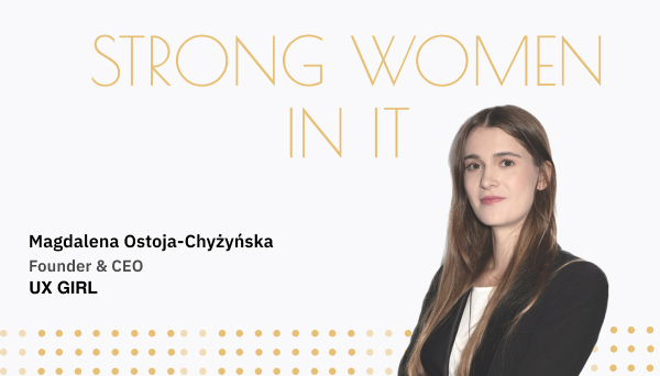
.jpg)
.jpg)


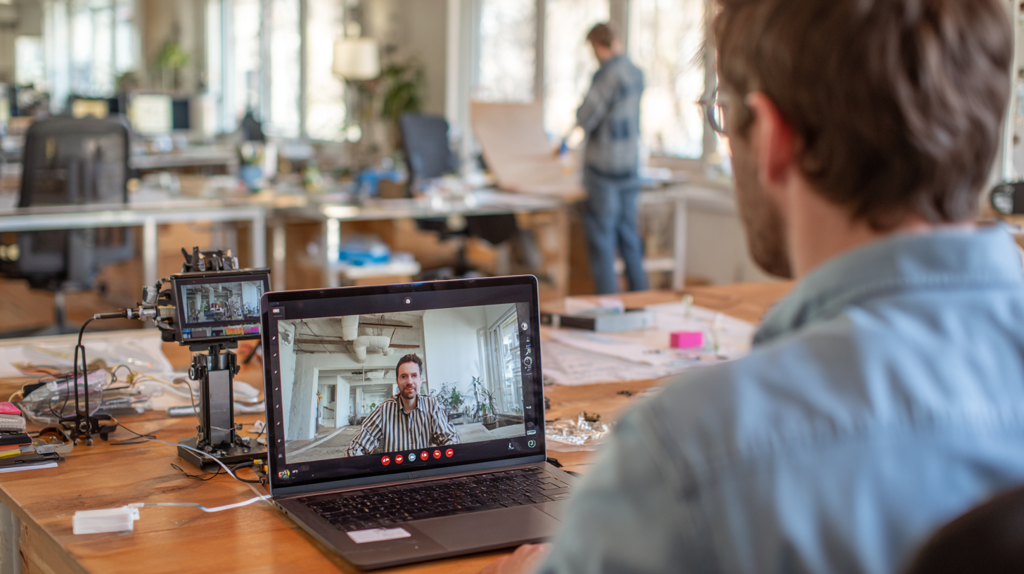
.jpg)


.jpg)
.jpg)

.jpg)
.jpg)

.jpg)


.png)

.jpg)
.png)
.png)
.png)


.png)


.jpg)


.jpg)

.jpg)


.jpg)

.jpg)


.jpg)


.jpg)
.jpg)


.jpg)


.jpg)


.jpg)


![A minimalist graphic defining Artificial Intelligence (AI). The text reads: 'THE SCIENCE OF CREATING INTELLIGENT MACHINES THAT CAN [MIMIC] HUMAN [PERFORMANCE AND] NATURALLY ACQUIRED CAPABILITIES.' Below the text is a small, centered, greyscale photo of a white robotic hand, and the caption 'Artificial Intelligence'](https://cdn.prod.website-files.com/63722c0a69a5307826c01e08/653163ff5dfcf69a5774f116_7.0%20AI%20Demystified_%20Breaking%20Down%20the%20Basics%20-%20Blog.png)
.jpg)


.jpg)

.jpg)
.jpg)


.jpg)
.png)


.jpg)


.jpg)


