“Design used to be the seasoning you’d sprinkle on for taste. Now it’s the flour you need at the start of the recipe.’’

— John Maeda, Designer and Technologist

Contact us

Please tell us a bit about your project idea and we’ll get back to you as soon as possible.
Tell us about your project idea
Thank you! Your submission has been received!
Oops! Something went wrong while submitting the form.
Privacy Policy

This Privacy policy was published on March 1st, 2020.

GDPR compliance

At UX GIRL we are committed to protect and respect your privacy in compliance with EU - General Data Protection Regulation (GDPR) 2016/679, dated April 27th, 2016. This privacy statement explains when and why we collect personal information, how we use it, the conditions under which we may disclose it to others and how we keep it secure. This Privacy Policy applies to the use of our services, products and our sales, but also marketing and client contract fulfilment activities. It also applies to individuals seeking a job at UX GIRL.

About UX GIRL

UX GIRL is a design studio firm that specialises in research, strategy and design and offers clients software design services. Our company is headquartered in Warsaw, Poland and you can get in touch with us by writing to hello@uxgirl.com.

When we collect personal data about you
  • When you interact with us in person – through correspondence, by phone, by social media, or through our uxgirl.com (“Site”).
  • When we get personal information from other legitimate sources, such as third-party data aggregators, UX GIRL marketing partners, public sources or social networks. We only use this data if you have given your consent to them to share your personal data with others.
  • We may collect personal data if it is considered to be of legitimate interest and if this interest is not overridden by your privacy interests. We make sure an assessment is made, with an established mutual interest between you and UX GIRL.
  • When you are using our products.
Why we collect and use personal data

We collect and use personal data mainly to perform direct sales, direct marketing, and customer service. We also collect data about partners and persons seeking a job or working in our company. We may use your information for the following purposes:

  • Send you marketing communications which you have requested. These may include information about our services, products, events, activities, and promotions of our partners. This communication is subscription based and requires your consent.
  • Send you information about the services and products that you have purchased from us.
  • Perform direct sales activities in cases where legitimate and mutual interest is established.
  • Provide you content and venue details on a webinar or event you signed up for.
  • Reply to a ‘Contact me’ or other web forms you have completed on our Site (e.g., to download an ebook).
  • Follow up on incoming requests (client support, emails, chats, or phone calls).
  • Perform contractual obligations such as invoices, reminders, and similar. The contract may be with UX GIRL directly or with a UX GIRL partner.
  • Notify you of any disruptions to our services.
  • Contact you to conduct surveys about your opinion on our services and products.
  • When we do a business deal or negotiate a business deal, involving sale or transfer of all or a part of our business or assets. These deals can include any merger, financing, acquisition, or bankruptcy transaction or proceeding.
  • Process a job application.
  • To comply with laws.
  • To respond to lawful requests and legal process.
  • To protect the rights and property of UX GIRL, our agents, customers, and others. Includes enforcing our agreements, policies, and terms of use.
  • In an emergency. Includes protecting the safety of our employees, our customers, or any person.
Type of personal data collected

We collect your email, full name and company’s name, but in addition, we can also collect phone numbers. We may also collect feedback, comments and questions received from you in service-related communication and activities, such as meetings, phone calls, chats, documents, and emails.

If you apply for a job at UX GIRL, we collect the data you provide during the application process. UX GIRL does not collect or process any particular categories of personal data, such as unique public identifiers or sensitive personal data.

Information we collect automatically

We automatically log information about you and your computer. For example, when visiting uxgirl.com, we log ‎your computer operating system type,‎ browser type,‎ browser language,‎ pages you viewed,‎ how long you spent on a page,‎ access times,‎ internet protocol (IP) address and information about your actions on our Site.

The use of cookies and web beacons

We may log information using "cookies." Cookies are small data files stored on your hard drive by a website. Cookies help us make our Site and your visit better.

We may log information using digital images called web beacons on our Site or in our emails.

This information is used to make our Site work more efficiently, as well as to provide business and marketing information to the owners of the Site, and to gather such personal data as browser type and operating system, referring page, path through site, domain of ISP, etc. for the purposes of understanding how visitors use our Site. Cookies and similar technologies help us tailor our Site to your personal needs, as well as to detect and prevent security threats and abuse. If used alone, cookies and web beacons do not personally identify you.

How long we keep your data

We store personal data for as long as we find it necessary to fulfil the purpose for which the personal data was collected, while also considering our need to answer your queries or resolve possible problems. This helps us to comply with legal requirements under applicable laws, to attend to any legal claims/complaints, and for safeguarding purposes.

This means that we may retain your personal data for a reasonable period after your last interaction with us. When the personal data that we have collected is no longer required, we will delete it securely. We may process data for statistical purposes, but in such cases, data will be anonymised.

Your rights to your personal data

You have the following rights concerning your personal data:

  • The right to request a copy of your personal data that UX GIRL holds about you.
  • The right to request that UX GIRL correct your personal data if inaccurate or out of date.
  • The right to request that your personal data is deleted when it is no longer necessary for UX GIRL to retain such data.
  • The right to withdraw any consent to personal data processing at any time. For example, your consent to receive digital marketing messages. If you want to withdraw your consent for digital marketing messages, please make use of the link to manage your subscriptions included in our communication.
  • The right to request that UX GIRL provides you with your personal data.
  • The right to request a restriction on further data processing, in case there is a dispute about the accuracy or processing of your personal data.
  • The right to object to the processing of personal data, in case data processing has been based on legitimate interest and/or direct marketing.

Any query about your privacy rights should be sent to hello@uxgirl.com.

Hotjar’s privacy policy

We use Hotjar in order to better understand our users’ needs and to optimize this service and experience. Hotjar is a technology service that helps us better understand our users experience (e.g. how much time they spend on which pages, which links they choose to click, what users do and don’t like, etc.) and this enables us to build and maintain our service with user feedback. Hotjar uses cookies and other technologies to collect data on our users’ behavior and their devices (in particular device's IP address (captured and stored only in anonymized form), device screen size, device type (unique device identifiers), browser information, geographic location (country only), preferred language used to display our website). Hotjar stores this information in a pseudonymized user profile. Neither Hotjar nor we will ever use this information to identify individual users or to match it with further data on an individual user. For further details, please see Hotjar’s privacy policy by clicking on this link.

You can opt-out to the creation of a user profile, Hotjar’s storing of data about your usage of our site and Hotjar’s use of tracking cookies on other websites by following this opt-out link.

Sharethis’s privacy policy

We use Sharethis to enable our users to share our content on social media. Sharethis lets us collects information about the number of shares of our posts. For further details, please see Sharethis’s privacy policy by clicking on this link.

You can opt-out of Sharethis collecting data about you by following this opt-out link.

Changes to this Privacy Policy

UX GIRL reserves the right to amend this privacy policy at any time. The latest version will always be found on our Site. We encourage you to check this page occasionally to ensure that you are happy with any changes.

If we make changes that significantly alter our privacy practices, we will notify you by email or post a notice on our Site before the change takes effect.

Title Image for this blog post

Press Office

UX GIRL among the best UX Design suppliers - SuperbCompanies rank

WSTAW

The main values of UX GIRL are a holistic approach, leadership and passion. Although the team is not large, we strive to maintain these values fully. Since its inception, UX GIRL has been joined by new people who bring different perspectives and experiences. This allowed us to create a group of people who work as a team to create great designs and have already many satisfied customers.

What does this lead to?

Amazing people and great results provide success for UX GIRL. One of these successes is being included in the ranking of the best UI/UX Design Agencies by SuperbCompanies! It is an honor for us to be among the best, and we are also glad that our hard work has been recognized by SuperbCompanies.

About SuperbCompanies

SuperbCompanies is a platform that includes SEO and IT service providers to help users find the best of the best. When creating the ranking, various aspects such as quality, reliability, and market presence are taken into account.

Each SuperbCompanies ranking includes suppliers of specific categories and since it has existed for 10 years now it makes them a reliable source of information

In addition to feeling joy, we are also motivated and have enormous strength to continue working hard. Although we are already included in this ranking, our aim is to achieve the highest possible position!
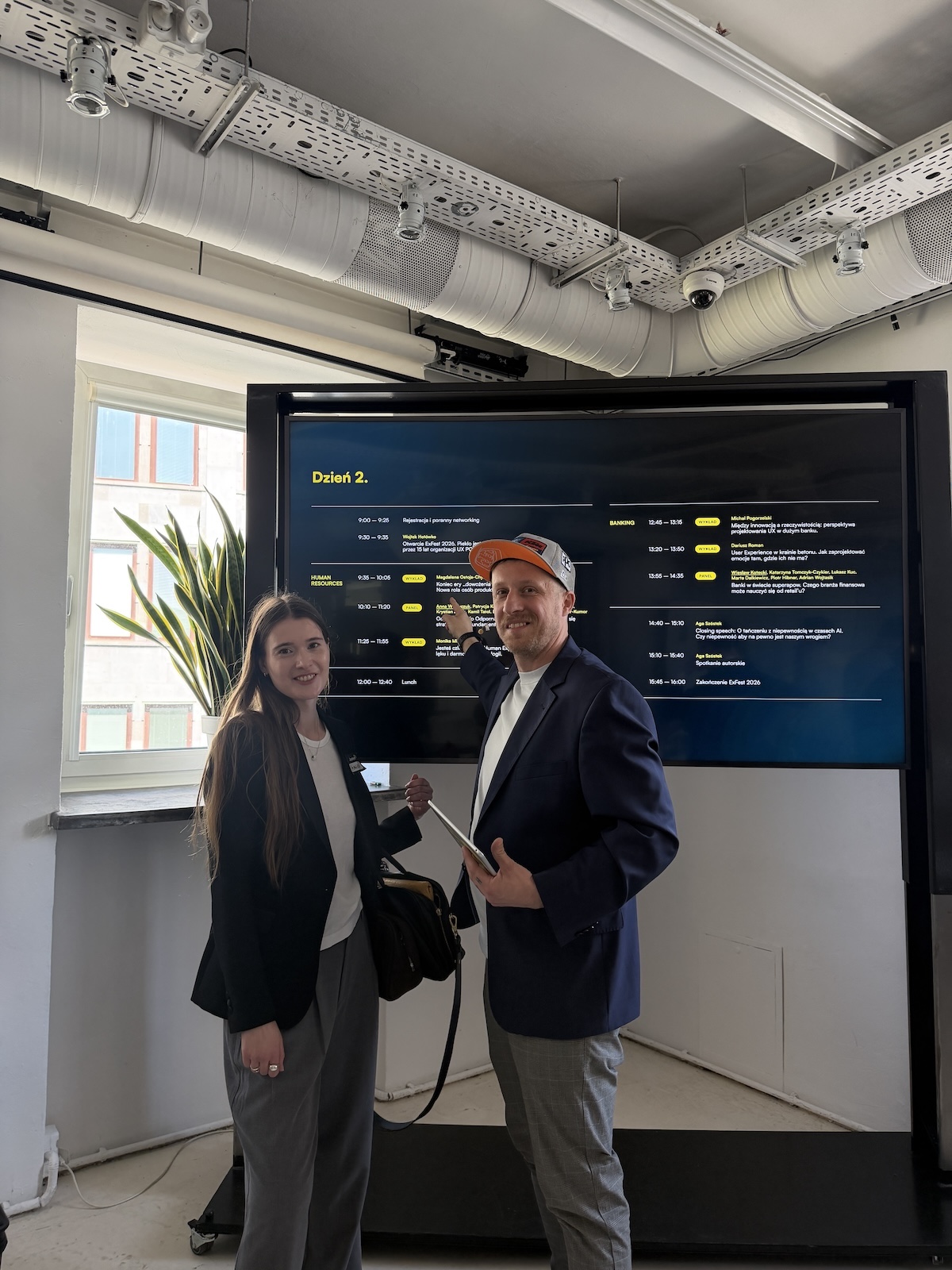
Check out our other

articles

Best Design Conferences moved to Remote Online this year 2020
5 min

Best Design Conferences moved to Remote Online this year 2020

This years work leisure times meaning attending conferences might be a little troublesome for most of us to say the least with all the restrictions due to COVID-19 situation. Even though travelling to a distant country to meet new people and talk work matters in a light way while drinking free beverages is not possible, there is another option to learn something new and possibly meet others, meaning online remote conferences.

Many of the yearly happenings have successfully moved to the virtual space this year to accommodate new conditions. While the experience might be slightly different we still think it’s worth it, so grab your favourite beverage and snacks and get ready for some binge keynoting.

UX Healthcare: Frankfurt

July 8, 2020

Better user experience can save lives. With this bold statement UX Healthcare conference presents their mission. At UX GIRL Healthcare is at the forefront of our services sectors and we, as well as UX Healthcare, also see a big need in revolutionising this industry. Healthcare systems need better design and need some talks about it. Frankfurt edition of this conference will be held fully online with later editions to stay in the usual format. It’s a great possibility to catch a glimpse of the healthcare industry progress in terms of technology and experience working products. We particularly recommend attending these sessions: Adventures in Surgical UX from Tim Caynes and UX for AR: Brain Surgery with Augmented Reality.

Gdynia Design Days

July 4–11, 2020

Gdynia Design Days: Attention theme 2020 poster with Akiyoshi Kitaoka optical illusion

This baltic conference is already an established brand in the polish design scene. 2020s’ years theme is Attention! which was announced even before the worldwide epidemic of COVID-19. It was chosen to showcase mindfulness and enhance focusing on values, that we sometimes forget these days. We have our own possibility of adding to the theme, as Magdalena-our founder will be performing design workshops there. If you want to learn more about Blockchain and how to solve sustainability issues with it through design be sure to sing up here.

HCI International

July 19–24, 2020

We were particularly looking forward to visiting this conference, as it was scheduled to be held in a beautiful venue Bella Sky, Copenhagen, but it’s great to know that the conference has been fully moved to the online. HCI International is a very solid science-oriented conference covering all aspects of Human Computer Interaction. If want to see factual research studies being presented-this is something for you. We also highly recommend it for people interested in accessibility.

FinTech Design Summit

July 30, 2020

Financial world is finally catching up with new technology and it’s a very interesting moment for designers to dive deeper into Capital Markets, Corporate and Personal Banking and Brokerage. The conference will feature aspects of Product, Design, UX and Strategy in the Fintech sector. It would be great to listen to Andy Montgomery talk about Square, which was one of the hottest startups in the early fintech days and still stays strong in e-commerce. For people more interested in Blockchain we think listening to Sarah Gregory from Coinbase might just be the best thing to do in your free time.

Enterprise Experience 2020

August 31-September 3, 2020

It’s hard not to notice the organiser of the event Rosenfeld Media, which is responsible for delivering technology and design oriented books to eager reading designers for over a decade. The program of the conference is quite robust with lectures ranging from design for US satellites, through LEGO and giants like Mastercard, Salesforce, ZenDesk. Seems like everyone will find something worthy to listen to.

UXPA 2020 International

September TBA, 2020

Offline conference that was supposed to be cancelled and moved to 2021 decided to run a mini version of it during September. Dates are still TBA, so make sure to write it down a check once in a while. Conference is organized by UXPA association (former UPA) and will be free for all it’s members. Special feature for this conference is a big UX Quiz, which can be completed solo or in team.

Design Thinking: Virtual Experience

September 8–11, 2020

John Maeda @ Design Thinking: Virtual Experience

Biggest highlight of this conference is John Maeda, a designer and technologist that was marked by Wired magazine as to be to design as Warren Buffet is to finance. He will be talking about transformation and going beyond design — we can’t wait. Apart from this talk we think it would be beneficial to attend to some workshops that are being held by people from IDEO U.

Disrupt 2020

September 14–18, 2020

It’s hard not to know this conference if you have been to the startup world once in your lifetime. Techrunch Disrupt offers a glide through this years hottest startups that will certainly be big in years to come. It might be the best place to catch a glimpse at the newest user interface trends to come and see them in action on a live product. The conference is supposed to be held offline, but will feature a Digital Pass, that will allow attendees to listen to select keynotes from their homes.

Design Matters ‘20

September 23–24, 2020

Shot from the Design Matters 90' inspired website

A conference with a rebel flare, we really recommend you visit their 90' inspired website. Design Matters explores new movements in the digital design scene. This year it features Real Fake, Next Gen Design and Scrappy Creative as the conference themes. All sound pretty neat, so we think you should attend just to check them out of curiosity. It will be held onsite in Copenhagen, but live stream tickets are available.

Mobile HCI 2020

October 5–8, 2020

This Mobile conference is organized by ACM (Association for Computing Machinery), a nearly 75-years old organisation directed at technology and computing. We expect a decent dose of research backed information concerning mobile applications and human computer interaction there. The conference has been fully moved to the virtual space, so expect lots of presentations and insights delivered straight to your comfortable sofa.

UXDX

October 6–9, 2020

Last but not least, UXDX offers a fresh view on combining product, design and development topics. Conference is to be held online and will get you the knowledge needed to amp your product development process a level higher.

Either onsite or online we still think conferences do broaden up your horizons. Make sure to save some time for these events and try to network, given our current possibilities.

Have fun!

-This blog post originally appeared on medium-

Title image for this blog post
5 min

UX/UI Design Trends for 2022

As you may have guessed already, designing digital products is something more than just pampering their visual layer and taking care of the aesthetic experience of end users. Designing is primarily the ability to meet the specific problems of our recipients. It is to propose solutions based on previously acquired information regarding strictly defined needs and goals. Regardless of whether we create a mobile app, website, or a complex system for a specialized target group (e.g. astrophysicists or vascular surgeons), we should always get to know the expectations and needs of the people we design for. In addition to collecting requirements, drawing flows, thinking about, and testing individual user paths, we must remember such aspects as the usability of the solution being created, its availability, or even the necessity to take into account technological limitations.

Does this mean the visual layer should be sidelined or simply ignored? That’s not true, as often it is just as important as all the rest. This importance of aesthetics to us (and our users) is shown by trends in UI design that have been appearing for many years. As with all trends, you shouldn’t get too attached to them, since they are often very fleeting and pass faster than they can appear on our smartphones or in our browsers. Nevertheless, whether we’re talking about clothes, music, art, architecture, or interface design, we can always follow certain trends and track how they shape a given market. Some of them, as we have already mentioned, are temporary and do not find much support among recipients. Others, on the contrary, have been ruling for years and with each subsequent year, they evolve, popularize and penetrate deeper.

Today, we are going to discuss the trends of UI design for the new year, 2022. The majority of them debuted on our monitors and smartphones’ screens some time ago. However, due to the extremely rapidly developing technology, allowing some concepts to evolve, due to popularity or sentiment, many of the above-mentioned trends will stay with us for much longer and will certainly attract attention for the next year.

Even so, we must not forget that we are still talking about trends, a certain fashion or approach that is currently at the forefront. It does not mean, however, that we should follow it blindly from now on. Again, first of all, we should create solutions focused on a given need, solutions that respond to the problem presented to us.

Why bother with trends then? Why follow something that may become a thing of the past in a few or a dozen months? It’s quite simple.

To design better, to understand the market and to keep up with changing standards. In this fast-paced technological world, the way content is presented in apps and on websites keeps changing rapidly. People are constantly attracted by new stimuli and someone (perhaps from our competition) is constantly trying to attract their attention. If we want to relatively easily adapt to the changing world (not only the external, but also the virtual one), and at the same time not to be overwhelmed by the enormity of often unnecessary information — we should wisely and consciously follow the trends. This will allow us to approach design much more confidently and better. Being up to date, the ability to adapt to current standards, and being remembered are very important aspects today. They have a direct impact on how our product will be perceived outside. People buy with their eyes. The first impression is not an overrated slogan, but an actual phenomenon that can decide whether users will love our product.

Below is a brief presentation of a few trends we believe are worth paying attention to today. Some of them have been around for a while and will certainly not disappear any time soon. This is confirmed by, for example, all those fantastic projects that we can see on the Internet.

Use of 3D elements

Screenshot of PhotoVogue Festival website
PhotoVogue Festival website

No one is surprised today that designers are replacing flat illustrations with graphics and even animations in 3D. The development of technology and the emergence of new tools and plugins that allow you to easily create 3D objects is conducive to the development of this increasingly common trend. Both the ease of creating in 3D and much better resources such as stronger computers, faster internet, better optimization, and more front-end libraries allow our applications and websites to come to life.

3D very often means that our project is remembered, that it does not get lost in the multitude of subsequent pages, and thus it may also pay off in sales results. 3D objects make our products more attractive. The effect of depth or “popping out the screen”, although not so new, still attracts attention and enriches the reception among potential users.

Today you don’t have to be a Blender or Maya master — you can just use Figma and plugins such as:

  • Vectary 3D Elements
  • Fig3D
  • 3D shapes

It is also worth looking at Dimension CC from Adobe.

Bold Typography

Beyonity webiste

The fact that many websites and mobile apps have been moving towards minimalism for some time now does not need to be pointed out. Minimalism leads the way and it’s hard to be particularly surprised about it. First of all, we often associate it with professionalism. In addition, fewer elements mean less cognitive overload for users. Minimalism is also a huge plus for optimization — the simpler something is, the faster and smoother it works. It requires less resources (at least theoretically) as well.

A suitable complement to minimalist designs is the use of bold, clear, sometimes even exaggerated typography. It often comes down to placing individual headlines taking up a large part of the page view. In such a way, the user can be more involved in the content presented. The purpose is sometimes purely artistic. It is worth experimenting, breaking patterns, and building a design based on typography — this is what can play the first fiddle.

Dark Mode

TEN.finance website

Another concept worth following is a dark mode theme. Usually available as an option we can turn it on at night to protect our eyesight. Today we can, however, more and more often observe its default presence in web design, where users encounter light or white typography on a dark background. It is worth remembering the basic rules relating to contrast and how human eyesight reacts to certain color combinations. Hence, remember not to use white on a purely black background and vice versa, i.e. if you choose the dark mode, make sure that the background is e.g. dark gray, not 100% black, etc.

Anyway, apart from strictly aesthetic values, the dark mode also allows you to save the battery (less bright pixels have a positive effect on how quickly we have to search for a charging socket).

Protecting eyesight, energy, and aesthetic values are just some of the advantages of using the dark mode in our products. Dark themes with contrasting colors also improve visibility for some groups of visually impaired individuals. When designing a dark version of an app or a website, make sure that your solution is available to a wider audience. Designing in an inclusive manner is an important aspect of any good design. Therefore, if we want to comply with the guidelines or simply respond to the needs of all target groups, we should take it into account. Thus, if you haven’t thought about using dark themes for your apps or websites, it might be time to do so.

Y2K

Vintageria — online shop

One of the biggest UI trends is Retro Design. It is often seen as a way to bring back nostalgic memories and focus on things we already know, repackaging comfort and knowledge of the past and adapting it to the needs of the present.

Research has shown that nostalgia gives our lives a sense of meaning and continuity, leading to a stronger sense of interconnectedness and clear direction. Nostalgia also helps to relieve the uncertainty of the future by letting people feel they belong and have a purpose.

Each decade was characterized by something special and thanks to this, retro design can be understood in various ways. We can talk about the pop art trend or the psychedelic design of the 60s. Memphis Style with art deco elements and bold geometric shapes of the 80s, or abstract shapes and patterns, dorky fonts, kitsch textures, and grunge of the 90s.

What we want to highlight here is the so-called Y2K aesthetics, which officially returns and pops up everywhere from industrial, interior, and graphic design to social media, pop culture, and UI design.

The Y2K concept is described as futuristic with a retro twist. Based largely on cyberculture, Y2K’s aesthetics are known for their shiny textures and holographic metallics that are becoming a big trend on their own right now. Youthful, tacky, plastic, and colorful.

The trend has already started to emerge on social media platforms such as TikTok, where young people are experimenting and trying to get new quality out of thick, chunky fonts, bright colors, and trashy, futuristic style.

With a smile on their face, the older generation observes how subsequent apps and websites utilize the trends of their youth. The younger generation, at the same time, with the child’s fascination, creates crazy combinations, turning kitsch into a fashion of today’s times.

Maybe, for a while, it makes sense to depart from modern, flat, minimalist concepts and delicate colors, to take a step back and see what will never come back in the same form?

Dusty Design

Stacks website

To make buttons stand out, designers are experimenting with ways to make them look like they’re floating above the background. We often use drop shadows and different combinations and variants of gradients to liven them up.

One trend that we predict will be huge in 2022 is dusty buttons. Buttons on glass surfaces will look like they’re behind a thin coating of dust, providing a sense of depth and making the buttons appear more tactile. This trend highly shows that the boring flat buttons era might be way behind us and a completely new future is approaching.

Color of the Year

Very Peri color palette

The Pantone Color Institute, every year for over 20 years, announced the color of 2022. This time they chose a warm and subdued mixture of blue, violet, and a hint of red. Officially called Pantone 17–3938 Very Peri, described as dynamic periwinkle blue hue with a vivifying violet red undertone. In RGB space, it’s exactly 102, 103, 171. And the HEX value is #6667AB.

The color is a response to the current world situation and is intended to suggest the need for change, the search for new opportunities, hope, and creative strength. The inspiration was not only the coronavirus pandemic, but also virtual reality headed by Metaverse and NFT.

Very Peri is meant to encourage people to discover and enter a new reality with optimism and childlike curiosity. It allows us to accept the opportunities and perspectives that surround us. The time of transformation and the need to adapt to a new vision of the world require not only exceptional creativity, but also self-confidence, passion, and energy.

In general, the combination of blue and purple is associated with innovation, creative thinking, and modernity. On the other hand, warm accents add a tinge of optimism and joy.

Does this mean that in 2022 we should design our products based on this color theme? Not necessarily, but it’s worth having it in the back of your head. Color trends set by the Pantone Institute quickly shape fashion in the world around us. Hence, you can almost be sure that shades of purple and blue will storm not only apps and website interfaces, but also fashion shows and interior designs.

Color is still one of the most powerful means to communicate and express emotions. Therefore, let’s not be afraid to follow color trends and experiment with what is currently popular.

These are just a few of the design trends worth following. In addition to the above-mentioned, it is worthwhile to observe concepts such as:

  • motion design & micro animations
  • new european bauhaus
  • immersive design
  • behavioural design
  • blurred, colorful backgrounds
  • claymorphism & glassmorphism,
  • smooth swipe
  • emotional design
  • abstract design
  • animated illustrations

Finally, for dessert, we left two more concepts that have caused a lot of buzz in recent years, namely AR (Augmented Reality) and VR (Virtual Reality). Well known and widely used, but still not as common as we would like.

Additionally, in the past year, the tech world has turned its eyes to two hot terms, Metaverse and NFT. We won’t go into details right now, but they are definitely things that will change the way we perceive VR today. Watch the development of all mentioned directions, because there are probably a lot of things that can happen in this realm soon. As designers, we should always stay on our toes.

-This blog post originally appeared on medium-

Title image for this blog post
5 min

Design Trends for 2024

Another crazy year is behind us. Both in the world of politics and the international situation, as well as in the world of technology. We can confidently say that, on the one hand, we need new impulses and impressions after the rather boring and specific period of the pandemic. On the other hand, looking at what is happening in the world in general, we need peace and rest.

Looking at current trends in both graphics and UI/UX design, they perfectly reflect this dualism. We have the color of the year 2024 recently announced by Pantone - a soft, pinkish-orange hue called "Peach Fuzz", reflecting the collective desire for respite and the Bento Grid introducing harmony. But at the same time, we have the bold intrusion of 3D and VR concepts, juicy color combinations, and neubrutalism, which have as much in common with calmness as Java has in common with Javascript (i.e. not much).

And all this is poured with AI sauce. Yes, last year was definitely the year of AI and everything indicates that this year will be no different in this respect.

So sit back and take a look at what design will follow in 2024.

3D

Probably more than once, when reading this article, you will get the impression that this has happened before, this or that trend is nothing new and there is actually nothing to be excited about. However, it is not as obvious as it may seem at first glance. Some time ago we were already dealing with 3D elements on websites, but often they were actually either isometric projections of rather clumsy illustrations, or elements in the skeuomorphic style, which is not actually full-fledged 3D. Alternatively, browser-based gaming experiences. Now we are talking about 3D in all its glory. A complex and engaging experience that we can increasingly observe, e.g. in the form of product presentation on a website or in branding.

macOS Sonoma; Spline; ozero.design; reddit.com; lusion.co; resend.com; Sauce: elegantseagulls.com

Sometimes you can even find statements suggesting that this is the end of the era of flat design. We can't really agree on this here. I think that both approaches, i.e. minimalist and 3D style, coexist and will coexist for a long time. Once in a while, you need simplicity, but other times you need three-dimensional immersion.

The development of 3D is not surprising, because every year we have better and better technologies and hardware capabilities at our disposal. Faster Internet, faster computers, better optimization of tools such as WebGL, creation of new libraries, and improvement of existing ones, e.g. three.js. The creation of tools that allow people who are not specialists in the subject to work with 3D. Recently, the Spline tool has become very popular. It runs in a browser, and the intuitive interface and a bunch of predefined operations allow you to create fantastic 3D objects and interactions with minimal effort. You no longer need to learn how to use Blender - in Spline we can click everything quickly and painlessly 😀

Enriching your website with three-dimensional elements and animations allows you to build a more complete, more attention-grabbing experience. In addition to websites, we can also use 3D in our personal brands. Recently, the popular website Reddit refreshed its brand by creating a new logo in the form of a three-dimensional mascot. In turn, three-dimensional application icons appeared in MacOS. Such companies also (or maybe primarily?) shape the directions in which the industry is developing, and this shows that 3D fashion will not disappear so quickly. So expect an in-depth experience even more!

Heatmapping

Heatmapping is a graciously named style that focuses on the blending of colors, which interlace in various ways to create attention-grabbing backgrounds, shapes, and even fascinating rainbow-like animations. Sometimes, this style simply comes down to working with gradients, which don't always have to be static or cliched. Nowadays, we're witnessing vibrant color combinations, bold unions, and the introduction of animated colors. As a result, we gain a broader and more nuanced experience. Additionally, the Aurora UI or Aurora Borealis style, also involving color blending, has been quite popular in recent years. It's a technique that involves blending colors in a way that mimics the Northern Lights, featuring smooth color transitions within an often muted palette to create a cohesive and soothing experience.

mymind.com; Dribbble: Graphic Assets, Colorful Gradient Backgrounds,Textures; stripe.com; monopo.co.jp; exhibition at the National Museum of Contemporary Art Αthens (ΕΜΣΤ); morrre.dsgn, Hybrid. Identity design by @timtijnk for a music festival; Sleepiest; Behance: Ai кроссы, Elena Kolodub; wope.com

Returning to heatmapping, the style refers to techniques used, for example, in product analytics. Serving as a tool to analyze user behavior data on websites or mobile apps. A heatmap (or heat map) is a graphical representation of data where values are depicted by color, crucial for pinpointing what works or doesn't on a website or page and identifying the areas users interact with the most. Heatmapping allows for identifying the most frequently clicked spots, analyzing scrolling behavior, and investigating which elements attract particular attention. "Hot" areas, indicating high interest, are marked in red, while "cold" areas, showing lesser engagement, are highlighted in blue, with intermediate colors like orange, yellow, green, and purple providing additional insights.

As we can see, all these techniques involve manipulating colors to create more sophisticated experiences. This approach allows designers to infuse UI elements with depth, movement, and emotion, using color psychology to evoke specific feelings or reinforce brand identity. The style is not limited to web design and digital products, but also appears in merchandise, apparel, print media, home furnishings, and more, showcasing its versatility and widespread appeal in enhancing user engagement and visual storytelling.

Bento Grid

Projects are continuously emerging, created by designers who aren't afraid to experiment with how content is arranged within interfaces.  From ultra-minimalist and brutalist, sparing in form concepts, through horizontal scrolling, to completely wild layouts in which everything comes alive.

In the latter half of 2023, the so-called Bento Grid made its appearance on Apple's website and several other popular products, especially in the AI sector. Observing how many companies have adopted this concept on their sites, it's safe to predict that the Bento Grid will be the layout of 2024!

relume.io; schoooool.com; ozero.design; Windows 8; Windows 11; microsoft.com; iconwerk.com; liam.is

Inspired by the compartmentalized design of Japanese bento boxes, this grid system segments the screen into distinct areas, each dedicated to different content types. The Bento Grid isn't just for interface projects; it can be used in various presentations, reports, data visualizations, and branding. It's also currently one of the most popular styles on Linktree. The simple yet interesting division into rectangles of various sizes allows for an unconventional, clear, and hierarchical presentation of content. However, the Bento Grid should be used sparingly to avoid ending up with a layout that could overwhelm users, making the intended hierarchy less visible. Nonetheless, if you're looking for a way to present your data or any content in an interesting and scalable manner, consider using the Bento Grid. Remember, it's merely a concept, a tool, and the clarity and readability of the content you place within it depend entirely on you.

Interestingly, this concept isn't entirely new. For instance, it could be experienced with the tiles introduced by Microsoft in 2012. This perfectly shows that certain ideas and solutions come back after years and can once again experience their glory. Often in other contexts, but with the underlying idea remaining unchanged.

Massive Typography

This trend or style has been around for a few years now, but still it seems to be on top and even more and more websites incorporate it into their interfaces. Besides it’s often elegant or artistic, it has several other advantages.

First of all, it makes the users immediately focused on the specific elements and more involved in the content that we want to exaggerate.

Secondly, if space is limited due to large text sizes, we have to carefully choose what text we want to have on the website. This necessity ensures that only the most relevant and essential information is presented, avoiding the clutter of unnecessary details. We, as creators, are forced to articulate our thoughts in a succinct and effective way.

vanholtz.co; stripesessions.com; ikonliving.gr; gencell.preprodenv.com; homage.se; andagain.uk; ohm.studio

Typically, the use of bold typography is seamlessly integrated with a minimalist design approach, creating a harmonious blend that emphasizes clarity and simplicity. We don’t have to worry too much about additional visual assets, because they are not needed anymore. Website is lighter and it’s a good in terms of the optimization purposes.

Of course, current design can be crazy. We have so many possibilities to play and experiment with, that you can come across massive typography style together with 3D elements, animations, fluffy assets, etc. Actually, sky is the limit. Nonetheless usually, when it comes to this trend, the structure is pretty straightforward and the typography dictates the whole website’s vibe.

Immersive experience

This is very broad and general term, but in short it embraces all the bold and unique solutions that make your project stand out. They often guarantee mesmerizing experiences.

Immersive design frequently incorporates complex or ubiquitous animations that make a profound impact on users, transforming elements from mere decoration into powerful storytelling tools. Leading companies leverage this technique to showcase products or weave compelling narratives, elevating the user experience beyond the conventional.

lusion.co; pendereckisgarden.pl; panicstudio.tv; sarahfatmi.com; flyingpapers.com; gsap.com; sbs.com.au/theboat/; parfaitekuisson.fr

Another category that gives us often an immersive experience is the so-called scrapbook style or mixed media style. It’s essentially a modern twist on collage with playful or vibrant color palettes, untypical interactions, and a bunch of visual combinations that break the UX rules. It’s also eagerly used in graphic design. A mix of images, shapes, colors, and good storytelling creates an opportunity for memorable projects that resonate with the audience.

Lastly, immersive design refers also to AR/VR solutions, but we describe them in more detail below, as a separate trend.

Photo Grids

This UI style might not be as widely discussed as dark mode or brutalism, yet it undoubtedly deserves a special mention on our list. For at least a few years now, we've observed designers experimenting with grid and content layout in fascinating and unique ways, often resulting in even electrifying projects. At first glance, we can see just images scattered across a page. The implemented interactions seem to appear random, merely artistic whims. Indeed, these layouts often contain a significant amount of artistry and visual flair, but as the name suggests, they're grounded in a grid system. There's no rule stating that every website must adhere to a similar layout or that tiles must be of equal size and spaced evenly. Today's layouts and content presentation methods surprise with their form and creativity. However, a closer analysis of how individual images are arranged quickly reveals a pattern, showing they are strategically placed on a grid, everything aligned and thoughtfully considered.

surface.arcticvolume.com; dmitrkutsenko.com; sceners.co; cosmos.so; guillaumetomasi.com; adamho.com/#Industries

The primary goal of utilizing this style is to present one's projects, photographs, products, or simply what one wishes to showcase intriguingly. This style is often seen on design agency websites, e-commerce platforms (like clothing stores), architects' and photographers' websites, as well as for showcasing physical products (such as a ceramics collection).

Beyond unconventional content presentation, this approach often tells a story, builds a brand, and ensures the viewer is enchanted by both the photo grid and its contents.

It's also crucial that all images are visually cohesive and appropriately prepared, as they form the basis of the entire layout.

The style is particularly gracious because the ways to present and arrange content on the grid are nearly endless. Moreover, we can add a bunch of different interactions (like hover, click, or scroll effects) that enhance the whole experience even more. Designing the hero section in this manner can create an excellent first impression. Despite an initial impression of scattered content, everything harmoniously coexists, with nothing feeling visually out of place or uncomfortable. It simply works!

Monochrome Design

For many, "Dark Mode" might be the more familiar term. In essence, it's about designing with a focus on dark color schemes. Nowadays, the background doesn't have to be just dark gray or black. Many designs incorporate various accents, gradients, glows, illuminated interactions, etc.

Dark mode is not a new concept but has recently experienced a true renaissance. There's been a surge in fantastic projects and products with websites that dazzle with their design. Creators play with dark colors, introducing transparency, highlights, subtle micro-interactions, and additional accent colors, proving the popularity of this style is well-founded.

linear.app; feyapp.com; pipe.com; wope.com; evervault.com; satellitor.com; twingate.com; diagram.com

A while ago, Linear made its mark on the market. The company showcased a website that now serves as a benchmark for designing in dark mode. The website looks really good, and many designers are emulating its style, further popularizing the trend.

Besides Linear's website, there have been several other noteworthy projects recently that have made an impact and also become a significant source of UI inspiration. For example, the Twingate website or the Diagram project, which should be recognizable in the design world.

Beyond just looking good and giving the website a professional vibe, dark mode is also easy on the eyes and makes content consumption effortless.

Perhaps your next project will be inspired by this style?

Neubrutalism

Neubrutalism is a fancy term for the trend that is a next stage of the raw and overwhelming brutalism style. It's also a pretty good reflection of the Y2K hype. We are ready to claim that neubrutalism is somewhere in the middle. It's a return to simplicity, functionality, and minimalism but with a bold twist. This style is all about creating impactful layouts using stark colors, sharp lines, and geometric shapes. It's a fusion of old and new, drawing inspiration from the raw, unfinished materials of brutalist architecture and updating it with modern design principles. The core of neubrutalism lies in its uncomplicated layouts, uncluttered spaces, and modern typography, all brought to life with bright, contrasting colors and flat illustrations.

figma.com; gumroad.com; thegreatlake.fun; arc.net; budapestpark.hu/en; cleanwith.plus; adidasarena.com

This trend is more than a nostalgic nod to the architectural brutalism of the 1950s or the colorful vibrancy of pop art. It represents a modern, minimalistic look that emphasizes functionality and user experience (UX) through simple yet bold forms. Neubrutalism has become a popular choice for designers wanting to make their projects stand out. It's particularly effective for showcasing products and services in a distinctive way that captures attention and engages viewers.

The style encourages creativity, offering a unique way to express a brand's identity and spirit. With its emphasis on simplicity and impactful visual elements, neubrutalism can help your project make a lasting impression, whether you're looking to present your work in a new light or tell a captivating story through your website's design.

Spacial Design

This year is the year when Apple releases its Apple Vision Pro device. Of course, the hype started last year when Apple presented its new product at the WWDC23 conference. There was a lot of speculation, discussion, and the Internet was flooded with conceptual designs tailored to Apple's glasses. However, this year we are dealing with the official premiere, so it is easy to guess that the discussions and buzz around spatial design will return with a vengeance.

Apple Vision Pro (apple.com); bezi.com/hq; thespaces.com/airbnb-virtual-reality-hospitality (airbnb)

What exactly are Apple Vision Pro? To put it simply, these are virtual reality (VR) glasses. However, to be more precise, it is actually an advanced device with cameras, sensors, microphones, a powerful M2 processor and the new R1 chip and, above all, two built-in ultra-high resolution displays that, when combined, create one 4K screen with 23 million pixels that can generate an image up to 1200” wide. We can therefore use our favorite applications, serve online, watch movies or make video calls on a screen placed in a physical space.

However, this is not completely new when it comes to the VR market. Similar devices have been appearing for many years, and VR is used, for example, to eliminate cognitive disorders, treat concentration, present real estate projects, in games and a whole host of other things. Nevertheless, this year will certainly be significant, because it is Apple that will make its contribution and do it in its own spectacular style, giving the impression that their glasses are the most advanced and simply the best. Whether this is actually the case, we do not know, but it is almost certain that we will experience more and more VR projects. We are curious whether the premiere from Apple will be the impetus that will finally popularize VR technology among consumers.

Generative AI

This article would certainly be incomplete if we did not mention probably the biggest trend of the last several months, namely the use of AI algorithms.

ChatGPT, Midjourney (currently in version V6), Adobe Firefly and several other popular tools have introduced a new approach to how we work and what our projects ultimately look like. From a visual perspective, it is primarily the generation of images that deserves a lot of attention. The quality and realism offered by Midjourney or DALL-E 3 are really great and we are not surprised that people fell in love with working with prompts, creating visual gems. If you want to learn more about AI tools that are worth testing, please take a look at one of our previous articles: read about AI tools

Adobe Firefly (firefly.adobe.com); Relume (relume.io); otterdev.io; app.leonardo.ai; midjourney.com/showcase; logitech.com/pl-pl/products/keyboards/mx-mechanical-mini-mac.html

However, Generative AI is not only about images, it is also about generating text content, generating diagrams and design concepts (e.g. using the Relume tool), generating reports and summaries based on the entered data, and recently also generating videos or animations using simple text prompts.

Perhaps the first boom in these tools has already passed, but for sure another solution that will attract the attention of creators will soon appear on the market. And even if nothing like this happens, the number of applications and projects using generative AI is so large that it will certainly be a trend both this year and in the next few years.

As you can see, the industry is not idle and a lot is going on. The trends presented above are, in our opinion, only the most interesting, selectively picked ones. In general, there are many more concepts and styles that we can experience in the digital space. In some industries, one style shines through more than another, and that's okay too.

Trends are cool and it's worth keeping an eye on the pulse to know what direction our industry is heading and what's triumphing now, but let's not forget that trends pass and come back. They are often the result of some, as it later turns out, completely insignificant impulse. Therefore, first of all, let us approach it with caution and distance. We should first address our actual needs, which, as it often emerges, are completely different from what is currently on top.

Begin your design adventure now!
Contact us